Still so many stupid things...
Well, iOS8. Overall good on my 5S.
However - getting a rid of Camera Roll and the new stupid iCloud Photostream system is a big step back. Collections & Moments? Still very badly done - so much space wasted.
And why the hell can't I see all of my photos at once in one album? And then decide which one gets to stay on my iCloud and not on my phone?
Give me back Camera Roll!
Music and Video apps - still not perfect. Far from it.
Same old things - Albums are still rolled out. I have an artist with 30 albums. If I want to play some songs form the last album I have to scroll through like 350 songs to get there! It's a horrible experience! When I'm looking at particular artist Albums tab and want to perform Search for some song by that artist - it searches through everything - why not just the particular Artist or tab selected - Songs, Albums, Genres, etc.?
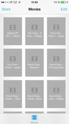
Videos - what is this? Now we have useless grid without any thumbnails. It's even worse than before! Nearly no name fits in. Everything is cut down. Why can't we have just a regular good old list with little thumbnails and one or two lines so the name could be actually read properly?
UI & UX teams - wake up!
Come on, this is not you, Apple.
No point of sending feedback either. Nobody at Apple reads it anyway I think.
Well, iOS8. Overall good on my 5S.
However - getting a rid of Camera Roll and the new stupid iCloud Photostream system is a big step back. Collections & Moments? Still very badly done - so much space wasted.
And why the hell can't I see all of my photos at once in one album? And then decide which one gets to stay on my iCloud and not on my phone?
Give me back Camera Roll!
Music and Video apps - still not perfect. Far from it.
Same old things - Albums are still rolled out. I have an artist with 30 albums. If I want to play some songs form the last album I have to scroll through like 350 songs to get there! It's a horrible experience! When I'm looking at particular artist Albums tab and want to perform Search for some song by that artist - it searches through everything - why not just the particular Artist or tab selected - Songs, Albums, Genres, etc.?
Videos - what is this? Now we have useless grid without any thumbnails. It's even worse than before! Nearly no name fits in. Everything is cut down. Why can't we have just a regular good old list with little thumbnails and one or two lines so the name could be actually read properly?
UI & UX teams - wake up!
Come on, this is not you, Apple.
No point of sending feedback either. Nobody at Apple reads it anyway I think.

 watch has again skeuomorphic elements. WTF???