Got a tip for us?
Let us know
Become a MacRumors Supporter for $50/year with no ads, ability to filter front page stories, and private forums.
Apple Releases Lion Developer Preview 3 and Xcode 4.1 Preview 5
- Thread starter MacRumors
- Start date
- Sort by reaction score
You are using an out of date browser. It may not display this or other websites correctly.
You should upgrade or use an alternative browser.
You should upgrade or use an alternative browser.
Just looking forward to window resizing ease...yeesh. I'd also like to have w7 snap to fit, that makes life so much easier. Thanks for the updates Apple...go Lion!
Look up Cinch on the App Store. Works like a dream
And that is why Lion supports GL 3.2...
That is a nice improvement, but I wonder why they didn't go for 4.0/4.1 ?
Maybe that's planned for a later point release 10.7.2 or somethin' ?
Yep, that works to cancel. But that just closes the Save dialog, it doesn't close the document without saving.
Hit Cmd + delete
Since DP2, if you click and hold an App icon in Launchpad, they start to wiggle just like iOS and a black "X" shows up on the upper left corner of the icon.
That just works to DELETE the app from the system, if you want to REMOVE it does not work anymore... wondering how to do.
The greatest thing about Mac OS X is it's security, spaces, app store, and multi-touch gesture implementation. Other than that, I really honestly believe that Windows 7 has it beat. At this point Lion is playing catch-up with finally allowing users to easily resize windows, having a proper log-in screen, and uniting app tools into one window rather than having multiple toolbars scattered around in small, separated windows. I really hope they don't let iOS slip behind..
That is a nice improvement, but I wonder why they didn't go for 4.0/4.1 ?
Maybe that's planned for a later point release 10.7.2 or somethin' ?
You are right, I expected them to go for 4.1 straight away. The best thing about 4.1 is that OpenGL and OpenGL ES are basically merged in this version, which would allow nice cross-platform Mac OS X/iOS development. I can only speculate that some aspects of GL 4x cannot be supported on all Apple hardware (64bit floats?) - but things like these can be easily emulated in software, and let's be honest - who uses them anyway?
The greatest thing about Mac OS X is it's security, spaces, app store, and multi-touch gesture implementation. Other than that, I really honestly believe that Windows 7 has it beat. At this point Lion is playing catch-up with finally allowing users to easily resize windows, having a proper log-in screen, and uniting app tools into one window rather than having multiple toolbars scattered around in small, separated windows. I really hope they don't let iOS slip behind..
Yes its the best ever version of Windows, but thats it. Windows 7 was a triumph of marketing as well I believe, judging by the amount of people who now claim better than Mac. The philosophies underlying the systems hasn't changed.
It's still got the legacy, lazy, braindead UI decisions they've had for years. Modal dialogs everywhere, non resizable windows, convoluted processes to perform basic tasks and ridiculous over complication because someone, somewhere was too afraid to make a decision. If you dig a bit there is plenty for Microsoft to improve. Sometimes you don't have to dig at all.
And then there is the ("Waiting for programs to close" message when you got logout/shutdown) and the list of programs is empty! There just as many minor niggles with Windows as the Mac, probably more actually.
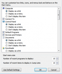
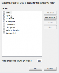
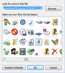
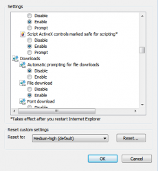
Anyway the screenshots below are all pulled from Windows 7 SP 1. 21st century computing? I think not.
Edit: So people don't get the wrong end of the stick with my point. My point is not to dump on Microsoft. They have some of the leading UX/UI people in the world. But it is hard to make a business case to go back over and make things feel better (can't be quantified) when work currently. The only way these are going to get redone is if the functionality needs to change.
Attachments
-
 Screen shot 2010-05-01 at 23.59.43.png30.1 KB · Views: 125
 -
 Screen shot 2010-05-02 at 00.02.31.png21.2 KB · Views: 108
 -
 Screen shot 2010-05-02 at 00.03.33.png53.5 KB · Views: 2,802
 -
 Screen shot 2010-05-02 at 00.11.57.png30.6 KB · Views: 120
 -
 Screen shot 2010-05-02 at 00.13.34.png21.7 KB · Views: 1,940
Last edited:
Maybe it's just me, and I've got used to it, but it feels like Apple have fixed the odd mouse acceleration with this build, finally!  Anyone else noticed this? (Using a Magic Mouse)
4 finger swipe down doesn't do anything anymore! Shattered, because it used to be the gesture to just expose windows open for the current app.
Also, new -> arrow in bottom right of dashboard which takes users back to Space/Desktop 1:

Also, new -> arrow in bottom right of dashboard which takes users back to Space/Desktop 1:

The greatest thing about Mac OS X is it's security, spaces, app store, and multi-touch gesture implementation. Other than that, I really honestly believe that Windows 7 has it beat. At this point Lion is playing catch-up with finally allowing users to easily resize windows, having a proper log-in screen, and uniting app tools into one window rather than having multiple toolbars scattered around in small, separated windows. I really hope they don't let iOS slip behind..
Being a recent switcher, I agree. Simple things that I assumed were in OS X simply aren't. I really feel like the menu bar always taking up pixels is a total waste of space. Auto hide, anyone? I really like Chrome/FF4 in W7 with the hidden menubars that are nicely integrated into one button for a clean interface and saved screen pixels. I feel like it's time they create a feature to turn off the menubar altogether. Integrate the menubar into the dock with a feature similar to tray icons.
I just feel like it's silly to always be looking at "File" "Edit" "View" etc. when you could just mouse over, or click an icon that brings these options out.

If you're a recent switcher I think you will start to like Mac OS X over time. I guess it takes a little getting used to.
The problem I see with having all sub menu under one sub menu is that it would take longer to find the right one. Also, it would be inconsistent if not all applications did this.
But the menu bar doesn't take up that much space, does it? Anyway, I also see it being fixed at the top and ”can't be missed” as a good feature. But maybe it could hide itself when the cursor is moved away, but then it had to show itself superfast when needed, otherwise you get GUI friction.
I miss many things in Windows 7 from Mac OS X, like the program switcher witch is much more fathomable when having a lot of apps and windows open (I have 20-30 apps open quite often) and the way Mac OS X just shows each app instead of every window makes it quicker to navigate.
I also miss not being able to scroll in a background window with the scroll wheel.
It's also more difficult yo type some characters in Windows, you need to do the ”alt four numers” thingy on the keypad to get the one you want.
I also miss QuickLook and native PDF support.
But sure, Windows 7 isn't bad. On the surface it is definitely the first Windows I fell comfortable in. But like elppa says, there are many places where Windows still feels awkward and hasn't moved forward.
Many things that can get better in Mac OS X too, for sure, but it feels more fulfilled in its ”forward moving” I think.
Maybe it's just me, but I think the new log-in screen looks like a dull version of the Windows (since XP) login/user switch screen (fading animation aside)
I guess it's not just you, but I and many don't agree.
I think it looks clean and sober with beautiful icons and fonts.
4 finger swipe down doesn't do anything anymore! Shattered, because it used to be the gesture to just expose windows open for the current app.
Also, new -> arrow in bottom right of dashboard which takes users back to Space/Desktop 1:
Image
4 finge down HAS to have some form of functionality similar to expose, or at least an option to turn it back on.
Apple would be idiots to change/remove such a feature, especially when they're focusing so much on MacBook Airs now.
Over analysing a login screen ? Proclaiming Windows a better OS because it has a "better" login screen ?
Wow, some people are really into the shallow end of OS comparisons...
Wow, some people are really into the shallow end of OS comparisons...
Yes its the best ever version of Windows, but thats it. Windows 7 was a triumph of marketing as well I believe, judging by the amount of people who now claim “better than Mac”. The philosophies underlying the systems hasn't changed.
It's still got the legacy, lazy, braindead UI decisions they've had for years. Modal dialogs everywhere, non resizable windows, convoluted processes to perform basic tasks and ridiculous over complication because someone, somewhere was too afraid to make a decision. If you dig a bit there is plenty for Microsoft to improve. Sometimes you don't have to dig at all.
And then there is the ("Waiting for programs to close" message when you got logout/shutdown) and the list of programs is empty! There just as many minor niggles with Windows as the Mac, probably more actually.
Anyway the screenshots below are all pulled from Windows 7 SP 1. 21st century computing? I think not.
Been a mac user for 20 years. Personally I think windows 7 is way better then mac os x on many levels. What you outlined above means nothing to how productive a person can be while using windows 7.
So what there's circa 95 icons still circulating? your point is moot.
In regards to legacy. Do you think 90% of the people that use a computer even know what that is? Do you think I care that legacy is still a part of the O.S when I am working on a project or using the computer to do daily things? Get serious dude.
Legacy never affected my capability to get **** i want to do done.
For reasons unknown, DP3 won't show up in Software Update. I'm stuck with DP2 Update 2, at build 11A444d right now.
I've noted a few things about Developer Preview 2 Update 2 in another forum, I wonder if you guys who have DP3 can comment them :
I've noted a few things about Developer Preview 2 Update 2 in another forum, I wonder if you guys who have DP3 can comment them :
- OpenGL 3's support is still faaaaaar from complete.
- iCal hasn't changed since last build. Still ugly IMO. It may not look like bloody diarrhea anymore, but it looks like vomitted pea soup.. ---> I've seen the latest one in DP3 with the new buttons and it's actually starting to grow on me. There's room for improvement when it comes to the color though.
- Windows-that-appear-or-disappear animations are still inconsistent. Safari and Preview are the ones that have it best, most apps don't have them, some apps have other animations...
- Mission Control : still strange to me, and I've tried it with just a few applications. I'm also missing a quick way to access my Desktop. Exposé had this feature before.
- LaunchPad... my favorite one. It hasn't changed. Same problems again and again. It's hard to figure out how to remove applications, it'll be harder to figure out how to actually delete them from your hard drive, and holding an icon makes them shake for no reason at all. The icons to go to the next and previous page and too small, I would prefer the same icon they're using in Dashboard to show the next page of widgets.
If you're a recent switcher I think you will start to like Mac OS X over time. I guess it takes a little getting used to.
The problem I see with having all sub menu under one sub menu is that it would take longer to find the right one. Also, it would be inconsistent if not all applications did this.
But the menu bar doesn't take up that much space, does it? Anyway, I also see it being fixed at the top and can't be missed as a good feature. But maybe it could hide itself when the cursor is moved away, but then it had to show itself superfast when needed, otherwise you get GUI friction.
I miss many things in Windows 7 from Mac OS X, like the program switcher witch is much more fathomable when having a lot of apps and windows open (I have 20-30 apps open quite often) and the way Mac OS X just shows each app instead of every window makes it quicker to navigate.
I also miss not being able to scroll in a background window with the scroll wheel.
It's also more difficult yo type some characters in Windows, you need to do the alt four numers thingy on the keypad to get the one you want.
I also miss QuickLook and native PDF support.
But sure, Windows 7 isn't bad. On the surface it is definitely the first Windows I fell comfortable in. But like elppa says, there are many places where Windows still feels awkward and hasn't moved forward.
Many things that can get better in Mac OS X too, for sure, but it feels more fulfilled in its forward moving I think.
I guess it's not just you, but I and many don't agree.
I think it looks clean and sober with beautiful icons and fonts.
I'm really liking several things about OS X so far, such as: incredible multitouch, no more manual driver updates, no registry, fast boot and load times, Firefox seems faster than my W7 experience, nice system preferences panel, everything is nicely integrated and works well. So there are many things I like better than W7, I just wish OS X had some key features that I really like.
Things I'm missing from W7: Auto align in explorer, TRIM, Cut & Paste, Window Snapping, No Menubar, & believe it or not Aero (Shine 2.0). The grey theme is getting old really fast for me.
Really liking the things I've seen from Lion so far. Killer new login screen (exactly how I wanted it!), Cut & Paste, stack icon size control, full screen apps, among other things.
Things I'm missing from W7: Auto align in explorer, TRIM, Cut & Paste, Window Snapping, No Menubar, & believe it or not Aero (Shine 2.0). The grey theme is getting old really fast for me..
I'm sorry, but what exactly are you missing by not having TRIM?
The performance gains on a standard system are minimal at best.
And Macs have had cut and paste forever. CMD+X for cut, CMD+V for paste.
CMD+C is copy.
CMD+X is cut.
4 finger swipe down doesn't do anything anymore! Shattered, because it used to be the gesture to just expose windows open for the current app.
Also, new -> arrow in bottom right of dashboard which takes users back to Space/Desktop 1:

Reminds me of this:

I'm sorry, but what exactly are you missing by not having TRIM?
The performance gains on a standard system are minimal at best.
And Macs have had cut and paste forever. CMD+X for cut, CMD+V for paste.
CMD+C is copy.
CMD+X is cut.
I just feel Apple should get TRIM running on non-apple drives. I'm aware of TRIM coming in Lion, just hasn't been confirmed if works on non-apple drives.
I'm aware of the shortcuts, but I still think it's stupid you can't right click and cut, then paste. The average user could benefit.
Register on MacRumors! This sidebar will go away, and you'll see fewer ads.

