Become a MacRumors Supporter for $50/year with no ads, ability to filter front page stories, and private forums.

MacRumors

macrumors bot
Original poster
Apr 12, 2001
65,679
34,299


Apple today seeded a new beta of Safari 15.1 for macOS Big Sur and macOS Catalina, allowing developers to test the new Safari update ahead of its launch. Safari 15.1 is also the version of Safari that's available in the macOS Monterey beta.
macos-monterey-safari-favorites.jpg

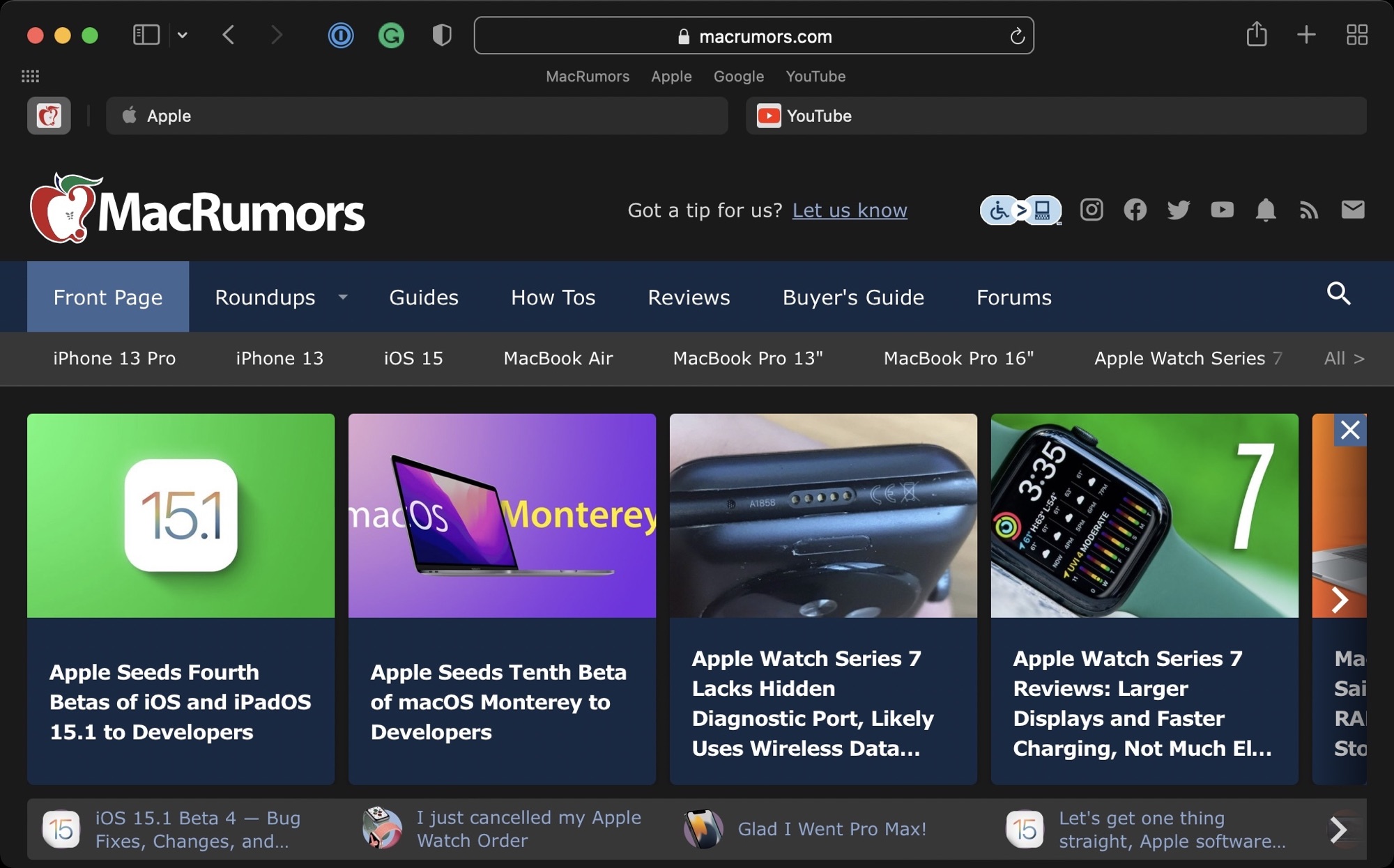
In yesterday's macOS Monterey release, Apple tweaked the design of the Favorites bar, moving it back up above the Tab bar where it was before Safari changes were implemented with the macOS Monterey update and the Safari 15 release. Safari 15.1 includes the same tweak to the Favorites bar.

Apple in macOS Monterey overhauled the look of Safari, debuting a new tab design that has proven to be unpopular with users. Apple has been refining the Safari design since then, and the changes coming in Monterey were made available to macOS Big Sur and macOS Catalina users with the launch of Safari 15.

Registered developers can download the Safari 15.1 beta by logging in and then navigating to the More Downloads section. The latest versions of macOS Big Sur or macOS Catalina are required to install the beta.

Article Link: Apple Releases macOS Big Sur Safari 15.1 Beta With Relocated Favorites Bar
 

Tagbert

macrumors 603
Jun 22, 2011
6,238
7,271
Seattle
Having the favorites above the tabs makes sense. Now the tabs are closer to the content thus emphasizing the relationship of the tabs and content. If only they would fix the inverted shading of active vs inactive tabs in light mode. The active tab should be the lightest and have most contrast. the inactive tabs should be darker and have less contrast.

I've given up hoping that they will make the tabs look more like tabs and less like buttons that are completely unconnected to the content.
 

Unregistered 4U

macrumors G4
Jul 22, 2002
10,597
8,588
I just realized I haven’t used favorites in awhile. I think I’ve just gotten so used to my tabs just “being there” that having a button to open a new one (rather than going to the open one) would only be used once during an initial install, maybe.

I’m going to have to take another look to see if favorites still has some utility for me. They’re still there, I haven’t deleted them, but I just haven’t used them, soooooo maybe I’ll delete them? :)
 

dlewis23

macrumors 65816
Oct 23, 2007
1,164
1,916
I miss when apple used space efficiently before big sur, now everything needs to be padded to hell and back and it doesn't even look good

Somethings were far to small in the old designs.

Personally I think this is all preparing for the Mac to go Touch. With a touch screen elements have to get bigger, if you add padding you can hide the increased size of elements.
 
  • Like
Reactions: nycanuck

e1me5

macrumors 6502a
Jun 11, 2013
503
1,085
Cyprus
Speaking of favourite tabs, today my curated favourite tabs were replaced by links of the Google services, what is that?
 
Register on MacRumors! This sidebar will go away, and you'll see fewer ads.