Got a tip for us?
Let us know
Become a MacRumors Supporter for $50/year with no ads, ability to filter front page stories, and private forums.
Apple Releases Safari 15.1 for macOS Big Sur and macOS Catalina
- Thread starter MacRumors
- Start date
- Sort by reaction score
You are using an out of date browser. It may not display this or other websites correctly.
You should upgrade or use an alternative browser.
You should upgrade or use an alternative browser.
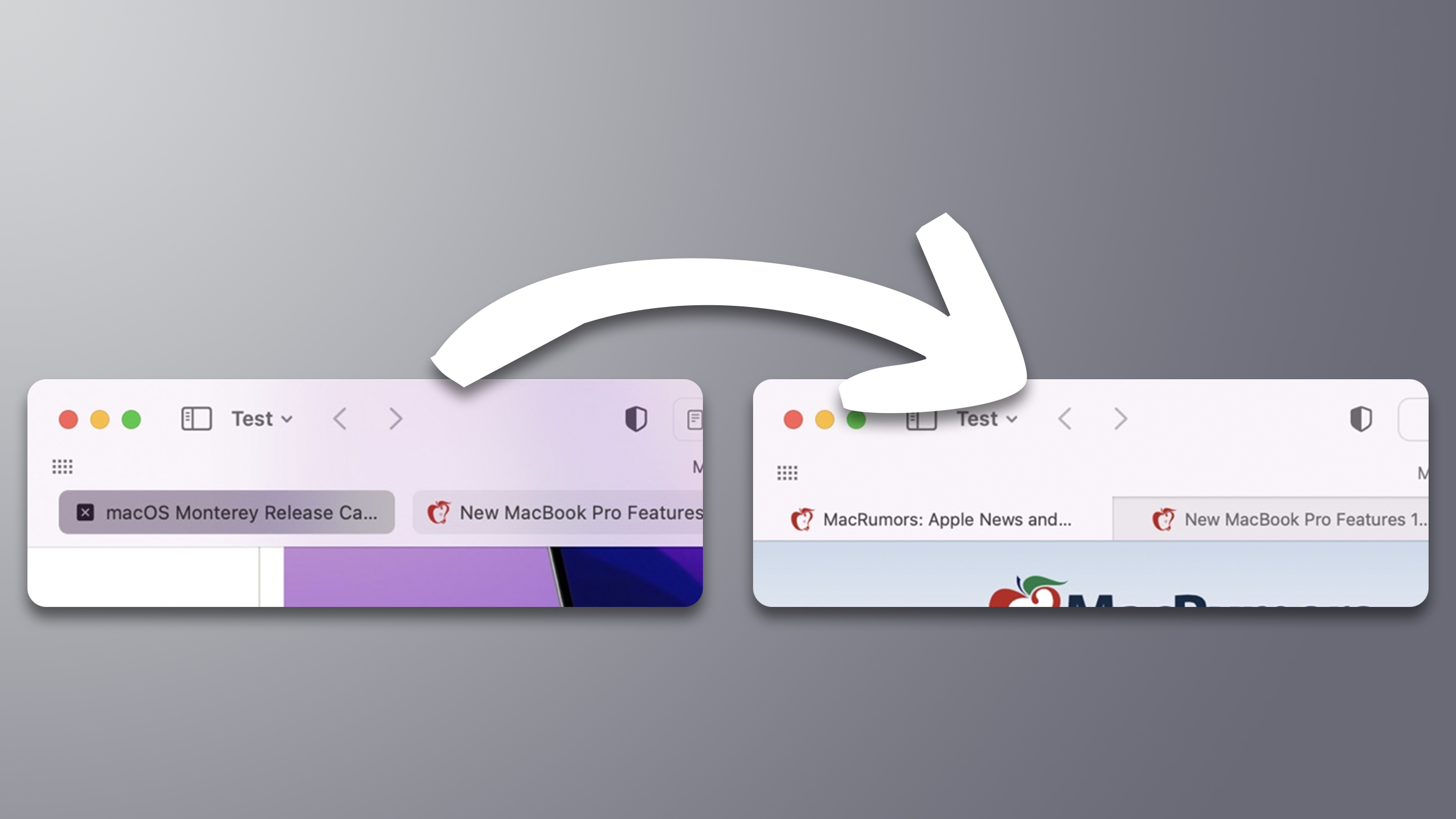
Why does the image show different content in the tabs? If this is a comparison to show the differences in the interface, wouldn't it make sense to use the same content?
I never click on the wrong tab since I don't use tabs. Windows are much easier to organize/manage.I’m waiting for the one weirdo to say they liked the new tab bar and they never clicked on the wrong tab. 🙃
I preferred the new style. Is there an option to not regress and make progress the default?
Love the 15.1. You even can read more of your website titles. At first, I liked redesign with rounded tabs in the bottom row, but using it more and more sometimes I don't know which tab is selected, it happens rarely but when it does it's annoying. Thanks, Gruber.
I think part of the problem here is that the new design has ‘bedded in’ by now for the atypical users who live at the bleeding edge, installing betas at the start of the summer.
Yes.Can I install this without updating to macOS Monterey?
Great news.
I’m surprised at the amount of people on the thread who are ‘compact UI/tab colour’ fans though.
These new UI choices were badly thought out.
Compact UI leads the non-focussed tabs to ‘jump around’ & decreases the amount of tabs that you can see without scrolling. A major fail for any tab system.
But the original vision of compact UI and page colour tabs are still there for those who want to drink the kool-aid")
Slightly off topic, but for those who are saying that reverting to the old safari design is similar to Apple bringing back the HDMI port on the new MBPs… 🙄
Well, the event the other week was full of audio visual professionals. That’s a huge huge hint as to who the new MBPs are really aimed at. And they all seem to like the return of the HDMI port!
(I’m sure Apple is more than fine with prosumers buying specs of the new MBPs with power, storage and memory that they will never meaningfully use though 💰).
I’m surprised at the amount of people on the thread who are ‘compact UI/tab colour’ fans though.
These new UI choices were badly thought out.
Compact UI leads the non-focussed tabs to ‘jump around’ & decreases the amount of tabs that you can see without scrolling. A major fail for any tab system.
But the original vision of compact UI and page colour tabs are still there for those who want to drink the kool-aid
Slightly off topic, but for those who are saying that reverting to the old safari design is similar to Apple bringing back the HDMI port on the new MBPs… 🙄
Well, the event the other week was full of audio visual professionals. That’s a huge huge hint as to who the new MBPs are really aimed at. And they all seem to like the return of the HDMI port!
(I’m sure Apple is more than fine with prosumers buying specs of the new MBPs with power, storage and memory that they will never meaningfully use though 💰).
Great news.
I’m surprised at the amount of people on the thread who are ‘compact UI/tab colour’ fans though.
These new UI choices were badly thought out.
Compact UI leads the non-focussed tabs to ‘jump around’ & decreases the amount of tabs that you can see without scrolling. A major fail for any tab system.
But the original vision of compact UI and page colour tabs are still there for those who want to drink the kool-aid
Slightly off topic, but for those who are saying that reverting to the old safari design is similar to Apple bringing back the HDMI port on the new MBPs… 🙄
Well, the event the other week was full of audio visual professionals. That’s a huge huge hint as to who the new MBPs are really aimed at. And they all seem to like the return of the HDMI port!
(I’m sure Apple is more than fine with prosumers buying specs of the new MBPs with power, storage and memory that they will never meaningfully use though 💰).
I agree with your criticism of the compact UI, but the standard layout (with “collapse tabs to icons” enabled) in dark mode was absolutely fantastic.
Obviously there were some issues in other modes, and the design was probably rushed out quicker than it should have been.
But I’m actually pretty upset that Apple have reverted the whole thing rather than fixing the flaws. Apple used to offer something better, different, and forward-thinking when it came to UI design, but seems like now days boring conservatism is starting to win out 😔
I want the opposite - compact tabs* but without the colour matching.I want the old tabs with the colour matched title bar though!
*although I would prefer they look like tabs rather than buttons
That's only an issue if you have a lot of tabs open, which some people (myself included) don't (especially with tab groups). What it always does is get rid of a big wasted bit of space, which is more of a nice feeling thing that a significant practical benefit, but nice feeling things are nice.I’m surprised at the amount of people on the thread who are ‘compact UI/tab colour’ fans though.
These new UI choices were badly thought out.
Compact UI leads the non-focussed tabs to ‘jump around’ & decreases the amount of tabs that you can see without scrolling. A major fail for any tab system.
Apple's interface design hasn't been the best for a while already. This is just another symptom.It's minor and doesn't really matter, but…
View attachment 1881187
View attachment 1881188
Why is "Show color in Compact Tab Bar" in "Advanced"? You already have the Compact/Separate radio buttons in "Tabs". Why not simply show the checkbox when "Compact" is selected.
(Also, that blue border is really slim. It's barely noticeable that "Separate" is selected.)
This is excellent news. Each to their own, of course, but I thought the design change was awful, right up there with the skeuomorphic calendar. Delighted to see the old tabs back!
Fair enough. I’m not one of those who pines after iOS 6 or mountain lion (or even Catalina).I agree with your criticism of the compact UI, but the standard layout (with “collapse tabs to icons” enabled) in dark mode was absolutely fantastic.
Obviously there were some issues in other modes, and the design was probably rushed out quicker than it should have been.
But I’m actually pretty upset that Apple have reverted the whole thing rather than fixing the flaws. Apple used to offer something better, different, and forward-thinking when it came to UI design, but seems like now days boring conservatism is starting to win out 😔
I’m happy for the UX to be pushed forward.
It’s just that the safari new UX simply wasn’t ready IMHO and was more like an early alpha.
I’m not a UX designer so I don’t know how Apple can take this forward.
Perhaps though I’d prefer them to refine and make consistent a modern unified UI in one go across macOS, iPadOS & iOS instead of having UI experiments across macOS (which seems to have happened since we got Apple News etc on the Mac).
Fair enough. But with super high res screens, reducing the browser chrome seems less important than it would’ve been on say the MacBook or pre retina screens.That's only an issue if you have a lot of tabs open, which some people (myself included) don't (especially with tab groups). What it always does is get rid of a big wasted bit of space, which is more of a nice feeling thing that a significant practical benefit, but nice feeling things are nice.
I wish. But it's not possible to turn off tab icons 😩So Safari 15.1 just looks like Safari 14.2 this time, right?
Just turn it off then (under "Advanced" in Safari's settings).I want the opposite - compact tabs* but without the colour matching.
*although I would prefer they look like tabs rather than buttons
Ok I downloaded, this is great!
It doesn't make any sense why that made that change, when the rest of the entire OS uses tabs at the bottom of their apps. And it feels much easier to identify which tab is active (my eyesight is getting worse and worse!)
It doesn't make any sense why that made that change, when the rest of the entire OS uses tabs at the bottom of their apps. And it feels much easier to identify which tab is active (my eyesight is getting worse and worse!)
Good for those who have not yet updated to Monterey. Now they can get the latest version of Safari
I love you!Just turn it off then (under "Advanced" in Safari's settings).
I do not love whoever decided not put that option in the Tabs section where it belongs.
Yes, it appears to be fixed. I saw that bug the other day, when I had two windows open; the second window would open links in blank tabs.Does this update fix the bug where opening a link in a new tab always opens a blank tab instead of the link on Catalina?
Register on MacRumors! This sidebar will go away, and you'll see fewer ads.