Become a MacRumors Supporter for $50/year with no ads, ability to filter front page stories, and private forums.

MacRumors

macrumors bot
Original poster
Apr 12, 2001
67,875
38,560


Apple in iOS 15 introduced a new Safari experience that moves the URL bar and tab interface to the bottom of the iPhone, a decision that has been controversial with iPhone users.
iOS-15-Beta-6-Safari-Address-Bar-Feature-2.jpg
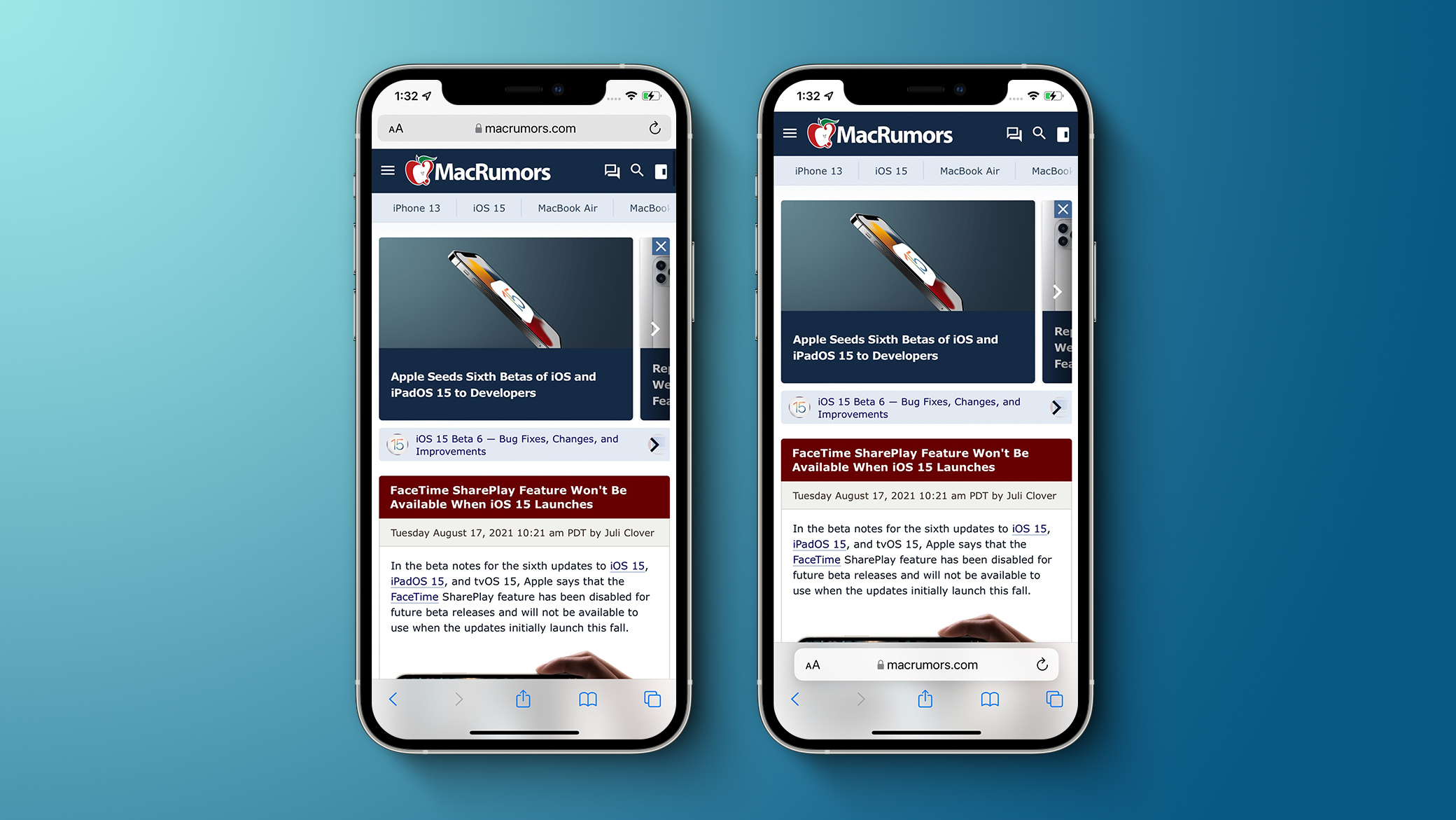
Safari options in iOS 15 beta 6​

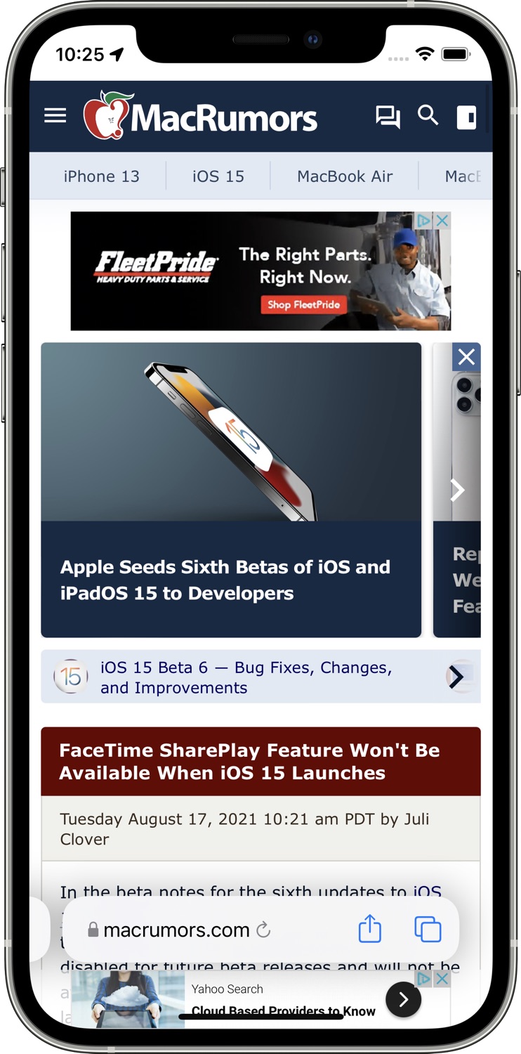
Throughout the beta testing period, Apple has been tweaking the design of the Safari browser on the iPhone and in beta 6, there are further refinements. The bottom tab bar has been redesigned to appear below page content, and Apple has also added a toggle to show the address bar at the top of the iPhone rather than the bottom.
original-safari-design-ios-15.jpg
The original design in iOS 15 beta 5​

The addition of a toggle to show the address bar at the top of the Safari interface returns Safari to a more iOS 14-like experience, walking back many of the iOS 15 changes.
full-safari-changes-ios-15-b-6.jpg

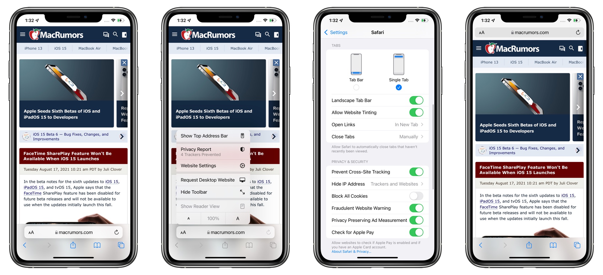
With the bottom view option toggled on, Safari offers a dedicated toolbar with buttons at the bottom of the interface, which is also an improvement over the prior floating design.

Apple has also introduced new setting options to remove the website tinting and to enable a Tab Bar while in landscape mode. There was previously a "Show Color in Tab Bar" accessibility setting, which appears to be the same as the new "Allow Website Tinting" toggle.

Apple previously added similar toggles in iPadOS 15 and macOS Monterey to offer either a separate tab bar (which was the original default when the betas launched) or a merged tab bar, which is more similar to the previous design.

Article Link: Apple Reverses iOS 15 Safari Changes With New Toggle for Top Address Bar
 
Last edited:
its nice to have options, but if they make bottom default, and have a toggle to change it in settings, almost every iOS user is just going to use it at the bottom.
 
Interesting...rather than saying "You're looking at it wrong" and forcing the change on everybody, Apple is giving users a choice. I wonder if this is because Sir Jony is (finally) gone.
 
  • Like
Reactions: gank41 and zv470
So glad it’s back at the top! It was the first thing I changed with Beta 6!
 
  • Like
Reactions: Huck
It took my a while to reprogram 11 years of muscle memory... but now I actually prefer the bottom address bar.

I'm indifferent. On a computer, it is still at the top so that instinct to go to the top is still there. I mean how many times do you tch the top bar vs the buttons at the bottom really. Or browsing with one hand on the phone regularly (yes, giggity).

At the bottom makes some screwy issues with swiping between apps because the home bar is down there. And it made some website touch targets not work with that floating bar.
 
personally, it doesn’t matter to me either way because I like both.
My only frustration has been that the “request desktop” button is way more hidden than it used to be.
I do find it interesting that Google tried to do a very similar change to chrome internally, and it also got reversed quite quickly.
This right here is exactly why I don’t think we will ever see another iOS 7 style complete redesign, no matter how many people think that they want it.
The iPhone/iPad user interface is just too big and too familiar that any slight changes, even to a single app like Safari, or a couple years ago when they completely redesigned reminders, breaks too much compatibility and consistency and just frustrates the majority of customers
 
  • Like
Reactions: macsound1
I would like it to be on the top, but having gestures to switch between neighboring tabs is also great. I wonder if they can find a way to implement that without making the bottom of web pages virtually un-touchable, or just keep the address bar on top.
 
They landed on the right bottom bar solution at the same time that they ditched the top bar. I’m not sure why people want the top bar? You literally have to reach to the top of the screen to tap on it, then reach to the complete opposite side of the screen to start typing…
 
Glad to see toggling options! 🤩

Additionally: Would be great to see an iOS Technology Preview of Safari, too!
 
Last edited:
Register on MacRumors! This sidebar will go away, and you'll see fewer ads.