Become a MacRumors Supporter for $50/year with no ads, ability to filter front page stories, and private forums.
personally, it doesn’t matter to me either way because I like both.
My only frustration has been that the “request desktop” button is way more hidden than it used to be.
I do find it interesting that Google tried to do a very similar change to chrome internally, and it also got reversed quite quickly.
This right here is exactly why I don’t think we will ever see another iOS 7 style complete redesign, no matter how many people think that they want it.
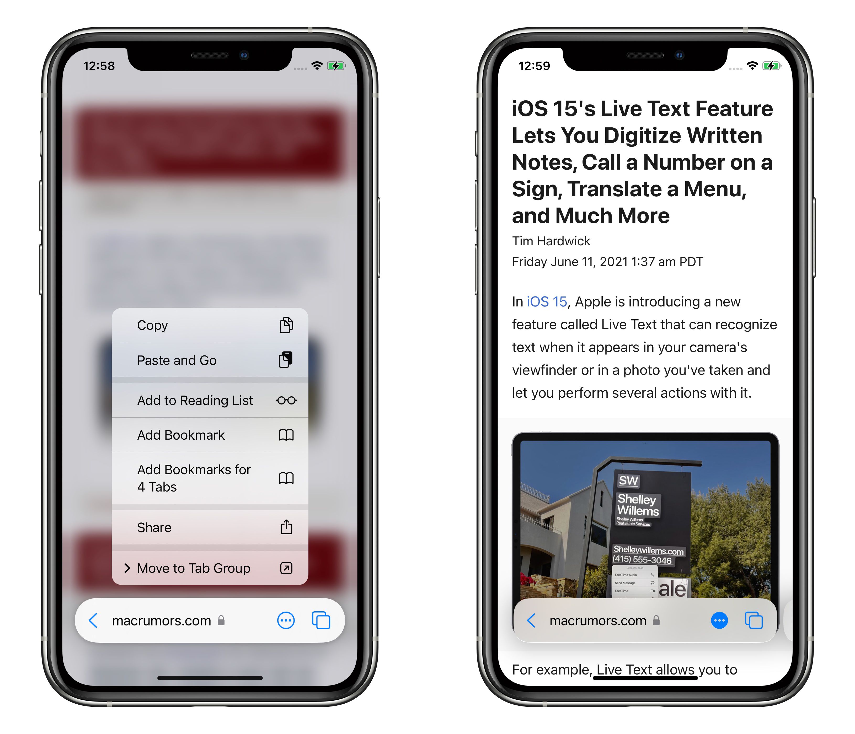
The iPhone/iPad user interface is just too big and too familiar that any slight changes, even to a single app like Safari, or a couple years ago when they completely redesigned reminders, breaks too much compatibility and consistency and just frustrates the majority of customers

Giving users a FEW more options, like move home screen icons wherever you want icon theming/theme packs, etc wouldn't change the overall usability. There's still plenty of road left.

But there s a reason the web browser has looked basically the same for 10-20 years. It just works. All look basically the same in terms of very general layout and have not changed over the years.
 
Users rejoice! There was absolutely nothing wrong with Safari on iOS14. No need to change it whatsoever. “If it ain't broke, then don't fix it” is the old adage that applies here. I do like the changes in Monterey however, I find myself using safari 15 more than Chrome and Edge...
 
Last edited:
  • Like
Reactions: whirldy and gank41
Have to say, at first having the address bar at the bottom annoyed me to no end, because for a decade I've been tapping at the top to use the address bar. BUT, given how large my 12 pro max is, I've ultimately found having the address bar at the bottom to be so much more functional and easy to use. I am converted!
 
FAR preferable to have the URL at the bottom, just so much easier to reach and type, wonder why no-one seems to have done it before?! (the floating version was a definite no though!)
 
  • Like
Reactions: jjpiv
...Courage.

I understand the complaining. But at the same time... UI design needs to evolve to some degree. One-handed usage has suffered for years. Guess we'll just keep on going with the status quo.
 
  • Haha
Reactions: 0057252
They landed on the right bottom bar solution at the same time that they ditched the top bar. I’m not sure why people want the top bar? You literally have to reach to the top of the screen to tap on it, then reach to the complete opposite side of the screen to start typing…
Because it overlays some items on a website that you can't access, especially if the website wasn't coded well. The other issue is, that I am hardcore struggling finding my reading list/bookmarks. everything needed just so many more clicks than before and that update took away the intuitiveness, which every developer wants for their apps.
 
So far it feels like the right answer. Bookmarks and back/forward are all there all the time. And the bar isn't floating causing conflicts

And now you can swipe between tabs without triggering the home bar swipes.

It feels weird permanently there at the bottom look-wise. But so far so good, it doesn't interfere with elements at the bottom of the screen like before.
 
They landed on the right bottom bar solution at the same time that they ditched the top bar. I’m not sure why people want the top bar? You literally have to reach to the top of the screen to tap on it, then reach to the complete opposite side of the screen to start typing…

it messes with a lot of pages especially thanks to the idiotic cookie banners and it wasn’t intuitive at all (how is anyone supposed to figure out that you can long press on the bar to get to a menu?) and the refresh button was way too close to the search, it should have been moved further to the right. I kept hitting it by mistake when trying to type in another url
 
Hm. I only downloaded the iOS 15 beta last Sunday. I have no idea how much has changed since the widely reviled first iterations, but… I love it. I think it's great. bottom reachable nav ftw. Better solution for tabs, absolutely. Advanced stuff like reader view and whatnot logically placed and accessible.

If this is what it was like all along, I dunno what the haters were on about. If this is the result of listening to user feedback and refinement, it's going great.
 
  • Like
Reactions: ipedro
Not sure why they make changes for the sake of change. I guess when you run out of ideas, you mess with something that isn’t broken. Glad to one can revert back to normal.
 
Best news I’ve heard all year.

Maybe I’ll end up liking it, but at first glance I absolutely hate it - now I have the option to try it out.
 
Thankful. No matter how much time I've spent with it, I just have not developed the right muscle memory. I've been on it a month now and still reach for the top.
 
  • Like
Reactions: therunningman
As an iPhone user since the first one, my muscle memory got used to the top address bar. I hated the "bottom" change, but I was getting used to it. Now I can compare, and I like that. It's nice to have the choice; a literal "win win".
 
Six revisions for Apple to finally cave and give testers what they asked for since day one.
It’s fine if you want to try something new, and arguably many people like the redesign, but for christs sake just give those of us who don’t the option to go back to the previous style.
Why is this concept so hard for Apple to figure out? It would be like a car company releasing a vehicle with no seat, steering wheel or side mirror adjustment controls and telling buyers to deal with it.
 
  • Disagree
  • Like
Reactions: ipedro and jk1221
You can tell a change is a good design decision when they have to walk it back and offer the old one alongside.

What's that story about Steve Jobs being shown two keyboard options for the original iphone?

I personally got used to the bottom bar, but it makes tapping the top to scroll up difficult. And many websites put buttons on the bottom of the page, causing a bottom address bar to be a PITA.
 
It took my a while to reprogram 11 years of muscle memory... but now I actually prefer the bottom address bar.
Exact same feeling for me. But now I wouldn’t want the top back. I prefer to see website and the address crap down the bottom, and out of the way.
 
Not sure I like the up and down arrows on the bottom when I chose to keep my tabs at the top.
 
Out of all of the things I'd like to do with on the iPhone with one hand, tapping a browser address bar to search/type in a url isn't really near the top of the list. If they want to focus on one-handed use, they need to start with making the Home Screen align from the bottom of the screen instead of the top. I'm glad they've added the option to return the address bar to the top here.
 
  • Like
Reactions: jk1221
i dont see why having it on the bottom benefits you. someone please explain. At the top it disappears as you scroll, now its just in the way. I hope the option is there to keep it at the top if you want
 
  • Like
Reactions: LunarFalcon
Register on MacRumors! This sidebar will go away, and you'll see fewer ads.