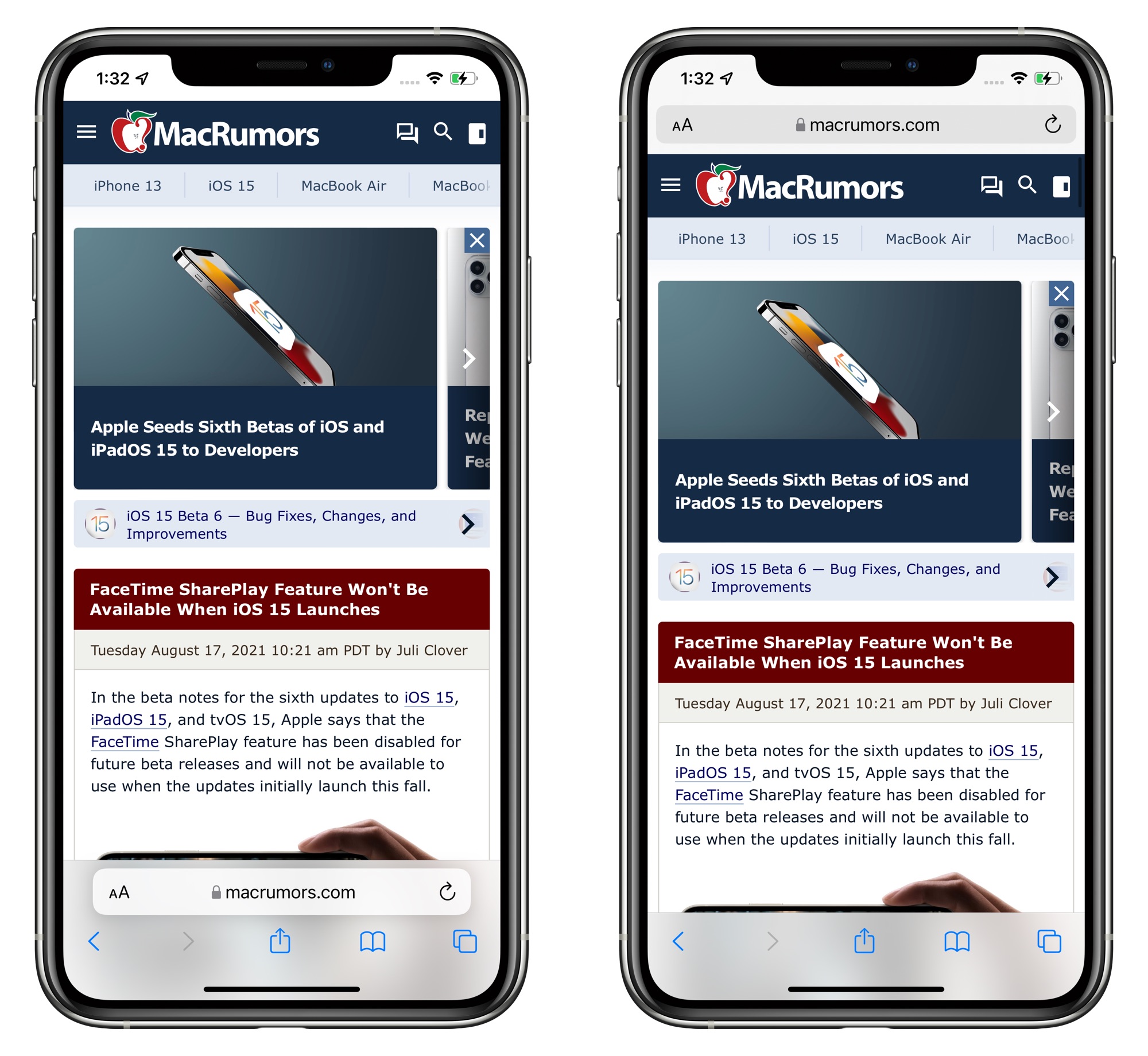
Apple in iOS 15 introduced a new Safari experience that moves the URL bar and tab interface to the bottom of the iPhone, a decision that has been controversial with iPhone users.
Safari options in iOS 15 beta 6
Throughout the beta testing period, Apple has been tweaking the design of the Safari browser on the iPhone and in beta 6, there are further refinements. The bottom tab bar has been redesigned to appear below page content, and Apple has also added a toggle to show the address bar at the top of the iPhone rather than the bottom.
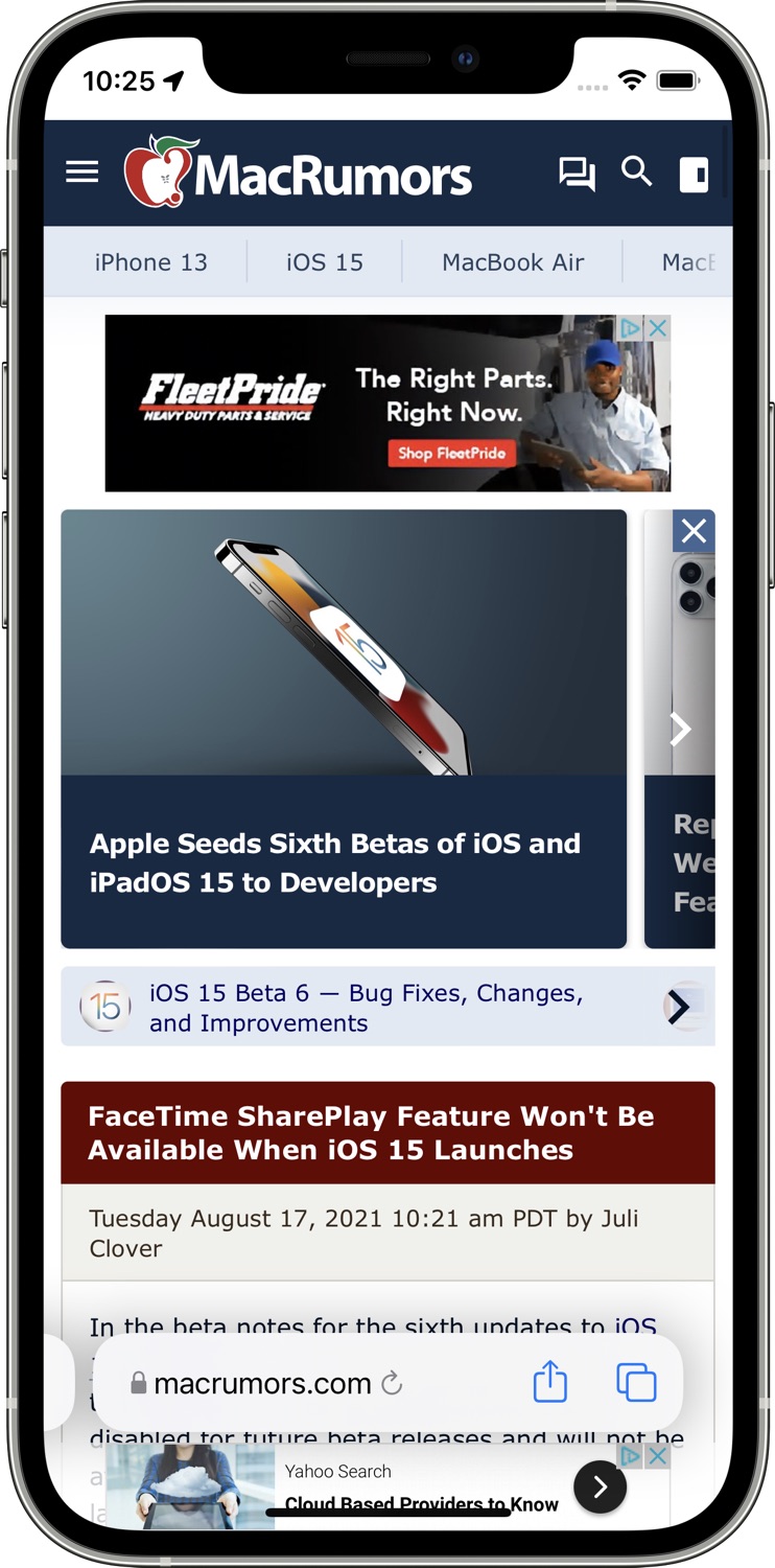
The original design in iOS 15 beta 5
The addition of a toggle to show the address bar at the top of the Safari interface returns Safari to a more iOS 14-like experience, walking back many of the iOS 15 changes.
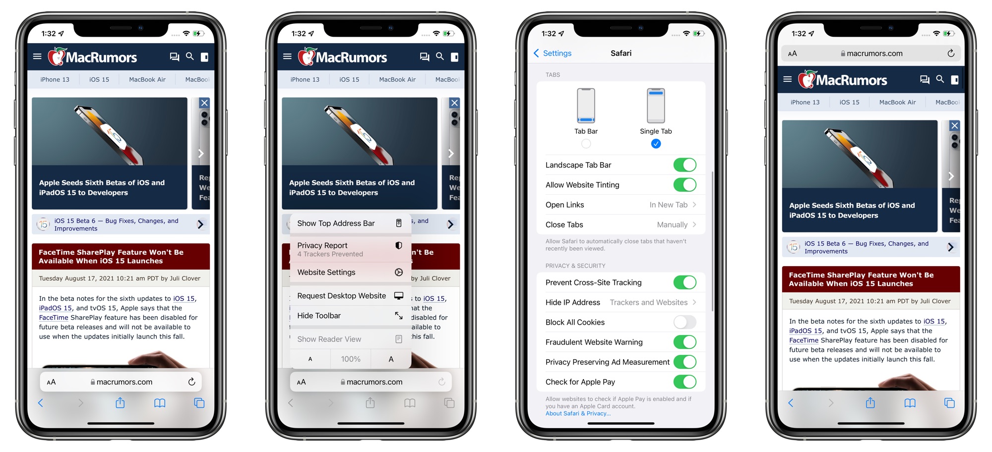
With the bottom view option toggled on, Safari offers a dedicated toolbar with buttons at the bottom of the interface, which is also an improvement over the prior floating design.
Apple has also introduced new setting options to remove the website tinting and to enable a Tab Bar while in landscape mode. There was previously a "Show Color in Tab Bar" accessibility setting, which appears to be the same as the new "Allow Website Tinting" toggle.
Apple previously added similar toggles in iPadOS 15 and macOS Monterey to offer either a separate tab bar (which was the original default when the betas launched) or a merged tab bar, which is more similar to the previous design.
Article Link: Apple Reverses iOS 15 Safari Changes With New Toggle for Top Address Bar
Got a tip for us?
Let us know
Become a MacRumors Supporter for $50/year with no ads, ability to filter front page stories, and private forums.
Apple Reverses iOS 15 Safari Changes With New Toggle for Top Address Bar
- Thread starter MacRumors
- Start date
- Sort by reaction score
You are using an out of date browser. It may not display this or other websites correctly.
You should upgrade or use an alternative browser.
You should upgrade or use an alternative browser.


Apple in iOS 15 introduced a new Safari experience that moves the URL bar and tab interface to the bottom of the iPhone, a decision that has been controversial with iPhone users.
Safari options in iOS 15 beta 6
Throughout the beta testing period, Apple has been tweaking the design of the Safari browser on the iPhone and in beta 6, there are further refinements. The bottom tab bar has been redesigned to appear below page content, and Apple has also added a toggle to show the address bar at the top of the iPhone rather than the bottom.
The original design in iOS 15 beta 5
The addition of a toggle to show the address bar at the top of the Safari interface returns Safari to a more iOS 14-like experience, walking back many of the iOS 15 changes.
With the bottom view option toggled on, Safari offers a dedicated toolbar with buttons at the bottom of the interface, which is also an improvement over the prior floating design.
Apple has also introduced new setting options to remove the website tinting and to enable a Tab Bar while in landscape mode. There was previously a "Show Color in Tab Bar" accessibility setting, which appears to be the same as the new "Allow Website Tinting" toggle.
Apple previously added similar toggles in iPadOS 15 and macOS Monterey to offer either a separate tab bar (which was the original default when the betas launched) or a merged tab bar, which is more similar to the previous design.
Article Link: Apple Reverses iOS 15 Safari Changes With New Toggle for Top Address Bar
Oh thank God they saw sense. Please fire the person that thought this would be a good idea too !
Apple in iOS 15 introduced a new Safari experience that moves the URL bar and tab interface to the bottom of the iPhone, a decision that has been controversial with iPhone users.
Safari options in iOS 15 beta 6
Throughout the beta testing period, Apple has been tweaking the design of the Safari browser on the iPhone and in beta 6, there are further refinements. The bottom tab bar has been redesigned to appear below page content, and Apple has also added a toggle to show the address bar at the top of the iPhone rather than the bottom.
The original design in iOS 15 beta 5
The addition of a toggle to show the address bar at the top of the Safari interface returns Safari to a more iOS 14-like experience, walking back many of the iOS 15 changes.
With the bottom view option toggled on, Safari offers a dedicated toolbar with buttons at the bottom of the interface, which is also an improvement over the prior floating design.
Apple has also introduced new setting options to remove the website tinting and to enable a Tab Bar while in landscape mode. There was previously a "Show Color in Tab Bar" accessibility setting, which appears to be the same as the new "Allow Website Tinting" toggle.
Apple previously added similar toggles in iPadOS 15 and macOS Monterey to offer either a separate tab bar (which was the original default when the betas launched) or a merged tab bar, which is more similar to the previous design.
Article Link: Apple Reverses iOS 15 Safari Changes With New Toggle for Top Address Bar
See? Apple can listen and learn from criticism.
Now they should do that for the on-device privacy breaching backdoor that they want to introduce with the pretense of fighting CSAM.
Now they should do that for the on-device privacy breaching backdoor that they want to introduce with the pretense of fighting CSAM.
Apple has always been listening, just because they don’t give people what they demand doesn’t mean they didn’t listen.Thank You! You are starting to listen!
Hopefully this is all a lesson to Apple that iOS doesn’t need radical redesigns now.
It’s used by over a billion people who rely on it being rock solid with no ‘where has x gone!?’ moments after iOS upgrades.
It’s shocking that it’s taken this debacle to reveal that:
- the navigation and input elements (that Apple insists on keeping at the top) are in the era of big phones, far easier to use when placed at the bottom of the screen (who knew?).
Here’s hoping that Apple now does the screamingly obvious in iOS 16 and moves the other nav controls to the bottom too.
And even better, provide a top/bottom toggle for this (like the safari beta which we’re discussing).
The part where you claim Apple can't make up their minds? You note just before that Safari's UI isn't finished because it's a Beta... Expect to continue seeing changes to Safari's UI for weeks to come. As for the wasted space with the extra options bar at the bottom? Well that completely minimizes out of view when scrolling, regardless of whether you have the URL Bar at the Top or Bottom. But with the URL Bar at the bottom, you'll still have that minimized URL Bar when scrolling along with the bar at the top integrated with the notch. With the bar at the top, though, that opens up the bottom to extend to the end of the phone's screen. It's actually very obvious which way has more leftover screen real estate than the other..The new Safari UI wasn’t finished, that’s why this is a beta, but Apple succumbed to public pressure and reverted back to a space wasting UI — and worse can’t make up its mind so is telling users to choose.
THIS! If you get a larger "Max" style iPhone but then your complaint is that the screen is too big and you need software/accessibility help to do basic things like typing a web address, you've probably got the wrong sized phone, or you need to just use both hands...Ummm, dunno if anyone’s noticed, but we have two hands.
And it looks like this is what we'll get! Huzzah! Options! Leaving the URL Bar at the bottom by default is great, and giving people the option to revert back will help the rest of the folks that don't have "Max" style iPhones. Considering they're going to start putting those new iPhones on crates & planes across the world pretty soon, they need a finalized build of iOS to put on 'em. Giving folks this option means they've kinda covered their butts while still affording them time to tweak it. All good stuff.Apple could leave it up to the user if they want it at the top or bottom.
Well that’s a relief. What a stupid design decision. At this point they’ve basically rolled back all the Safari changes, which is good because I hated the way they looked when they introduced it. Safari was one of the main reasons I didn’t want to update to iOS 15. Now it’s gone, at least. Of course, I still won’t update because of spying, but still.
Request desktop button is back in the aA menu where it was beforepersonally, it doesn’t matter to me either way because I like both.
My only frustration has been that the “request desktop” button is way more hidden than it used to be.
I do find it interesting that Google tried to do a very similar change to chrome internally, and it also got reversed quite quickly.
This right here is exactly why I don’t think we will ever see another iOS 7 style complete redesign, no matter how many people think that they want it.
Chrome Ditched Redesign That Was Similar to Safari in iOS 15, Says Former Google Employee
Apple introduced a sweeping overhaul to its Safari browser's interface on iOS 15, iPadOS 15, and macOS Monterey, with a redesign that includes an address bar that floats at the bottom of the screen, changes to the way users switch tabs, and more. Apple says this new-look Safari has been...www.macrumors.com
The iPhone/iPad user interface is just too big and too familiar that any slight changes, even to a single app like Safari, or a couple years ago when they completely redesigned reminders, breaks too much compatibility and consistency and just frustrates the majority of customers
Love the phrasing.Apple could leave it up to the user if they want it at the top or bottom.
- Trying to cram every control into a single address bar with tiny touch targets: really dumb
Glad to see Apple reverse course on that last design blunder.
Yeah it really goes against Apple's WWDC21 (and all previous years') guidelines for not cluttering the UI, reduce but make it intuitive = controls while making your app's controls discoverable.
I think it's actually listed in their HIG on the Dev Portal, too. The whole thing where the Reader icon would change to the Refresh icon. Or if you were downloading something, the Download icon would turn into the Reader icon that would THEN turn into the Refresh icon... Ugh. I still don't know how to get to my downloaded item directly from Safari now, other than knowing it's in my iCloud Downloads folder because that's where I set it by default.Yeah it really goes against Apple's WWDC21 (and all previous years') guidelines for not cluttering the UI, reduce but make it intuitive = controls while making your app's controls discoverable.
It's great that they're in a position to make the interface better for when the URL Bar is at the bottom while still allowing people to switch to the old UI. I think the only question now is whether the new UI will continue to be the default.
:::EDIT:::
Looks like there’s a Downloads option when tapping the aA icon. Seems confusing to me when they already offer an option to long press the URL bar. Maybe they just need stuff in a specific spot to be accessible without having to long tap on it?
Last edited:
Wait a sec. Just updated from one of the earlier betas. Is there a way to make it look back to what it first looked like on iOS15? I mean, "the original design" (that biggest screenshot from this article). It was way cleaner and took less space.
Last edited:
Is there still the option to move the Address Bar to the top?Vindicated. 🥹
Yes. There’s 3 options now:Is there still the option to move the Address Bar to the top?
- Compact Bar like the one I just referenced (seen in WWDC25)
- Bottom Bar
- Top Bar
Basically the bottom bar and the top bar are like the ones we have now, but no longer edge to edge to be consistent with the new design. The floating bar (called Compact) is just like this one, the one I have seriously missed from the early iOS 15 betas!
Register on MacRumors! This sidebar will go away, and you'll see fewer ads.