Got a tip for us?
Let us know
Become a MacRumors Supporter for $50/year with no ads, ability to filter front page stories, and private forums.
Apple Reverses iOS 15 Safari Changes With New Toggle for Top Address Bar
- Thread starter MacRumors
- Start date
- Sort by reaction score
You are using an out of date browser. It may not display this or other websites correctly.
You should upgrade or use an alternative browser.
You should upgrade or use an alternative browser.

The issue with the previous bottom bar for me we’re the touch points. With the reload button being right there, I constantly would hit reload. With the blocky design, I’m much more comfortable with the bottom bar. Massively less chance of erroneous input from me.
Safari is moving backwards. All the original ideas behind the new Safari experience on iOS, iPadOS and macOS was an improvement. Sure it felt awkward to begin with due to muscle memory. But having the address bar at the bottom makes perfect sense on iOS. Wasting less vertical space on iPadOS and macOS using the new tab system also made perfect sense.
I'm glad Apple is providing us with options to customise this. So even though they have completely retracted their whole idea behind collapsable tabs etc on iPadOS and macOS as the new default I can still enable it through the settings.
The address bar on iOS is still at the bottom by default. Which makes perfect sense so I don't have to move my thumb to the top of the screen. Sadly the latest update have made it look less clean and more cluttered. The floating bar felt and looked much better. Only issue it had in the latest BETA releases was the position of the reload button. It was way too easy to hit the reload button when I didn't want to. This works out much better in BETA6 with the new design, but this could have been achieved by simply moving the reload button so it wasn't in the middle of the floating bar. This new bottom bar that is anchored at the bottom is taking up too much space and the icons make it look cluttered, especially as these buttons are not centered based on the address bar.
Why do we keep moving backwards? Have Apple lost all faith and confidence? I applaud the fact that they are offering all these options letting users take control and decide themselves if they want the address bar at the top or the bottom. If they want to have the new collapsable tabs etc. But why is that with every new BETA release Safari is getting closer and closer to just being Safari v14 all over again?
Loads of people hated it and if they rolled it out to the public millions more would hate it or switch browsersNo courage. While it needed some refinements over the beta period, the floating bar was fantastic. It had gotten intelligent enough to get out of the way when appropriate and came with great gestures to navigate through tabs quickly.
I liked when Apple had the balls to stick to their guns. Users eventually got used to changes and far more often than not, grew to appreciate them. Sticking in the past because of public pressure is a Microsoft thing.
It’s not. I couldn’t get on with it and the public would hate itActually, I have not tried it, but it kind of makes more sense to be at the bottom, it seems easier to operate with one hand.
To be honest, I was not a fan of the floating bar design... but I am growing a little concerned about the proliferation of different design options recently. Sometimes, Apple's OSes seem to be heading the Microsoft way, with redundant designs, inconsistencies, multiple ways to do the same thing, too many options... Don't get me wrong: it is good to have options sometimes - but there is also something nice in consistency, coherence, a uniform design throughout the system.
What's the point of moving the address bar to the bottom in safari if everything else remains aligned from the top throughout the whole OS? Why does the address bar at the bottom in the new safari beta look different than that the same bar at the top? (which is thinner and longer). And how many bar styles do we really need in iOS? (I'm looking at you, big fat search bar in App Library, I despise you).
But this is not even just an iOS thing. Am I the only one who liked how Safari tabs in macOS used to look exactly the same as tabs in all other apps - such as Finder for instance? Now, they look completely different.
I guess we should have expected this year's releases to be rather minor and underwhelming, with all the work from home issues during the last 12 months. That's fine. But I am starting to wonder whether there is a trend here, towards more and more trying to please everyone rather than focussing on the details and consistency of the product.
As someone who's not on the betas, I'm looking forward to trying both options - but I'm relieved the "old" version is one of them. Like many readers here, I'm the nucleus user among my family and friends, and I was dreading having to show people how to use (of all things) the default web browser.
Apple in iOS 15 introduced a new Safari experience that moves the URL bar and tab interface to the bottom of the iPhone, a decision that has been controversial with iPhone users.
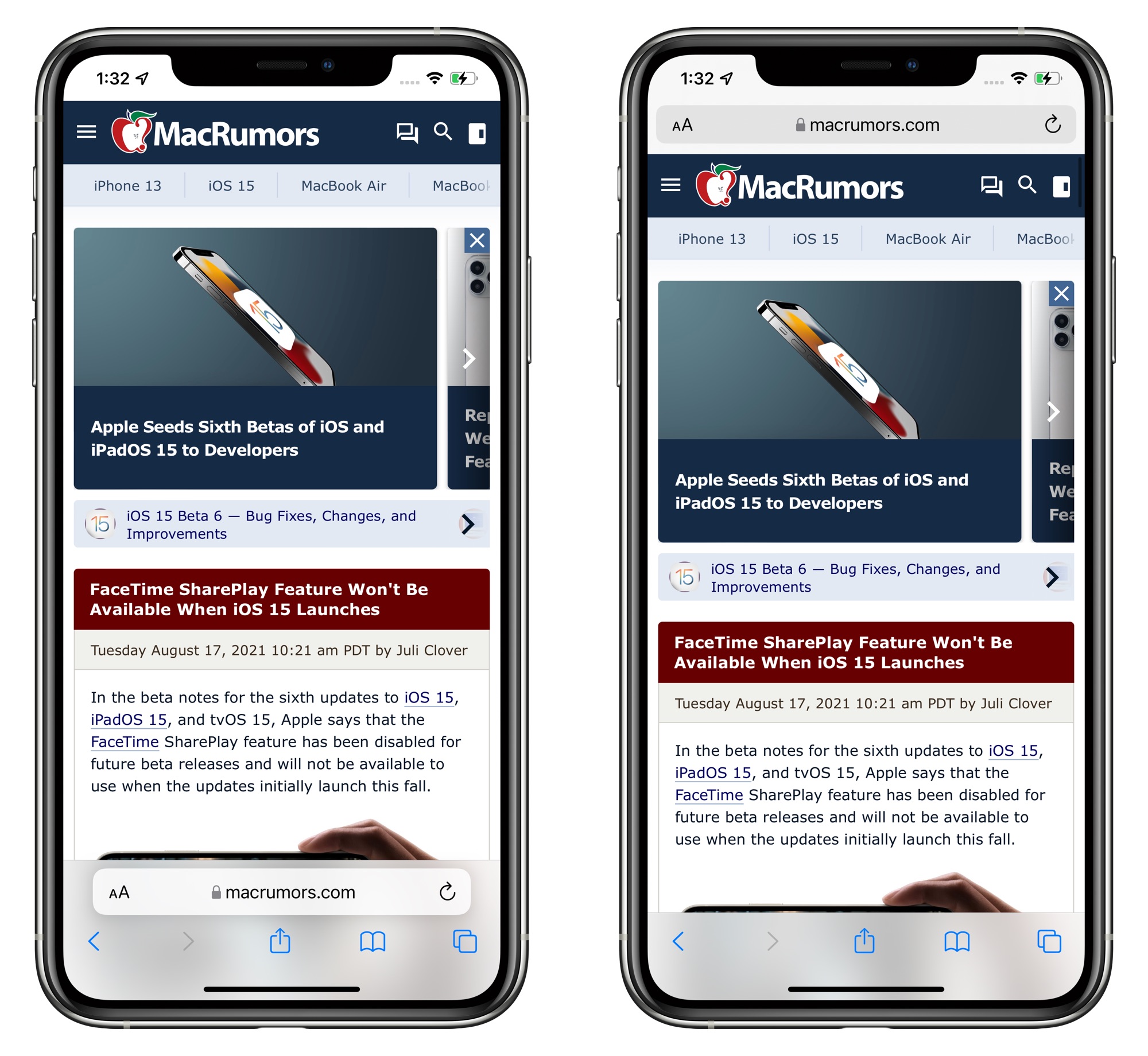
Safari options in iOS 15 beta 6
Throughout the beta testing period, Apple has been tweaking the design of the Safari browser on the iPhone and in beta 6, there are further refinements. The bottom tab bar has been redesigned to appear below page content, and Apple has also added a toggle to show the address bar at the top of the iPhone rather than the bottom.
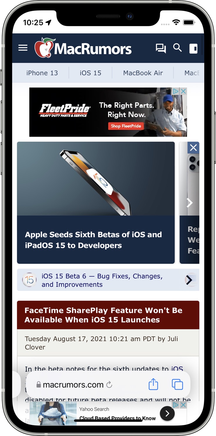
The original design in iOS 15 beta 5
The addition of a toggle to show the address bar at the top of the Safari interface returns Safari to a more iOS 14-like experience, walking back many of the iOS 15 changes.
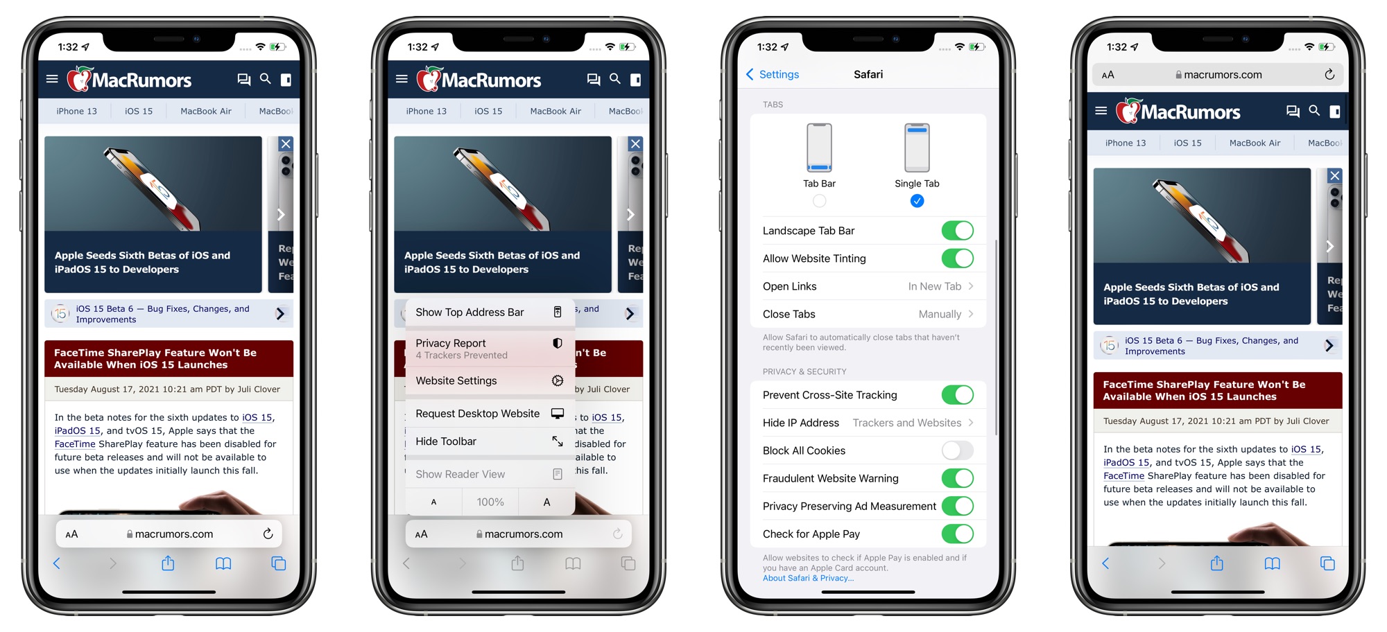
With the bottom view option toggled on, Safari offers a dedicated toolbar with buttons at the bottom of the interface, which is also an improvement over the prior floating design.
Apple has also introduced new setting options to remove the website tinting and to enable a Tab Bar while in landscape mode. There was previously a "Show Color in Tab Bar" accessibility setting, which appears to be the same as the new "Allow Website Tinting" toggle.
Apple previously added similar toggles in iPadOS 15 and macOS Monterey to offer either a separate tab bar (which was the original default when the betas launched) or a merged tab bar, which is more similar to the previous design.
Article Link: Apple Reverses iOS 15 Safari Changes With New Toggle for Top Address Bar

I’m really pleased they’ve given us the option to go back to the old style. But there is one thing that I find really jarring. Once you see it you can’t un-see it:
On iPhone when you press the tab button, the current tab minimises as expected into a tile. But there is a slight delay in the animation for the URL bar to minimise within that tile.
It’s a small thing but it looks really jarring and I now miss the old tab view. I’m starting to wish Apple just left Safari alone. Whist I’m not averse to change, this feels like ‘progress’ for the sake of progress. The minimal functional benefits afforded by the tab bar are not worth the jarring change to the UX.
I prefer the address bar in the bottom, my complain was that they hid the options, I still think that finding text in a website using safari is pretty unintuitive, to find that option you have to go into the share menu ... the hell
All you have to do is type it in the address bar and search the current page.I prefer the address bar in the bottom, my complain was that they hid the options, I still think that finding text in a website using safari is pretty unintuitive, to find that option you have to go into the share menu ... the hell
Then tap find “text” and it highlights it on the page.
I actually really like the new merged version, makes more sense to me than what they did before. For someone who’s on the beta, taping on top to get back to the top of the page is done with just one tap, or do you still need two? (In iOS 14c you’d tap once to get the address bar, then again to scroll to the top…)
Loads of people hated that Apple was dropping the floppy disk and we got the iMac. Loads of people hated that Apple dropped the parallel port and we got USB. Loads of people hated Apple dropping the Home button and we got this amazing gesture UI which most of us would not go back on. Loads of peoplen *still* hate that Apple dropped Touch ID but a whole lot more people love the seamlessness and features of Face ID. That didn’t stop Apple from moving on.Loads of people hated it and if they rolled it out to the public millions more would hate it or switch browsers
The new Safari UI wasn’t finished, that’s why this is a beta, but Apple succumbed to public pressure and reverted back to a space wasting UI — and worse can’t make up its mind so is telling users to choose.
I need one to handle my steering wheel.Ummm, dunno if anyone’s noticed, but we have two hands.
Register on MacRumors! This sidebar will go away, and you'll see fewer ads.