Become a MacRumors Supporter for $50/year with no ads, ability to filter front page stories, and private forums.
I really hate the flat borderless bright colors the entire Tech industry has moved to. It looks awful, it's confusing, all sense of depth is removed. It also removes any sense of important information. I can't wait for this fad to die out.

Don't worry, it won't last long. At least that's what I'd guess.

Flat isn't all bad, but it needs to be implemented a whole lot better and not radically.

You mention a good point, as soon as you remove all the depth, elements that should set themselves apart are quickly overlooked.
You can use flat elements to guide users to those elements that matter most, actually speeding up their navigation, but recently I see more bad than good examples of implementation, Apple isn't the worst, but over the months of iOS 7 and 8 I've seen where iOS lacks clear UX.

Glassed Silver:mac

Agreed -- more than anything else, good UI design should really be all about the concept of "don't make me think." The closer you can get to everything being natural and intuitive with no need to really have to think about how to do something, the better.

If a completely flat design means I have to take a moment longer to figure out what I need to click or do, that is not good. If it helps me to save a moment because it makes things more clear or intuitive, then that's great.
 
Forget the look, they need to make it easier to use.
Make it more obvious how to buy a song, not by clicking on the price, it should at least be in the drop down menu or even better a BUY Button.
We should also be able to buy all songs in the wishlist at once.
It also needs to be easier to sync only songs we want by allowing us to deselect all songs at once and not using playlists but just the checked boxes.
 
I updated to the Yosemite 5th Beta & iTunes 12.0 update and ever since then it seems as if connection to the iTunes store has been hit or miss. I can't even view my purchased music anymore. Makes me not want to buy anything off of the store right now until Apple resolves the issue. I'm just hoping that when Apple releases the official version of Yosemite to the public it isn't filled with bugs like iOS 8 has been. Honestly all these bugs makes me want to hold off on buying an iPhone 6 Plus...
 
I updated to the Yosemite 5th Beta & iTunes 12.0 update and ever since then it seems as if connection to the iTunes store has been hit or miss. I can't even view my purchased music anymore. Makes me not want to buy anything off of the store right now until Apple resolves the issue. I'm just hoping that when Apple releases the official version of Yosemite to the public it isn't filled with bugs like iOS 8 has been. Honestly all these bugs makes me want to hold off on buying an iPhone 6 Plus...

I had this issue very early in development but it improved and eventually stopped. The only issue I have is and old one that returned like a bad rash; my iOS devices running 8.1 beta 2 and 8.0.2 cannot connect to my iTunes Shared Library (mostly movies). I have to log out of my iPad and log back in for it to work. Seems it has to reconnect and repopulate every time.
 
Yeah, because removing Podcasts into its own separate, janky, unusable App worked just so amazingly well.

Just NO.

What is so freaking difficult about using iTunes now?

The categories in the store are clearly labelled Music, Movies, TV, Apps, Books, you click it and it displays all the new and featured items for that category, how much simpler does it need to be?

They totally f'ed over Podcasts by removing them from the store and you think it's a great idea for them to make 5 or 8 separate Apps????

I find having multiple apps confusing personally. Especially when it is on a desktop computer since getting them to agree with each other is sometimes a complete PITA (see iBooks -> iTunes).
 
I agree that they probably shouldn't be standalone, but the name and icon should change. It just doesn't make any sense to call something iTunes (with an icon that has a big music note) that includes movies, TV Apps, etc. Maybe iMedia, iEntertainment, iHub, Apple Media -- I am sure Apple can come up with something that would make more sense. I do understand why they don't want to move away from such a strong brand, but there is such a huge disconnect between the name and what it includes.

This really came to my attention when I was trying to explain to my mother how she could rent a movie on your Mac (coming from using Windows and never owning Apple products before) -- and she asked where's the "video" store. I said it's through iTunes, the icon with the music note on it. She didn't even think to look there because she thought it must obviously be for music being named iTunes and having a music note to represent it. I had to agreed with her that it makes no sense, but said that's just how Apple does it.

I don't store my books in /Library/.
To access files, I click on the face.
To pull up a list of programs, I click on a spaceship.
I can't feed my mouse cookies.

She'll figure the rest out.
 
Remember the question Bono asked Steve Jobs: "Why does iTunes look like a spreadsheet?"

Between music, movies, TV shows, books, podcasts ... there's just too much data to deliver. Perhaps it's time to split iTunes off into separate apps for the separate media, and another app just for syncing. That would certainly lighten up the current bloat.

Just stop with this nonsense. It's already simple enough to use, can't believe people are dumb enough to promote the idea of even MORE useless apps.

----------

I find having multiple apps confusing personally. Especially when it is on a desktop computer since getting them to agree with each other is sometimes a complete PITA (see iBooks -> iTunes).

I totally forgot about iBooks. Another example of why the idea of breaking up iTunes is just incredibly BAD. The iBooks, Podcast and Apps Apps are all horrendous and stupid. If I want to purchase media, apps, etc, I want to go to ONE place.

----------

One thing that needs looking at is the tv shows for me. Browsing my tv shows currently works better on my iPad or iPhone with the album art and then drilling down takes you to the seasons artwork and episodes from there.

iTunes now shows the entire shows episode list when I click on it. There is minor separation between the seasons with the season numbers in a font slightly bigger. This just doesn't work well for me with shows (for example, South Park) that have at least 100+ episodes.

I just don't get you people. Lord knows I'm not the biggest fan of Apple. But what is so damn difficult about how the TV stuff works? It's all grouped nicely under ONE Icon, the Season Info is CLEARLY labeled, so for Southpark, click the icon, click the season you want to watch and select an episode based on the information. Man that is soooooo difficult.

Do you want Apple to come to your house and act out the episodes as well? Any changes Apple makes to the UI, if past is prologue, will just f everything up even more. Their UI design in the last few years has been god awful.
 
Last edited:
I hope it fixes the problem I have where iTunes constantly asks for my password so it can automatically download content when I specifically have my preferences set to NOT download anything automatically.

Could it be iTunes Match that you are referring to? That's my beef with iTunes... the constant need to sign out and then sign back in just so that iTunes Match will work, as I keep all of my music in the cloud.

----------

I don't store my books in /Library/.
To access files, I click on the face.
To pull up a list of programs, I click on a spaceship.
I can't feed my mouse cookies.

She'll figure the rest out.

Parasprite, you just won me over with your coolness. :cool:

----------

You don't need to wink. They should be wording their articles better.

My favourite it "coming in the fall" which means anywhere from here to Christmas. Real useful.

One thing to consider is that if they set a hard, fixed date, such as "October 16th", and then missed that due to not being ready, how many people would come out to complain then? It's safer to give a general timeframe to work with. Mavericks isn't exactly broken right now, so people aren't "waiting" to use their computers.
 
I don't store my books in /Library/.
To access files, I click on the face.
To pull up a list of programs, I click on a spaceship.
I can't feed my mouse cookies.

She'll figure the rest out.

Sadly, this just makes me realize how much better many of the icons and naming conventions are in Windows 8 -- simple and clear -- many icon provide a very good visual clue of what you will get by clicking on something. For example:

  • Music uses headphones and is named "Music"
  • Video uses a simple play icon inside a video frame and is named "Video"
  • File explorer uses a file folder icon and is named "File Explorer"
  • Store is a shopping bag and is named "Store"

It's very basic, but it works. Of course, not all are good, and too bad the overall user experience isn't up to par in many ways.

And don't get me wrong, there are many reasons why I choose to use a Mac over Windows. And many of the Mac apps and features look nice are are very intuitive, but there is definitely room for improvement for some elements of OS X.

Anyone will get used to it after using a Mac for a while, but people new to a Mac shouldn't have to figure it out -- in an ideal user experience it should just make sense from the start without having to even think about it.
 
Last edited:
Just like the iOS 8 problems and iPhone 6 problems don't exist, amirite?


I didn't say that, nor do I believe that. My comment had nothing to do with the issues that Apple products have, and everything to do with how people react to those issues.
 
Sadly, this just makes me realize how much better many of the icons and naming conventions are in Windows 8 -- simple and clear -- many icon provide a very good visual clue of what you will get by clicking on something. For example:

  • Music uses headphones and is named "Music"
  • Video uses a simple play icon inside a video frame and is named "Video"
  • File explorer uses a file folder icon and is named "File Explorer"
  • Store is a shopping bag and is named "Store"

It's very basic, but it works. Of course, not all are good, and too bad the overall user experience isn't up to par in many ways.

And don't get me wrong, there are many reasons why I choose to use a Mac over Windows. And many of the Mac apps and features look nice are are very intuitive, but there is definitely room for improvement for some elements of OS X.

Anyone will get used to it after using a Mac for a while, but people new to a Mac shouldn't have to figure it out -- in an ideal user experience it should just make sense from the start without having to even think about it.

The way it used to be. OSX is kinda messy and I get a lot of complaints from people I've talked into buying a Mac
 
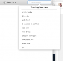
Either Apple has recently enabled this for my country just now or they added this new feature along-side the revamped store.

It now shows trending searches based on your country/region. Not very helpful but a nice touch to make searching easier for some.
 

Attachments

  • Screen Shot 2014-10-11 at 23.39.27.png
    Screen Shot 2014-10-11 at 23.39.27.png
    91.9 KB · Views: 87
Oh great, more white. :confused:

To be honest, no more updating to new versions at the start, I refuse to be a tester of new versions. I will stay on OS X 10.9.5 and iTunes 11.4, I'll let YOU all test these for a few months or more, maybe even 6 months to make sure the bugs are worked out.
 
Oh great, more white. :confused:

To be honest, no more updating to new versions at the start, I refuse to be a tester of new versions. I will stay on OS X 10.9.5 and iTunes 11.4, I'll let YOU all test these for a few months or more, maybe even 6 months to make sure the bugs are worked out.

Agreed on the white.
They must have contracts with opticians or something.

Glassed Silver:mac
 
I just don't get you people. Lord knows I'm not the biggest fan of Apple. But what is so damn difficult about how the TV stuff works? It's all grouped nicely under ONE Icon, the Season Info is CLEARLY labeled, so for Southpark, click the icon, click the season you want to watch and select an episode based on the information. Man that is soooooo difficult.

Do you want Apple to come to your house and act out the episodes as well? Any changes Apple makes to the UI, if past is prologue, will just f everything up even more. Their UI design in the last few years has been god awful.
I would love to be able to click on the show icon and then the season I want, it used to work like this. With the new version 12, they have removed that. As an example, I've attached what it looks like scrolling through any show that has multiple seasons, it's every episode with the season number just indented and bold.
 

Attachments

  • Screen Shot 2014-10-12 at 9.36.46 am.png
    Screen Shot 2014-10-12 at 9.36.46 am.png
    412.2 KB · Views: 127
Sadly, this just makes me realize how much better many of the icons and naming conventions are in Windows 8 -- simple and clear -- many icon provide a very good visual clue of what you will get by clicking on something. For example:

  • Music uses headphones and is named "Music"
  • Video uses a simple play icon inside a video frame and is named "Video"
  • File explorer uses a file folder icon and is named "File Explorer"
  • Store is a shopping bag and is named "Store"

It's very basic, but it works. Of course, not all are good, and too bad the overall user experience isn't up to par in many ways.

And don't get me wrong, there are many reasons why I choose to use a Mac over Windows. And many of the Mac apps and features look nice are are very intuitive, but there is definitely room for improvement for some elements of OS X.

Anyone will get used to it after using a Mac for a while, but people new to a Mac shouldn't have to figure it out -- in an ideal user experience it should just make sense from the start without having to even think about it.

Windows 8 is the first OS they've made in a while that made me consider installing it to VM/Bootcamp. It's still a little clunky on the inside, but it seems like the OS does its best to stay out of the way most of the time.

Oh, I suppose I also need Office and...well, you probably know Office 2011.

Parasprite, you just won me over with your coolness. :cool:

Finally someone is noticing this. :D

I totally forgot about iBooks. Another example of why the idea of breaking up iTunes is just incredibly BAD. The iBooks, Podcast and Apps Apps are all horrendous and stupid. If I want to purchase media, apps, etc, I want to go to ONE place.

The only upside I can see is being able to allow mobile data for Music (iTunes Radio) but not for updating Podcasts or downloading Apps...but I'm really reaching for straws here.

There's really no reason to not (at least) have purchasing all in one place.

----------

I would love to be able to click on the show icon and then the season I want, it used to work like this. With the new version 12, they have removed that. As an example, I've attached what it looks like scrolling through any show that has multiple seasons, it's every episode with the season number just indented and bold.

I'm not sure if I like having it in a long list or not but I definitely have a really hard time telling seasons apart in that screenshot. Hopefully they've fixed the (bug? feature?) where the scrolling speed is significantly slower than the rest of OS X.

Also, those colours remind me back when Microsoft sold the brown Zune. :(
 
Apple has started rolling out a new iTunes Store design for OS X Yosemite testers that have iTunes 12 installed.

Julie: shouldn't it really be "who have iTunes 12 installed"?
 
Grammar

Julie: shouldn't it really be "who have iTunes 12 installed"?

Could it not be both??:eek:

----------

The iTunes Store is a mess. They need to remove a lot of stuff on the homepage. I think they need to start personalizing it. Larger artwork but fewer content. Apple knows what content we like by now. Customization is the way to go from here on out.:apple:
 
It's alway easiest to streamline looks by hiding user interface elements, but you attain looks at what cost? Confounding the user base and imposing tips and tricks one needs to learn in order to gain proficiency at doing what should be simple to grasp tasks.
 
I never did like the flat look.

If you can even get to their homepage of iTunes.

Looks like "connect 4..." anyone wanna play :p
 
Last edited:
Julie: shouldn't it really be "who have iTunes 12 installed"?

Not exactly a high authority of grammar, but this place is usually pretty solid at providing a wide variety of details and sources: Link

Summary: They are basically interchangable, but it can vary based on your own writing style and regionalisms.

Could it not be both??:eek:

One style will rule them all.
One style to bind them.
One style to bring them all with Strunk and White that who binds them.
:D
 
Last edited:
Could it be iTunes Match that you are referring to? That's my beef with iTunes... the constant need to sign out and then sign back in just so that iTunes Match will work, as I keep all of my music in the cloud.

No, I have iTunes Match off. I buy CD's and convert them for use on whatever device I choose, plus the CDs become part of my own offline backup.

I can't for the life of me figure out why iTunes needs me to sign in every time I open the app.
 
Register on MacRumors! This sidebar will go away, and you'll see fewer ads.