Oh those guys were great. If only the dreams Americans had around 2003 were as good.
I think the dreams and the ideals were fine. It was the execution of them that was extremely poor.
Oh those guys were great. If only the dreams Americans had around 2003 were as good.
I wish Americans were less jingoisticly patriotic in general, but a man can dream.

Hehe Beta Testing it right now.")
I won't be happy with yet another OS X release. How about letting 10.10 mature a little and get back some of that famous OS X rock-solid stability that we haven't seen for years?
For OS X though, I will always keep Lucida Grande as my font of choice. It is readable and was a symbol of the operating system.
I prefer the thin font, looks more hot to me
Here's the two fonts side by side from Ars Technica. San Francisco Display Ultralight (left) compared to Helvetica Neue Ultralight (right).
Image
I liked the original San Francisco font. The was the one that looked like a ransom note, iirc. Though my favourite font has always been Chicago from my old Mac days.
I get it. It's annoying when people are full of themselves. However, being patriotic is not something that should go away. You should be proud of your country as well, I understand it just shouldn't cross the border into just being jerks about it.
it's funny, America and Apple are similar in that way. They and their following act somewhat superior, and everybody else thinks it's acceptable, if not necessary to bash and hate on them like it's their job. Maybe we should all just do our own thing and not worry about the drama so much?
I think the dreams and the ideals were fine. It was the execution of them that was extremely poor.
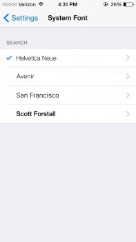
Why not let us choice the system font? Similar like Notes on iOS 6
Honestly I don't see a huge difference I just hope it does not break any of my apps that depend on a certain size text since they use "system". This new font seems a bit more narrow and I can't remember for sure but I think it will use the old until it's updated for iOS 9.
Erm... Where did you get that settings again...?
It might not work all that well on a system level, especially on a mobile system that is for devices with smaller screens, where fonts might make it hard to fit certain names and information in the place that exists for it, etc.Why not let us choice the system font? Similar like Notes on iOS 6
Rows and rows of icons. How boring...
One doesn't necessarily preclude or even affect the other.I think they should fix some issues instead of changing a font