Avenged110
macrumors 6502a
Absolutely not. I actually still use that (technically iOS 6, but still).Am I the only one who misses this?
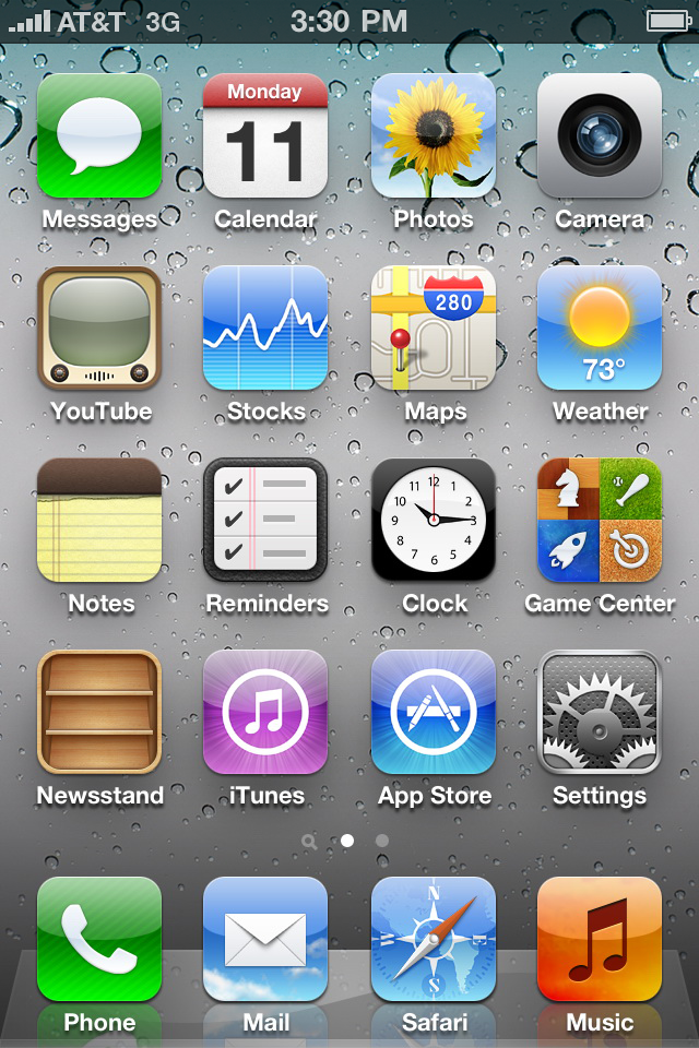
That's iOS 5. iOS 6 was even more beautiful.Yes you are. God iOS6 wasuglybeautiful
Last edited:
Absolutely not. I actually still use that (technically iOS 6, but still).Am I the only one who misses this?
That's iOS 5. iOS 6 was even more beautiful.Yes you are. God iOS6 wasuglybeautiful
The Watch app's icon is still the worst one of them all.
No, it’s iOS 4. By iOS 6, Apple perfected skeuomorphism.Absolutely not. I actually still use that (technically iOS 6, but still).
That's iOS 5. iOS 6 was even more beautiful.
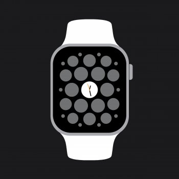
just the dots from the watch app screen would be enough to say "Apple Watch"I did two (not so quick because I’m not very skilled) mock-ups basically using the colors of the current icon and I think it looks better. What do you think?
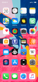
Edit: added my Home Screen with the redesigned icons to give a better idea of what it would look like.
Newsstand and Reminders weren't introduced until iOS 5, and Game Center in 4.1. The iPod app wasn't split out into Music and Videos on iPhone until 5.0 as well. But it's interesting because Apple changed to the "swoop" bars with 4.0.1.No, it’s iOS 4. By iOS 6, Apple perfected skeuomorphism.
This is the problem with flat design. It is clearly limited to the point where you can end up getting crap like this. When you could imagine doing this yourself in under 2 minutes in Microsoft paint using the most basic shapes.. it doesn’t exactly scream quality.
I did two (not so quick because I’m not very skilled) mock-ups basically using the colors of the current icon and I think it looks better. What do you think?
Edit: added my Home Screen with the redesigned icons to give a better idea of what it would look like.
just the dots from the watch app screen would be enough to say "Apple Watch"
I’m judging you based on what apps you have and your layout.
I’m judging you based on what apps you have and your layout.
And to what conclusion did you come? I actually put a lot of thought into my layout.
I did that back with my iPhone 6. I had to redo something, lost how I had it, and now it’s kind of however now.
I should redo mine to how I want it. I used to leave some of the defaults at the top alone, since that’s what Steve thought would be best.
I used to go with the iOS 6 layout for a looong time because that was most aesthetically pleasing to me. Now I tried to put the Apps in categories (like daily organizing stuff in the first row, then Maps, Weather, Health and Activity below Calender and Clock because it all has something to do with date and time, etc.), tried to avoid the same colors being next to each other and have the black app icons in a zig-zag going from top to bottom. Second screen is just in alphabetical order and that‘s it.

Maybe it was iPhone 5s!
What do you mean? I don‘t understand.
That’s the layout I spent a lot of time setting up to just how I liked it. Everything on the front page.
Something happened, I lost that set up, and I just never bothered again. It was on my iPhone 5S, so I’ve been unorganized since iPhone 6 came out.
You are not alone on this.Am I the only one who miss this?
Am I the only one who miss this?
Am I the only one who miss this?
Yuck glad that design is long gone, outdated then and now
It’s so hard to make a joke on this forum!And to what conclusion did you come? I actually put a lot of thought into my layout.
It’s so hard to make a joke on this forum!