Not only has it been available on the watch since watchOS 1, it's a built-in app and can't even be deleted.Still not available on the Watch!
Got a tip for us?
Let us know
Become a MacRumors Supporter for $50/year with no ads, ability to filter front page stories, and private forums.
Apple TV Remote App for iOS Gets New Icon
- Thread starter MacRumors
- Start date
- Sort by reaction score
You are using an out of date browser. It may not display this or other websites correctly.
You should upgrade or use an alternative browser.
You should upgrade or use an alternative browser.
The design of the physical remote itself is pretty "flat" as well. The thing is so aggressively symmetrical that your hand can't tell top from bottom in a darkened room, and a stray touch on the control surface can wreak havoc on any video currently playing. I ended up putting a square of bright yellow electrical tape along the bottom so I can quickly orient it in my hand in the dark.
I went to charge mine the other day and realized that the IR transmitter window has been carefully designed to be exactly the same size and shape, and in the same exact position, as the lightning charge port on the other end of the remote -- which works perfectly to fool the user into trying to plug in the wrong end of the thing.
The actual function of the remote is pretty great. You can dictate into the mic to avoid typing, and that control surface is pretty great for scrubbing through video -- but it's all put together in a really user-hostile way.
I had that issue as well. It took me a while before I started to instinctively feel for the volume rocker. Now I adjust the remote in my hand before I even notice I grabbed it backwards. I never consider my phone or watch for some reason.
Are you serious?! Do you really think this looks better than what we have today? I think it looks outdated - almost like something from the 90’Am I the only one who miss this?

[doublepost=1553674844][/doublepost]Sure the icon is a better representation of the apps function. But something that I will never understand is how Apple could release this remote.
The design is ok, but it’s also alienating; try giving it to a “non-tec” person. If they understand that there’s a touch pad, they will then struggle to navigate - there is such an unpropotional learning curve.
I think this is the worst designed product that Apple has relseased in recent years - by a long shot! And this is the second iteration...
I don't see what the purpose of this app is anymore when you have the quick app via the Control Center? Are there any differences?
It’ll be back before long with a dash of colour when ‘TV’ gets it’s redesign. Obviously changed to a remote to avoid confusion
View attachment 828648
I came here to say this.
Apple TV is now the app, not the box. The box is called Apple TV 4k and Apple TV HD — but not for long, I imagine. I think we’ll see a new Apple TV box launched before the Fall when Apple TV+ goes live, likely with a new form factor and a new name.
Since Apple TV (the app) will be everywhere, the box only makes sense for older TVs that don’t have AirPlay and don’t have the app. An HDMI AirPlay stick makes a lot of sense. In this case, the remote would be the only visible hardware so it makes sense to emphasize it going forward (hopefully with a redesign).
Welcome back, skeuomorphism.
Now can we bring back Scott Forstall and get back on track?
This isn't skeuomorphism. That's an icon representation of a physical device, skeuomorphic would be trying to represent it's physical properties on screen to create the visual effect of the remote.
In terms of semiotics, I'd argue the icon of the remote gives greater clarity of its function to an unfamiliar user, or even a familiar one performing a quick scan. Which is kinda the literal point of an icon. Whether it looks better is a different question and I'd agree it looks weird proportionately. But johnyslats nails it:
Obviously changed to a remote to avoid confusion
They want some clear definition between the products. The fact that there is greater semiotic benefit is a nice bonus.
YesAm I the only one who miss this?

[doublepost=1553689195][/doublepost]
I personally love the remote it allows me to use the Apple TV almost identically to an iOS deviceWhat I find most disheartening about this is that they seem to be this committed to the worst remote ever conceived. Enough so to change the icon to reflect it in all it's failure as a remote. Signaling IF there is a new ATV released soon, it'll still have this abomination as a remote. Sad.
I still use my aluminum ones with the arrow-wheel. So much better.. and it wasn't great, lol.
[doublepost=1553689539][/doublepost]
I handed to my niece and nephews and once I said use it like a phone touch screen they where good to go. I actually like the remote and hope if they decide to satisfy those who hate it they just create a second option and not replace it completelyAre you serious?! Do you really think this looks better than what we have today? I think it looks outdated - almost like something from the 90’
[doublepost=1553674844][/doublepost]Sure the icon is a better representation of the apps function. But something that I will never understand is how Apple could release this remote.
The design is ok, but it’s also alienating; try giving it to a “non-tec” person. If they understand that there’s a touch pad, they will then struggle to navigate - there is such an unpropotional learning curve.
I think this is the worst designed product that Apple has relseased in recent years - by a long shot! And this is the second iteration...
[doublepost=1553689676][/doublepost]
Unless they decide to make a cheaper version there is absolutely no reason to do an Apple TV redesign. The only thing it’s lacking is hey Siri supportI came here to say this.
Apple TV is now the app, not the box. The box is called Apple TV 4k and Apple TV HD — but not for long, I imagine. I think we’ll see a new Apple TV box launched before the Fall when Apple TV+ goes live, likely with a new form factor and a new name.
Since Apple TV (the app) will be everywhere, the box only makes sense for older TVs that don’t have AirPlay and don’t have the app. An HDMI AirPlay stick makes a lot of sense. In this case, the remote would be the only visible hardware so it makes sense to emphasize it going forward (hopefully with a redesign).
There goes my favorite iOS icon...
Don't worry - the new TV app coming in May is the ATV icon with a new colour! But yes, I agree, it was my favourite iOS icon app too!
Wrong! That is the iTunes Remote app. This app is different. This app has Siri that can play content on the ATV, and control the volume.Not only has it been available on the watch since watchOS 1, it's a built-in app and can't even be deleted.
Last edited:
Not a great icon, but I use the option from the lock screen or control center so I don't use the app. It can stay hidden in a folder.
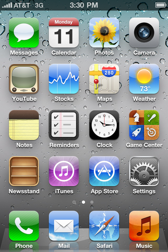
Am I the only one who miss this?

Yeah, 3G was great, wasn't it?
Last edited by a moderator:
Talk about a downgrade. Did anyone at Apple actually look at it on screen prior to pushing the change?
Yeah, that's such a subtle tactile cue, though. It's definitely a "form over function" design.I had that issue as well. It took me a while before I started to instinctively feel for the volume rocker.
The design of the physical remote itself is pretty "flat" as well. The thing is so aggressively symmetrical that your hand can't tell top from bottom in a darkened room, and a stray touch on the control surface can wreak havoc on any video currently playing. I ended up putting a square of bright yellow electrical tape along the bottom so I can quickly orient it in my hand in the dark.
The actual function of the remote is pretty great. You can dictate into the mic to avoid typing, and that control surface is pretty great for scrubbing through video -- but it's all put together in a really user-hostile way.
Yes, I've done the above so many times! But lest I only bash, I do agree that the functionality of the physical remote far exceeds the prior versions, just wish it wasn't so expensive when I'll inevitably need to replace it . . .
Yeah, the mic alone is a brilliant feature, and the little touch surface is great generally, if a little too easy to trigger accidentally. Pretty typical of Apple to have awesome features and a beautiful design that's not particularly friendly ergonomically. See also: basically every mouse Apple has ever made.Yes, I've done the above so many times! But lest I only bash, I do agree that the functionality of the physical remote far exceeds the prior versions, just wish it wasn't so expensive when I'll inevitably need to replace it . . .
I don't know if it's just me but my generation 3 does not pickup anymore on this app. it was working fine before the update. Anyone else out there confirm this?
In terms of semiotics, I'd argue the icon of the remote gives greater clarity of its function to an unfamiliar user, or even a familiar one performing a quick scan.
Well hopefully this is not a hard new directive for Apple, lest we start getting screenshots of apps as icons.
This remote icon is a bit twee.
tbh if the remote had different colour buttons that would be a start
i love apple tv but hate the remote
i love apple tv but hate the remote
With a full Apple TV Remote available in Control Center on modern devices, there's little reason to download the standalone Apple TV Remote app.
I use the downloadable app, even in iOS 12.2, for the "Details" button (top right). I can check the time remaining on a kid's show without pausing it. I wish Apple had included the button in the control center app. #parentusecase
And different colors for the Buttons would help? Okkktbh if the remote had different colour buttons that would be a start
i love apple tv but hate the remote
Not sure why everyone has trouble telling the top from the bottom. The ring is a giveaway in your hand. The volume big button is a giveaway in your hand also. I’ve never had issues figuring out in the dark which way I had it in my hand. But hey let’s add ugly colors to an all black sleek design. Yea no.
yeah , black on black works so well in the dark when you're watching a movie etc
'rolleyes'
[doublepost=1553724742][/doublepost]
https://www.apple.com/shop/reviews/MM4T2AM/A/apple-remote
nuff said
'rolleyes'
[doublepost=1553724742][/doublepost]
And different colors for the Buttons would help? Okkk
Not sure why everyone has trouble telling the top from the bottom. The ring is a giveaway in your hand. The volume big button is a giveaway in your hand also. I’ve never had issues figuring out in the dark which way I had it in my hand. But hey let’s add ugly colors to an all black sleek design. Yea no.
https://www.apple.com/shop/reviews/MM4T2AM/A/apple-remote
nuff said
Register on MacRumors! This sidebar will go away, and you'll see fewer ads.

