I couldn't find the post you mentioned. Can you tell us how to change the default settings?I didn’t think that any smart TV interface could be worse than Amazon’s, but this one takes the cake with autoplaying previews with audio.
edit - Just saw @landonjh’s post. Thankfully these settings are changeable. Really egregious that the default settings are to have these previews turned on.
Got a tip for us?
Let us know
Become a MacRumors Supporter for $50/year with no ads, ability to filter front page stories, and private forums.
Apple TV Users Complain About tvOS 16.2 'Watch Now' Redesign
- Thread starter MacRumors
- Start date
- Sort by reaction score
You are using an out of date browser. It may not display this or other websites correctly.
You should upgrade or use an alternative browser.
You should upgrade or use an alternative browser.
I too hate the redesign. Definitely seems like a push towards ad $ and away from user experience
Not that id touch google products with a barge pole.... (privacy!)I recently bought a new tv that has google built into it.. I know it’s a privacy nightmare but wow is it nice have a up next with integrated apps..
Wish apple would have been able to pull this off years ago with Netflix. Now I’m questioning if I even need an Apple TV for anything other than home automation.
Im aware they copied (as usual) appleTV's up next aggregation functionality - but do they include Netflix too?
If so ill be so annoyed with Netflix - why are they still a hold-out for AppleTV up next when they have allowed Google to do it?
Well I actually don’t know if it supports Netflix, but it does support YouTube tv which apple doesn’t.Not that id touch google products with a barge pole.... (privacy!)
Im aware they copied (as usual) appleTV's up next aggregation functionality - but do they include Netflix too?
If so ill be so annoyed with Netflix - why are they still a hold-out for AppleTV up next when they have allowed Google to do it?
You can disable it on the Apple TV. Settings app -> Apps -> TV (APPS SETTINGS section) -> Autoplay Video Sound Off.What I don’t like is not the video preview, but the audio of the preview. It’s not the end of the world, but I find it annoying every time it starts playing.
I’ve been using Apple TV for over a decade and currently use it on 77” A80J. You don’t hear me crying about it.No, not really at all. Not only is the giant ad on top, but scrolling down to up next causes the up next row to scroll full vertical screen from bottom to top (Giant Ad on the bottom now) when you want to use it, and it’s an UI nightmare, especially on a large screen TV when your entire visual focus has to change dramatically like that. Many of us use Apple TV because of how convenient the up next row was. Saying not to complain is stupid. Apples needs to fix this.
You can also disable the auto play video by going into accessibility and then motionI couldn't find the post you mentioned. Can you tell us how to change the default settings?
Just adding my voice to this to say I love the Up Next feature and I hate this new update. Please don't bury the Up Next under a bunch of ads please Apple.
Apple TV users are not happy with design changes that Apple added to the Apple TV app with the launch of tvOS 16.2, iOS 16.2, iPadOS 16.2, and macOS Ventura 13.1, according to a number of complaints shared on Reddit.
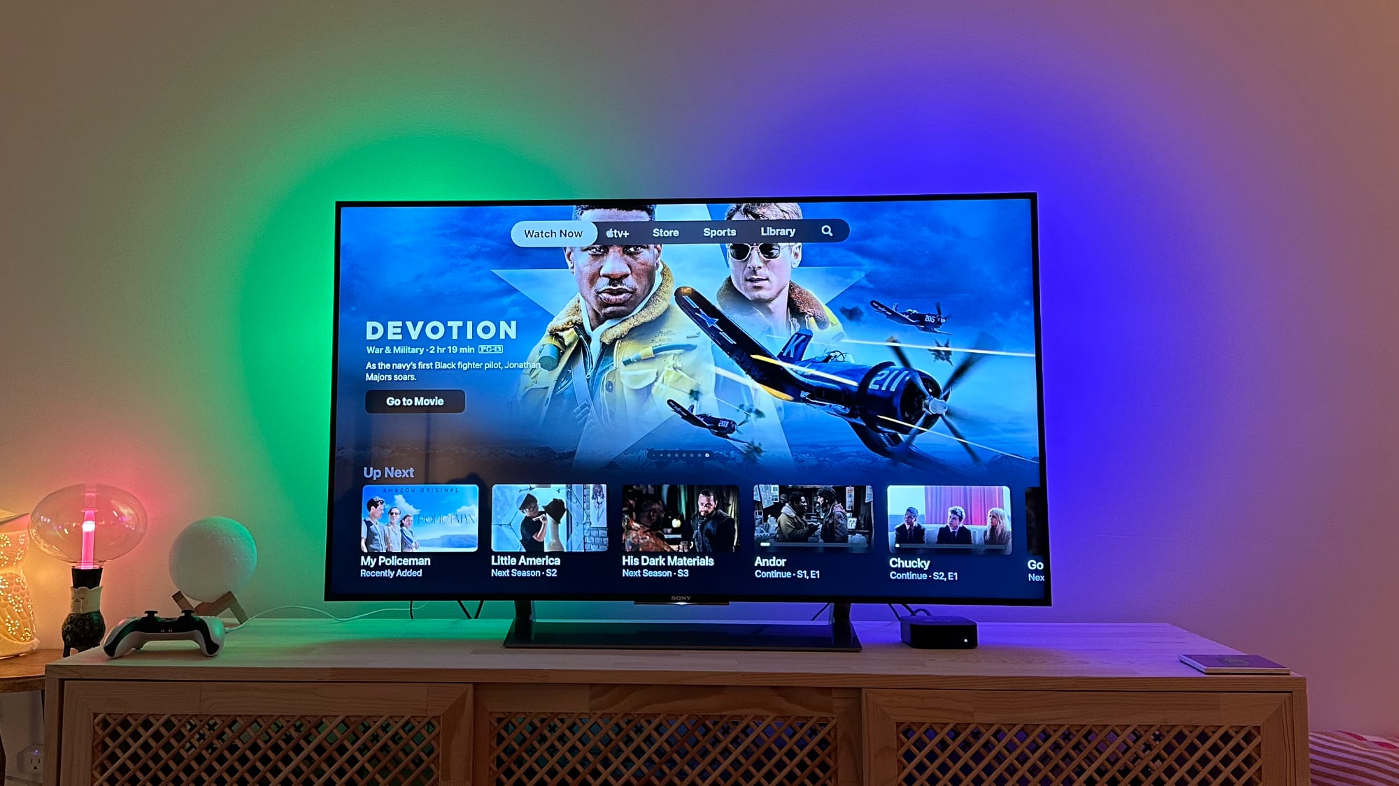
Apple with tvOS 16.2 and its sister updates demoted the "Up Next" section in the "Watch Now" tab of the Apple TV app, instead adding a large featured content section with no option to disable it. The previews also autoplay content with audio, much to the annoyance of Apple TV users. From Reddit user Sean310:
When tvOS 16.2 was being beta tested, there was a full "Featured" section that was shown above Up Next, but after a number of complaints, Apple changed the design. "Up Next" continues to be visible at the bottom of the Watch Now tab, but the majority of the interface is taken up by a rotating carousel featured shows and TV moves.
There is no way to toggle off the featured section or to revert to the interface that put more focus on Up Next, and as it transitions through content, Apple offers options to "Go to Show" or "Go to Movie" quick links. Though the interface change has been available since tvOS 16.2 was released on December 13, it appears the tvOS auto update function recently sent out the update on a more widespread basis. From Reddit user WikiWikiWhat:Apple TV users have been complaining about these design tweaks since tvOS 16.2 was in testing, and Apple has not made an effort to offer options to swap back to the old interface. It is not clear if the uptick in complaints will sway the company, and for now, the interface is here to stay. It's also worth noting that these same design changes have also been implemented in the TV app for iPhones, iPads, and Macs.
Article Link: Apple TV Users Complain About tvOS 16.2 'Watch Now' Redesign

Just to clarify for anyone who reads this, these instructions don't pertain to the TV app, which is what the article is about. Up Next for Top Shelf is an Apple TV Home Screen setting, there isn't an option to move Up Next in the TV app.
Wrong. We’re taking about the top banner inside the AppleTV app. Not the Home Screen.
Totally agree. I get Apple TV+ through their bundle. I’ve watched many of the shows. Yet the app still has them front and center suggesting them. Their vast technology can’t even determine that?My biggest issue with the TV app is the heavy advertising of Apple TV plus.
I get it, apple owns the service and has a right to do this, but the tv app was meant to be a way to view content from all services, with no one service getting more coverage.
I have actually stopped using it more recently and only use it for up next, it’s just too cluttered and hard to find stuff. What would be useful as well is a toggle so it only shows content you are subscribed to and not a link to buy it on iTunes.
The whole app needs a redesign, it’s a mess.
If they wanted us to watch all of our streaming services through their app, it kind of implies their app is better. The big, abundant ads make that untrue.
The biggest problem with almost all of the major streaming services (Netflix, Amazon, Disney, HBO Max, Paramount Plus) is the single row horizontal scrolling interface which provides no way to expand a collection so it shows more titles on the screen. It is especially annoying on a desktop computer with a mouse - I often have to click more than 20 times to see all the titles in a collection. It seems the developers of these interfaces never bothered to test with more than 2 items in a collection! It’s also ironic that Tim Cook complains about mindless, endless scrolling which is exactly what the single line horizontal scrolling interface promotes.
Last edited:
Paramount+ does this right. They have a tab for My List which shows an entire screen of whatever you put there.The biggest problem with almost all of the major streaming services (Netflix, Amazon, Disney, HBO Max, Paramount Plus) is the single row horizontal scrolling interface which provides no way to expand a collection so it shows more titles on the screen. It is especially annoying on a desktop computer with a mouse - I often have to click more than 20 times to see all the titles in a collection. It seems the developers of these interfaces never bothered to test with more than 2 items in a collection! It’s also ironic that Tim Cook complains about mindless, endless scrolling which is exactly what the single line horizontal scrolling interface promotes.
You are not only complaining, you are complaining about something you don't care about. Welcome to 2023, same as 2022, 2021, 2020, etc.why is everyone complaining all the gd time
i don't care about what some reddit user said, i care about apple updates lol
-kp
And of course you know better than everyone else.I think everyone is overreacting. The up next queue sits at the exact same spot it always has on the screen. Instead of seeing a giant picture of the show/movie you are watching it’s just a picture of another show/movie you might like. It’s the exact same layout if you move over into the originals tab. These two tabs now share feature parity. This has not fundamentally changed how the up next queue works. Go buy a chrome cast, fire tv cube, or Roku if you are unhappy.
It would be great if streaming apps allowed users to customize the layout and have settings to turn off autoplay... if there's one thing I truly hate about the Netflix Apple TV app (besides the content) it's the darn autoplay every time you scroll over something! 
You can turn off the auto play for previews in Netflix. You might have to do it through your account via the website.It would be great if streaming apps allowed users to customize the layout and have settings to turn off autoplay... if there's one thing I truly hate about the Netflix Apple TV app (besides the content) it's the darn autoplay every time you scroll over something!
Agreed!why is everyone complaining all the gd time
i don't care about what some reddit user said, i care about apple updates lol
Too many whinners and complainers over on Reddit and in the world.
That said ...
The new layout looks too confusing and cluttered. 🤷♀️
Change it back to the old ways. Keep it simple.
While I dislike the arrangement, I didn't even notice the auto audio playing. If you've seen Amazon Prime's layout you'd loose your mind.
I think ATV+ team needs to stop implementing what is new and visually addicting or eye popping. They need to test and then go through focus groups - expanding the group member count every time to ensure they get a proper consensus and feedback. More importantly ALLOW the USER NOT to accept the change!
Where as the dawn of the USER gone with computers and all these software changes?
MCP > Master Control Program
I mean why do we need a splash screen to tell us an application is loading that is modal - dead center on the screen when the user is VERY sure what application they launched!?
This is what is happening to the end user now in computing!

Totally agree. I get Apple TV+ through their bundle. I’ve watched many of the shows. Yet the app still has them front and center suggesting them. Their vast technology can’t even determine that?
If they wanted us to watch all of our streaming services through their app, it kind of implies their app is better. The big, abundant ads make that untrue.
It’s even worse if you use Apple Music. Take the “‘22 Replay” playlist they’re hyping right now. I listened to over 20k tracks last year. Apple picked the 100 that they “thought” was representative of my listening habits. Guess what was on that playlist? Virtually EVERY TRACK from the Severance soundtrack, an album I listened to ONCE last year.
It’s getting WAY out of hand.
I'm complaining about this redesign of the AppleTV environment....

What's hidden inside the white ball?
What's hidden inside the white ball?
Last edited:
Literally looks like every other single streaming platform... and users complain.
At this point it looks worse and functions less capably than most other streaming platforms. That’s the issue. Apple has been degrading the Apple TV experience, not upgrading it.
I forget where I ordered from once, but I used the Apple Card. Got those popups after, and the first was to apply for Apple Card...EEDIOTS!!!Totally agree. I get Apple TV+ through their bundle. I’ve watched many of the shows. Yet the app still has them front and center suggesting them. Their vast technology can’t even determine that?
If they wanted us to watch all of our streaming services through their app, it kind of implies their app is better. The big, abundant ads make that untrue.
Figment's childI'm complaining about this redesign of the AppleTV environment....
View attachment 2140084
What's hidden inside the white ball?
Please don’t give solutions… the people will have nothing to moan aboutIt’s all changeable.
Settings -> Apps -> TV
Change “Up Next Display” to Poster Art to see covers again.
Change Top Shelf to “Up Next” to put it back at the top.
Change “Autoplay Video Sound” to Off to disable autoplay.
Hell yes I do.And of course you know better than everyone else.
Register on MacRumors! This sidebar will go away, and you'll see fewer ads.