Become a MacRumors Supporter for $50/year with no ads, ability to filter front page stories, and private forums.
In a command prompt, use winver. Note the version listed
EG, Windows 95, NT 4, 98, and ME are all considered Windows 4.x.

NT 4 and Windows 95/98 don't use the same kernel at all. They might share the GUI sub-system (actually, it's called the Win32 sub-system, which is probably what Windows Team blog is referring when referring to API versions, since Win32 is the Windows API) (and yes, I know the 64 bit version is called Win64, just like the 16 bit version was called Win16), but they do not share the same architecture/kernel at all, which Smitty inferred. So no, Smitty wasn't right at all, is use of the word kernel was wrong and confusing.

Anyway, the only way it makes sense again is Windows NT releases. I doubt the Windows Team Blog are in on marketing meetings. ;)
 
Hmm, I thought the way it was in the older Lion builds looked nicer.

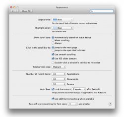
The iOS slider does not make any sense when quickly looking at options on screen. One has to click-drag-release for the slider function to work, not a hugh problem on iOS since its on a small screen.

Considering that Mac OS is not touch based, makes additional steps to accomplish the same task and is less intuitive.

Applaud :apple: for the change, however neither option bothered me at all, I usually overcome the minor initial learning curve. ;):D
 
I'm skipping Lion. I see no advantage over Snow Leopard.

also...the new ical reminds me of this... :D

world-desert-560.jpg
 
The iOS slider does not make any sense when quickly looking at options on screen. One has to click-drag-release for the slider function to work, not a hugh problem on iOS since its on a small screen.

Considering that Mac OS is not touch based, makes additional steps to accomplish the same task and is less intuitive.

You didn't have to click-drag. Just click your option, exactly as before. (Same as iOS, you don't have to drag the slider, you can press on your option.)

Although, the design of the slider made it look like you had to do this, which is probably why they changed it.
 
Please also replace those crappy black white icons with colored ones.What is wrong with colors? Is lion color-alergic??

What is odd is that Apple has these great IPS screen on the iMac, ACD and the have gone with a neutral scheme to focus on the content.

I still preferred the "pinstripes" of Mac OS 10.0, loved the eye-candy and the rainbow of colours.

Neutral is alright, just want some colour back into the GUI. Then again you will always have those who will never agree with anything. ;)
 
You didn't have to click-drag. Just click your option, exactly as before. (Same as iOS, you don't have to drag the slider, you can press on your option.)

Although, the design of the buttons made it look like you had to do this, which is probably why they changed it.

Considering the Finder, where a slider had 3+ options to select, the user would eventually get frustrated. They could have kept it and added the same blue colour to the text or option being selected.
 
No, smitty was correct. MS uses version numbers that identify it's code. It's how software devs can write code that decides whether the app should be allowed to install.

In a command prompt, use winver. Note the version listed
EG, Windows 95, NT 4, 98, and ME are all considered Windows 4.x. 2000 and XP are both 5.x, Vista and Windows 7 are 6.x. So it's clear 7 is nothing more than marketing.

From the horses mouth: http://windowsteamblog.com/windows/archive/b/windowsvista/archive/2008/10/14/why-7.aspx

Umm just going to point this out to but Windows 95, 98 and ME were all the windows 9.x kernel code.
Knight pointed out that what you are reading is just the gui version number. GUI is just a shell around the OS(aka eye candy). The kernel is what really matters and what is really accessed and controlled.
NT and beyond were on different version of NT.
Knight is the one is correct and he has proving he knows his stuff in that deparment.

Windows had 2 lines for the longest time the NT line (business for the most part) and the other one which has been known as the 9.x line.
Windows XP killed off the 9.x line and they went NT only.
 
For the love of god get rid of the faux leather.

I generally agree with the overall consesus. The attempt to bridge OS X and iOS GUI's are disappointing. It's not so much one thing in particular but the culmination of terribly implemented GUI nuances.

The grey Finder and Mail sidebar icons are more confusing, as was the grey iTunes X icons that were quickly remedied with an iTunes.rsrc file to add the previous color icons. ICal would benefit from a black/grey leather with more grain/definition, as would Address Book. Finder windows have about the same UI as L/SL, and I'm not into the latest iOS scroll bars (too thick, I preferred the thinner scroll bars). The depressed/non-depressed buttons seem misplaced. The blue standard system folders seem even more inconsistent comparatively (and they have been around since 10.5) and I loathe the icons for iTunes/App Store/Safari (which is really outdated).

Overall, instead of Apple [finally] producing an OS X with a unified GUI, nothing seems consistent. Either add flare and color or don't.

OS X Lion needs Lithium, it's becoming schizophrenic!
 
Considering the Finder, where a slider had 3+ options to select, the user would eventually get frustrated. They could have kept it and added the same blue colour to the text or option being selected.

Why do we assume that the person using it is an idiot? What was so confusing about it? It takes two seconds to get use to it.

I think inverted scrolling has the potential to confuse people more and is probably harder to get use to.
 
NT 4 and Windows 95/98 don't use the same kernel at all. They might share the GUI sub-system (actually, it's called the Win32 sub-system, which is probably what Windows Team blog is referring when referring to API versions, since Win32 is the Windows API) (and yes, I know the 64 bit version is called Win64, just like the 16 bit version was called Win16), but they do not share the same architecture/kernel at all, which Smitty inferred. So no, Smitty wasn't right at all, is use of the word kernel was wrong and confusing.

Anyway, the only way it makes sense again is Windows NT releases. I doubt the Windows Team Blog are in on marketing meetings. ;)

do you happen to know what windows 7 code name was or was windows 7 the code name that became the marketing name?
edit never mind: Look it up. it was Blackcomb what I though it was but was not sure.
 
Why do we assume that the person using it is an idiot? What was so confusing about it? It takes two seconds to get use to it.

I think inverted scrolling has the potential to confuse people more and is probably harder to get use to.

I am guessing that you have never worked as tech support or with family members or relatives that are not tech savvy. ;):D

Remember :apple: produces products for the young and young at heart. ;)

Have you not noticed that Steve Jobs weak eyesight and the text in Mac OS growing ever so large. If it was my choice I would have tiny text on screen.
 
I am guessing that you have never worked as tech support or with family members or relatives that are not tech savvy. ;):D

Remember :apple: produces products for the young and young at heart. ;)

Part of my hobby involves thinking of UI designs and tweaking others. I don't see why you think slider buttons are more confusing than inverted scrolling?
 
Hm. I hate to say it but I'm preparing to be a little disappointed.

The shading of a button is about the most minor UI change I could think of, compared to the big changes I was expecting. As for the color schema, I thought i'd be glossy black... like imovie, fcp, etc... nice clean, high contrast, classy look, keeps your focus on your content.

But I guess I was expecting some next-generation stuff, like a semi-intelligent contextual version of Finder that'd closer integrate into applications, to put compatible files at your fingertips, & make the OS work with you, instead of be worked by you.

...Integration of cross-OS applications, like auto-syncable iWork, Garageband, iMovie projects, etc... so your content can be worked on seamlessly from one device to another & allow us to focus even more on our content & less on our tools.

an 20 foot voice activated foldable touchscreens and and... i know, i know...
 
I heard microsoft is making some changes to its next OS release too. Apparently the blue screen of death will be a black screen of death in Windows 8.

btw- does anyone know why the current version is named Windows 7? Why 7?

As for Lion, I am looking forward to having the ability to switch to an iOS appearance for apps. It will be nice to organize then like that. The idea has grown on me.

Calling it Windows 7 sort of makes no sense, technically it's the 10th version of Windows, if you dont count server editions.

It's only the 7th if you start counting from Windows 98.
 
Well that's good. I wasn't liking the way the UI was going, and this is a step (admittedly backwards) in the right direction. Hey, if it ain't broke, don't fix it.
 
The main problem with the "slider" idea is that it wasn't intuitive which selection was active (since we're so used to a depressed icon indicating selection). I like the concept of a slider; it reminds me of the old tile games. Perhaps a compromise would have been to have the selected item's text glow, as if a little LED were behind it. That would have made it really clear which item was active.
 
I agree. I am using scroll reverser on Snow Leopard right now and enjoy it a lot. After about a day or two it becomes more natural.

I booted into snow leopard on another partition after using Lion for a while and I had trouble not scrolling inversely. I've gotten quite used to it.
 
You're mixing up your kernels. NT 4.0 doesn't share a kernel with 95/98, NT 3.51 doesn't share a kernel with Windows 3.x...

Windows 7 is Windows 7 because it's the 7th release of Windows NT.

1- Windows NT 3.1
2- Windows NT 3.5
3- Windows NT 4.0
4- Windows 2000
5- Windows XP
6- Windows Vista
7- Windows 7

That's the only way it makes sense.

And to think through all those Windows versions there was no significant improvement in the operating system as a whole, just specs on paper. :rolleyes:
 
Register on MacRumors! This sidebar will go away, and you'll see fewer ads.