Become a MacRumors Supporter for $50/year with no ads, ability to filter front page stories, and private forums.
NT 4 and Windows 95/98 don't use the same kernel at all. They might share the GUI sub-system (actually, it's called the Win32 sub-system, which is probably what Windows Team blog is referring when referring to API versions, since Win32 is the Windows API) (and yes, I know the 64 bit version is called Win64, just like the 16 bit version was called Win16), but they do not share the same architecture/kernel at all, which Smitty inferred. So no, Smitty wasn't right at all, is use of the word kernel was wrong and confusing.

Read my post. I didn't say he was right about them being the same kernal. I simply said he was right about the naming conventions.

The version in question isn't simply the gui version number, but the code base version as a whole.

Anyway, the only way it makes sense again is Windows NT releases. I doubt the Windows Team Blog are in on marketing meetings. ;)

The only way it makes sense is by using the actual version numbers that MS gave us, which are quite easily found. ;) Not only in Windows but in several sources through the net. I'll believe the info MS gives us vs someone from macrumors.
 
The main problem with the "slider" idea is that it wasn't intuitive which selection was active (since we're so used to a depressed icon indicating selection). I like the concept of a slider; it reminds me of the old tile games. Perhaps a compromise would have been to have the selected item's text glow, as if a little LED were behind it. That would have made it really clear which item was active.

Exactly what I was talking about. :)
 
We haven't seen anything yet.

I booted into snow leopard on another partition after using Lion for a while and I had trouble not scrolling inversely. I've gotten quite used to it.

Agree that Lion scrolling makes more sense now that iOS is so popular. But the odd "slider" tab controller really didn't make sense to me. It was animation for animation's sake.
 
Both styles are bad.

Neither style does a good job of obviously denoting which tab is currently active. It's a really poor visual interface to make one tab be a lighter shade of gray and make the other exactly same-shaped tab be just a darker shade of gray. The active tab should have a different shape that denotes being "in front", like having the active tab lift vertically a bit higher above the inactive tabs. And/or make the background color of the active tab have a bright active-looking color like yellow, while the inactive tabs stay gray.
 
When I read the subject, I got a little hopeful...when I saw the screenshot showing Spaces/Exposé, I really thought the "UI tweak" was that they'd let us use the old Spaces if we wanted to.

Guess not, it's still that b******ized Mission Control...
 
Mac is going back to beige

Sheesh, what a BORING update. Who cares about the shade of the buttons in the System Preferences? They're still using this same boring GREY that they've been using since Panther (minus the brushed steel). How boring is grey? I hate to say it, but Windows 7 with their translucent plastic is TEN TIMES more attractive than Mac OSX.

Apple used to make visually interesting computers. Now it's all this boring industrial design.

What's next? Going back to BEIGE?
 
Read my post. I didn't say he was right about them being the same kernal. I simply said he was right about the naming conventions.

The version in question isn't simply the gui version number, but the code base version as a whole.

Windows 95/98 don't share a code base with Windows NT. You are aware that the NT line is a complete rewrite, 32 bit from the ground-up and a completely different kernel/system architecture ?

It's like saying OS X and classic are the same code base...

The Win32 sub-system (which is only 1 sub-system in NT) might share some code, that's about it.

The only way it makes sense is by using the actual version numbers that MS gave us, which are quite easily found. ;) Not only in Windows but in several sources through the net. I'll believe the info MS gives us vs someone from macrumors.

No, because then as pointed out by your MS friend, it would be Windows NT 6.1 ;) Your blog post even says it doesn't make sense, so I don't see how "MS gave you info" when your "source" says it doesn't make any sense.

Again, only way it actually makes sense is from a marketing perspective and as being the 7th release in the Windows NT line-up.
 
It's really hard to screw up a simple UI "Button" but leave it to Apple to constantly assume their user base is stupid and can't manage a simple "click". Give us the ability to change themes if you want to the UI to look differently.

We promise not to kill ourselves.
 
I hate to say it, but Windows 7 with their translucent plastic is TEN TIMES more attractive than Mac OSX.

I personally find that the "translucent plastic" in Windows 7 looks like it was ripped off from the 90s and a bad Linux window manager. Seriously, it screams "look at me, I'm trying too hard!".

And it's a complete rip-off of KDE 4.x.
 
So KDE4 is a bad 90s Linux Window Manager?

As far as the look goes ? Yes. As far as the architecture behind it goes ? No (gone is the fake transluscency hacks of Rasterman and Enlightenment and in are the compositing extensions). Context man, I see your break from MacRumors didn't teach you to stick to context. :rolleyes:
 
As far as the look goes ? Yes. As far as the architecture behind it goes ? No (gone is the fake transluscency hacks of Rasterman and Enlightenment and in are the compositing extensions). Context man, I see your break from MacRumors didn't teach you to stick to context. :rolleyes:

Well your two comments are linked.

Also !@#$ context.
 

Attachments

  • download.png
    download.png
    59.9 KB · Views: 94
Well you're two comments are linked.

Both my comments refer to the look. Windows 7 looks like a bad Enlightenment theme. Anyway, the "translucent" plastic was ripped off KDE 4.x (which is true, look at plasma), which while not sharing the bad hack ridden architecture of the 90s version enlightenment does seem to share the look of its themes.

Context. Is. Everything.

All these months, and again you try to argue with me over what I meant. New Zealanders really have a problem with the concept of "I know better what I meant that you do and it was clearly posted had you followed the context".
 
Apple has sprung open a box of snakes.

Mixing elements of iOS & OS X, is a no win proposition. It's the golly gee whiz kids, vs. the professionals.

The kids love the look of iOS, FART Apps, and all that nonsense. Its all fun & games on mommy & daddies money.

The grown ups who use their Macs to get things done, find some of these changes far from amusing. For us its about productivity & efficiency. It's about computing.
 
Context. Is. Everything.

Context is Legion.

All these months, and again you try to argue with me over what I meant. New Zealanders really have a problem with the concept of "I know better what I meant that you do and it was clearly posted had you followed the context".

I thought regulars long ago learned to stop taking me seriously? All I've been doing is borderline trolling since 2010. How is "So KDE4 is a bad 90s Linux Window Manager?" not an obvious troll comment? Of course its not, its an average modern window manager.

God you canadians are so serious about everything. ;):rolleyes:
 
Last edited:
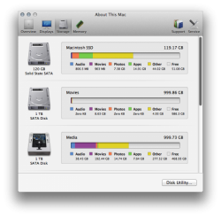
"About This Mac" System Information now shows HDD content by type as opposed to just "other" (orange)
 

Attachments

  • Y3lS7sa1lPlH8QZ7vNNtdUgjrDLVrphG_m.png
    Y3lS7sa1lPlH8QZ7vNNtdUgjrDLVrphG_m.png
    125.4 KB · Views: 203
Last edited by a moderator:
Switching subpanes with cmd-tab

Just like switching between tabs using ctrl-tab in Safari and other web browsers I think it would be good to be able to switch between subpanes using the same keyboard shortcut.

What do you think about that?
 
Dredful and confusing. What is on an what is off is not obvious. I prefer Apple to just leave the UI as it is in Snow Leopard. I hate this white only colourless drab look. Bring back Blue widgets. Stop wasting time by obsessing over trying to make everything look like an iPhone. I don't want an Apple Display, an Macbook Pro etc to look like an iPhone with the glass mirror front. I certainly don't want OS X to look like iOS.

Apple, focus on more important things such as a decent FileSystem (ZFS), Queued file copies, more robust and threaded I/O API's, Resolution Independence etc.
 
The way it is in Snow Leopar

I like it as it is in Snow Leopard.

Yes! I completely agree! What's wrong with Aqua candy blue style? It looks great and is intuitive. This gray-only stuff seems like a step backwards.
 
Register on MacRumors! This sidebar will go away, and you'll see fewer ads.