You were saying....
You really need me to expand upon my "apples and oranges" comment? Really? Wow
Comparing the iPhone UI to the Apple Watch does not work for obvious reasons.
You were saying....
It's. Still. Just. CGI. How can they award a computer generated image? The thing isn't out yet.
The Emperor's new clothes have won an award..
Maybe he means don't judge a book by it's cover.
It's plain stupid to judge this thing based off looks. And it does not look great to begin with.
You really need me to expand upon my "apples and oranges" comment? Really? Wow
Comparing the iPhone UI to the Apple Watch does not work for obvious reasons.
So circularity it is in the minds of the designers almost as if it is an unconscious wish that the display was also circular.
I still think it should have been round. And don't you come back with "the UI wouldn't work on a round watch" nonsense. If you look at a lot of the design elements that have been built into many of the apps they are already tending towards circularity.
Shouldn't be Spock 'will be' logical. He's not due to be born for 215 Years.
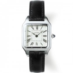
Why are people still persisting with the "watches are supposed to be circular" chestnut? They're not. They've been non-circular for decades. Apple aren't breaking any perceived "rule" about watches, except one conjured from thin air by people deliberately being inflammatory.
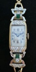
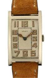
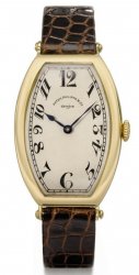
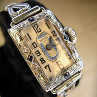
http://www.ablogtowatch.com/top-10-the-great-gatsby-era-watches/
These took me all of 10 seconds to find. If Cartier can make a square watch, then Apple sure as %$#@ can.
Voted on by a bunch of Jony Ive wannabes.
If they had one in hand then congrats, if not then this means nothing.
Why would you need a background in design to have an opinion on a products looks? It's a purely subjective matter, would you ask the same question to someone who thinks it is good looking?
You can't give it a design award before it's released, before it's in peoples' hands and getting used every day in the real world. That's when we will be able to judge how well it has been designed, and not before.
It's plain stupid to judge this thing based off looks. And it does not look great to begin with.
There are many circular design elements already in those screenshots even though the display is square. So circularity it is in the minds of the designers almost as if it is an unconscious wish that the display was also circular.
Apples and oranges

I think everyone is entitled to an opinion about how they think something looks. But when it comes to something like evaluating the quality of the design I think you can make the argument that you need some training to understand what is good design as opposed to what is pretty. I think something could be attractive and not be an impressive design because it is not novel or violates accepted practices, etc. And probably the opposite could be true as well.
I was merely stating that, to me, a circular watch face is more aesthetically pleasing and that people stating it is impracticle due to design considerations are wrong.
I was merely stating that, to me, a circular watch face is more aesthetically pleasing and that people stating it is impracticle due to design considerations are wrong.
I think everyone is entitled to an opinion about how they think something looks. But when it comes to something like evaluating the quality of the design I think you can make the argument that you need some training to understand what is good design as opposed to what is pretty. I think something could be attractive and not be an impressive design because it is not novel or violates accepted practices, etc. And probably the opposite could be true as well.
I see movies often that I find enjoyable that critics hate. Presumably they know more about the technical aspects of a movie. I just know if I had a good time.
I was merely stating that, to me, a circular watch face is more aesthetically pleasing and that people stating it is impracticle due to design considerations are wrong.