Become a MacRumors Supporter for $50/year with no ads, ability to filter front page stories, and private forums.
Having used it for over a month now, I’ll say that OS 10 is a bit of a misfire IMO. So many weird choices:
  • Taking TWO input methods for widgets on a device that is horribly limited as-is.
  • Removing the memory on the app list; in prior OS’s if you exited out it would remember your place, now it resets to the top of the list every time.
  • Making elements smaller so that they can add borders/backgrounds to screens, on such a small device.
  • Many things that were 1-2 presses (or 1 when Force Touch was still a thing) are now 3+.

I just don’t get it. The prior UX worked for the most part. This one is just dumb.
 
Have you actually tried this view on watchOS 10? Because what you describe sounds like you never used it, which is why I suggested learning to make the features that exist already work for you.

Grid view is no longer an amorphous blob of apps which everybody including myself hated. Apple finally copied WearOS and now it scrolls from top to bottom. You can place them in any order you want, such as putting the 15 apps you use the most at the top.
I didn’t know it has changed in watchOS 10. I didn’t see it mentioned in any of the reports here or the MacStories review. I am going to play with it tomorrow (I have kept my original watch running watchOS 10 alongside my newly acquired one running watchOS 9).
 
Battery issues, battery issues, battery issues.
On Watch 8, with OS 9, battery would last all day.
On OS 10.0 and 10.1, battery needs to be charged at least twice a day.

Yes, I've gone through and disable just about everything I can. No widgets, no complications, lowered brightness and on and on. Makes no difference, the battery just drains like crazy. Massive difference than with OS 9.

So that's my big issue. Battery life. Pretty much killed a lot of the usefulness, for me at least. Now this watch that's on my wrist all day long needs a lot of time and care to make charging work throughout the day, multiple times. That wasn't how it worked before.

Watch OS 10.x sucks.


aaaahhh....


I've been skim reading this thread

This I the biggest issue for me.

Has 10.x updates fixed this battery drain issue?

My AW6 is pretty crummy battery as it is!

Regards
Martin
 
There are ways you can work around some of this. You could set up automations or use focus modes for whatever activity you are doing if you have specific faces you want during that time.

An exercise example: (edited with better workflow)
1. Go into Settings > Focus > tap the +
2. choose your focus mode or add a custom one
3. tap Customize Focus > choose the watch face under Customize Screens
4. tap "Add Schedule" and choose "App" -- Choose the phone app you want to trigger your focus mode/watch face

Now you'll never have to touch your watch again for this situation. It will set your preferred face when you open your exercise app and start a workout, it'll revert back when you're done.


Hello again Missingar,


That is awesome advice! thanks for sharing.

I'll see if I can get it to work for 'outdoor walking'


Regards
Martin
 
  • Love
Reactions: missingar
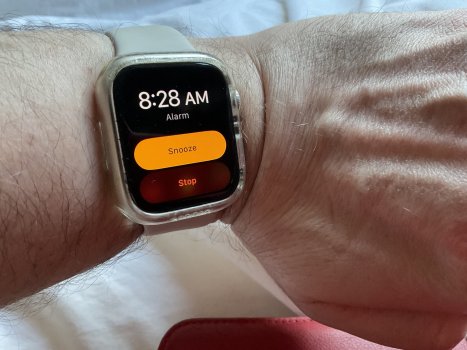
So I thought OS10 was a bit rubbish as it had shrunk the Stop bottom when the alarm goes off, as you can see in the photo I grabbed when it went off it’s just my eyes at the 7AM it normally goes off at not being the best lol, and me being stupid:

IMG_0050.jpeg

I have kinda got used to it now, don’t use any of the widgets though but I fiddle with the crown now and then as you get that grinding vibration when you do lol, bit like a fidget spinner I guess. And I see the widgets list when I do this but don’t use it at all.
 
Last edited:
This is the entire point of the widgets-- so that you can easily access whatever data you need, while still being able to use whatever watch face you prefer. The point is to eliminate the need to switch between watch faces. You just roll the dial upwards and glance at your calendar, weather, whatever.

Personally, I think it's great, and much better than watchos9
I love the widgets page, but…

- Not all apps can be added as a widget (i.e. Stocard)
- I wish I could have more than one widgets with three apps.
 
So I thought OS10 was a bit rubbish at it had shrunk the Stop bottom when the alarm goes off, as you can see in the photo I grabbed when it went off it’s just my eyes at the 7AM it normally goes off at not being the best lol and me being stupid:

View attachment 2307680

I have kinda got used to it now, don’t use any of the widgets though but I fiddle with the crown now and then as you get that grinding vibration when you do lol, bit like a fidget spinner I guess. And I see the widgets list when I do this but don’t use it at all.

The fact that button is so hard to see is exactly why OS10 is rubbish.
 
The fact that button is so hard to see is exactly why OS10 is rubbish.
Yes I won’t lie, it was a lot easier to see in the previous OS. Which is kinda what you need when you have literally just woken up.

EDIT: alarm went off this morning and it took my eyes ages to focus on those colours they use and allow me to read the words. Yes a VERY poor colour choice.
 
Last edited:
Totally agree. Apple seems to have changed the functionality of all the buttons to make everything less useful in watchOS 10. I used to be able to use the side button to access frequently/recently used apps. Where is that option now? Now I have to click on the crown, scroll to Apps to find them. Absolute worst rubbish of an update— they seem to be changing things for the sake of changing them. Hopefully, all the Apple execs will figure this out when they can’t get their watches to work.

You may already know this, but you can access the favorite apps still by double clicking on the crown.

Edit: sorry. I see that others already mentioned this.
 
Last edited:
You may already know this, but you can access the favorite apps still by double clicking on the crown.

Edit: sorry. I see that others already mentioned this.
Haha— I most certainly did NOT know that! Thanks all! I stand corrected but I also still believe Apple should avoid switching all the button functions around every couple years.
 
So I thought OS10 was a bit rubbish as it had shrunk the Stop bottom when the alarm goes off, as you can see in the photo I grabbed when it went off it’s just my eyes at the 7AM it normally goes off at not being the best lol, and me being stupid:

View attachment 2307680

I have kinda got used to it now, don’t use any of the widgets though but I fiddle with the crown now and then as you get that grinding vibration when you do lol, bit like a fidget spinner I guess. And I see the widgets list when I do this but don’t use it at all.

This Alarm UI annoys the hell out of me. In the morning with blurry eyes it's very easy to accidently prod the Stop button when you meant Snooze. These buttons should be seperated with the time in the middle
 
  • Like
Reactions: Pezimak
aaaahhh....


I've been skim reading this thread

This I the biggest issue for me.

Has 10.x updates fixed this battery drain issue?

My AW6 is pretty crummy battery as it is!

Regards
Martin

I would say, maybe a bit? I can't even tell. I still have to charge it twice a day.
This is a 6 month old Watch 8, I wonder if it is used (It is not supposed to be obviously) or a bad apple?

I think the battery drain is a bit better with 10.1.1, but again it's tough to really say.
Overall OS 9 ran WAY better. Leaps and bounds better on my watch and I see zero things that I use or need in OS 10. If only I could just downgrade, I absolutely would but sadly can't.

I have zero widgets and now zero complications on my watch to conserve anything and everything. Background app usage is nearly non-existent and so on. All in all, OS 10 is a complete looser and totally useless upgrade that only truly downgrades things.
 
  • Sad
Reactions: Marty_Macfly
I would say, maybe a bit? I can't even tell. I still have to charge it twice a day.
This is a 6 month old Watch 8, I wonder if it is used (It is not supposed to be obviously) or a bad apple?

I think the battery drain is a bit better with 10.1.1, but again it's tough to really say.
Overall OS 9 ran WAY better. Leaps and bounds better on my watch and I see zero things that I use or need in OS 10. If only I could just downgrade, I absolutely would but sadly can't.

I have zero widgets and now zero complications on my watch to conserve anything and everything. Background app usage is nearly non-existent and so on. All in all, OS 10 is a complete looser and totally useless upgrade that only truly downgrades things.


I feel your pain!

It sucks, I was looking to buy the missus and AW9, I won't be able to face the look of shock, when she out of battery half way through the day!
 
  • Like
Reactions: parameter
I guess I was not the only one pissed off about the forced press to swipe feature; 10.2 has brought back tap-less swiping between faces!! I just installed. You get to it by going into the Settings on the Watch, then Clock, and you can turn back on the option to swipe to switch faces. You can't seem to access this setting via the app on the phone for whatever reason, but I enabled and it's back to how I liked it.
 
I guess I was not the only one pissed off about the forced press to swipe feature; 10.2 has brought back tap-less swiping between faces!! I just installed. You get to it by going into the Settings on the Watch, then Clock, and you can turn back on the option to swipe to switch faces. You can't seem to access this setting via the app on the phone for whatever reason, but I enabled and it's back to how I liked it.
I was annoyed but not heart broken. I am glad its back though and I immediately turned in on in the settings.
 
For me, as an owner of a 5, I found the watch very useful for a very long time. Like a 1100+ day move streak. It did all I wanted without a struggle. It, like Apple products of old, “just worked”. Since OS 10, I’ve taken to wearing my 13 year old Tissot T-Touch which, after all those years and just 3 battery replacements in all that time still “just works”.

The Apple watch, or at this point should I just say “Crapple Watch” get worn only for workouts. I’m done and unless Apple cleans up it UX act, am very unlikely to spend another dime. Heck, I can barely tolerate my iPhone 13 these days. But that’s fodder for another day…
 
  • Sad
Reactions: Marty_Macfly
With watchOS, it seems like 2 steps forward and 1 step back in every major release. Changing what physical buttons do every couple of releases is nothing but a headache for most longtime Apple Watch users. Muscle memory is a huge part of a good UI. watchOS 10 changing the side button to Control Center from the Dock feels so unnecessary when the swipe-up worked fine. Sure, you can swipe up to see the new widgets, but turning the Digital Crown does the same exact thing.

When rumors of watchOS 10 bringing back Glance-type widgets from the original Apple Watch I was looking forward to it. I hardly use the widgets in watchOS 10. IMO most of the widgets and fonts are too small and nothing like Glances. It feels like a badly recycled Siri watch face.


The new force touch to change watch faces was an epic fail and Apple finally relented (because of user complaints) and brought the swipe back (due to muscle memory). But it's buried in the Settings app of the watch ONLY and it's under Clock, not Display, which would make more sense for anyone trying to figure out how to enable it. It should be in the Watch app on your iPhone too, it's how most users set and change settings on the watch.

I miss the Dock and being able to choose what apps are there. Double-tapping the Digital Crown is like iPhone multitasking, showing recent apps, not my favorites. If you type Dock, or Favorites into the search field of the iPhone Watch app, it shows recents, favorites, dock ordering, but tapping them does nothing. Kinda sloppy on Apple's part not to remove Dock references, since the Dock is now "App Switcher" in watchOS 10. Double tapping the Digital Crown scrolls through apps, and the most recently used app appears at the front of the Dock with other apps behind it, in the order they were last opened.


Don't fix what's not broken.


Attachments

  • IMG_418D20A4AECA-1.jpeg
    IMG_418D20A4AECA-1.jpeg
    87.1 KB · Views: 48
  • IMG_BFBACBEE05DB-1.jpeg
    IMG_BFBACBEE05DB-1.jpeg
    64.4 KB · Views: 42
Last edited:
Just watched the youtube about glances. Never knew them because I started to wear an Apple watch 2017.
They were good! Just as it has to be. On the whole screen, readable!
And man, the old weather infos! White on black, no fancy colors, READABLE!
I would pay money to get glances on my Series 7!

Now knowing of glances the widgets are even worse than i thought.
And bringing back the swipe with this wiggling 10:09 is just pure diabolic intention.
 
Just watched the youtube about glances. Never knew them because I started to wear an Apple watch 2017.
They were good! Just as it has to be. On the whole screen, readable!
And man, the old weather infos! White on black, no fancy colors, READABLE!
I would pay money to get glances on my Series 7!
I 100% agree with you! I get why Apple is pushing these changes to try and make every device more "familiar" across the board. watchOS 10 tried to match iOS and iPadOS lock screens by using force touch to change watch faces. Thankfully enough people used the Feedback Assistant to let Apple know it needed to bring the option back.

Just because iOS, iPadOS, and macOS have widgets, docks, app switcher, etc. and they're very useful, watchOS suffers by trying to match its bigger siblings for the sake of the appearance of a unified UI across all devices. Widgets in watchOS 10 are just too small to glance at and get the same information Glances did so well displaying.

The widget stacks' new eye candy looks nice but it fails at improving upon or being useful in this iteration, IMO.
 
Register on MacRumors! This sidebar will go away, and you'll see fewer ads.