Got a tip for us?
Let us know
Become a MacRumors Supporter for $50/year with no ads, ability to filter front page stories, and private forums.
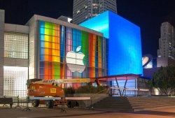
Apple's Yerba Buena Decoration Shows Stretched iOS Icons, Possibly Hinting at Taller iPhone 5
- Thread starter MacRumors
- Start date
- Sort by reaction score
You are using an out of date browser. It may not display this or other websites correctly.
You should upgrade or use an alternative browser.
You should upgrade or use an alternative browser.
Actually, I don't find it that clever.
I mean, it's impressive that someone took the time to see that, but it's not like a mind blowing illusion or anything. It's just stretched and blurred. I'd say it's just a design without a real message.
I mean, it's impressive that someone took the time to see that, but it's not like a mind blowing illusion or anything. It's just stretched and blurred. I'd say it's just a design without a real message.
How..does..anybody..come up..with that..?
Like..someone just randomly decided "LET'S STRETCH THIS IMAGE YA'LL!"
Just how? It's a serious question.
Welcome to the world of being a designer. These people just think like that. If you stretch anything enough, it can become something entirely different. Cool things happen accidentally a lot of the time too.
New iTunes update? It's been years and has grown dull.
I hope so. iTunes has become so bloated.
Welcome to the world of being a designer. These people just think like that. If you stretch anything enough, it can become something entirely different. Cool things happen accidentally a lot of the time too.
Haha, yea, that's why I really wanna know what the guy was doing when he decided to stretch it. So interesting. =D
I hope so. iTunes has become so bloated.
Rather than a new ITunes, I'd rather see it go away entirely. Replace it with Music, Videos, and iTunes Store apps, just like iOS. Managing your iOS device would be done in the finder.
I don't think theyll ever do that, though, because they need one app for Windows.
How..does..anybody..come up..with that..?
Like..someone just randomly decided "LET'S STRETCH THIS IMAGE YA'LL!"
Just how? It's a serious question.
It is not random. I assure you that professional designers spend a great deal of time iterating over the various aspects of their design. Designers think about the various ways they can convey the message through visual imagery. They write down different words relating to what they are trying to say through the design. They think about the interactions between the different words. They do research on similar successful design. They develop dozens of thumbnail sketches and rough comps of around 5-10 good ideas. These are whittled down, sometimes combined, sometimes entirely new stuff is added through team collaboration. Once you settle on a concept it's all about tweaking it until it's aesthetically where you need it to be while maintaining a clarity of message and brand identity. In this case, the message was meant to be hidden and subtle, while adhering to the somewhat playful, creative image that has defined Apple for years (look at past event decor). It was probably a joy for the designers to implement this idea knowing that they were hiding the icons in plain sight. And as a testament to their work, it went largely unnoticed online for nearly a daywhich is quite a long time in this day and age of instant communication.
I hope I have answered your question. While my answer might not be 100% accurate to the process used at Apple, this is an abbreviated explanation of process based on my experience as a designer. Though sometimes things just come to usthe final output is often far from our first "random" thought once it is iterated and developed into a fully-coherent concept. But is any though truly random? Our very thought patterns have been guided by our experience and interaction with the world around us since birth. But I'll leave that debate to the philosophers in the crowd.
Rather than a new ITunes, I'd rather see it go away entirely. Replace it with Music, Videos, and iTunes Store apps, just like iOS. Managing your iOS device would be done in the finder.
I don't think theyll ever do that, though, because they need one app for Windows.
iTunes is a hub right now: a library of your content, a device manager, and a storefront. Apple needs to make these three things snappier and more intuitive. If the best way to improve the experience means breaking one or all three out into their own dedicated app, so be it.
I think if the interface got a refresh and things were faster to jump in and out of, I'd be a happy camper.
Rather than a new ITunes, I'd rather see it go away entirely. Replace it with Music, Videos, and iTunes Store apps, just like iOS. Managing your iOS device would be done in the finder.
I don't think theyll ever do that, though, because they need one app for Windows.
Hell, FORGET Windows I don't need or want a Windows iTunes App!!!
After 3 years from getting my first iPhone (iPhone 3GS) to this past month, I finally made the FULL Apple transition owning:
iPhone 4S
iPad (3rd Generation)
15" MacBook Pro with Retina Display

Wow, sneaky. Really can't wait to see what I'll be using a phone upgrade on in two weeks. 
Truly, I couldn't care less if the screen gets wider; it's great that it's probably going to get taller, but the two real things I'm looking forward to are LTE and a better camera. Holding off on buying a separate PAS digicam is excruciating while using an iPhone 4. LTE will help level the playing field, and for me it just means fast fast fast data on Verizon.
But I know what we're all crossing our fingers for: "One more thing..."
It is not random. I assure you that professional designers spend a great deal of time iterating over the various aspects of their design. Designers think about the various ways they can convey the message through visual imagery. They write down different words relating to what they are trying to say through the design. They think about the interactions between the different words. They do research on similar successful design. They develop dozens of thumbnail sketches and rough comps of around 5-10 good ideas. These are whittled down, sometimes combined, sometimes entirely new stuff is added through team collaboration. Once you settle on a concept it's all about tweaking it until it's aesthetically where you need it to be while maintaining a clarity of message and brand identity. In this case, the message was meant to be hidden and subtle, while adhering to the somewhat playful, creative image that has defined Apple for years (look at past event decor). It was probably a joy for the designers to implement this idea knowing that they were hiding the icons in plain sight. And as a testament to their work, it went largely unnoticed online for nearly a daywhich is quite a long time in this day and age of instant communication.
I hope I have answered your question. While my answer might not be 100% accurate to the process used at Apple, this is an abbreviated explanation of process based on my experience as a designer. Though sometimes things just come to usthe final output is often far from our first "random" thought once it is iterated and developed into a fully-coherent concept. But is any though truly random? Our very thought patterns have been guided by our experience and interaction with the world around us since birth. But I'll leave that debate to the philosophers in the crowd.
That was extensive sir, but thank you! You have explained it amazingly. And yes it does seem rather fun to implement such subliminal messages like that. And I'm sure the designers are proud of their work. Heh =)
Stroke job.....
"After taking the above image and skewing it and shrinking it, we've found he was correct, and it seems several icons are clearly recognizable in their un-stretched form."
What a stroke job.... But Safari is snappier.....
"After taking the above image and skewing it and shrinking it, we've found he was correct, and it seems several icons are clearly recognizable in their un-stretched form."
What a stroke job.... But Safari is snappier.....

Register on MacRumors! This sidebar will go away, and you'll see fewer ads.