Become a MacRumors Supporter for $50/year with no ads, ability to filter front page stories, and private forums.
The iPhone I have in my pocket beats the iPad mini I have at home on my night stand.
Many of us have both.
Stuck somewhere without your iPad Mini, use your iPhone.
Stuck somewhere with your iPad Mini, use it for better experience.

I also keep all my books in both Apple Books and Kindle*, so I can use either system – sometimes I just fancy using my Kindle Oasis, for one reason or another (e.g. e-ink screen or it's days-long battery in solid use, compared to Apple devices which obviously die much faster). It's nice to have options.

(* 1. Calibre app is your friend! 2. Send To Kindle now accepts DRM-free Epub uploads, soon removing the ancient Mobi.)
No way I am using a iPhone on a 6 hour plane flight for books and movies.
 
No way I am using a iPhone on a 6 hour plane flight for books and movies.

When I read books on my iPhone XR, I found that I like having vertical scrolling turned on. It surprised me really; I had thought I would find it hard on my eyes, but I prefer it to turning pages so often with the relatively small screen of the phone, compared to using a mini iPad or iPad Pro.
 
When I read books on my iPhone XR, I found that I like having vertical scrolling turned on. It surprised me really; I had thought I would find it hard on my eyes, but I prefer it to turning pages so often with the relatively small screen of the phone, compared to using a mini iPad or iPad Pro.
Yeah, I've been reading on my phone - vertical scrolling, horizontal - finally adapting to it. The iPad folk are gunna hate me but I had to return that 12.9. Just way too big. My phone? Always with me. Vertical scroll = get more on the screen too.
 
I just found out about this today. I guess I will not be reading books on my iOS devices until they re-enable this setting. I’ve heard arguments probably from younger people that it’s not a real book so it doesn’t need the page turning animation, but I think it sets Apple apart from the other companies by showing that their products have that attention to detail. Not anymore. I did complain about it on the Apple Feedback app and I sent an email to Tim Cook. We’ll see if that actually makes any difference.
 
I just found out about this today. I guess I will not be reading books on my iOS devices until they re-enable this setting. I’ve heard arguments probably from younger people that it’s not a real book so it doesn’t need the page turning animation, but I think it sets Apple apart from the other companies by showing that their products have that attention to detail. Not anymore. I did complain about it on the Apple Feedback app and I sent an email to Tim Cook. We’ll see if that actually makes any difference.
Biggest thing that bothers me is that every other app utilizes edge to edge text. Kindle, economist, websites, and yet books has massive margins wasting massive chunks of screen space. Now I don’t have iOS 16 yet and I hear it does better but still no excuse imo.

I’ve got 400 books on iOS Books app.

Like you I’ve put in feature requests for years. Good luck :)
 
It’s not looking great. Not sure why they changed it, there wasn’t a lot wrong with it. The floating buttons are ridiculous on an app specifically designed to read text.
 
I just found out about this today. I guess I will not be reading books on my iOS devices until they re-enable this setting. I’ve heard arguments probably from younger people that it’s not a real book so it doesn’t need the page turning animation, but I think it sets Apple apart from the other companies by showing that their products have that attention to detail.
Ironically, the change made me take another look at the Kindle app (and pull my old Kindle Paperwhite out of mothballs, which I've discovered is a far better e-reader for me than an iPad mini).

In the process, I discovered that the Kindle app actually added the page-turning animations somewhere along the way. While there are still other things about the app that I'm not thrilled with, I'm quite happy I made the switch back.

Thankfully, I tend to buy my books only when I'm ready to read them, so I didn't have a huge library to worry about. I just migrated my "Want to Read" list over.

Biggest thing that bothers me is that every other app utilizes edge to edge text. Kindle, economist, websites, and yet books has massive margins wasting massive chunks of screen space. Now I don’t have iOS 16 yet and I hear it does better but still no excuse imo.
That was the other thing that surprised me. I've been so myopically focused on Apple Books for years that I didn't realize how annoying the margins were until I switched to the Kindle app. Maybe iOS 16 does a bit better, but not noticeably so compared to other apps. Apple seems to like margins and whitespace.... Even Apple's Mail app has wider margins than it arguably should when you compare it to other mail apps like Gmail and Spark.
 
That was the other thing that surprised me. I've been so myopically focused on Apple Books for years that I didn't realize how annoying the margins were until I switched to the Kindle app. Maybe iOS 16 does a bit better, but not noticeably so compared to other apps. Apple seems to like margins and whitespace.... Even Apple's Mail app has wider margins than it arguably should when you compare it to other mail apps like Gmail and Spark.
Reading in portrait mode on the Kindle app and every other app is SO NICE.

I can only stand the Books app if I read in landscape mode and vertical scroll on. But holding the phone in landscape is not as nice as portrait. Still, I'm half way through Jurassic Park for the first time (almost completely on my 13 PM). We humans are good at adapting lol.

First thing I'm going to do with iOS 16 is open the Books app. LOL. 15 mins to go!
 
That was the other thing that surprised me. I've been so myopically focused on Apple Books for years that I didn't realize how annoying the margins were until I switched to the Kindle app. Maybe iOS 16 does a bit better, but not noticeably so compared to other apps. Apple seems to like margins and whitespace.... Even Apple's Mail app has wider margins than it arguably should when you compare it to other mail apps like Gmail and Spark.
Well that's a little frustrating. While the margins are a little better... still wasted space.

1663005896523.jpeg


I find it funny that in the customized options that the example uses the full margin space... That's frustrating! LOL. SO CLOSE :D

1663005937530.jpeg


I'm happy. It's better than we had before.
 
Last edited:
I do most of my reading in the sun around or in a pool. Until Apple comes out with a water resistant e-ink or equivalent product I only buy Kindle books.
You know I ditched the Kindle for the iPad a few years ago thinking it was one less device to lug around.

I just picked up a new Kindle Paperwhite in one of the many sales they had this year and it's suddenly got me reading more than I have in years. They have really improved the tech and the small change in screen size made a huge difference to my aging eyes. It's robust, inexpensive and gets handled like the rugged device that it is, vs. my iPad which feels fragile in comparison.

There will never be an Apple Kindle equivalent - the market isn't important enough to them and they won't be able to control the content.
 
My review of the Apple Books app from the perspective of a 13 Pro Max.

I'm happy they slightly increased the margins. The ability to customize the text is OK but going too far one way or the other makes the font impossible to read. So the customization options are meh.

I am not happy that the app still seems to have problems remembering where I left off (often defaulting to the start of a chapter that I may be 90% done with). I use vertical scrolling.

The X button on the top right, despite having a ton of empty space, sits right on top of the text. Same for the "go back to page" on the top left - despite having a TON of empty margin space, they both sit on top of text. Incredibly annoying.

I'm constantly accidentally setting Bookmarks because now, when I swipe up, and if I drag my finger slightly as the screen is scrolling up - a bookmark is set. Annoying. Note: I use vertical scrolling.

The app seems a LOT less sensitive to swipe motions. About 1/3 times I swipe up, the phone acts like it didn't register my finger.

If I didn't have 400 books on Apple Books, I'd move back to Kindle. I really hope they fix some of the problems in the oncoming iOS 16 updates.


I did finish Jurassic Park (first time) almost entirely on my iPhone :D.
 
I was a bit disenchanted to see the intrusive controls.
Exactly.

Apple Books (iOS 16). Landscape, vertical scrolling on - see top right and left. What the heck?! Tons of margin space to have those be NOT over text.

1663684687653.jpeg


Apple Books (iOS 16). Vertical, vertical scrolling on - same thing (note top right/left and bottom right):

1663684719798.jpeg


Meanwhile.... Kindle (below), and every other app on iPhone including Apple's own News reader in Safari do the below:

1663684770986.jpeg
 
Interestingly, although the Kindle iOS app thankfully still has the page turning animations, I discovered that you don’t get the best and most interactive animations unless you keep orientation lock OFF.

With orientation lock on (in the app, not the systemwide setting), the page turning animations run by themselves at a preset speed, but if you turn orientation lock off, you’ll be able to pick up the page and turn it more fluidly as you move your finger, just like you used to be able to do in Apple Books.

I have no idea why this is the case. It seems like a weird bug, as orientation lock shouldn’t have anything to do with it. However, if you’re using the Kindle app and not getting the nicer page turning animations, try turning orientation lock off. You may also have to close and reopen the book you’re reading before the new animations kick in.
 
Disappointed to see the skeuomorphic page turning get removed. The new animation is so average and clinical. I hope the rest of the changes are nice in practice because Books is my favorite app to read in.
Not only they removed the skeuomorphic page turning, but also the new “animation“ is… lousy - it is stuttering like some rubbish android ebook reader on my iPhone 13 Pro Max, I am so angry about it…
 
  • Like
Reactions: SamanthaBunny
Not only they removed the skeuomorphic page turning, but also the new “animation“ is… lousy - it is stuttering like some rubbish android ebook reader on my iPhone 13 Pro Max, I am so angry about it…
It’s amazing how bad the scrolling is. Stutters really badly on my 13 pm too. About 9/10 when I open a book it’ll be in a different location too. Really sad.


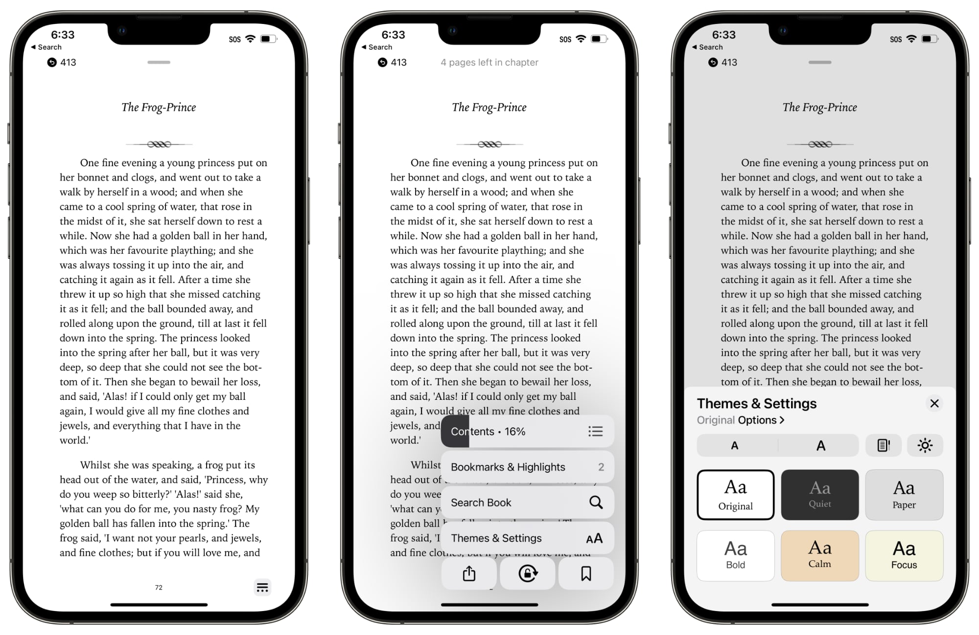
Apple in iOS 16 and iPadOS 16 has overhauled the design of the Books app, simplifying the interface and adding some new customization tools.

ios-16-books-app-1.jpg

In iOS 15, there's a toolbar at the top of the app that provides access to the chapter index, font adjustments, search tools, and bookmarks, but in iOS 16, everything has been moved to the bottom of the app.

There's a single tappable icon at the bottom of the book interface to access the settings. It provides a distraction-free reading experience, but it's worth noting that it can't be tapped away.

Tapping on the button brings up all of the available settings in the Books app. The top menu bar features the table of contents, while there's also an option to tap in to see all of your bookmarks and highlights.

The search interface is also available, and search does not appear to have been updated. There's a one-tap option for locking orientation, bookmarking a page, and accessing the share sheet.

Tapping on Themes and Settings brings up options to change the font size and the color of the background. There are a few new color options in iOS 16, including a lighter gray, a different shade of white, and a light yellow.

ios-16-books-app-2.jpg

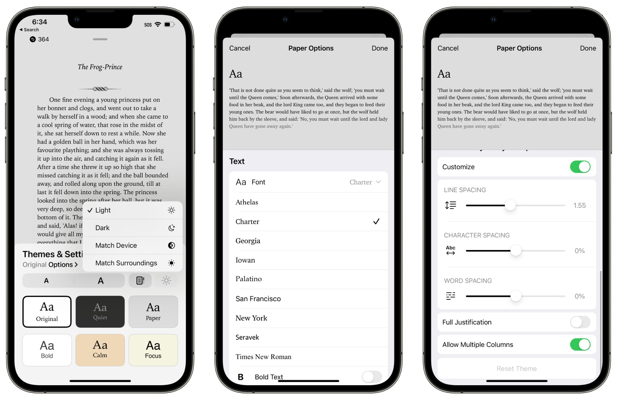
You can turn on vertical scrolling in this interface, and elect to activate Light Mode, Dark Mode, match the device settings, or match the ambient lighting with True Tone.

Tapping on Options brings up different fonts and the option to bold the text. There are easy to access Accessibility settings for adjusting line spacing, word spacing, and character spacing, along with toggling on full justification. Apple has also changed the way that pages turn.


All in all, the changes bring more customization options to the Books app on iPhone and iPad, and access to features like search and bookmarking still takes about the same amount of time despite the fact that they're now in a menu.

Article Link: Books App Gets Redesign in iOS 16 and iPadOS 16
I just discovered this and I’m heartbroken. Why can’t we have page turning animation ?? Why why why??? ONE good reason? I’m appalled and dejected over this.
 
Register on MacRumors! This sidebar will go away, and you'll see fewer ads.