Got a tip for us?
Let us know
Become a MacRumors Supporter for $50/year with no ads, ability to filter front page stories, and private forums.
Can't Get Used to Your MacBook Pro's Notch? These Apps Will Hide It for You
- Thread starter MacRumors
- Start date
- Sort by reaction score
You are using an out of date browser. It may not display this or other websites correctly.
You should upgrade or use an alternative browser.
You should upgrade or use an alternative browser.
"Counsellors are standing by to provide support in your time of need. Call our hotline at: 1-888-NOT-CHBS. Please note that our menu items may have changed."
In fact, here are all of the best laptops that support Windows Hello facial recognition. Take a look at their bezels:Well the passionate engineers at Dell already found a solution for this problem years ago. They also have WindowsHello biometric authentication in their notchless and bezelless screen even.
Computers, Monitors & Technology Solutions | Dell USA
Dell provides technology solutions, services & support. Buy Laptops, Touch Screen PCs, Desktops, Servers, Storage, Monitors, Gaming & Accessories
www.dell.com
HP® Spectre x360 Laptop - 13t touch (4FJ31AV_1)
Free shipping. Buy direct from HP. See customer reviews and comparisons for HP® Spectre x360 Laptop - 13t touch (4FJ31AV_1). Upgrades and savings on select products.
HP® Spectre x360 Laptop - 15" Touch Screen (1WB97AV_1)
Free shipping. Buy direct from HP. See customer reviews and comparisons for HP® Spectre x360 Laptop - 15" Touch Screen (1WB97AV_1). Upgrades and savings on select products.
Buy Surface Laptop Studio 2 - See Specs, Price, 14.4" Touchscreen | Microsoft Store
Buy the Surface Laptop Studio 2 from Microsoft Store. This powerful 14.4: touchscreen laptop features the 13th Gen Intel® Core™ i7, HD camera and long battery life. Free standard shipping. Free returns.
www.microsoft.com
Meet the Surface Pro – A powerful AI 2-in-1 laptop tablet | Microsoft Surface
Experience all-day battery life and versatility in the AI-powered Surface Pro 2-in-1 device, now available with a new 12-inch PixelSense touchscreen. This detachable laptop turns into an AI tablet and is our most powerful Surface Pro ever.
That took me a sec to see it 😂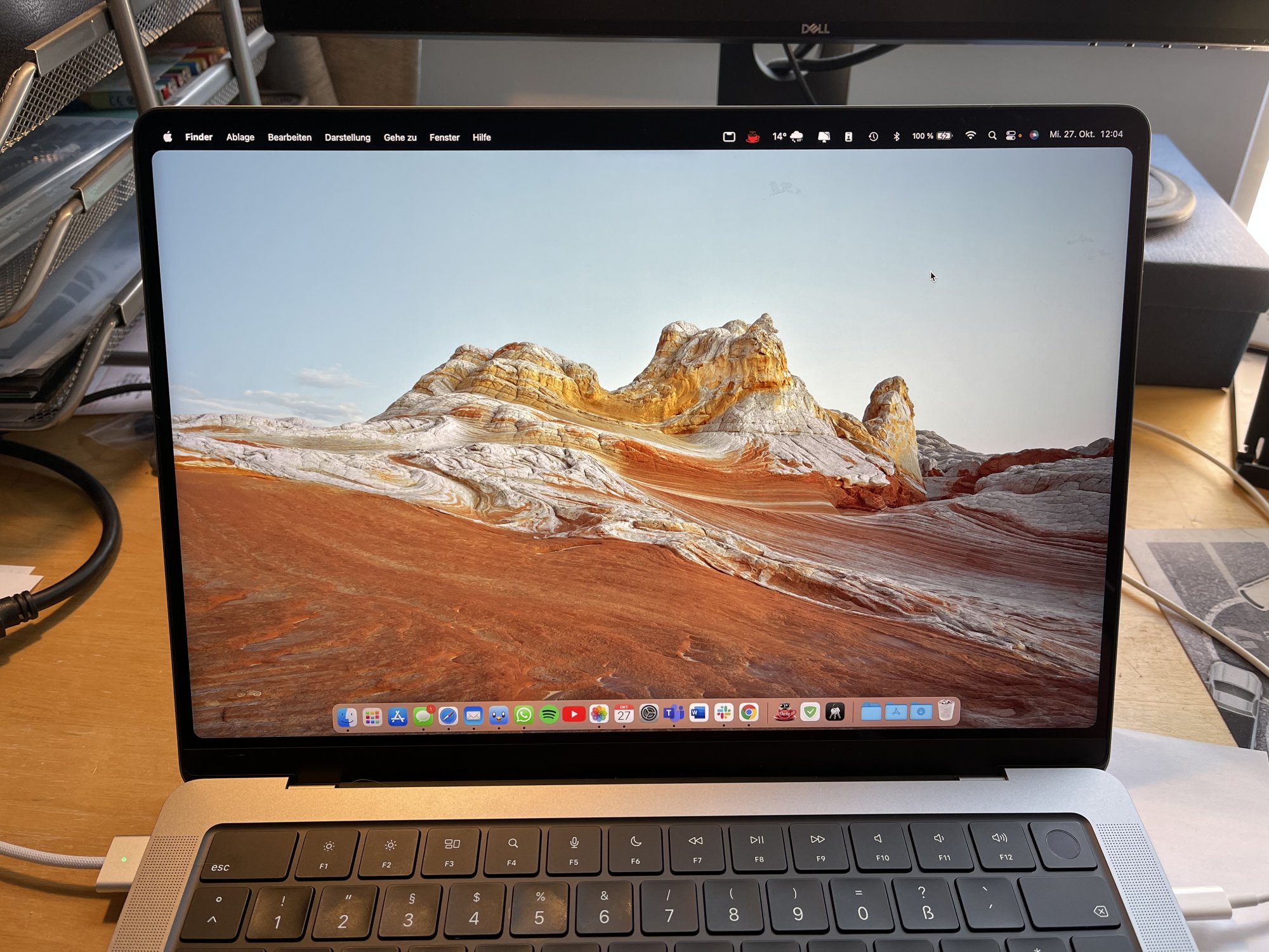
Using my amazing and magical powers of deduction, do your credit card numbers mainly consist of the numbers 1, 2, 3, and 5?! 🤣
No one cares about webcams.The Dell camera you’re referencing is low res garbage and Windows Hello is a convenience feature, not a security feature.
Comparing Windows Hello to Face ID is like comparing a twist tie to a padlock.
I'm looking forward to the notch simulator. I don't want my friends and colleagues who have notched MBPs to see my non-notched MBP and think lesser of me. Letting other people think that I have the latest Apple gear helps me with my self-worth... and save money in the process. Until then, I have a carefully cut piece of black electrical tape covering where the notch would be. It fools people from a distance."The ability to simulate a notch on older Macs is coming in an update."
Stop the world, I want to get off....
Hiding the notch will probably become a featute of the excellent Bartender
")
Computer Clan found that in the app preferences you can actually set apps to scale below the notch. I'm surprised this isn't getting coverage.
Except, you know, the huge and growing number of people who have video meetings for work every day.No one cares about webcams.
Or people like me who have family overseas and enjoy video chatting with them in high quality.
So, sure, no one.
Well it doesn't offer facial recognition with Windows Hello either. It's fingerprint only.No one cares about webcams.
It's actually the exact opposite of the Touch Bar. The touch bar removed functionality to provide its gimmick and tried to look cool. The notch added functionality despite how it looks and has no down side OTHER than how it looks.The notch is clearly another Touch Bar.
Hahaha, you are defending notch for what?It's actually the exact opposite of the Touch Bar. The touch bar removed functionality to provide its gimmick and tried to look cool. The notch added functionality despite how it looks and has no down side OTHER than how it looks.
I'm not defending the notch, I'm discussing your comparison.Hahaha, you are defending notch for what?
Touch Bar is useless and therefore, they removed it. Notch isn't different from that and it proves that Apple lacks technology just like iPhone.I'm not defending the notch, I'm discussing your comparison.
The touch bar had a use, it sacrificed functionality for it however. The notch literally adds space to the screen beyond what it had before. Who has this magical technology that you're referring to that can put a 1080p webcam in a slim bezel?Touch Bar is useless and therefore, they removed it. Notch isn't different from that and it proves that Apple lacks technology just like iPhone.
The touch bar had a use, it sacrificed functionality for it however. The notch literally adds space to the screen beyond what it had before. Who has this magical technology that you're referring to that can put a 1080p webcam in a slim bezel?

Apple seems to have forgotten it built a notch in the MacBook Pro
Parts of macOS simply forget the notch exists.
 www.theverge.com
You know, others already put 1080P webcam in a slim bazel.
Show that, just try.Apple seems to have forgotten it built a notch in the MacBook Pro
Parts of macOS simply forget the notch exists.
You know, others already put 1080P webcam in a slim bazel.
Oh noes... I think the image you posted looks awesome. Rounded corners and all. But then again, I always use "reduce transparency" so my wallpaper never shows thru the menubar.I tried one of them but I actually prefer the notch. Seeing the black bar at all time makes the screen appear smaller for some reason. Trick to the brain?maybe because this way you will have the actual bezel + the black „digital bezel“ from the menu bar so it ends up looking like one big bezel. I prefer seeing the wallpaper behind the menu bar
A smart way for the half of the Apple community to bypass 'the smart way'.
In the past Apple has wisely avoided dividing its community like this.
In the past Apple has wisely avoided dividing its community like this.
I thought I was having a bad week not being able to get the Apple smudge-cleaning cloth on release day, and now Notchgate.
These are dark times.
These are dark times.
This actually looks so sleek! Reminds me of the first iPhone with non-changeable black wallpaper that made the icons look like they were floating on glass. I used to love that design feature. In fact now I'm going to try one of these apps on my 27" imacI tried one of them but I actually prefer the notch. Seeing the black bar at all time makes the screen appear smaller for some reason. Trick to the brain?maybe because this way you will have the actual bezel + the black „digital bezel“ from the menu bar so it ends up looking like one big bezel. I prefer seeing the wallpaper behind the menu bar

Question. Xcode is my most used app by some distance. On my 2014 MBP the default menu options extend well into the right hand side of the screen.
I never have it in full screen mode as I find it much easier to flip between Xcode and the other apps I need while developing (Safari, Simulator, Terminal etc) in standard mode.
What happens to the Xcode menu with these "fixer" apps? Would there now be a large notch sized gap between two of the menus?
Clearly many disagree with youJust use the computer and you will quickly realize the notch is a complete non-issue.
Only thing worse than people complaining about the notch is the people defending it like it's their first born. Get a grip, folks.
Register on MacRumors! This sidebar will go away, and you'll see fewer ads.