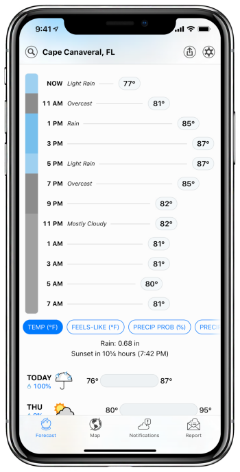
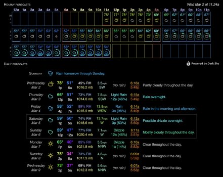
The gaps serve no functional purpose, so I assume the GUI was designed with some half-a$$ed judgment about aesthetics in mind, no doubt by somebody who has not been trained in data visualisation.
They do serve a purpose, they make it easier to discern the discrete steps more easily. Since not every bar is labeled, only the elements at 6am and 12pm, if you want for some reason to find the bar at, say, 9am, to see how it compares to the others (because, say, you'll be walking to work during the 9 o'clock hour), then you have to count across from either end. Having the elements separated from each other makes that task easier.
What those gaps do achieve is to impose high visual spatial frequency noise (visual jaggedness) on a low spatial frequency pattern (a smooth curve).
Again, the underlying data is
NOT a smooth curve. It is forecast numbers that apply to an entire hour. If you draw a smooth curve over it, you are
making up data that doesn't exist.
If the data says that expected rainfall for the
entire 10 o'clock hour is 1/2" and the expected rainfall for the
entire 11 o'clock hour is 1", you
cannot infer that the rainfall rate at 10:30 is going to be 3/4" per hour - I mean, you can, but that conclusion is not warranted by the data. They are giving numbers that represent an average for the entire hour. The underlying data that they are using to reach that conclusion might actually be indicating a huge downpour at 10:05 and clear skies at the end of the hour, or, conversely, the underlying data could be indicating clear skies until 10:55 followed by a huge downpour - you don't know the shape of the actual curve in the underlying data! They're simplifying it down for the hourly forecasts to two numbers: the likelihood of any precipitation in that hour, and the predicted intensity of precipitation for that hour
if any occurs. The bars accurately represent that "this is the average prediction for this entire hour" - it is
not for a single point in time.
You're asking for a display that
lies to the end user, presenting the data as though it was more accurate than it actually is, all in the name of having a pretty curve. The viewer can see the trends well enough with a bar chart, and most of them - some of whom aren't even university professors - can scan across the top of the bars without needing to have the program draw a smooth curve across them, in order to see, "oh, hard rain in the morning, tapering off by afternoon". And that's all the accuracy most people need.
And, again, the chart you were initially complaining about was indicating precipitation that at its most hard-hitting point barely reached 0.0050" per hour. That number is the low-end cutoff for
drizzle, so all the numbers shown in that chart would barely even get the ground wet.
(A long time ago, I wanted hard numbers for Dark Sky's dividing lines between the various characterizations of rain, so I analyzed roughly 50,000 samples of data where it had forecasted rain. I found that according to Dark Sky's standards, measuring in inches-per-hour, the interval [0.0050, 0.0092) is "Drizzle", the interval [0.0092, 0.0534) is "Light Rain", the interval [0.0534, 0.2136) is "Rain", and 0.2136 and above is "Heavy Rain" - actually, they list 2.0" or more per hour as "Violent Rain", but I've never encountered that in my data. So, numbers under 0.005" per hour wouldn't even qualify as drizzle.)
If designers of GUI's must use bar charts (rather than line or dot plots) for time series data, then they should at least eliminate the gaps between bars so that the true low spatial frequency pattern remains (although I note high frequency noise will remain because the rectangular nature of the bars - time series do not have corners).
Once again, the underlying data
DO NOT REPRESENT SPECIFIC POINTS IN TIME. They represent ENTIRE HOURS. If you treat a forecast for the
entire hour of 10:00:00 to 10:59:59 as being at a specific point in time, you're misrepresenting the data, in order to make it pretty. You would be more correct if you treated it as 3600 individual points, representing each second in the interval [10am, 11am). And if you did that, your "smooth curve" on the graph would look exactly like a bar chart,
with corners.
You're literally talking about trying to use a "pretty" representation of data to cause people to draw conclusions not warranted by the underlying data. The data that is available is a series of forecasts each of which is an
average for an entire hour. Presenting it as a bar chart is quite reasonable. Having the bars connected by point-to-point lines is inaccurate and misleading, because it will tend to cause people to infer that bits of the line between the hourly averages are valid data
when they are not, though this may be a useful visualization aid for anyone unable to look at a bar chart and see the trends without assistance. Drawing a curve (vs point-to-point lines) just makes the problem worse.
Dark Sky (now Apple Weather) gives per-minute forecasts for the next hour, per-hour forecasts for the next 48 hours, and per-day forecasts for the next week. If you want a nice curve of predicted rain, play connect-the-dots on a plot of the per-minute forecasts for the next hour. The hourly forecasts do not give enough data to make predictions at any finer granularity than... an hour. You can't properly plot them as discrete points and draw lines between them, because, while it does make the trends stand out, it will cause many users to look at the resulting plot and expect the lines in between the points to be representative of reality,
when they are not.
Plotting data is about maximising the signal (the true portrayal of the pattern), while minimising noise (deviations from the true pattern). Perhaps the bar plot is good enough for your purposes. That's fine, but with a little more effort the plots could be made far easier to read, which is what attracted most people to Dark Sky's predicted rain plots.
What attracted me to Dark Sky was extremely fine-grained rain prediction (per minute for an hour, per hour for two days, per day for a week), along with similarly good temperature data, and an API that I could use to access their data for use in my own programs.
To the best of my recollection, Dark Sky never presented predicted rain data as anything other than points or bars,
outside of the next hour - a timeframe for which they had per-minute data to work with. For the next hour, they'd draw a smooth curve, because they had data that warranted such representation. Do you have
evidence to the contrary?


