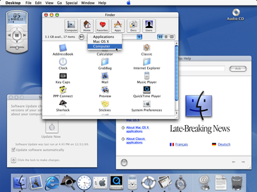
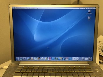
What a shock that a decade old UI looks dated.it’s pretty bad. I actually wasn;t sure if that post was meant to be ironic or sarcastic or actually serious. But it’s pretty dated and yikes is it silly in 2020
Got a tip for us?
Let us know
Become a MacRumors Supporter for $50/year with no ads, ability to filter front page stories, and private forums.
Developer's Visual Comparison of macOS Catalina and Big Sur Offers Closer Look at Apple's UI Redesign for Macs
- Thread starter MacRumors
- Start date
- Sort by reaction score
You are using an out of date browser. It may not display this or other websites correctly.
You should upgrade or use an alternative browser.
You should upgrade or use an alternative browser.
Lol, Mac OS X 10.0 would like a word with you. What you are saying is what was said when the transition of 9->X happened — and the lesson is the same. They are trying stuff out and the next one will not be the last one so let's see where it evolves from here.It is the infantilization of software, making it appeal to kids rather than adults. Candification, with transparency and effects using the combined wattage of a medium nuclear power plant. Duolingofication, just plain silly.
I don't understand the need to throw away shape as part of the visual recognition for icons. Why does everything have to be on a rounded square background?
Aw man, I forgot about the little music player/controlerYou’re a little behind. Aqua came out 20 years ago.

Aqua (user interface) - Wikipedia
en.m.wikipedia.org
I'm currently using it and I'm in love with it.
It feels fresh and I had no big issues so far. Some UI glitches here and there but that's all.
Thank you for using a different wallpaper... To each their own, I guess, but after a few macOS releases with gorgeous landscapes as the default images, the garish "stylized mountain range" Apple insists showing again and again in the Big Sur beta has been driving me nuts. I'm sure Apple using that Fisher-Price-looking gradient hasn't helped dispel the notion that the UI is getting more "child-friendly..."
Is it stable enough to be installed on my corporate machine?
K.
Given that the previous release still hasn't reached that milestone...
One thing I will NEVER get over...
is the fact imessages when sent are "blue", and the whole thing is "blue vs green text bubbles" and yet the Messages ICON is GREEN in all of Apple's OS systems.
CHANGE IT TO BLUE!!!!
is the fact imessages when sent are "blue", and the whole thing is "blue vs green text bubbles" and yet the Messages ICON is GREEN in all of Apple's OS systems.
CHANGE IT TO BLUE!!!!
How so? It's been incredibly stable while working from home through a VPN tunnel.Given that the previous release still hasn't reached that milestone...
I don't understand the hate this release gets. I have had zero issues and it had actually solved a few issues I had with the previous one.
So it looks like they are making everything whiter. Is that really the direction they want to be going these days?
The design of app interface seem to take more element from the Mac Catalyst apps. Would this suggest a trend of a unified iOS and macOS app in the future?
My first Mac ran Snow Leopard in 2011 and I remember how everything about it from the unibody build to the OS looked so modern and sleek.
But looking back at some of these UI elements today a lot of it hasn't; aged well and looks tacky in hindsight tbh. Like that green felt Game Centre? The faux binding and dip shadows on the Contacts app? Great fun to mess around it but wouldn't miss it today on my main Mac.
Last edited:
I can only hope you are sarcastic.
I didn't even know you could do that. What I did instead was add the Path button to the Finder Toolbar which does the same thing. Is that button still there?Question for anyone with the preview: can you right click on the window name in Finder to get access to the folder hierarchy or is that completely gone
Question: Are there still Proxy icons at the top of documents and folders? In the screengrabs of Finder and Preview it looks like they are missing...That would be terrible for me, since I use them ALL the time!
The fun and whimsy is gone, which is kinda sad really. There was something craft like and artisan about the icons in OS X and older third party apps, very distinctive and cultured. But I guess when your user base and developers are now people who probably less than 10 when the iPhone launch, you have to cater to that crowd. RIP photo realistic icons.
Attachments
Yes the proxy icon will appear when you hover the window title with the mouse.
The fact that all the icons are now square makes things harder to identify though...Not progress!I think it is looking good so far. The new icons make things look less cluttered and more organized.
Apple purposely did that.They really need to work on the menu bar's spacing. It's very "gappy" between the items in the bar and not as tight as it was. Icons are now spread out too far and depending on programs you are running the Menu or the icons will hide behind others. It's a pain when trying to find something and you have to click on the desktop so the default menu appears so that you may see the icons.
Normally I "right" click to see the hierarchy. That still works correct?Yes the proxy icon will appear when you hover the window title with the mouse.
However, more importantly: Is it possible to "Grab" and drag the proxy icon? How do you do this?
I enjoyed the battery and Airport Utility dock icons which you can see in this picture.The fun and whimsy is gone, which is kinda sad really. There was something craft like and artisan about the icons in OS X and older third party apps, very distinctive and cultured. But I guess when your user base and developers are now people who probably less than 10 when the iPhone launch, you have to cater to that crowd. RIP photo realistic icons.
Just make one OS already. We all know that's what you're heading toward.
Register on MacRumors! This sidebar will go away, and you'll see fewer ads.


