I'm currently using it and I'm in love with it.
It feels fresh and I had no big issues so far. Some UI glitches here and there but that's all.
Can you turn off translucency for the menu bar?
I'm currently using it and I'm in love with it.
It feels fresh and I had no big issues so far. Some UI glitches here and there but that's all.
It is the infantilization of software, making it appeal to kids rather than adults. Candification, with transparency and effects using the combined wattage of a medium nuclear power plant. Duolingofication, just plain silly.
It’s a 3D icon that is mean to look like a bulging text bubble. It is a physically accurate reflection. It does look out of place though, along with the battery health icon.i dont even understand why there is a green shadow in that position. Makes no sense to me and looks like someone was just missing a spot when using a photoshop tool too aggressively
Overall, Denty's takeaway is that the UI differences in Big Sur aren't as dramatic as he first thought, consisting of a "largely incremental set of changes to make macOS feel more coherent with iOS and iPad OS."
Can’t promise anything but I have used for 2 weeks on my company Mac and did not have a single issue except for some very minor UI glitches (mainly related to widgets).Is it stable enough to be installed on my corporate machine?
K.

Soon the Mac will be nothing more than an Apple version of the Surface Pro and it will just be iOS.
Just make one OS already. We all know that's what you're heading toward.
Quite the contrary, it looks fantastic. This refresh is long overdue. Very excited to get it.
macOS 11 Big Sur is the next major release of Apple's operating system for Mac, and following its preview at WWDC, one of the biggest discussions has revolved around the all-new user interface redesign.
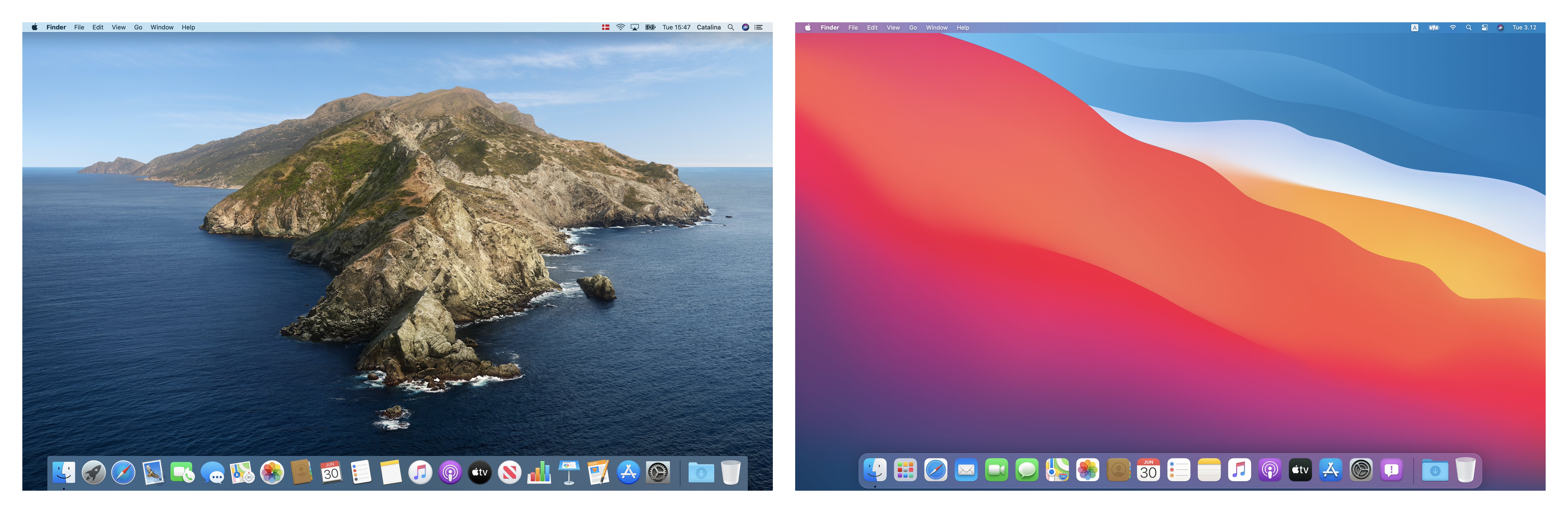
Developers are still learning what the impact the new UI will have on their apps, and with that in mind, app designer Andrew Denty has compiled an extensive visual comparison of the user interface changes between macOS Catalina and macOS Big Sur.
The side-by-side comparisons cover changes to Finder, Preview, System Preferences, the menu bar, Notification Center, Safari, Calendar, Contacts, Reminders, Notes, Photos, Apple Music, Podcasts, and many other native apps.
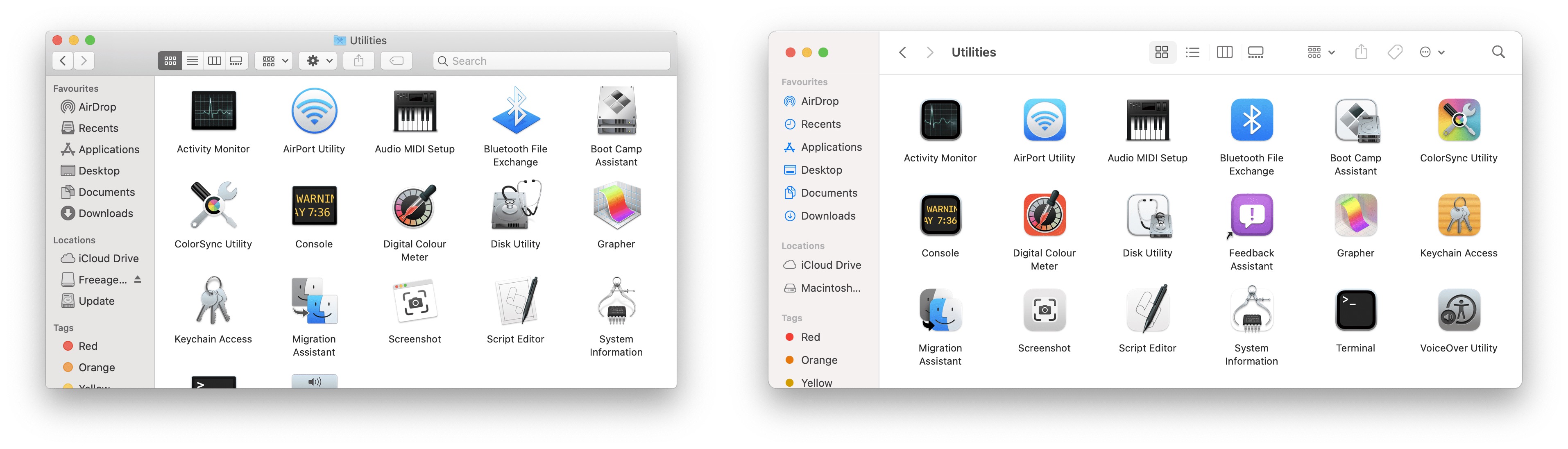
Overall, Denty's takeaway is that the UI differences in Big Sur aren't as dramatic as he first thought, consisting of a "largely incremental set of changes to make macOS feel more coherent with iOS and iPad OS."
That said, he thinks Apple "still has a vast amount of work to do to perfect the new macOS UI" before it exits the beta, and he hopes to see more consistency in the launch experience of apps, as well as more visual separation in elements like status bars and path bars, which he admits "look a little unloved" and don't yet feel properly integrated.
Subscribe to the MacRumors YouTube channel for more videos.
Big Sur is available for developers at the current time, but Apple also plans to make a beta available for public beta testers in July, followed by an official release in the fall. What are your thoughts on the redesigned UI? Let us know in the comments below, and don't forget to check out our Big Sur roundup for an extensive look at all the new features.
Article Link: Developer's Visual Comparison of macOS Catalina and Big Sur Offers Closer Look at Apple's UI Redesign for Macs
Indeed! All that white makes no sense, looks like Windows. It's much better now, definitely a step back. Typical.the new navigation bar or lack thereof in the finder etc. is just done for the hell of change no? maybe i am getting old and i cant believe i am saying this but "why change something that works". now its all white on white and somewhat hard to see.
Also the shadows on the icons, no just no. Especially that green "vomit smudge" on the iMessages and FaceTime icon. And why is a shadow green? Why are they not the same on iOS anyway? so many questions
I'm currently using it and I'm in love with it.
i like having unique shapes for app icons over new big sur all square uniformity
It is as fast as the previous version?I'm currently using it and I'm in love with it.
View attachment 931391
It feels fresh and I had no big issues so far. Some UI glitches here and there but that's all.
I wish they could come up with a better icon for Safari. I have full-on hate for that ugly blue compass thing. I despise it.
Edit: BTW, does the System Preferences > Accessibility > Display still support "Reduced transperency" in BigSur?
Despite Apple saying touchscreen Mac's are wrong this all seems to fit a touchscreen design.
This is one of the best updates in a very long time. I love the fact that we've done away with old-fashioned window frames, which were minimal already in past releases and that space is now occupied by tools and titles. I honestly adore the new look. There are a few glitches but nothing to write home about. My only question is, will we get a Dev Beta 2 this evening along with a Public Beta 1 release?
It is the infantilization of software, making it appeal to kids rather than adults. Candification, with transparency and effects using the combined wattage of a medium nuclear power plant. Duolingofication, just plain silly.
You can install Big Sur to an external drive and boot from the external by holding down the Option key at boot and selecting the external boot volume. There is no reason to install a beta OS over a working production OS.
