Become a MacRumors Supporter for $50/year with no ads, ability to filter front page stories, and private forums.

Do you like Liquid Glass on Mac?

  • Yes

  • Meh…

  • No


Results are only viewable after voting.
the effect is slightly noticeable on my min I, MBA- but more visual on the iPad, fone, tv.
I notice the better functionality of everything as I fell like in using Snow Leopard in 2025!
after OS nuances from Catalina forwards, I really needed this fully functional operating system
 
I realize this is mostly subjective, but I don't like anything about the UI. I haven't spent much time on it yet, but a few things stand out already. 1) I miss launchpad. I had all my apps arranged the way I wanted them with the first page being Apple native apps, and the second sorted by priority used. The new version forces me to scroll or use finder. 2) I had the widgets I wanted set up in notifications in a hot corner at the top right. By default, widgets are now on the desktop. Yes, I was able to change this back, but why should I have to? 3) When using Apple Music, the song title, Airplay icon and volume slider were at the top. Now to adjust volume you have to click on the speaker icon, then adjust it. Just an extra click but again, why? 4) Transparency, to me, serves no purpose. I ended up reducing it in Accessibility. Seems like change for change's sake. 5) And the round corners on everything. Why?

I'm generally a pretty staunch Apple supporter, but it seems like Tahoe (and don't even get me started on iOS 26) are just changes because they couldn't think of anything better to do. Very disappointed.
 
to adjust volume you have to click on the speaker icon, then adjust it. Just an extra click but again, why?

fwiw, instead of clicking twice, you can immediately start dragging. This worked for the systemwide volume icon, too, when it was still a vertical slider.

slider.gif
 
I realize this is mostly subjective, but I don't like anything about the UI. I haven't spent much time on it yet, but a few things stand out already.
Give it a little more time, when i first installed the beta i was like WTF is this, but after a day or so and some UI tweaking i started to like it, and when i switch to my mini which has an older macOS on it, it seems a bit bland.
 
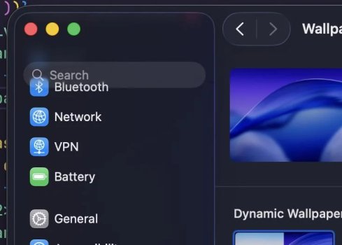
View attachment 2550151
This what happens when you force a square peg into a round hole.

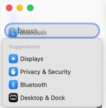
View attachment 2550152

“So you can focus more on your content”

By adding MORE lines. Clearly Sequoia was too focused.

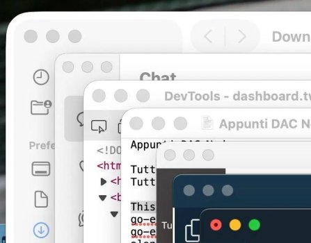
View attachment 2550156

I love having to work harder to find a space to actually grab a window. Gives “Think different” a whole new meaning.
not finding that hard to go (grab a window). otherwise, that all does look pretty good 👍
 
There are certain rules in design that have clearly been broken. It looks like they let an intern design this and then forgot to run it by quality control. There is no defense for this particular piece of the new UI.
you mean, the rules that people invented? and hasn't apple made some of it's success on changing those rules? 🤔
 
Am I losing my mind or was this actually greenlit to be released as a .0 release? Because it is internally inconsistent in its design rules, and the UI is inconsistently applied.

What was the goal of this UI? I know the stated goal was to unify all of Apple's OSes, but what was the mindset when applying LG to MacOS? This is an earnest question, because I've never actively disliked using my Mac before but these little inconsistencies, along with the unannounced changes and feature removals, actually makes me want to use my Mac less.


Attachments

  • y7s58l1cgipf1.jpg
    y7s58l1cgipf1.jpg
    43.8 KB · Views: 37
  • qzjdiqkxzkpf1.jpg
    qzjdiqkxzkpf1.jpg
    27.7 KB · Views: 47
  • brxkca3enjpf1.jpg
    brxkca3enjpf1.jpg
    10.7 KB · Views: 37
  • 88gsrljaeipf1.jpg
    88gsrljaeipf1.jpg
    45.4 KB · Views: 38
  • da9ah5kh3ipf1.jpg
    da9ah5kh3ipf1.jpg
    2.9 KB · Views: 43
  • 0vuqwh3c6ipf1.jpg
    0vuqwh3c6ipf1.jpg
    8.6 KB · Views: 40
  • 5ehynyjv9ipf1.jpg
    5ehynyjv9ipf1.jpg
    9.6 KB · Views: 34
The TV app cache pictures in Vertical look so Ugly on a personal library ... anyway to change this ?

Was a MAC OS Vista really what the customer was awaiting/needing/expecting ?
 
Last edited:
I am slowly getting used to it, but I am not a fan of it. I have increased the resolution on my display to make things appear slightly smaller because everything seemed bigger to me, which has made it a bit more bearable. I use Music a lot (still collecting and copying CDs old school style) and I am bereft with grief. I long for iTunes! They have butchered that app, just as it was starting to get stable too!
 
Am I losing my mind or was this actually greenlit to be released as a .0 release? Because it is internally inconsistent in its design rules, and the UI is inconsistently applied.

What was the goal of this UI? I know the stated goal was to unify all of Apple's OSes, but what was the mindset when applying LG to MacOS? This is an earnest question, because I've never actively disliked using my Mac before but these little inconsistencies, along with the unannounced changes and feature removals, actually makes me want to use my Mac less.
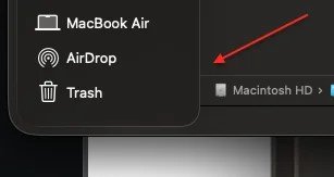
These look like shots from a horror movie for UX designers or people with OCD. Only it's real life and this was the final release.

I'll deal with the daily "upgrade your OS" notifications for a while longer.
 
It is so bad isn't it?! Stuff just isn't aligned correctly. The corner radii of windows and boxes etc are all over the place. The traffic lights for windows (maximise, minimise and close) have a border that just makes them look blurred and not at all 'glass like'. The highlight on app icons just makes the icons look unbalanced and not level. You actually have to concentrate more on your content to try and block out the distractions which is the exact opposite of what LiquidAss was supposed to be.

The one thing that's annoyed me the most and it's not really a 'glass' thing but Apple in all their wisdom have once again changed the format of movie and TV show artwork. So once again I will have to go through my entire video library of over 1000 items to fix all of them. This will be the third time they have changed this! When they went landscape from portrait they butchered the artwork to fit as well. Check out Castaway as an example. They butchered the artwork so much in the previous changes they just went with a close cropped image of his face and title on a white background. Their design team has really gone down hill over the years.

UPDATE: i can’t believe how stupid apple are some times. The artwork is now portrait in tv app but landscape in TVOS. They’ve done this before too. This means ypu either have stupid looking artwork in tv app library or you fix that and have stupid looking artwork on your appletv. I pointed this out to the in the past and the updated the appletv a few months later. I give up.
 

Attachments

  • Screenshot 2025-09-17 at 10.51.38.png
    Screenshot 2025-09-17 at 10.51.38.png
    6 KB · Views: 23
  • Screenshot 2025-09-17 at 11.17.30.png
    Screenshot 2025-09-17 at 11.17.30.png
    5.2 KB · Views: 21
Last edited:
Am I losing my mind or was this actually greenlit to be released as a .0 release? Because it is internally inconsistent in its design rules, and the UI is inconsistently applied.

Some of these screenshots look absolutely grotesque. This isn't just extremely bad design, it's actually buggy.

Apple is really losing it.

It's time all those boomers in upper management get replaced with younger folks with more attention to product.

Like, holy ****.
 
The TV app cache pictures in Vertical look so Ugly on a personal library ... anyway to change this ?
Like I mentioned above Apple have made this change a few times before and it just gets worse each time. Because my movies are not from the Apple Store I have to manually fix all my stuff every time they mess around with it. I use the link below which hooks into Apples system but as I mentioned some of the artwork will be butchered to hell because they've changed them too many times. https://bendodson.com/projects/apple-tv-movies-artwork-finder/
 
Last edited:
  • Like
Reactions: ad2san
Register on MacRumors! This sidebar will go away, and you'll see fewer ads.