App sidebars on the Mac have been around for a couple decades now, I don't really see this as iOS-ifying anything really, just a redesign to make it more consistent with the rest of the Mac.
On one hand many apps are using sidebars (or toolbars, panes or similar), be it on the left, right or bottom, of the screen for a while now. That is good to remind everyone, so thank you. However on the OS level, the finder essentially, this has not been the case. The folder sidebars have just been mostly shortcuts to get you to other folders places without far less mouse clicks.
If we talk the move from Classic OS to OS10, the dock as the major change. Apple's attempt to declutter the desktop from all the different application aliases people filled it with. Same core reasoning behind both though, people want to get into their apps quicker and with less required mouse clicks.
Mac OS even though it has had folder sidebars for a while now, they were never used in the way you mention.
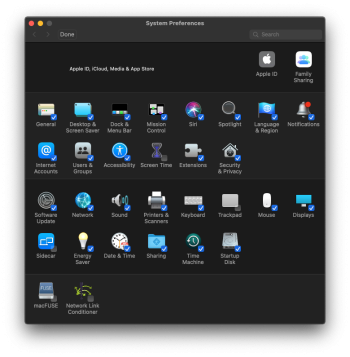
I can see how having a sidebar could be better. If we take the system area now (no longer preferences sadly, but maybe you can edit the icon name in terminal) right now if you are in, for example, in the keyboard area, you need a few clicks to move to another area of the system.
Keyboard -> Preferences overview screen -> the next area you want to go into (displays for example)
With the sidebar, you remove the whole preferences overview screen as that no longer exists. One less mouse click.
Though would all the preferences fit in the sidebar without the need to scroll them down? That scrolling would be an extra click. So in that case at least the top few preferences on the sidebar list are one click faster to access.
The big point here however is how Apple has marketed this change. Apple did not say "making the System similar to the application you love and already know how to use". Apple made the iOS comparison. To me this shows, that even though the application comparison does exist, Apple's main motivation was instead making the system easier to use for iOS users migrating to their first Mac.
Definitely not thrilled here. I liked the idea of making iPad OS line up more with macOS. We have a problem where the mobile market has been (wrongly) driving innovation/changes at Apple for bottom line (bean counter driven) vs allowing proper and superior engineering to drive innovation (similar to how Japanese mfg works, which is awesome).
There are a LOT of kernel and lower level framework issues that need to be resolved and the multi-monitor situation has been problematic for a while now such as the enormous number of people who are having trouble with macOS remembering correct positions of displays (and subsequently apps) when connecting and disconnecting from hubs and such.
Also feature castration is always a concern. They really broken iWork and never restored the WONDERFUL multi-select functionality and I've really quite hated iWork Pages and Keynote ever since they did that due to the need I actually have in my workflow requirements.
It's a clear improvement simply because you can switch between the different preference panes without moving backwards-and-forwards to a panel of settings. Imagine if every app you used had a home screen of icons instead of a sidebar, it'd be terrible!
I happen to agree 100%.
I remember many years ago when Steve Jobs said Macs (possibly in reference to the Mac Pro, but I can not remember) are like trucks. Not many people will use them or need them, but society as a whole is very glad they (Trucks and Macs) exist and fill the role that they do.
Steve Jobs was referring to hardware in that statement, but it could as easily be said for software too.
Sure software developed for the Mac (be it high end or more simple stuff like Pages and Numbers) are not being used by the majority of Apple customers. This majority are iPad or iPhone users who just consume content, use mail/calendars or use their iPhone as a phone (shocking I know).
Catering to the majority is fine and is required to make revenue and profits as a business. However catering to the majority at the expense of the minority is a very slippery slope to be going down. Especially when the majority rely on the work the minority (developers, office workers, other professionals etc etc) do. Making professional's lives easier by having easy to use feature sets in applications, or in some cases keeping features, not removing them benefits everyone. A happy professional is a hard working professional and the majority do enjoy the content that the professionals (and prosumers too) make.
Apple also need to remember that what the majority use, most of the time, is a simplified version of what the minority professionals have used. Today's cutting edge is tomorrow's consumer mainstream. Taking away that by feature castration (as said by the user I quoted) really harms this natural process that, in my opinion is essential to how the industry as a whole works.
I love it. The actual settings app in macOS 12 is very confusing, and the UI is not great. The new one will be more natural to use for people alternating often between macOS and iOS
This is exactly why Apple made the change. To tempt more iOS users to buy a Mac.
What about long time Mac users? Do they like the change? They are the ones who are more likely to be keeping an eye on their system and other settings and tinkering them (at both high and low levels).
Retention of existing MacOS users is just as important as bringing in new people to MacOS (via iOS or Windows).
I am sure Apple realises this, but is Apple just expecting the existing MacOS users to accept the changes without question just to suit the new MacOS users?
How will the changes make existing MacOS users tasks they do easier and quicker to accomplish?
It's a clear improvement simply because you can switch between the different preference panes without moving backwards-and-forwards to a panel of settings. Imagine if every app you used had a home screen of icons instead of a sidebar, it'd be terrible!
If you consider the finder, an application, then that is exactly what you have had for decades. A home screen of icons. Both MacOS and iOS are the same in this regard. The one difference is MacOS has the dock and aliases to make navigating to the applications you want to use a bit quicker.
Is this a case of the finder desktop (MacOS and iOS) being outdated and needing a sidebar improvement?
I feel many are seeing this change as iOS user centric with the long time MacOS users just along for the ride.
Is the sidebar for the system an improvement? Possibly? A number of people (such as yourself) seem to think so.
I just feel the marketing around the change (as shared in the original post) is giving many people the wrong idea about it and possibly about Apple's attitude towards long term macOS users.
I think it is about time the Apple ][GS style control panel returned.
Split up the sidebar and the system preference into two windows and it becomes exactly what you just shared.