Become a MacRumors Supporter for $50/year with no ads, ability to filter front page stories, and private forums.
You’re all welcome to view my screenshot which shows that Reduce Transparency turns off all transparency or you can provide supporting evidence to prove otherwise. Otherwise you’re just whining about an update you’re not using while providing zero evidence to back up your claims.

Your claim was that the Reduce Transparency option resolves the issues with Liquid Glass. We have repeatedly demonstrated and explained that it addresses one issue with Liquid Glass.

Yes, reduce transparency does in fact reduce transparency. Nobody is arguing there. That being said - if you cannot understand, or are unwilling to understand, that the Liquid Glass design language is much more than just transparency effects I believe we’re done here.

Have a great evening!
 
You’re all welcome to view my screenshot which shows that Reduce Transparency turns off all transparency or you can provide supporting evidence to prove otherwise. Otherwise you’re just whining about an update you’re not using while providing zero evidence to back up your claims.
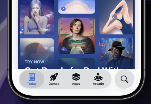
My issue with RT as a solution is that it produces artifacts I don't like; for example, there is no bottom bar padding above the buttons. And the selected-color-icon on grey is equally hard to read.

I like Liquid Glass for the same reason I liked Aqua because of the glossy eye-candy, it some stuff just doesn't work because they are carrying over iOS18 elements which aren't optimized for the new style.

Screenshot 2025-09-29 at 8.14.30 AM.png
 
Last edited:
And this ... 👇

and why is everything soooo overly animated in iOS 26?

Do my icons really need to fly in every time I close Notification Center?

Does every text box need to pulse and flash when I tap it to type?

Does every iMessage need to flash and animate when I send?

Does the background really need to go black when I use the app switcher?

I feel like I’m going to have a seizure with all this flashing and pulsing.
 
Your claim was that the Reduce Transparency option resolves the issues with Liquid Glass. We have repeatedly demonstrated and explained that it addresses one issue with Liquid Glass.

Yes, reduce transparency does in fact reduce transparency. Nobody is arguing there. That being said - if you cannot understand, or are unwilling to understand, that the Liquid Glass design language is much more than just transparency effects I believe we’re done here.

Have a great evening!
You again refused to elaborate on what your actual issue is outside of transparency, so no I don't understand.

The person I initially responded to complained about the transparency because they have vision issues and Reduce Transparency (which eliminates transparency) solves that.
 
You again refused to elaborate on what your actual issue is outside of transparency, so no I don't understand.

Didn't you see these messages?


My issue with RT as a solution is that it produces artifacts I don't like; for example, there is no bottom bar padding above the buttons. And the selected-color-icon on grey is equally hard to read.

I like Liquid Glass for the same reason I liked Aqua because of the glossy eye-candy, it some stuff just doesn't work because they are carrying over iOS18 elements which aren't optimized for the new style.

View attachment 2560823

And this ... 👇


other issues ...

* Why does apple take it upon themselves to introduce gradients into other companies logos with Liquid Glass? It makes everything look smeared and out of focus. I'd be pissed if it were my brand.

1759188074947.png


* What the hell is this menu mess?

1759188289496.png


* Why do I get this blank page when prompted for a 2FA code?

1759188513344.png


Oh and why does my phone make a set of taptic click reminiscent of my watch running out of battery every time someone answer a phone call I've made?

It all just not good. iOS 26 is visually incoherent, confusing, messy, and overly animated.
 
other issues ...

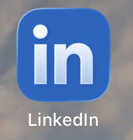
* Why does apple take it upon themselves to introduce gradients into other companies logos with Liquid Glass? It makes everything look smeared and out of focus. I'd be pissed if it were my brand.

View attachment 2561162
However I bet you have no problem with Apple changing the LinkedIn icon to support dark mode in iOS18 and earlier where they changed it from white text on blue to blue text on a black background WITH a gradient.

Selective outrage is what that’s called.
 
However I bet you have no problem with Apple changing the LinkedIn icon to support dark mode where they changed it from white text on blue to blue text on a black background WITH a gradient on the black.

Selective outrage is what that’s called.

Apple doesn't change the logo for dark mode. It's part of the app package submitted by the developers.

Alternative facts is what that's called.
 
  • Like
Reactions: triptolemus
But not all of them which means Apple isn't universally changing icons without approval or assets. Keep at it and you might realize what happened.

Neither of us know for sure, so this is just a distraction ... see the long list of other complaints, but whoever decided to smudge the icons, it was a bad idea.
 
Neither of us know for sure, so this is just a distraction ... see the long list of other complaints, but whoever decided to smudge the icons, it was a bad idea.
For someone who didn’t know for sure, you sure were quick to accuse Apple. Meanwhile, I’m still on 18 but the Fantastical icon is now glassy in style.
 
For someone who didn’t know for sure, you sure were quick to accuse Apple. Meanwhile, I’m still on 18 but the Fantastical icon is now glassy in style.

For someone who wants to push the issue instead od focusing on the larger point, it’s worth looking it up …

“The system dynamically applies visual effects to your app icon layers, so there’s no need to include specular highlights, drop shadows between layers, beveled edges, blurs, glows, and other effects.”

So … yeah it’s Apple


One larger issue is that LI has change their icon numerous times across both iOS and android, sometimes dramatically, but all of a sudden a slight gradient an issue now.


Something you would have noticed if you read/watched what you posted.

IMG_0086.jpeg

Effects happen specifically to layers in the icon which means developers have to prep their icons a certain way.

Also

It’s not happening universally to all icons which means developers have to opt in by preparing their icons a certain way. A flattened, layerless icon file wouldn’t have the affect applied.

Why doesn’t every icon with white objects have a similars automatic gradient applied?

I’m seeing glass effects on ios18 icons which means it’s not only an automatic a 26 thing.

Finally, a company as large as LinkedIn is not going to let another company change their icon without their input.
 
Last edited:
Can we get smaller round corners? I can’t dealt with these big ass round corners anymore!
I’d want that on the actual hardware as well - one of the reasons I think the iPhone 5s was peak iPhone is the corner size compared to the overall rectangle which appears much too large on the more modern phones, unnecessarily cutting off the status bar / below keyboard area of the screen.
 
I’d want that on the actual hardware as well - one of the reasons I think the iPhone 5s was peak iPhone is the corner size compared to the overall rectangle which appears much too large on the more modern phones, unnecessarily cutting off the status bar / below keyboard area of the screen.
I still have my 5 which I use as a music player in one room and I simply couldn’t go back top a phone that small because everything on the screen is too small. IMO the XR was the best phone size, luckily the 16E has the same screen size so I could go that route if I wanted a smaller phone. The back/forward side swipe has solved most of my one handed usability issues with my 15 Pro.
 
Register on MacRumors! This sidebar will go away, and you'll see fewer ads.