Why are there still so many elements that are completely flat? Look at the buttons on each of these pages

Got a tip for us?
Let us know
Become a MacRumors Supporter for $50/year with no ads, ability to filter front page stories, and private forums.
Everything New in iOS 26 Beta 5
- Thread starter MacRumors
- Start date
- Sort by reaction score
You are using an out of date browser. It may not display this or other websites correctly.
You should upgrade or use an alternative browser.
You should upgrade or use an alternative browser.
I’d also like them to focus on making it readable and consistentThe new design is starting to grow on me. From the bouncy animations, the even more rounded interface, the 3D glass effect, the interface feels more alive and interactive .
Rather than just cool effect, Id like them to focus on making it even more alive over time
I wonder why Freeform has its icon on that page but the others don't.Why are there still so many elements that are completely flat? Look at the buttons on each of these pages
View attachment 2535157
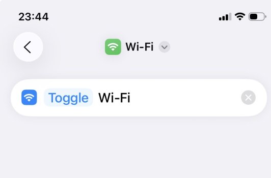
Having read up a bit now i see. While i cant fix that particular issue here is a shortcut that turns wifi on /off
Just add it to control centre then you get your functionality but as another button not the built in system wifi button.
There's a simpler way. It took me a while to realise you could change Turn to Toggle ...

I do not see this setting at all? care to expand?View attachment 2534915
View attachment 2534916
No offense, but this feature has been around for many years (it was already available back in iOS 12).
It’s under Settings > View
I second this - in case Apple is listening to the two of us...Or some sort of option for a second secure session (kind of like Samsung's Secure Folder option).
Thank you 🙂. I agree I think it's an important feature ! And I think apple with all its software expertise could do a real good job at it too.
Screenshot Markups are broken for me. Tapping the markup pen icon, alongside the share sheet icon, just hides and reveals the Ask / Translate / Search buttons at the bottom of the screen. I can force it appear by swiping up from the bottom edge, which sends the screenshot to the bottom-left corner as a thumbnail, and then tapping the thumbnail to fill screen once again. At this point the markup tools are there and can be hidden/revealed as intended.
I don’t think those haven’t been updated yet.Why are there still so many elements that are completely flat? Look at the buttons on each of these pages
View attachment 2535157
I agree. Besides that though, how long will they carryover all these “classic view” options?All these options to revert UI changes really show a lack of confidence on Apple's part.
They are going to have to discontinue them eventually… and it will be even harder to pry the classic view option out of people’s hands that have refused the change since day 1.
I don’t always prefer the new way but change is inevitable, might as well get used to it.
Register on MacRumors! This sidebar will go away, and you'll see fewer ads.

