mattlqx
macrumors newbie
Lol @ you pretending to work for Facebook
Keep it classy, MacRumors!
Release notes are a sore spot. I just wanted to elaborate on the reasoning behind keeping them static.
Peace.
Lol @ you pretending to work for Facebook
text is way too small on the fb app... smaller than apple's own apps.. yet messenger is fine
Glad I'm not the only one. I was thinking maybe it just looked smaller since it had been so large but I think it is quite a bit smaller than it should be. Maybe we'll see an adjustment in future updates.
Releasing a version of an application on a mobile platform should be the same non-event that it is on the web and ever slowly, inch by inch, we are making progress to that goal.
Full disclosure: I'm Facebook employee on the Release Engineering team.
Release notes are a contentious topic. While some people would very much like us to describe every one of the thousands of changes that go into our mobile applications each and every release, the plain fact is that is just impossible.
Many changes are under the hood for performance and bug fixes. Many changes are trivial (moved button X over Y pixels). I know you're probably not looking for that level of detail (some are though). You're probably most concerned with "what are the new features in the app that I may want to check out?". That is equally hard to spell out into release notes.
Why is that? For one thing, features typically don't release broadly to everyone at once. There's no point in putting in a release note for a feature that you can't yet use. We do this for scaling and quality reasons, it's a fundamental part of Facebook. If small scale tests of something new go smoothly, we release a feature more widely in a controlled way. Releasing new things to the many hundreds of millions of people that use our mobile apps is a methodic process.
Beyond that, there are logistical hurdles too. Release notes need to be approved and translated into *dozens* of languages. But before you can even get to that step, you need to write what the actual release notes are. This takes a lot of time away from a release manager that should be more concerned with what bugs are blocking the release than with collecting bullet points for notes that a vast majority of people don't care about anyway. And with dozens of new features (some large, but mostly small) each release and a limited number of characters to express what has changed, which features should make the cut? How should they be described in a flat text space? Do you really want a simple text description to be your first impression of a feature?
Ultimately, we can express new features far better with walkthroughs also known as NUXs. These dialogs can allow you to control whether you want to enable a new feature, explain what value the feature aims to give you, show you how to use it. None of these things can be accomplished by putting a blurb in the App Store release notes.
Also think about this, do you look for release notes when you go to a website? How do you know what's changed there? Are you bothered by that? Many major websites do frequent pushes of a large number of changes. Facebook pushes dozens to hundreds of changes to the main website twice a day, every weekday. Releasing a version of an application on a mobile platform should be the same non-event that it is on the web and ever slowly, inch by inch, we are making progress to that goal.
Release notes are useful for small applications with a few changes each release but are useless for large, complex applications with hundreds of developers. We're not trying to keep secrets from you. There are just simply better ways of telling you what's interesting when those features are ready for you.
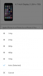
How come I can't watch videos on YouTube in full HD? Max is 720p when I know the videos I want to watch are offered in 1080P?
Full disclosure: I'm Facebook employee on the Release Engineering team....We're not trying to keep secrets from you.
Press the options icon in the corner then quality icon and set 1080p.
How come I can't watch videos on YouTube in full HD? Max is 720p when I know the videos I want to watch are offered in 1080P?
Thanks for the reply, but I already tried that. Max I can choose is 720P. I am on Wi-Fi too as I know can't stream HD over 3G / 4G
Full disclosure: I'm Facebook employee on the Release Engineering team.
Release notes are a contentious topic. While some people would very much like us to describe every one of the thousands of changes that go into our mobile applications each and every release, the plain fact is that is just impossible.
What is the point of the "Messages" tab in the app? Apple should reject this app for its non-functional Messages tab
Reviews will come in no matter what, especially for an app as widely used as Facebook. And really it doesn't matter to them how good or bad the reviews are ultimately as people will either get the app because they need it or want it or they won't, with reviews often not playing that much of a role for that many people (at least on a percentage level) when it comes to a largely used app like Facebook.Many people would argue it's just a new strategy to remove bad reviews by releasing "updates" without actually disclosing what they do.
How accurate is the "active now", "last active x amount" on the mobile app and mobile site?
What is the point of the "Messages" tab in the app? Apple should reject this app for its non-functional Messages tab along with the Facebook Message App for being redundant. If Facebook doesn't give a darn when its customers dislike pointlessly stupid changes, maybe they'll listen when Apple smacks them with app rejections.
Not sure whether Facebook or Apple would stand to lose more if this happened and neither budged...