Become a MacRumors Supporter for $50/year with no ads, ability to filter front page stories, and private forums.
I know dozens of people with iphones. The only time I hear anyone complain about anything with liquid glass is on this board. Even then, it's not a universal opinion that they messed up. I think many of you have opinions that are too strong and you falsely assume that this is the opinion of the masses. Maybe I'm wrong.
I don’t hate Liquid Glass but it’s undeniable that it’s a step back in many regards

Of course if you’re gonna ask any random person they’re not gonna tell you anything is off with their iPhone but when a lot of people who live and breathe UI design tells you there’s fundamental problems about Liquid Glass something is definitely wrong

Also a design doesn’t need to be atrocious to be disappointing coming from a company that’s held design in high regard for all of its existence

(Oh and because I didn’t make it clear my beef is really with macOS, hence the menu icon complaint. I find the design works much better on iOS while it falls flat on its face much more on the Mac with inconsistent rounded corners, controls adding padding and breaking certain existing UIs, the look not applying to apps compiled with older SDKs, etc)
 
Last edited:
I don’t hate Liquid Glass but it’s undeniable that it’s a step back in many regards

Of course if you’re gonna ask any random person they’re not gonna tell you anything is off with their iPhone but when a lot of people who live and breathe UI design tells you there’s fundamental problems about Liquid Glass something is definitely wrong

Also a design doesn’t need to be atrocious to be disappointing coming from a company that’s held design in high regard for all of its existence

(Oh and because I didn’t make it clear my beef is really with macOS, hence the menu icon complaint. I find the design works much better on iOS while it falls flat on its face much more on the Mac with inconsistent rounded corners, controls adding padding and breaking certain existing UIs, the look not applying to apps compiled with older SDKs, etc)
You make good points. I don't use a mac at all, so I have no idea what it looks like there. I actually like iOS26 and I have noticed a few bugs, but for the most part I think it looks great. I do recognize a lot of people on this board complaining about it, but a lot of people on this board complain about almost everything, so I take it with a grain of salt.
 
  • Like
Reactions: I7guy
You make good points. I don't use a mac at all, so I have no idea what it looks like there. I actually like iOS26 and I have noticed a few bugs, but for the most part I think it looks great. I do recognize a lot of people on this board complaining about it, but a lot of people on this board complain about almost everything, so I take it with a grain of salt.
Yeah I think the worst thing about iOS is sometimes Liquid Glass doesn’t adjust to make sure the icons or text are readable, similar to what happened with iOS 7

I wouldn’t be surprised if all those problems are gone by iOS 27.2
 
  • Like
Reactions: ayephoner
I don’t hate Liquid Glass but it’s undeniable that it’s a step back in many regards
I do not believe it is any step back.
Of course if you’re gonna ask any random person they’re not gonna tell you anything is off with their iPhone but when a lot of people who live and breathe UI design tells you there’s fundamental problems about Liquid Glass something is definitely wrong
So if I like a restaurant but a critic pans the same restaurant is my opinion wrong - especially if the restaurant is doing ok?
Also a design doesn’t need to be atrocious to be disappointing coming from a company that’s held design in high regard for all of its existence

(Oh and because I didn’t make it clear my beef is really with macOS, hence the menu icon complaint. I find the design works much better on iOS while it falls flat on its face much more on the Mac with inconsistent rounded corners, controls adding padding and breaking certain existing UIs, the look not applying to apps compiled with older SDKs, etc)
I don’t use a Mac, is use windows, so my experience is with iOS 26 and iPadOS 26, which I do like.
 
Well, not to be rude, but hopefully you’re not working as a designer.
Yes… hopefully for you, you go visit LensCrafters. It’s fantastic. It’s completely out of the way and barely noticeable except for the notification pane. So unless you pull that down and up constantly, you see nothing out of the ordinary. Just a smooth experience all around.
 
"Snow Leopard" Update

iOS 27 will apparently focus on bug fixes and under-the-hood improvements to boost performance rather than new features. It's been referred to as a "Snow Leopard" update, because that was a version of macOS that Apple famously claimed had "zero new features" because it was all about fixing the existing software.

Apple engineers are reportedly going through iOS 26 to look for bloat, bugs, and any other issues impacting performance that can be fixed in iOS 27.
I’ll believe it only when I see it. Tim Cook is a greedy corporate scumbag who cares about maximizing profits, not about maximizing user-experience (which is what Steve Jobs cared about). Therefore, Cook correctly knows that one way to maximize profits is to jam-pack every new iOS release with more features (because it’s a good marketing strategy), as well as by not spending money to have employees focus on a Snow Leopard strategy of fixing bugs and optimizing code to get rid of bloat.
 
Last edited:
  • Love
Reactions: Lioness~
Don’t forget possible big changes to the calendar app:

 
Looking forward to all the new features on my iPhone mini - I think I will be totally overwhelmed 😴
 
Not sure that current pool of engineers at Apple can pull the awesomeness of Snow Leopard.
I think they can if they’re allowed to follow the philosophy’s

“add no new features, only refine what already exists”

“Review all known bugs across all iOS generation as it’s well known that some bugs never get fixed in an iOS generation.

What bugs still exist today? could be a shoddy animation, a limitation in settings etc. compile and improve on them”

“Only add a new feature if it fixes an old bug or design limitation.”

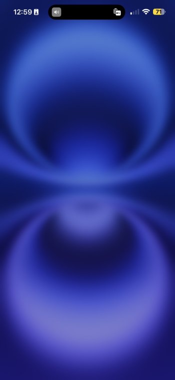
For example, I feel giving customers the ability to turn off the widget page on the Home Screen. For some users that page is useless now since they allowed widgets alongside the apps too.

See attached, this is what my dedicated widgets page looks like, I don’t need it so please let me hide it.
 

Attachments

  • IMG_2589.jpeg
    IMG_2589.jpeg
    71.5 KB · Views: 3
Yeah I think the worst thing about iOS is sometimes Liquid Glass doesn’t adjust to make sure the icons or text are readable, similar to what happened with iOS 7

I wouldn’t be surprised if all those problems are gone by iOS 27.2
I haven't seen this at all, but I'm thinking it might vary device to device and depending on settings. I know I have my text very large on a 17pm, but I made the text that large on my mom's 17pro and it created overlap issues and she had me turn it to a smaller size.
 
Yes… hopefully for you, you go visit LensCrafters. It’s fantastic. It’s completely out of the way and barely noticeable except for the notification pane. So unless you pull that down and up constantly, you see nothing out of the ordinary. Just a smooth experience all around.
All I can say to that is, if you don’t notice it, I’m happy for you.
For the rest of us, we actually pay attention to detail.
And the picture below doesn’t even show anything you’d have to go look for.
IMG_5497.png

I’m sorry, I was rude to you previously. That was uncalled for.
I’m probably just jealous that I can’t enjoy the design the way we’re all supposed to.
But I can’t look past the inconsistencies and weird design choices. It just baffles me how they could roll out an incomplete design language.
 
I haven't seen this at all, but I'm thinking it might vary device to device and depending on settings. I know I have my text very large on a 17pm, but I made the text that large on my mom's 17pro and it created overlap issues and she had me turn it to a smaller size.
It’s also very dependent on what content you’re scrolling over
To be fair they’ve improved A LOT over the betas, in beta 1 it was very common to have unreadable text in tab bars in Apple Music, by beta 4 it only really happened over certain album art
 
Register on MacRumors! This sidebar will go away, and you'll see fewer ads.