Become a MacRumors Supporter for $50/year with no ads, ability to filter front page stories, and private forums.
I don’t get bored of the cutlery though.

THIS. One of the better arguments I’ve read.
[automerge]1590235007[/automerge]
Tell me about it. I'm tired of all the money Tim's bringing to Apple and investors like myself. Sooo frustrating

This one too says a lot very well....are people more excited about Apple now (and driven at Apple now) for financial reasons or because of the excitement from the products....
 
Last edited:
  • Like
Reactions: Feyl
But that philosophy came in with iOS 7? It wasn't part of iOS 6 and before, which was designed to make things appear like physical equivalents. Look at the design video around the 3 minute mark:

What really functionally changed between iOS 6 and 7 which bothers you? As far as I remember it, 7 was largely a new skin on the familiar functions of iOS, with a few new useful features like control centre. It wasn't a radical change in how iOS worked, just how it looked. They got rid of things like button outlines, but the text was in the same place so you already knew that tapping it would take you back or whatever its function was.

The irony of ironies is that I find iOS7-now to too often “get in the way” more now than before because its over-subtlety results in either uncertainty or extra work. It’s toned-down interface cues in the form of burying frequently-used commands behind ellipses or hamburger icons results in more tap-tap-tapping to find off-screen tools, the white-out light-grey light-blue subtleness between “content” and “background” threw out all the context-defining cues that helped a user subconsciously organize the areas of the screen in front of him/her, often requiring extra delays to manually comprehend what’s in front on the screen. The ”minimalist design contest” reducing the cues differentiating actionable items (buttons/options) vs. information-only further adds to the uncertainty and increases comprehension time and then productivity. Although there have been (and still often are) times where it‘d take 10-20 seconds to seek out and implement a tool or button that I know “should be there somewhere,” it’s mostly all micro-pauses of uncertainty that start to stack up unbearably over time.

A large thing that truly botherS me is the heavy use of thin light grey/brown font on stark white backgrounds started seemingly with iOS 7 -- the iPhone was/is already impossible to read outdoors and the font change made the impossible even more impossible (as if that were possible).

Further, iOS 7 kicked off a certain over-minimalist aesthetic both in functional cues and physical appearance, and since the “world” still follows Apple, it opened the door to inspire 3rd-party developers/digitical-content folk to follow suit, many of which just don’t have the training/skill of Apple... Where the big problem arises is when these folk attempt to implement a less-than-natural (IMHO) interface aesthetic in apps that accidentally go even farther than Apple, with pale yellow font on burnt orange backgrounds, with zero borders or background color changes to help define things on the screen, and where the text “buttons” look no different than other information text.

Things were largely better before, right out the gate, when a system was designed to first function well, and look a certain way secondly.
[automerge]1590236371[/automerge]
Probably because you view it as a tool rather than a fashion item.

Yep! If Jony & team didn’t prioritize iOS as fashion and instead we had a Scott-led team focusing on attractive/intuitive function, iOS would be a much better place!
 
Last edited:
I wonder if anyone is actually still running iOS 6 on their iPhone?

I can still remember when I upgraded from iOS 6 to 7 on my iPhone 5 and wishing I had stayed on iOS 6. I still miss the music app in iOS 6.
 
  • Like
Reactions: Feyl and Tozovac
I disagree. The OS is supposed to “get out of the way”, when it’s doing its job well you should barely be conscious of it.

Agree. Just hate when its minimalist vagueness and hiding of functions off-screen really gets in the way of intuitive use. It’s those times when I notice the OS the most, and not in a happy way.

I think is it. It sounds like for you the OS is something that you don’t want to get out of the way, you want to be aware of it, to find it novel, interesting, fun. That is mutually exclusive with it being something you’re barely aware of.

That sounds like your interpretation/words, not his or her message. I think very few seek the return of over-skeuomorphism and instead miss the common sense UI cues Jony threw out with the baby and the bathwater.

Clearly one person’s “getting in the way“ is another person’s no-never-mind.

I wonder if anyone is actually still running iOS 6 on their iPhone?

I can still remember when I upgraded from iOS 6 to 7 on my iPhone 5 and wishing I had stayed on iOS 6. I still miss the music app in iOS 6.

Exactly. Me too. I miss a music app that had all the controls upfront at all times, instead of hiding them away in favor of prioritizing album art.
 
That’s what I miss the most about the music app in iOS 6 you open it and you can immediately start playing and every thing was where you wanted it to be, no wasting time.

Today’s music app is visually a disaster. It open with the word LIBRARY that takes up 1/4 of the top space (So now I need to be told this is my library) as if I don’t know what this is. Then the bottom now playing is another 1/4 and below that tabs for library, radio and search are another 1/4 inch so my now 4.7” 6s is now about 3.5” of real estate.

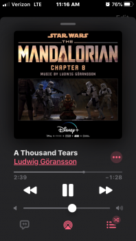
Oh but it gets better lol..the now playing screen is a bunch of wasted space and again I need to be told that it’s a pop up so it doesn’t use the entire screen. It stops short at the top with a bar line to tell me hey, did you know this is just a pop up now playing? Lol come on Apple this is not my first tech experience and I’m not 12 yrs old. Then will use have of your screen for the song title, time line, volume and pause, play and forwards backwards and then tack in some buttons so you can find more hidden menus.

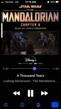
it’s just a convoluted mess. I’d pay to have the iOS 6 music app back. I’m using cesium (now called Cs Classic Music Player) which reminds me a lot of iOS 6 music app.
 
Here's the Cs Classic Music Player App from the App Store. I feel it most mimics iOS 6. It also allows you full customization of buttons. Here I told the app to not show the volume bar (then I purposely snapped this pic to show I can still use Apple's volume side bar that disappears. This allows you to remove it. I also get to see album artwork the way it was meant to be seen. I import most of my own music (I'm a huge LP guy and enjoy seeing my imported artwork in full form) Apple's shrinks it to 60-80% based on play or pause (ludicrous)

This is just one small part (music) of how it shows how Apple changes things just for the sake of changing.

Cs Classic Music Player .PNG

Apple's Current Music Player App (same song playing)

Apple's Music App.PNG
 
Should have gone with a horse’s head.

That was just the movie, and that scene was wrong on so many levels, and it got the whole godfather wrong.

In the novel, it were the horse's testicles that he found in his bed. So, they didn't kill the horse. But they made sure he couldn't use it for breeding anymore. Also, it was a nice double message: We can also do this to you, you damn pedophile.
 
  • Love
Reactions: makr
Probably because you view it as a tool rather than a fashion item.
True, but to be fair I do have cutlery I like, I think it probably says something, albeit a little, about me. Heck, same goes for most tools I suppose. So they’re *slightly* fashion items?
 
..Things were largely better before, right out the gate, when a system was designed to first function well, and look a certain way secondly.
I don't agree things were "largely better before". But YMMV.
Yep! If Jony & team didn’t prioritize iOS as fashion and instead we had a Scott-led team focusing on attractive/intuitive function, iOS would be a much better place!
This is akin to saying: "if Steve were alive..."
 
  • Like
Reactions: Tozovac
Heir apparent turned down for safest bet. Jobs thought he would win against cancer, part of his narcissistic thought pattern. He had convinced even the execs he'd bounce back, "as he had done many times before." Death came as surprise. Cook was in power when Jobs was still chairman of board - controlling his puppets from afar.

Once we was dead, they all had no master. The strings attached to their legs and arms got tangled. Some hated one another, envious or ego. They booted the heir apparent because they didn't understand what made him special to jobs.

Now you have a bean counter looking to count some moar.
An egomaniac who gets a green light for every Apple Music and tv deal.
A marketing department without their "Why".
A designer that lost his muse.

No puppet master and a misunderstanding of the purpose statement: "changing the status quo". Billions spent on green power and a few mislaunches of new products by announcing them before they are baked.
Best post I have read on MacRumors!
[automerge]1590261019[/automerge]
That's a nice little piece of fiction!
You have your opinion, I know the facts.
 
  • Haha
Reactions: PickUrPoison
I wouldn't say a zero chance of Forstall returning. Remember, it was Jony Ive who hated him and who made the ultimatum to Tim Cook. Incidentally, Jony is no longer at Apple.

Steve Jobs used both of their talents in ways that worked. Without Steve there to keep them in their own boxes and act as the glue for their talents, it no longer worked.

I didn't personally care for the skeuomorphism but Steve Jobs saw something in Forstall that he liked so much that he kept him around for decades. I wouldn’t want him in charge of UI but someone with that kind of a rare long term insight into Jobs’ mind, will forever be valuable to the company.
It’s not just skeuomorphic design, it’s user friendly interface that anyone can make it work. For me, the iPhone in its current state is a joke. Nothing is intuitive. Everything has to be taught now. You cannot hand a person an iPhone 11 and expect them to be able to use it. When Forstall was in the lead of software, everything was intuitive and a lot of things were skeuomorphic. One of Apple’s biggest mistakes under Cook was firing Forstall - a sad decision as Cook was threatened; that’s not speculation- it’s fact. The second in the chain of mistakes is putting Ive in charge of software and user interface which he knew nothing about. They took away all the intuitiveness when they completely axed skeuomorphic design. The bashing of skeuomorphic design at the time was all throughout Apple to support Jon Ive. But in reality, he led them down the wrong path. The third major flaw of Cook’s reign is a complete disregard for customers, and total foresight only for share value. This is a problem in many companies as CEOs are rewarded greatly in stock to do the wrong things just to increase shareholder value of stock, which Cook is a large benefactor. So disregarding so much potential with Forstall, and not making them just work together sent Apple down the wrong path. Apple is big enough to sustain the loss of innovation in the short run, but in the long run Apple seems right to be the next Blackberry. Unless the Board finds a real leader, who can innovate and understand the product pipeline, the company will suffer greatly. Some other company will swoop in and provide the software experience people expected and got from Apple years ago but no longer can use or realize. So many bugs and so many confusing user interface decisions. A lack of willingness to update hardware and sell this crap may be the saddest part. Sure the iPhone is great, but it’s a nightmare for a first time user to understand. The design has been held onto for too many years. The designers were pushed aside by the bean counter at the top. He figured people will be lax with the same designs for years on end. Like the 2020 iPhone SE. great that Apple can design a good chip, but I wish Apple could maintain properly its ecosystem and lead. Not going to happen as long as Cook is in charge - that’s a fact.
 
It’s not just skeuomorphic design, it’s user friendly interface that anyone can make it work. For me, the iPhone in its current state is a joke. Nothing is intuitive. Everything has to be taught now. You cannot hand a person an iPhone 11 and expect them to be able to use it. When Forstall was in the lead of software, everything was intuitive and a lot of things were skeuomorphic. One of Apple’s biggest mistakes under Cook was firing Forstall - a sad decision as Cook was threatened; that’s not speculation- it’s fact. The second in the chain of mistakes is putting Ive in charge of software and user interface which he knew nothing about. They took away all the intuitiveness when they completely axed skeuomorphic design. The bashing of skeuomorphic design at the time was all throughout Apple to support Jon Ive. But in reality, he led them down the wrong path. The third major flaw of Cook’s reign is a complete disregard for customers, and total foresight only for share value. This is a problem in many companies as CEOs are rewarded greatly in stock to do the wrong things just to increase shareholder value of stock, which Cook is a large benefactor. So disregarding so much potential with Forstall, and not making them just work together sent Apple down the wrong path. Apple is big enough to sustain the loss of innovation in the short run, but in the long run Apple seems right to be the next Blackberry. Unless the Board finds a real leader, who can innovate and understand the product pipeline, the company will suffer greatly. Some other company will swoop in and provide the software experience people expected and got from Apple years ago but no longer can use or realize. So many bugs and so many confusing user interface decisions. A lack of willingness to update hardware and sell this crap may be the saddest part. Sure the iPhone is great, but it’s a nightmare for a first time user to understand. The design has been held onto for too many years. The designers were pushed aside by the bean counter at the top. He figured people will be lax with the same designs for years on end. Like the 2020 iPhone SE. great that Apple can design a good chip, but I wish Apple could maintain properly its ecosystem and lead. Not going to happen as long as Cook is in charge - that’s a fact.
Understand it's your opinion, however, my opinion is that ios 4/5/6 was not the epitome of flawless design. Thinking it was, is a joke. When I bought my ipad 2, went down to the Apple store for a class. Maybe everything has to be taught today, but based on the table full of people back then, not much has changed.

It's been almost 10 years since Cook took control of Apple. Is not that long term enough to understand Apple is not like Blackberry, or is long term 20 years or more? Cooks job is not to cater to every single individual, and with hundreds of millions of customers, not all with agree with what Apple is doing and their products. One doesn't grow a company to $1T unless the company is doing something correctly for a large part the target market. (And I don't believe the opinions I have read on MacRumors, suggesting Apple customers just settle. That type of disregard for people's intelligence is nonsense.)

At any rate the facts are above are just opinions. That's a fact.
[automerge]1590271677[/automerge]
I don't agree things were "largely better before". But YMMV.

This is akin to saying: "if Steve were alive..."
The change in ios from 6 to 7 had to be sanctioned by Steve, at least partly. Apple has to plan for it's operating systems years in advance. As I said above, imo, IOS 4/5/6 was not the epitome of design and form and function. I don't think there is any high bar. Apple refreshes IOS from year to year in a direction Apple wants to take IOS. All companies freshen up their products. Some people agree with these "refresh", others don't.
 
Last edited:
It’s not just skeuomorphic design, it’s user friendly interface that anyone can make it work. For me, the iPhone in its current state is a joke. Nothing is intuitive. Everything has to be taught now. You cannot hand a person an iPhone 11 and expect them to be able to use it.

And yet literally a billion people use it. Do you think they all took a two-week boot camp?

In fact, compared to macOS and Windows of the 90s, iOS is far more intuitive, as you can tell by how toddlers pick it up.

When Forstall was in the lead of software, everything was intuitive

🙄

Right. He also cured cancer! And then Ive brought it back!!

People here have an amazing ability to paint "everything used to be better" pictures, whether it's 10.6 Snow Leopard (which shipped with a bug that would delete entire user profiles) or iOS 6 (which had a UI so tacky, even some of the shadows had shadows).

and a lot of things were skeuomorphic. One of Apple’s biggest mistakes under Cook was firing Forstall - a sad decision as Cook was threatened; that’s not speculation- it’s fact. The second in the chain of mistakes is putting Ive in charge of software and user interface which he knew nothing about. They took away all the intuitiveness when they completely axed skeuomorphic design. The bashing of skeuomorphic design at the time was all throughout Apple to support Jon Ive. But in reality, he led them down the wrong path. The third major flaw of Cook’s reign is a complete disregard for customers, and total foresight only for share value. This is a problem in many companies as CEOs are rewarded greatly in stock to do the wrong things just to increase shareholder value of stock, which Cook is a large benefactor. So disregarding so much potential with Forstall, and not making them just work together sent Apple down the wrong path. Apple is big enough to sustain the loss of innovation in the short run, but in the long run Apple seems right to be the next Blackberry. Unless the Board finds a real leader, who can innovate and understand the product pipeline, the company will suffer greatly. Some other company will swoop in and provide the software experience people expected and got from Apple years ago but no longer can use or realize. So many bugs and so many confusing user interface decisions. A lack of willingness to update hardware and sell this crap may be the saddest part. Sure the iPhone is great, but it’s a nightmare for a first time user to understand. The design has been held onto for too many years. The designers were pushed aside by the bean counter at the top. He figured people will be lax with the same designs for years on end. Like the 2020 iPhone SE. great that Apple can design a good chip, but I wish Apple could maintain properly its ecosystem and lead. Not going to happen as long as Cook is in charge - that’s a fact.

Uh.

OK.

You just literally wrote a paragraph that went from firing Forstall to the 2020 iPhone SE being "the same design for years on end".

I don't even know how to respond to that?
 
He was the prime sponsor/investor in "Fun Home"
I looked at the imdb page for Fun Home and the producers are listed as:
Fox Theatricals, Barbara Whitman, Carole Shorenstein Hays, Tom Casserly, Paula Marie Black, Latitude Link, Terry Schnuck/Jack Lane, The Forstalls, Nathan Vernon, Mint Theatricals, Elizabeth Armstrong, Jam Theatricals, Delman-Whitney and Kristin Caskey & Mike Isaacson
These aren’t in alphabetical order, so is it listed by importance? Because “The Forstalls” is pretty behind a good group of others.
skeuomorphism is not how it looks, but how it works.
I looked up Skeuomorphism and most definitions indicate that it’s how it looks, not how it works.
One day he shall come back to Apple, just like Steve did. Steve was a product over profits guy and we all know what Tim is going after. I think Scott is exactly like Steve.
Just like Steve did? Steve actually had the charisma and vision to pull together a group of folks that founded a startup that went on to be purchased by Apple. Sooooo, going to produce on Broadway is nothing like what Steve did.
It is strange that such a brilliant guy isn't hired by Google or Microsoft since he left Apple.
Not strange at all. There are lots of brilliant people that can’t work with others. If they’re worth keeping around, they make them “individual contributors”. I’m assuming either no one wanted to hire him because they knew of his reputation OR he was only excited to work in the tech industry when he was under Steve Jobs.
Steve returned to Apple after 10 years, so never say never.
Steve didn’t just take a vacation away from tech for 10 years then drop back by Apple for a job, he was actually running ANOTHER tech company at the time that got bought by Apple. SOOoooo, if Scott can pull some folks together, form a tech company, run it to be successful enough to become a takeover target by Apple, then sure. I doubt that’s in the cards, though.
I wouldn't say a zero chance of Forstall returning
I wouldn’t say zero chance either, because anything can happen. But he doesn’t seem the type that would take a lower job than an executive and I don’t know any tech company that will hire a tech executive that has nothing to show for the past few years. Most of the posters here have done more in tech since 2012 than Forstall.
People here have an amazing ability to paint "everything used to be better" pictures
I’ve heard it described as however the world was when folks formed their view of “self” is what they consider the “best times”. And, it’s hard for them to see anything as better than that. Folks that want to have a clearer assessment of the current day actually have to make a conscious effort to recognize the bias up front.
 
Last edited:
It’s not just skeuomorphic design, it’s user friendly interface that anyone can make it work. For me, the iPhone in its current state is a joke. Nothing is intuitive. Everything has to be taught now.

I’m pretty harsh on iOS after iOS 7, and I might not agree with saying “nothing is intuitive,” but I certainly agree that a LOT of the interface cues after the uber-minimalization fad starting with iOS7 is not intuitive and needs YouTube or googling to figure out. Especially when Apple makes the method of enacting certain features different depending on device, such as control center. Apple’s adding more and more features and complexities to iPads and iPhones while reducing the interface cues and number of buttons is a recipe for continued frustration.

I recall an interview article or video of Jony stating that now that everybody knows how to tap glass, we no longer need certain affordances which opens up a lot of freedom, blah blah blah. Yeah the world has a finite number of users and there will never again be another first-time iPhone user, and there never will be any new apps or apps that are ugiven a bunch of unnecessary plastic surgery just to “freshen things up into a modern interface.”
 
True, but to be fair I do have cutlery I like, I think it probably says something, albeit a little, about me. Heck, same goes for most tools I suppose. So they’re *slightly* fashion items?

Good points but when have you last encountered a fellow claiming he/she needs a new fork design because the old one feels kinda “stale” :)
 
Good points but when have you last encountered a fellow claiming he/she needs a new fork design because the old one feels kinda “stale” :)

Agreed. To that point, and I posed this question at least a dozen times in various threads to which nobody’s answered: since iOS 7 redesigned most every aspect of the interface, can anybody point to how the prior version of any ios7 reworked interface tool/method was a flawed or broken design and *how* the new version was that much better? By and large, most of the new versions are just different and not better in any obvious and objective way.

I find it rather easy to come up with objective examples of how the new methods are worse as far as intuitive efficient design: thin, low contrast harder to see font on stark white backgrounds, an absolute minimum of borders and visual indications to help set context, such as the iOS calendar for one example, and, of course, the unintuitive removal of visual cues differentiating actionable items from informational items.

http://cheerfulsw.com/2015/destroying-apples-legacy/
 
Last edited:
I'm probably in a minority, but I liked Forstall's work on iOS more than Ive's. Sure--some of the skeuomorphic stuff could be a bit cheesy, but at least you knew when something was a damn button.

And people forget that we needed skeuomorphism back then because this was all new. We were all moving from devices with physical buttons and switches to devices where those controls were rendered in pixel form on an ever-changing screen. Replicating those buttons, switches and knobs on screen was a huge help in quickly letting a user know what a control was and how to use it.

Ive seemed impatient to get us all past that. And while arguably users were more ready for that, having used the training wheels of skeuomorphism -- Ive also showed a pretty cavalier attitude toward human factors. I think he imagined his products as being used only in that perfect white void of the Apple product videos.
 
  • Like
Reactions: Tozovac
I was disappointed when he left Apple. He was by far the best presenter at the keynotes after Steve jobs. I wondered if he might go and do something amazing and then come back and run Apple in future, like Steve did. Unfortunately it doesn’t look like that’s going to happen.
 
  • Like
Reactions: Unregistered 4U
Register on MacRumors! This sidebar will go away, and you'll see fewer ads.