Perhaps a tighter crop? You could also darken / lighten selectively to better emphasize what it is you want your audience to see in the picture, particularly the focal point(s).
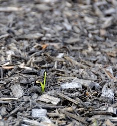
I like what you have here--it is an interesting capture. The reason, I think, the B&W pic came across as washed out is because the color palette in the original (color) is small and uniform (mostly browns / muted earth tones). This allows for the eyes to wander.
Just an opinion to be sure. Hope this helps in some small way.
Thank you, Maxx. All of the suggestions here help. If they did not, then I wouldn't be here.
BTW: I really like the level of C&C in this thread.


