Become a MacRumors Supporter for $50/year with no ads, ability to filter front page stories, and private forums.
Here are pages 2 and 3 of the brochure.

For the table, I gathered info from Land Rovers website, and put information together. He also was convinced I didn't write the 2 paragraphs (which is even that well written, I took about 3 min to write it). There are about 12 pages in total, most of which are informational and then there are 4 pages that have pictures of the interior and exterior colors available.

In 7th grade I knew more about PowerPoint than the computer teacher. She even admitted it. She was the person who switched me to apple though.
 

Attachments

  • Into.jpg
    Into.jpg
    222.2 KB · Views: 155
  • comparison.jpg
    comparison.jpg
    139.6 KB · Views: 116
Vader said:
Sorry, no offense, but I can't tell how that could be misinterpreted as a professional brochure, it has absolutely no info on the product.

Before we all become design critics, let's not forget the original poster is a freshman in high school... everyone has to start somewhere.
 
This is a decent piece of work. Im a Senior in college and this is by far better than half of the stuff i have seen in college. Looks pretty good in my book. I just think your professor doesn't realize your potential. Would he have any other reason to think you didn't do this??late work in other projects?do you keep a sketchbook of ideas, that way you could show your direction on this project. That is the first thing we learned, keep a sketch book that way if some one questions if it is your work then you can back it up.
 
I've quickly resdesigned the brochure. Maybe this will look better. I have converted blurbs on features of the car into paragraphs. This is what I have so far. In about 1/2 hour this is what I've done. This time binding is at the top for a more interesting design. I prefer the more minimalist look, simplicity = better. If you look at apple's website, look at how much more simplified it is.

This man thought I literally took a brochure, put it in a copy machine, and put it back together. I guess that is a compliment if it looks that good.
 

Attachments

  • cover-1.jpg
    cover-1.jpg
    87.5 KB · Views: 78
  • overview.jpg
    overview.jpg
    126.1 KB · Views: 86
  • interior.jpg
    interior.jpg
    112.6 KB · Views: 82
  • comparison-1.jpg
    comparison-1.jpg
    116.8 KB · Views: 70
You said you are a freshman in high school or college? Nonetheless, it looks good for a freshman. Yeah, your teacher is a moron if he's just gonna say you copied it with no proof. I had that problem. I was SO afraid of my work looking like my inspirations, I'd make it totally opposite and boring. I didn't want someone telling me that "I copied" something. In graphic design, follow what you like. Be inspired. **** other people...except your clients.
 
CompUser said:
I've quickly resdesigned the brochure. Maybe this will look better. I have converted blurbs on features of the car into paragraphs. This is what I have so far. In about 1/2 hour this is what I've done.


Couple of spelling errors, "luxery", other than that looks good, might want to split the page with the 2 pics with the text above it into 2 columns. But its totaly up to you your the designer.
 
CompUser said:
I've quickly resdesigned the brochure. Maybe this will look better. I have converted blurbs on features of the car into paragraphs. This is what I have so far. In about 1/2 hour this is what I've done. This time binding is at the top for a more interesting design. I prefer the more minimalist look, simplicity = better. If you look at apple's website, look at how much more simplified it is.

This man thought I literally took a brochure, put it in a copy machine, and put it back together. I guess that is a compliment if it looks that good.
I have a few pointers.

Your type is stressed.
Ill do a markup and repost, brb
 
ATD said:
Agreed. An accusation of plagiarism is a serious one. I interviewed a guy many years ago who had some my work in his portfolio. I RIPPED him a new one. If it's your work, stand your ground.


But if it isn't ALL your work (fess up son) get cracking on a new version pronto.
 
Quick Markup.

Move the title over to the left, this will counter balance the logo at the bottom right. Move the logo over just a bit to the left, away from the edge

Increase the space surrounding the text, and increase the leading between the lines. This will help the legibility. The Drop Cap is fine

no, Im not happy, Im gonna jump into photoshop and make another quick adjustment, BRB
 

Attachments

  • attachment.jpg
    attachment.jpg
    39.5 KB · Views: 69
Ok, this is a bit better. Might want to work on the colors also, Type on dark backgrounds are hard to read. Try using a white background, with black type for the main area. Or you could move the logo to the top, and kill off the bottom green area. That might actually work better. Hope this helps
 

Attachments

  • Update.jpg
    Update.jpg
    79.4 KB · Views: 76
It may also help if you write a rationale to go with it:

Here's the feel the (imaginary) client was after
Here's why these colours were chosen (corporate colours / to match existing literature / etc)
Here's why these fonts were chosen (ps.. lose the underlining on the back cover, always makes things harder to read. I'm not knocked out byh Copperplate Gothic, I think it's overexposed. But that's just me)
Here are the vertical and horizontal alignments I used and why

You have clipped corners on the photo on the back (like the darts that hold a family photo in a scrapbook) -- was that a decision? What meaning is it conveying? Why is it not used in the other photos?

Don't run the type up hard against the edges of the picture boxes, give it some room.
 
CanadaRAM said:
It may also help if you write a rationale to go with it:

Here's the feel the (imaginary) client was after
Here's why these colours were chosen (corporate colours / to match existing literature / etc)
Here's why these fonts were chosen (ps.. lose the underlining on the back cover, always makes things harder to read. I'm not knocked out byh Copperplate Gothic, I think it's overexposed. But that's just me)
Here are the vertical and horizontal alignments I used and why

You have clipped corners on the photo on the back (like the darts that hold a family photo in a scrapbook) -- was that a decision? What meaning is it conveying? Why is it not used in the other photos?

Don't run the type up hard against the edges of the picture boxes, give it some room.

Great pointers.

:rolleyes: Were probably stressing this kid out :) this is for H.S. after all

Glad neither of us, got into the Visual hierarchy
 
I like the model comparison chart.

See if you can redo it using as few ruled lines as possible.
Give it some space at the bottom too, don't crowd the edges.
I'd still dump the Copperplate and all the underlining.

A change of typeface conveys some meaning to the reader, such as emphasis. Beware of signalling a message when there is nothing to be communicated.

Example:
a change of typeface conveys some meaning to the reader

a change of typeface conveys some meaning to the reader

The second sentence is confusing, because the reader doesn't know the purpose of the emphasis on the various words. The first is more understandable because the bolding highlights the meaning of one word, which fine-tunes the meaning of the sentence.

Which is a longwinded way of saying, when the type starts as one face, jumps to Copperplate for the Model Specification, then back to another for the text, the reader tries to make sense of why the words "Model Specification" were singled out, of all that text, for 6 degrees of emphasis (Uppercase, by being isolated on one line, by being centred, underlined, larger sized and in Copperplate). When really the words weren't that great in significance. This is just a pet theory - real designers may differ (and probably will! ;) ) but I hate a noisy page, as a reader.
 
I would say that your second one is much better than the first, I see a much better flow with it. And I agree with the others here, give your copy more room, even make it smaller or try a sight tint of color to push it back a little. Let your eye see the car first and the body copy last. If you feel that you need more space to get your idea across, add more pages. I some times got in trouble in design classes because I would redesign the assignment if I felt it was not right. Always keep in mind that it's your portfolio, not the teachers.

If you like design and want to follow that as a field, don't feel you need to stop yourself at a single solution. I will often keep doing versions on a project until I run out of time (or budget), even if I feel that the first few designs nailed it. Design is a process, all about seeing something from as many angles as you can and exploring new ideas. Make it play, not work. You are off to a great start for being a freshman in high school, I knew I wanted to be a designer at the same age. :)
 
Thank you everyone for the advice, I'm probably going to make another 4-5 pages for it.

I wasn't sure where I should put the title, because it still seems a little off balance because the title is so big, and logo is so small. I was sure I had some typos, I usually don't look over things like that too much until the end. And since the packet is bound at the top.

Anyways this teacher was the person who I mentioned before here who said that "GIF images are not compatible with macs" and "I am taking classes a college on advanced photoshop. We were learning about histora, histio, historygrams" (would that be a histogram).

I sorta like this new design, because of its landscape orientation I have more workspace and most of the the pictures are landscape so it makes more room for text and pictures.

I really do not want to get rid of the Blue and Green because those are Land Rovers Colors.
 
ATD said:
I interviewed a guy many years ago who had some my work in his portfolio. I RIPPED him a new one.

:eek: :eek: :eek: :p :p :p I'd have loved to have been a fly on the wall in the that interview. :p The audacity alone to do something like that... incredible :eek:
 
iGav said:
:eek: :eek: :eek: :p :p :p I'd have loved to have been a fly on the wall in the that interview. :p The audacity alone to do something like that... incredible :eek:


It was ugly. I have seen people try to pass off work as their own when their involvement in the project was slight, but what are the odds of someone showing you your work? Only once for me. The guy worked for our client (a TV network), our job was to create and deliver a finished ad campaign, his was to take our finished work and make time changes for different markets, like changing 7:00 to 7:30 on the ad. That's it, making a 0 into a 3, his involvement was less that 1/10 0f 1%. He lost his job there and came to us looking for work. He might have thought that the ads were being created at the network and not on the outside. Not very bright. I mean, if your going to cheat, do some homework! I'm half joking here, ripping off other peoples hard work is not cool.
 
The point is, I did my work. The only thing I took were pictures but that is okay according to the teacher, in this case we do not have it cite where we got the pictures although I will probably write it down on the grading sheet.

I rearranged and redid the project a little. I like it more this way now anways. Attached are some of the pages.
 

Attachments

  • RR3.1.jpg
    RR3.1.jpg
    43.9 KB · Views: 61
  • RR3.2.jpg
    RR3.2.jpg
    55.5 KB · Views: 63
  • RR3.3.jpg
    RR3.3.jpg
    53 KB · Views: 63
  • RR3.4.jpg
    RR3.4.jpg
    55.5 KB · Views: 68
  • RR3.5.jpg
    RR3.5.jpg
    64.1 KB · Views: 71
More...
 

Attachments

  • RR3.6.jpg
    RR3.6.jpg
    59.5 KB · Views: 56
  • RR3.7.jpg
    RR3.7.jpg
    54.3 KB · Views: 71
  • RR3.8.jpg
    RR3.8.jpg
    48.7 KB · Views: 63
  • RR3.9.jpg
    RR3.9.jpg
    40 KB · Views: 66
  • RR3.10.jpg
    RR3.10.jpg
    39.5 KB · Views: 75
Echoing those who have posted before me... you're off to a great start!

There are some ways to improve upon it if you really want to get into the nitty gritty (typography, visual hierarchy, balance, color schemes, etc), but I have a feeling you've done things for a reason, and the way in which I design and how you've chosen to design this might be completely different based upon our preferences on design. You might hate my style, or not. It's all 100% subjective. But all in all, good stuff.

Long story short... nice work, kid. You're doing some pretty fine work for a freshman in high school.

When I was a freshman in high school, I was using PrintShop, and thought it was hot stuff. Now I do design all the time, and like to think I know what I'm doing.
 
neildmitchell said:
:rolleyes: Were probably stressing this kid out :) this is for H.S. after all

I dnt believe in the whole 'its just for high school' stuff, i think - if you can learn and produce good work then it can only be a good thing. strive for perfection no matter what level its at.
 
CompUser said:
Im going from the 2nd page of updates "More..."

Better

I like your left and right margins on for the first image, keep it and repeat it for all the pages. Consistancy consistancy.

Text is still stressed. (look how close it is to the top white Horizontal line )
Dont be afraid to move the text and images away from the edges, always make sure that there is enough space around the text blocks and images. When you butt up text and images right to an edge, it makes it very uncomfortable or stressed.

You need white space (unoccupied space) to help lead the viewers eye through the materials, I keep saying more space more space, but that is the reason why.
When you have lots of text and images taking up space, it appears as one solid block, the eye doesnt know where to go, and the viewer gets bored. By leaving more free space, its easier to look at and move through a layout, and makes it more interesting, the eyes see that there are more areas to explore.

The amount of space you left for the text wrap on the first page is good. Continue with whatever spacing you used, for any text wrap thoughout the layout.

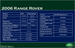
Top Align the tables, center align the top right header of the right table. Try a thinner table weight, it will help improve the readability of the text

The interior with colors, the layout is too busy, my eyes are bouncing like a ping pong from side to side. Good start tough. Maybe shrink the images down a bit, move away from the edges (like the exterior) have all text on the left side of the images bottom aligned

Exterior page, shrink each image down a tiny bit to increase the space surrounding each image, text on the left is fine, but I would bottom align it

Last page, Top align text with image, center the contact info in the space between the bottom of the image and the the bottom of the blue area

Try reducing the top green area to match the dimensions of the bottom green area, theres a bit too much white space (dead space) which is making the brochure a bit too top heavy.

Edges of brochure, if you were to actually get this professionally printed, scored and folded, you would run into problems with text being and images cut off where it is too close to the edges

If this is a facing page layout, where you view the brochure like a magazine, think about the the alignment of the headers and footers of the pages.
Whould they be laid out the same for each page?
(for the left pages) I would move the logo over to the left side. After the text such as "interior Colors" add a small gap and place the logo.
(For the right pages) move the text over to the right side with the logo as is. The header "2006 Range Rover" I would also move to the right side.
Think of the fold area as an edge, a stress area. Things get lost and uncomfortable in this area.

Over all, keep going, your doing great.
 
Looking better each time I see it! If you don't mind I'm going to push it one tiny step more, the reason to keep the type away from the edges is both artistic and technical. When a piece sent to a printer (print shop, not your desktop one) the printer will also ask you to keep the type away from the edges. This is called the Live Area. The reason for that is these are printed on large sheets and then cut down to size later. The trimming process is not dead on accurate, so they want you to pull the type in so that there is no possibly of the trims cutting off your type. That's all.
 
ATD said:
Looking better each time I see it! If you don't mind I'm going to push it one tiny step more, the reason to keep the type away from the edges is both artistic and technical. When a piece sent to a printer (print shop, not your desktop one) the printer will also ask you to keep the type away from the edges. This is called the Live Area. The reason for that is these are printed on large sheets and then cut down to size later. The trimming process is not dead on accurate, so they want you to pull the type in so that there is no possibly of the trims cutting off your type. That's all.
awesome tech. explanation, Kudos
 
Register on MacRumors! This sidebar will go away, and you'll see fewer ads.