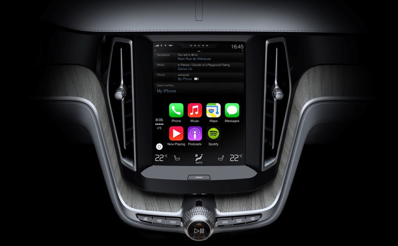
A few months ago, Volvo and Polestar announced updates for their infotainment systems to support dual-screen Apple Maps displays from CarPlay, allowing a supplementary Apple Maps view to appear in the driver display separate from the main infotainment screen.
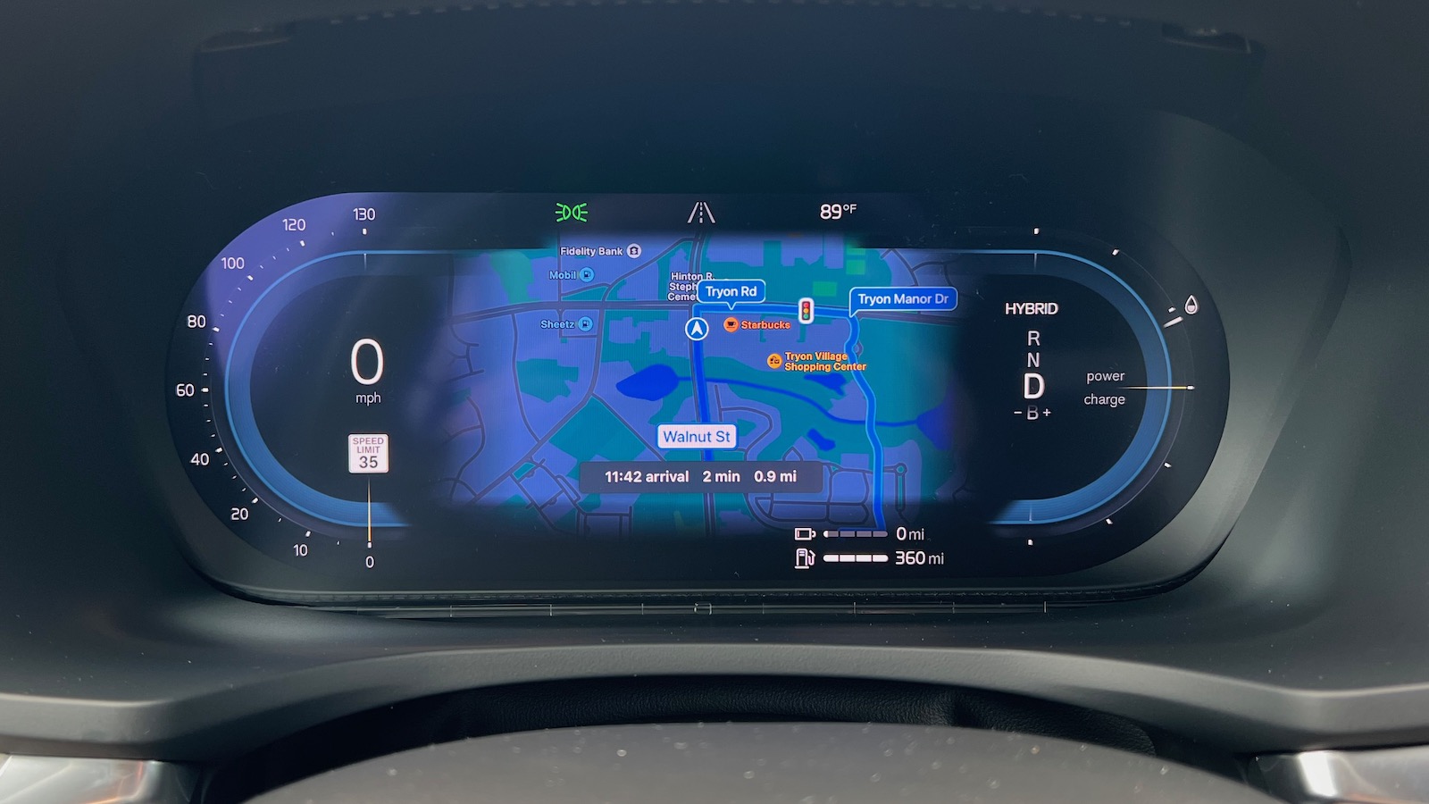
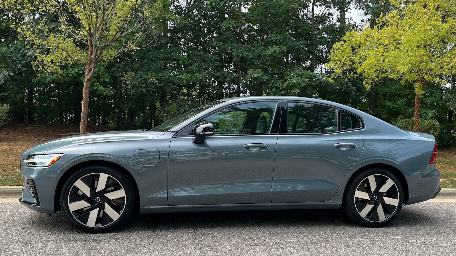
While an increasing number of vehicles are supporting text-based Apple Maps navigation prompts in the driver display and/or head-up display, Volvo is one of the first to adopt a full map view on a second screen, and I recently had a chance to test it out in a 2024 S60 Recharge.
The driver display Apple Maps screen is only active when there is a navigation route running in CarPlay, and it provides a familiar Apple Maps view with your vehicle position and your route, including upcoming traffic lights as well as surrounding streets, points of interest, and other features. At the bottom of the screen is a thin black box displaying your arrival time plus the time and distance remaining in the current trip.
This secondary Apple Maps screen doesn't show a visual text prompt of your next turn or exit, the distance until that movement, or lane guidance, but with Siri voice prompts and the visual representation of your route, you shouldn't have much trouble staying on course even if you don't have navigation up on the center infotainment screen. It also would be nice if the turn prompts were sent to the Head-Up Display, but they are not for Apple Maps.
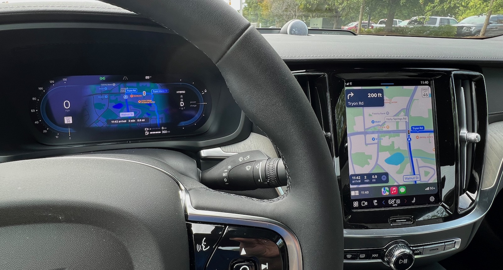
With Apple Maps taking up residence in the driver display, that frees up the main infotainment screen for other functionality, whether it be for another CarPlay app like Music or Podcasts or for the native infotainment system. And if you're in another CarPlay app, you'll still get pop-up text instructions for upcoming turns from Maps just like when when you're in a non-Maps app while using single-screen CarPlay.
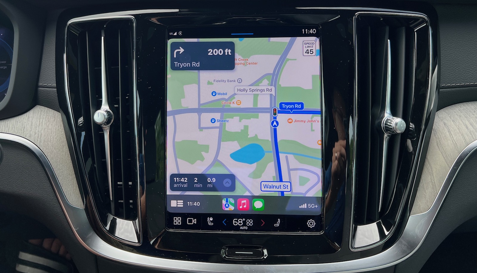
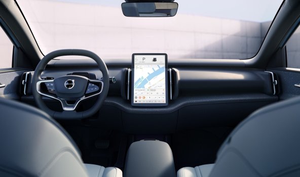
Volvo is notable for its portrait infotainment screens typically measuring 9 inches diagonally, although other manufacturers are increasingly adopting the form factor, particularly in electric vehicles. CarPlay on the main screen adapts to the portrait aspect ratio, with the usual sidebar containing status items and recent apps moving to the bottom and individual apps adjusting their layouts to fit.
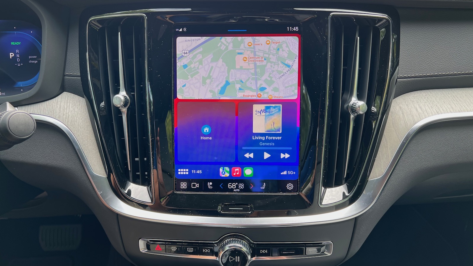
The CarPlay Dashboard view looks particularly nice in portrait orientation, with a horizontal view from the Maps app taking up the full width at the top and then plenty of room for generously sized tiles from other apps appearing below.
At least on this Volvo model, Apple Maps in the driver display appears in dark mode at all times, regardless of whether the main CarPlay screen is in light or dark mode. While it initially seemed a bit jarring for the two screens to display differently, it does make sense to always use dark mode in the 12-inch driver display to match the rest of the display elements like the speedometer. It results in a more cohesive look for the driver display and means you don't have a bright screen almost directly in your line of sight.
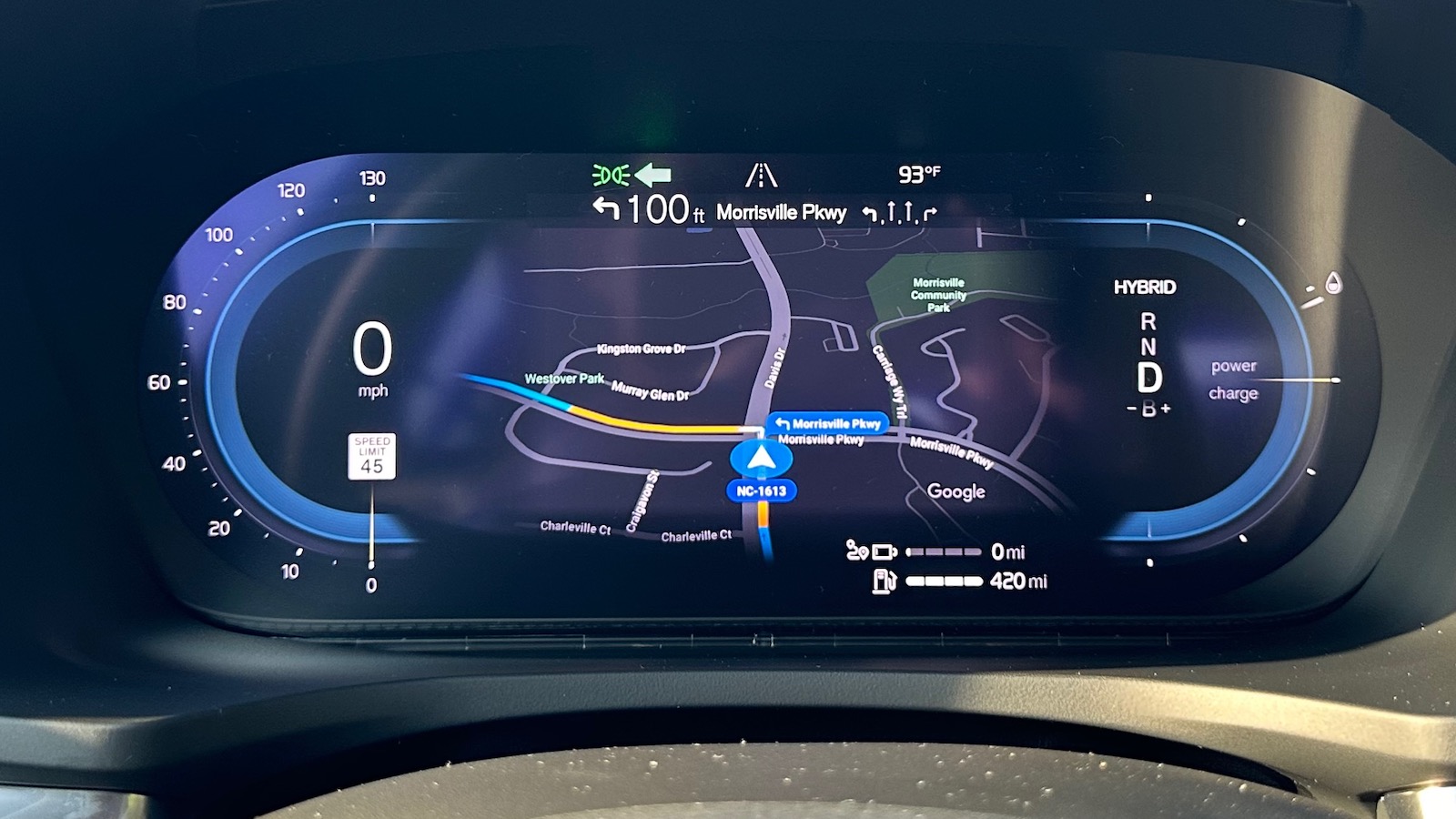
The native Volvo infotainment system now runs on Android Automotive from Google, so it features built-in Google Maps support that also shows up on the driver display, complete with upcoming turn prompts and lane guidance. The overall infotainment system was a bit sluggish to use at times, but Google Maps routing and features are solid, so it works well once you've got your route going. And with access to the Google Play Store, additional Android apps can be installed right on your vehicle's system.
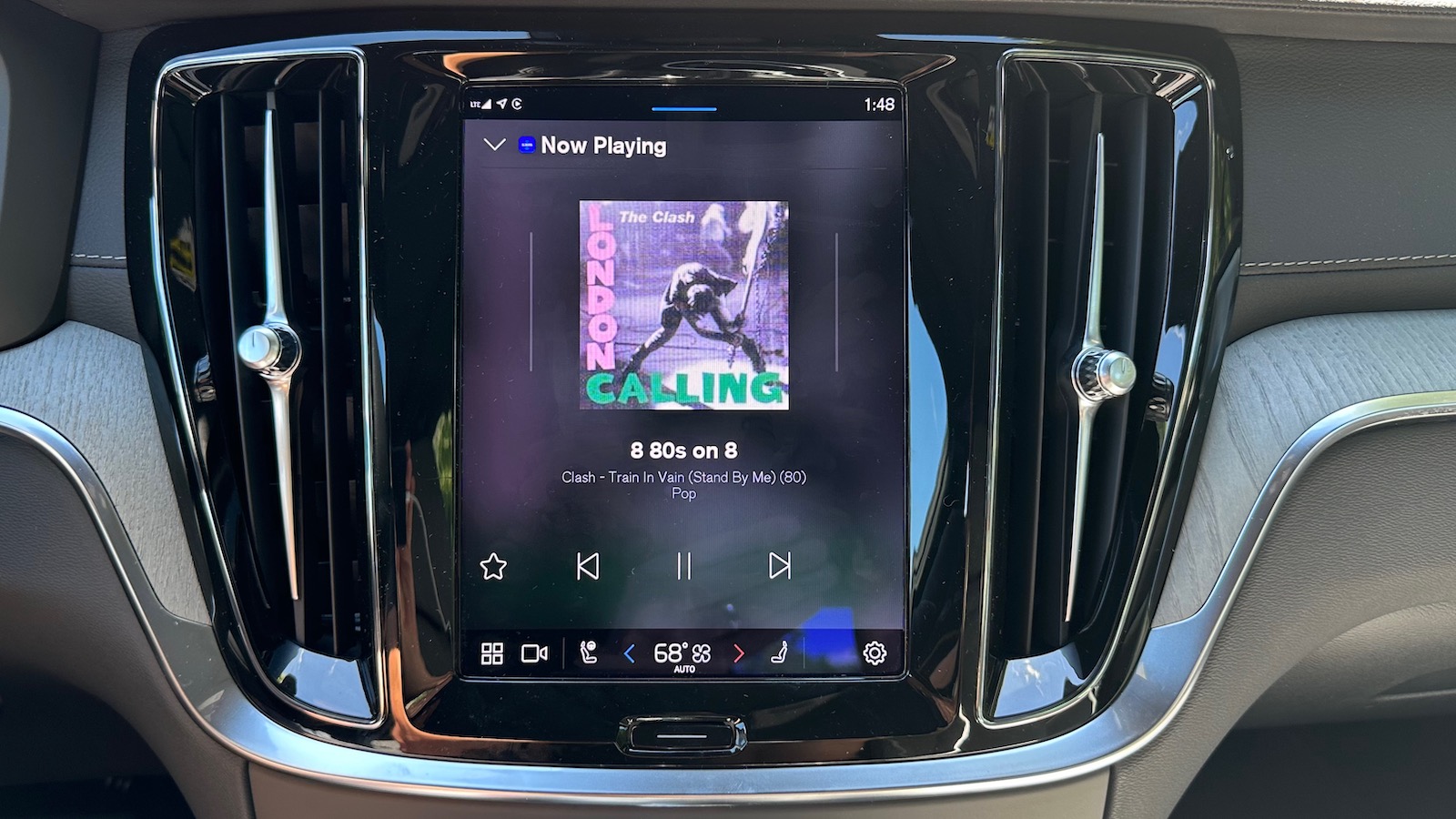
I have some mixed feelings about the overall look of the Volvo infotainment system. While individual app screens are generally fine, the application manager view in particular has a rather dated look with app icons broken up into sections by type. It's functional and you can rearrange apps however you like, but it just doesn't look very slick or modern to me... Click here to read rest of article
Article Link: Hands-On With Volvo's Dual-Screen Apple Maps CarPlay Experience
Last edited:


