It really doesn’t look ‘pretty much identical’People have too much time on their hands if they need to complain on this ‘redesign’ which looks pretty much identical to what the system looked before. Most people won’t even notice a thing has changed, Apple has only slightly tweaked the interface and there is no need to tone anything down unless somebody have specific conditions in which case accessibility options exist for that very reason. My complain is that Apple has not been bold enough and it missed an opportunity for a much more radical redesign. If they ‘tone down’ this already very subtle changes they might as well just give up on the whole thing.
Got a tip for us?
Let us know
Become a MacRumors Supporter for $50/year with no ads, ability to filter front page stories, and private forums.
Hate iOS 26's Liquid Glass Design? Here's How to Tone It Down
- Thread starter MacRumors
- Start date
- Sort by reaction score
You are using an out of date browser. It may not display this or other websites correctly.
You should upgrade or use an alternative browser.
You should upgrade or use an alternative browser.

You're giving them more ideas. Textbook Stockholm. Deny, deny, deny... fix (dopamine). Deny, deny, deny... fix (dopamine).Just why would anyone want transparent icons on a phone ?
Come on - why stop here ? Take it to the next level and reduce the brightness to 10% and add noise to all sound output.
Where some of the differences really show is when you customize the appearance of icons on home screens (press and hold on any area not occupied by an icon, then tap the Edit button that will appear in the upper left corner). This will show you the options for Default, Dark, Clear, and Tinted.People have too much time on their hands if they need to complain on this ‘redesign’ which looks pretty much identical to what the system looked before. Most people won’t even notice a thing has changed, Apple has only slightly tweaked the interface and there is no need to tone anything down unless somebody have specific conditions in which case accessibility options exist for that very reason. My complain is that Apple has not been bold enough and it missed an opportunity for a much more radical redesign. If they ‘tone down’ this already very subtle changes they might as well just give up on the whole thing.
Last edited:
And the last release of iOS 18 won't be leaving my phone either. Unless readability improves where I can clearly and quickly distinguish what I'm looking for, the Glass transparency look is not going on my phone.The glass design isn’t going anywhere in 27 either.
TBF, they trashed their own OS to start with. We're trying to un-trash it.So this is the state of Apple these days? "Hate the main thing we just announced? Here's now to trash it."
Present in iOS 18.5Hate feels an unusually strong word to use for the subject matter 🤔
I like the idea of the liquid glass option very much, though its current scope of adjustment restrict it from being far more pleasant. Hopefully the level of adjustments available will expand as the beta program progresses.
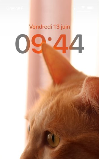
Thus far, I’ve found an issue where the Lock Screen ‘extend wallpaper’ option blends with the carrier and wifi icons significantly, as shown in the snap below.
View attachment 2519139
On reflection (see what I did there), I can’t remember whether this issue presented before liquid glass, but I’m inclined to say it didn’t, as I’ve used the same extended Lock Screen wallpaper prior to liquid glass without issue. I may be wrong!
I think the issue has been around for a while.
Attachments
And the last release of iOS 18 won't be leaving my phone either. Unless readability improves where I can clearly and quickly distinguish what I'm looking for, the Glass transparency look is not going on my phone.
I really like both iOS 18 and MacOS Sequoia. I've got my laptop and phone configured just the way I like it, and my workflow is working well for me. I've also got loads of shortcuts, and some decent Applescripts, which are working well.
I usually jump on the betas, as I like to be cutting edge, and I'll still probably upgrade to 26/Tahoe in a few weeks, but I'm keeping a close eye on all these threads to see how they develop. I'll also be ready to restore back if necessary.
Ah. Thank you for confirming! Ok, well let’s hope it’s something they look into given it is an ongoing issue. I appreciate your reply.Present in iOS 18.5
I think the issue has been around for a while.
Meanwhile, I'm told if you never turn on your iPhone, that will extend how long the battery can go between charges.
Consider this info another “Squirrel!" feature...
Consider this info another “Squirrel!" feature...
All Apple has to talk about at WWDC for iOS is Liquid Glass. Compare this with Google I/O and you can tell Apple is Stone Age software.
Just why would anyone want transparent icons on a phone ?
Come on - why stop here ? Take it to the next level and reduce the brightness to 10% and add noise to all sound output.
I don't want transparent icons. But do want transparent folders, widgets, and dock.
False.All Apple has to talk about at WWDC for iOS is Liquid Glass.
You clearly did not listen to tall the developer stuff.
I don't like the glassy effect at all - makes my eyes hurt.
I found the 'Reduce Transparency' option made it too opaque for me, but strangely 'Reduce Motion' added just about the right amount.
iOS26 Glassy...

...with 'Reduce Motion' on...

I found the 'Reduce Transparency' option made it too opaque for me, but strangely 'Reduce Motion' added just about the right amount.
iOS26 Glassy...
...with 'Reduce Motion' on...
You are my new best friend. This is exactly what I wanted. And I don’t mind the lesser animations eitherI don't like the glassy effect at all - makes my eyes hurt.
I found the 'Reduce Transparency' option made it too opaque for me, but strangely 'Reduce Motion' added just about the right amount.
iOS26 Glassy...
View attachment 2549818
...with 'Reduce Motion' on...
View attachment 2549819
Wow this is amazing. I have tried it out and I mush prefer my home screen folders now. And I actually quite like animations now.You are my new best friend. This is exactly what I wanted. And I don’t mind the lesser animations either
Wait wait… isn’t this the “reduce transparency” option?I don't like the glassy effect at all - makes my eyes hurt.
I found the 'Reduce Transparency' option made it too opaque for me, but strangely 'Reduce Motion' added just about the right amount.
iOS26 Glassy...
View attachment 2549818
...with 'Reduce Motion' on...
View attachment 2549819
I usually enjoy the system’s animations… but I guess I’ll give it a try when I install it.
Ok, I think Liquid Glass is great, not hard to read, looks good, doesn't bother me at all. iOS share sheet is much better. Messages and Phone apps better.
In use, I'm liking Tahoe, but all the gripes about UI are legitimate. Inconsistent application of effects (why not a translucent Apple Music sidebar?), and the navigation buttons in Finder are easy to see, but they're visually dissonant.
In use, I'm liking Tahoe, but all the gripes about UI are legitimate. Inconsistent application of effects (why not a translucent Apple Music sidebar?), and the navigation buttons in Finder are easy to see, but they're visually dissonant.
Yeah, I agree, and it’s been said several times in the forum. Do you think at Apple they read us? Because maybe we should send feedback about such dissonance hoping that, by macOS 27, they will finally bring the much desired consistency across all the UI. And polish a bit that Finder interface.In use, I'm liking Tahoe, but all the gripes about UI are legitimate. Inconsistent application of effects (why not a translucent Apple Music sidebar?), and the navigation buttons in Finder are easy to see, but they're visually dissonant.
I actually want *more* Liquid Glass, which I didn't expect. More liquid movement and animation (bouncing, sliding, warping), more translucency. And more color-on-translucency, like the Focus icons in Control Center.
Register on MacRumors! This sidebar will go away, and you'll see fewer ads.