Become a MacRumors Supporter for $50/year with no ads, ability to filter front page stories, and private forums.
Broke their own basic rules of simple UIs with non-busy surface details.

You can like or hate the individual effects of this update, but the overall legibility of UI elements is a big downgrade. It causes more eye strain on devices that absolutely shouldn't have that.

This feels more like someone wanting to make their mark on Apple UI design instead of reenforcing a UI design language that makes sense.
 
Disagree. It reflects more on the state of many humans these days... resistant to change, closed-mindedness, etc.

Liquid Glass is a beautiful, modern new approach to interface design, and will only get better.
o please stop bitch, there sshould be a vintage toggle to revert glass crap
 
  • Like
Reactions: decypher44
I am coming to like the freshness of the new design. The current issue is that there are so many variables at play that at times even with reduced transparency it can be tricky to see and read the text.

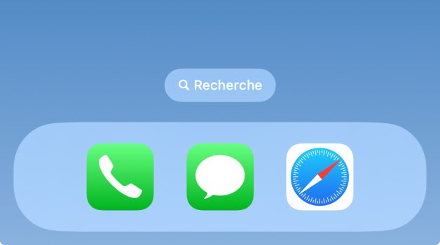
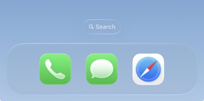
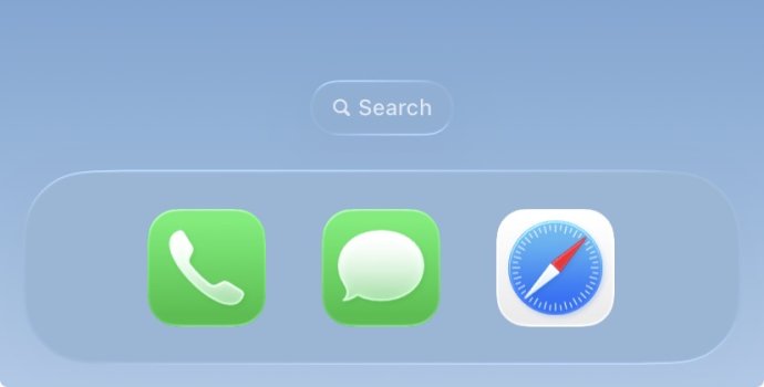
Just a small example for the search bar at the bottom of the Home Screen, using Apple’s Weather background:

This is how it looks in iOS 18.5:

IMG_2769.jpeg
Good visibility and readability, despite a light blue background. “Search” font looks bolder here.

This is how it looks in iOS 26 DB1 by default, without reduced transparency:

IMG_0006.jpeg
It is sleek, but that Search text is too pale and slim to be readable, IMO.

And this is how it looks in iOS 26 DB1 with reduced transparency:

IMG_0007.jpeg
As you can see, with this particular background colour there is barely any difference between the two.

I think Apple need to work on dynamically tweaking transparency depending on the Liquid Glass background colours.

So I am looking forward to seeing its evolution as time goes by.
 
Tbh before this update I was about to stop caring about Apple at all.

For me UI matters much more than for anyone else since I enjoy when my phone is pleasant to look at the moment I need it.

Since 2013 and iOS 7 there was barely any change in user interfaces and ever since then I dislike what Apple was making - flat, uninspiring and overly contrast UI that people would call “functional” any time any day vs “obsolete” skeuomorphic stuff.

Jony Ive was a famous proponent of minimalist interfaces, he hated skeuomorphism as much as a (in)sane person can hate something. And where is Jony now, bragging about some useless AI pins that will change our lives??

Thanks Jony but I guess Apple will change my life much better and in much straightforward way.

YES, iOS 26 is NOT a panacea. But it is a mighty beginning to functional yet easy to use interfaces where you don’t have to guess for half an hour what an app does by looking at its ugly, boring icon.

For example what is that?
This is icon for Final Cut Camera.
Is that “function over form”? I am not sure, I would need lots of time to guess what the app does.
1749724909011.jpeg


And I hope this design language will become no longer relevant over the next decade, so tired of this Jony Ive-esque aesthetic
 
  • Haha
Reactions: decypher44
YES, iOS 26 is NOT a panacea. But it is a mighty beginning to functional yet easy to use interfaces where you don’t have to guess for half an hour what an app does by looking at its ugly, boring icon.

For example what is that?
This is icon for Final Cut Camera.
Is that “function over form”? I am not sure, I would need lots of time to guess what the app does.
View attachment 2519267

And I hope this design language will become no longer relevant over the next decade, so tired of this Jony Ive-esque aesthetic
That's just a bad icon design and doesn't necessarily follow the Jony Ive form.

It certainly doesn't follow traditional minimalistic designs that came before Jony Ive, where you can strip away the colors and internal shapes, and look at the silhouette and still understand what the icon means.

iOS 26 is not a beginning towards a functional UI. It's a departure from it, and I sense the underlying reason isn't logical.
 
Everyone - Apple are stale and everything looks old. Apple - here's something new! Everyone - WE HATE IT! You just can't make it up!
 
The liquid glass is insane. I have vision issues. If this can't be shut off, I will switch to Android. Cook needs to fire about half the designers and hire programers who can put a new OS version out without some many bugs they need a dozen updates thoughout the year.
 
Hate? Lol. How can you hate something that’s been out 12 hours? Patience folks give it some time. Exactly like the many other times Apple changed things up and everyone was aghast(how could Apple do this?)and was eventually enjoyed.
 
  • Disagree
  • Like
Reactions: decypher44 and uacd
Its clearly a work in progress.

Given the feedback already I'm certain that the full release will have improved contrast though a stronger blur and darkening/lightening of background elements etc...

I remember hating iOS7's flat design overhaul when that launched. It was a jarring change that improved quickly through subtle but important adjustments. I have hope that the same will happen with this new design language.
 
  • Like
Reactions: uacd and one more
All I want is a new iPhone Mini and better window management for MacOS. Apple says screw you and installs Windows Vista on all my devices.

Apple listened to requests for an iPhone Mini but then almost nobody bought one.

And Windows Vista was criticised at the time for being a blatant rip-off of Apple's Aqua design language. At worst Apple are recycling and updating their own old design elements.
 
Discimer: An Unimpressed annual iPhone upgrader here.

PLEASE SPARE ME from this Windows Vista Bullcrap! I am SURE that the actual presentation will be better. BUT flat design should stay forever. Apple you failed to deliver meaning AI. You have Failed to deliver multitasking on iPhones. Failed to deliver foldables Which make total sense today. Don't make this the Last straw.
 
Its clearly a work in progress.

Given the feedback already I'm certain that the full release will have improved contrast though a stronger blur and darkening/lightening of background elements etc...

I remember hating iOS7's flat design overhaul when that launched. It was a jarring change that improved quickly through subtle but important adjustments. I have hope that the same will happen with this new design language.

I think there’s a difference though… the flat design of iOS7 jarred initially with some people because it was different, and they got used to it.

But in the main, it made everything much clearer to the user.

This Liquid Glass stuff adds absolutely nothing in terms of clarity or usability. Even if they improve contrast, it’s likely still going to be less clear than text on a solid white background.

It’s all for show, all to look nice. And hopefully come September it will look a lot better. But I don’t think it will age as well as the iOS7 aesthetic. Its beauty was in its simplicity. This is beauty for the sake of beauty, and will likely start to look dated before too long.
 
YES, iOS 26 is NOT a panacea. But it is a mighty beginning to functional yet easy to use interfaces
There’s nothing inherently “functional” or easy to use about faux-glass elements on a flat surface screen.

One of the primary determinants of ease of use is readability of texts or icons.
Which transparent or translucent “glass” effects virtually never contribute to in a positive way.
 
There’s nothing inherently “functional” or easy to use about faux-glass elements on a flat surface screen.

One of the primary determinants of ease of use is readability of texts or icons.
Which transparent or translucent “glass” effects virtually never contribute to in a positive way.

One of many reasons we don’t see a lot of signage around town “printed on glass”

The concept is ridiculous if you’re at all concerned with usability.
 
I think there’s a difference though… the flat design of iOS7 jarred initially with some people because it was different, and they got used to it.

But in the main, it made everything much clearer to the user.

This Liquid Glass stuff adds absolutely nothing in terms of clarity or usability. Even if they improve contrast, it’s likely still going to be less clear than text on a solid white background.

It’s all for show, all to look nice. And hopefully come September it will look a lot better. But I don’t think it will age as well as the iOS7 aesthetic. Its beauty was in its simplicity. This is beauty for the sake of beauty, and will likely start to look dated before too long.

I get what you're saying, but iOS 7 had aspects of the design that jarred with me for reasons other than it being so different from what came before. For example I disliked some of the really bright and vibrant colour choices for many of Apple's own app icons.

Over time they subtly toned down some of the more vivid colours enough that it stopped being headache enducing.

I agree that 95% of this new design language is purely about aesthetics and right now compromises usability, but I'm optimistic that the usability issues can be resolved. I don't think the clear icons option will catch on, in the same way I can't stand the current tinted icons option. The default or dark mode views will be preferable.

As for menus and control centre, the current iOS already has a lot of transparency and translucency. Liquid glass attempts to add some depth, but in an effort to show off their new material they've increased the transparency which was a mistake.

I think the new material itself is fine, but they need to stop messing around with other elements to make the material more noticeable, and instead lean into subtlety.
 
Liquid Glass = Windows Vista GUI. How Retro!

But seriously, who thought this would be a good idea and apparently thought nothing of those with Accessibility issues - or just tired eyes?
Just another "Squirrel!" distraction to hide the lack of any real work done on an OS originally created for the 2007 iPod Touch.
 
Register on MacRumors! This sidebar will go away, and you'll see fewer ads.