Got a tip for us?
Let us know
Become a MacRumors Supporter for $50/year with no ads, ability to filter front page stories, and private forums.
HATE the Body on new M1 MBPs - Squared-Off, Cheap Feel???
- Thread starter GanleyGanley
- Start date
- Sort by reaction score
You are using an out of date browser. It may not display this or other websites correctly.
You should upgrade or use an alternative browser.
You should upgrade or use an alternative browser.
Apple has decided that the laptop is coming to the end of its mainstream life (ask Kuo). The current MacBooks are legacy / vintage products, stuffed with old, cheap, nostalgia-driven ports to keep a particular ageing generation of users happy for a few more years. A dull, uninspiring box that took no effort to design and which is meant to look old against what will replace laptops in the future, encouraging the next generation to adopt new tech. This is Apple parking the trailer behind a shed, knowing that they and most users will forget about it in time.
2016: Apple stopped innovating with the Mac.
Apple is abandoning the Mac.
2019: macOS is starting to look like iOS.
Apple is abandoning the Mac.
2021: Apple completely reinvents the Mac, builds its own silicon from the ground up, delivering desktop class performance in a laptop, placing the Mac years ahead of its competitors and setting it up for the next decade.
Apple is abandoning the Mac.
Beauty is in the eyes of the beholder. The original poster can express his preferences toward the new macbook design. Nothing is completely right or wrong in that opinion.
Take it easy people.
At least there will be one less person jumping in front of people who want to buy. Can’t satisfy everyone.
Take it easy people.
At least there will be one less person jumping in front of people who want to buy. Can’t satisfy everyone.
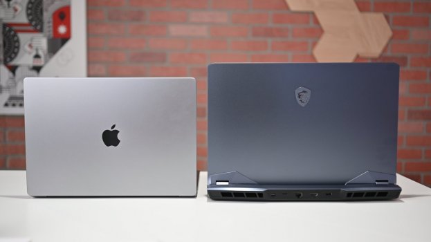
I held both the new 14' and 16' MBP in the Apple store. While the weight of the 16 isn't that much heavier than even the old 2015 MBP, it feels chunkier and heavier.
If I have the chance to hold both the 2015 15 and 2021 16, I suspect the 2015 MBP tapering near the edges changes how the user perception on the thickness of the laptop in a drastic way.
In addition, and I don't know how to describe it, when holding the old MacBook pro/air (2015 - 2020), they felt like one piece of metal, one solid piece of metal. But for the new MBPs, they don't have the same feeling. They feel solid, but not as one piece of metal like the old one.
I will take the 2015 body and the new chips inside anytime.
One can dream.
If only you were being serious, that would be so hilariously ridiculous. Just like how MacBooks have physical keys to keep typewriter fans happy. Function keys to keep IBM fans happy. Tab key to appeal to keep Elle McPherson fans happy. Space bar to keep NASA fans happy.…stuffed with old, cheap, nostalgia-driven ports to keep a particular ageing generation of users happy for a few more years.
I do get nostalgic though when I think about HDMI connectivity. Makes me long for the days when MTV actually played music videos, when David Lee Roth could sing, when candy cigarettes weren’t considered a gateway drug, the excitement over a new Atari 2600 release…. Ah the good old days.
Last edited:
I like everything but the notch. That is something no one will ever get used to, no matter how hard they try.
There's no cheapness on the new MBPs.
It feels like Rolls Royce engineering.
The hinge has this delightful smoothness that makes it a pleasure to open my Mac every time.
It feels like Rolls Royce engineering.
The hinge has this delightful smoothness that makes it a pleasure to open my Mac every time.
Sorry to disagree. Never has bothered and never will bother me! So by my being totally used to it, your statement is now invalidated. See, that is how logic worksI like everything but the notch. That is something no one will ever get used to, no matter how hard they try.

I reckon it feel far more premium than any MacBook I've owned or used. Including 2 prior MacBook Pros and 2 prior MacBook Airs.I saw the new M1 MacBook Pros - "16" and 14" tonight. The body is squared off and thicker than my 2013 MBP. WHAT??? And it feels cheap, not like the former Airplane Grade aluminum. You knock on it and it feels hollow-ish. And the bottom feet are harder than previous models, almost like a cell phone case that is hard plastic and sort of hits the desk too hard. I am pretty disappointed. Why, Apple, Why? I waited years to upgrade. Almost tempted to get a deal on an older one now.
?♂️
I think you might be using it wrong.You knock on it and it feels hollow-ish.
Yes the technical improvements are very welcome, as I mentioned. I think this thread was about the aesthetic design.
How do you know this was designed before the pandemic? Seems like a very long time to keep this design under wraps. Is that a known fact?
The design of this and everything else in the lineup seem very different, so that’s why the question of design timeline comes to mind. But as I mentioned, it’s just a random theory I had from seeing something similar happen in my own industry.
I think that Apple is going to a two very distinguish design models, "funny and colorful" for entry level machines /casual and a more serious feel for pro machines. Now, i think that we are in the middle of the transition in these two variants, and this is what causes the salad of styles that we have now. So, my guess about the designs after this process is finished will be:
"Colorful and funny designs: use of white, several colors"
- Macbook air, iMac 24, iPad air, iPhone non pro versions.
"Pro designs - grey/black, less color options."
- Imac 27/32, macbook pros, mac pros, iPad Pro and iPhone pro.
Not sure where to put the mini, as could be seen as entry-level but also as a pro machine if they fit a M1 MAX there.
Never gonna happen because Apple still targets casuals by their "Pro" machines, that category simply stands for more luxurious products with more features and better materials which are not aspects exclusive to "Pros"I think that Apple is going to a two very distinguish design models, "funny and colorful" for entry level machines /casual and a more serious feel for pro machines. Now, i think that we are in the middle of the transition in these two variants, and this is what causes the salad of styles that we have now. So, my guess about the designs after this process is finished will be:
"Colorful and funny designs: use of white, several colors"
- Macbook air, iMac 24, iPad air, iPhone non pro versions.
"Pro designs - grey/black, less color options."
- Imac 27/32, macbook pros, mac pros, iPad Pro and iPhone pro.
Not sure where to put the mini, as could be seen as entry-level but also as a pro machine if they fit a M1 MAX there.
This MacBook Pro is my favorite design since the original 2006-2008 MacBook Pros. That design I still actually sort of prefer - I'm a fan of the all silver look.
You don’t speak for me. You’re entitled to your opinion, but don’t presume for everyone. Yes, I too would prefer not to have a notch, but I can live with it and don’t notice it when focussing on using my MBP.I like everything but the notch. That is something no one will ever get used to, no matter how hard they try.
I got used to it after about 5 seconds.I like everything but the notch. That is something no one will ever get used to, no matter how hard they try.
Next.
I went into the store and handle both of the new pros. Apart from the weight, The only thing that really bothered me was the cut outs on each side.
The edges seemed to cut into my palms. It was like they were not chamfered enough.
I agree with the sentiment that if you need that performance these are not major concerns, but compared to handling a MacBook Air, the pros feel clunky.
I think if Apple continues this performance path, pros will be less and less necessary.
I 100% agree, but I love the internal options. I would already be using a topped out M1 Max if this new MBP wasn't so ugly. The black background on the keyboard looks awful in my opinion. I wish I could throw an M1 Max into my 2018 MacBook Pro. Yes, I'm aware everyone hated the butterfly keyboard, but I love it.I saw the new M1 MacBook Pros - "16" and 14" tonight. The body is squared off and thicker than my 2013 MBP. WHAT??? And it feels cheap, not like the former Airplane Grade aluminum. You knock on it and it feels hollow-ish. And the bottom feet are harder than previous models, almost like a cell phone case that is hard plastic and sort of hits the desk too hard. I am pretty disappointed. Why, Apple, Why? I waited years to upgrade. Almost tempted to get a deal on an older one now.
I just hope the iMacs with the M1 Max are nice. I'll buy one without hesitation if they are.
Nice try... but I haven't seen a trackpad that small in a while. Illuminated apple logo? this is not a 2020/2021 MacBook
===No it is not the new macbook pro 2021. The new one is not rounded on the top, the trackpad is a lot bigger on the new one and the Apple logo on the back is not white as on this photo. Stop telling untruths!
Fine absolutely fair i got it wrong. No need to "get my eyes checked" (rude) (and unnecessary?).Nope. Not the new model at all. Please get your eyes checked and look at the color of the Apple logo. It shows white but the new one is black as you have now been told.
But tbf my argument is not based around one photo. Its how I feel about the product. I may have ordered one but I'm just not a fan or how the lid or overall the case, or how the body is designed.
The imbalanced weight of the bottom was also immediately apparent to me when opening the lid. In these new macbooks, the weight is heavier near the
I might guess 2 things:
- they reduced the thickness of the aluminium (and possibly blend) in this new model, so as to fit more inside & reduce weight.
- they used less glue or glued things as closely to other things internally, for more replaceable/genius accesiible parts.
Edit: correction
Last edited:
I 100% agree, but I love the internal options. I would already be using a topped out M1 Max if this new MBP wasn't so ugly. The black background on the keyboard looks awful in my opinion. I wish I could throw an M1 Max into my 2018 MacBook Pro. Yes, I'm aware everyone hated the butterfly keyboard, but I love it.
Am so down with the assessment of the black background keyboard thing. I would be surprised that was purely a style choice to give this 2021 iteration a "new look"... (because its a poor one imo) I would want to know the functional choice was.
YUS you have one more, also a fan of those butterfly keyboards.
We all know it is what it is. This is a redesign not a repeat of the last so many MBPs.But tbf my argument is not based around one photo. Its how I feel about the product. I may have ordered one but I'm just not a fan or how the lid or overall the case, or how the body is designed.
The imbalanced weight of the bottom was also immediately apparent to me when opening the lid. In these new macbooks, the weight is near the screen, it makes the on-handed open difficult, and prone to toppling, mishandling, as well as balancing it on uneven surfaces should the need arise. It made me think... wow they really had done so much clever & subtle work in the past to make the whole bottom of the computer feel evenly weighted (with batteries or components) I had never considered this design & ergonomic element.
I might guess 2 things:
- they reduced the thickness of the aluminium (and possibly blend) in this new model, so as to fit more inside & reduce weight.
- they used less glue or glued things as closely to other things internally, for more replaceable/genius accesiible parts.
For both Silver and Shadow Grey buyers the black keyboard looks good IMHO, along with the black Apple icon on top of display lid. I like the keyboard lighting via control center, plus you can now have the keyboard turn off after so much inactivity. Beats the old approach of two f keys doing it. Also the all black keyboard is easier to replace. Its not the Magic Keyboard with all those crevices around the buttons for dirt to get wedged into or stick to the metal in-between. I don't place that much value trying to scoop up a 16" by one hand, perhaps that is more important for the 14"? Once I have carefully picked it up with both hands, and now carrying it under a shoulder one handed, carrying it between rooms is more pleasant without the sharper edges to content with then my previous one.
Last edited:
Completely agree. I have a 16" MBP M1 and it feels cheap. It's thick. And has sharp edges. It's absurd. How many DECADES can Apple keep the same design. It's just beyond stupid at this point. The same indented tab in the middle front of the base with the razor sharp points, the same basic frame design, the same pretty much everything other than a notch now.I saw the new M1 MacBook Pros - "16" and 14" tonight. The body is squared off and thicker than my 2013 MBP. WHAT??? And it feels cheap, not like the former Airplane Grade aluminum. You knock on it and it feels hollow-ish. And the bottom feet are harder than previous models, almost like a cell phone case that is hard plastic and sort of hits the desk too hard. I am pretty disappointed. Why, Apple, Why? I waited years to upgrade. Almost tempted to get a deal on an older one now.
Register on MacRumors! This sidebar will go away, and you'll see fewer ads.