

Become a MacRumors Supporter for $50/year with no ads, ability to filter front page stories, and private forums.

MacRumors

macrumors bot
Original poster


Apple this week detailed a broad set of improvements to Liquid Glass, the translucent design language it introduced last year, spanning readability, personalization, sidebar behavior, and app icons.
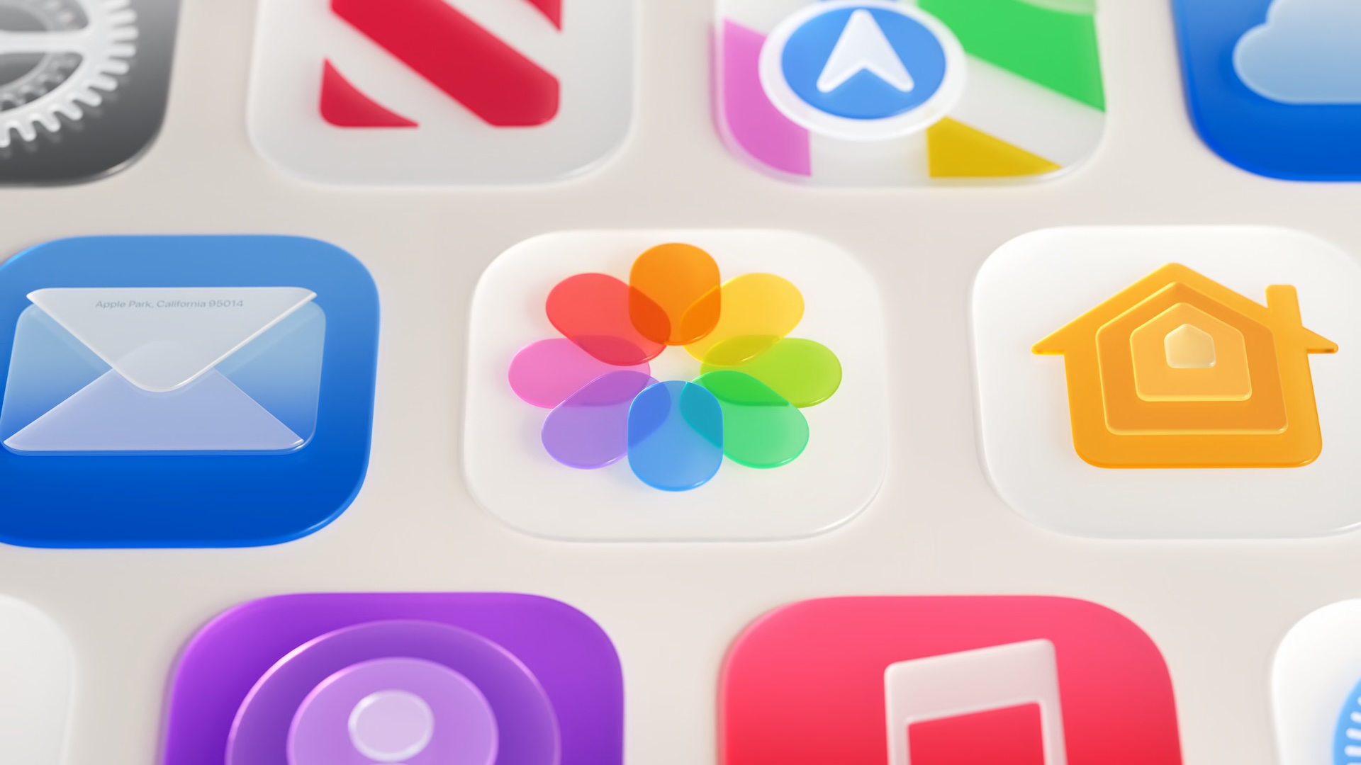
Photos-App-Icon-Liquid-Glass.jpg

Announced at the WWDC 2026 keynote and elaborated on further at the Platforms State of the Union, the changes address feedback that followed last year's rollout by making adjustments to the underlying foundations of how Liquid Glass is constructed.

At the core of the updates is a tuning of how the material handles content behind it. Apple has adjusted Liquid Glass so it more effectively diffuses complex content, improving readability throughout the system. To add greater depth and visual separation, Apple has also introduced a darkened edge around Liquid Glass elements, along with brighter specular highlights.

The headline change for users is a new transparency slider in Settings, which allows the look of Liquid Glass to be adjusted anywhere from ultra clear to fully tinted. The control goes considerably further than a binary toggle, giving users granular control over how much the glass effect appears across the system.

Apps already using Liquid Glass will gain many of these improvements automatically when running on iOS 27, without needing to be recompiled. Liquid Glass also adapts to accessibility settings such as Reduce Transparency and Increase Contrast.

Apple has also addressed behavior when content scrolls under floating bars. A uniform toolbar now appears across the top in these situations, keeping text legible while improving contrast. The effect is applied automatically for standard toolbars and can be further adjusted using the existing scroll edge effect APIs.

Icon rendering has been updated substantially. Apple says icons will now appear sharper and more defined, with new refraction features that can be selectively applied for added character. On macOS and iPadOS, developers also now have access to an API to surface icons for key app actions in menus, which are hidden by default.

Icon Composer, Apple's dedicated tool for designing app icons, has been updated to support building icons from multiple layers of Liquid Glass. New annotation features allow developers to add refraction or dial in content effects, while an interactive preview shows how a designed icon will look on earlier operating system releases.

Apple has also made a number of changes specific to macOS 27 Golden Gate, including further sidebar refinements and window corner radius updates. For a full breakdown of how Liquid Glass is evolving on the Mac, see our dedicated article.

Article Link: Here's How Liquid Glass Is Changing in iOS 27


Apple this week detailed a broad set of improvements to Liquid Glass, the translucent design language it introduced last year, spanning readability, personalization, sidebar behavior, and app icons.

Photos-App-Icon-Liquid-Glass.jpg

Announced at the WWDC 2026 keynote and elaborated on further at the Platforms State of the Union, the changes address feedback that followed last year's rollout by making adjustments to the underlying foundations of how Liquid Glass is constructed.

At the core of the updates is a tuning of how the material handles content behind it. Apple has adjusted Liquid Glass so it more effectively diffuses complex content, improving readability throughout the system. To add greater depth and visual separation, Apple has also introduced a darkened edge around Liquid Glass elements, along with brighter specular highlights.

The headline change for users is a new transparency slider in Settings, which allows the look of Liquid Glass to be adjusted anywhere from ultra clear to fully tinted. The control goes considerably further than a binary toggle, giving users granular control over how much the glass effect appears across the system.

Apps already using Liquid Glass will gain many of these improvements automatically when running on iOS 27, without needing to be recompiled. Liquid Glass also adapts to accessibility settings such as Reduce Transparency and Increase Contrast.

Apple has also addressed behavior when content scrolls under floating bars. A uniform toolbar now appears across the top in these situations, keeping text legible while improving contrast. The effect is applied automatically for standard toolbars and can be further adjusted using the existing scroll edge effect APIs.

Icon rendering has been updated substantially. Apple says icons will now appear sharper and more defined, with new refraction features that can be selectively applied for added character. On macOS and iPadOS, developers also now have access to an API to surface icons for key app actions in menus, which are hidden by default.

Icon Composer, Apple's dedicated tool for designing app icons, has been updated to support building icons from multiple layers of Liquid Glass. New annotation features allow developers to add refraction or dial in content effects, while an interactive preview shows how a designed icon will look on earlier operating system releases.

Apple has also made a number of changes specific to macOS 27 Golden Gate, including further sidebar refinements and window corner radius updates. For a full breakdown of how Liquid Glass is evolving on the Mac, see our dedicated article.

Article Link: Here's How Liquid Glass Is Changing in iOS 27
New icons look so much better, always thought 26 icons looked way too much like iOS 18 .

I’d still love to see icons go bigger like iOS 6 days, rather than limited to circles within the icon .
 
I wish they would change the Safari icon... It just feels so dated and out of place now compared to the rest of them. Here's a quick gemini icon I came up with, I think it matches much better (not perfect).

View attachment 2637092
I find the iOS 6 safari icon was so much nicer than the current one. The iOS 7 icons were generally ugly, but safari in particular was particularly so.
 
I really don’t notice this at all unless I’m looking for it or playing with the slider in Apple Music instead of just tapping the place I want to go… I guess that is all to say, I don’t care one way or another at present.
 
  • Like
Reactions: Apple Core
I'm officially tired of LG now. It was kinda fun for a hot minute, but it's basically a gimmick that's worn out. And I think it's already beginning to look dated as we speak. In some situations it's ok, but in others it's almost garish. I just do not need basic UI elements to be so glossy and distracting.
 
What a disaster Liquid Glass is. They are spending so much development on usability and basics that we’re already solved before they decided to release this abomination.

Here's the dilemma...

  1. User sees no visible changes — "Apple's not innovating!"
  2. Apple introduces a radical, modern new UI — "We liked how it looked before!"
Apple just can't win. I think their work on Liquid Glass has been forward-thinking and people will soon realize it was the best next step... a real physics-based UI.
 
def feels like a walk back. this whole OS update feels very stopgap.

they killed support for a surprising amount of devices without a lot of features and regression in styling.
They kept the iPhone update support

Plus the “unsupported” devices will receive security updates and minor bug fixes
 
  • Like
Reactions: TruthWatcher412
Here's the dilemma...

  1. User sees no visible changes — "Apple's not innovating!"
  2. Apple introduces a radical, modern new UI — "We liked how it looked before!"
Apple just can't win. I think their work on Liquid Glass has been forward-thinking and people will soon realize it was the best next step... a real physics-based UI.
In other words… Goomba Fallacy
 
I can't do the fully transparent or the monotone color look. It's too hard to find things when you're used to color. I wish there was a way to have the original app colors tinting the transparent glass. That would be cool!
 
  • Like
Reactions: Luftkopf
Register on MacRumors! This sidebar will go away, and you'll see fewer ads.