Apple still honestly has some time before the mass release of iOS 16 they can make this better, I'm one person who likes to see the percentage of my battery but I'm used to seeing it next to the battery logo, but if they fix it like some of the tests/demos shown in this post and thread it would be a great improvement
Got a tip for us?
Let us know
Become a MacRumors Supporter for $50/year with no ads, ability to filter front page stories, and private forums.
Here's Why the iPhone Battery Status Icon in iOS 16 Is So Controversial
- Thread starter MacRumors
- Start date
- Sort by reaction score
You are using an out of date browser. It may not display this or other websites correctly.
You should upgrade or use an alternative browser.
You should upgrade or use an alternative browser.
TheYayAreaLiving 🎗️
Suspended

Out of those proposed alternatives I actually preferred Apple's version.
It’s silly to complain about such a minor thing. Design could probably be better, but I’m just happy that this feature is avaible again.
This is the kind of attitude which runs through too much of Apple these days.
Steve Jobs worked on every little minute detail of a product to try and make the customer experience amazing.
These days Tim Cook is just milking the cash cow. Splitting product lines for no reason other than money grabbing.
Considering Apple just removed the battery indicator on the AirTag recently, I am surprised they even added it to the iPhone on the first place.
All these complains are just going to lead to them removing it all together again 😅
But also LOL at people on MR complaining about UI designers complaining about this. It is literally their job!
You may not have an eye for details or simply don’t care but that’s probably why you are not a UX designer anyway 🙃
They’ve only got one battery indicator so it had to come from somewhere.
I and a lot of other people are starting to question whether there even are any more UX designers or if they’re all UI designers. There are several things creeping into all the operating systems that look good but then don’t actually function that well. Notifications on Mac- well, notifications in general but especially on Mac. Hiding information until it’s moused over. Removing document proxy icons by default. I’m sure you can think of others.
Yeah I might not be able to do a better job of designing it but lots of people have quickly noticed shortcomings that they continue to not only ignore but lean into. Not that I’m actually sure this is one of them.
Oh and also that tiny millimeter of space under the dock ever since Big Sur drives me crazy. Just let it sit on the bottom like it used to! I don’t need to see the ever so slightest sliver of my wallpaper beneath it. It doesn’t have to float. I know it’s probably a minor complaint but it’s a total waste of space for an effect I’m not interested in and I don’t know of any way to turn it off.
Last edited:
Yes, people are dying fighting for their freedom, AND YOU'RE WASTING YOUR TIME AND ENERGY READING A STUPID APPLE RUMORS WEBSITE! WHY AREN'T YOU ON THE FRONT LINES FIGHTING RIGHT NOW?Literally people are dying fighting for their freedom and we are crying over a free new feature. Ok.
It's possible to care about more than one thing - even things of widely differing levels of importance - at the same time.
Wow, impressed by the number of people saying, essentially, "I don't care, so you shouldn't either", or whatabouting with everything else going on in the world. We're on a site dedicated to discussing even minor details of Apple products. It is possible to care about other things going on in the world, and also want better information display on your iphone.
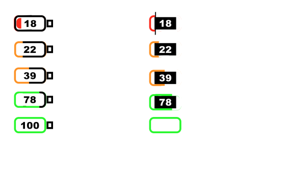
The iPhone currently gives the battery level in an analog format, which is good for a very quickly parseable general idea of the level, but which lacks precision. Like an analog watch. They are switching to a format that exclusively uses a digital readout for most of the time - this gives an exact number, but then the brain has to interpret that number to get to a general idea of the level. Like a digital watch. So, why not both?
The examples exhibited in this article show a number of better ways to handle this. When I initially saw the digital display, I saw it with a "100" (or maybe high 80's/90's?) display, with a full battery icon, and assumed the icon would become less full as the battery level lowered, like these suggestions show. I'm a bit dismayed that it appears Apple has completely forsaken the analog display in favor of digital, when that clearly wasn't necessary.
Exactly everytime someone does this someone has it worse, I always ask who is the one with the worst problems with the right to complain, and who are te judges to choose them?Yes, people are dying fighting for their freedom, AND YOU'RE WASTING YOUR TIME AND ENERGY READING A STUPID APPLE RUMORS WEBSITE! WHY AREN'T YOU ON THE FRONT LINES FIGHTING RIGHT NOW?
It's possible to care about more than one thing - even things of widely differing levels of importance - at the same time.
Regardless of the triviality, it’s a situation in which the fix is simpler than the problem it creates. While some may argue otherwise, it goes against generations of conditioning that a filled in battery icon means a full battery while one with some empty space indicates a battery is discharging and how much is left. This visual element serves as a gauge for whatever action or process is being tracked and, for many people, that is an important piece of information for the snap assessments and subconscious influences visual cues have in understanding textual information (e.g Analog watch faces not only tell the time but visibly indicate the progress of a day…something a pure digital time readout in a circular watch face would not). Keeping the battery icon filled in and putting a tiny number in there eliminates the visual cues. It ceases to function as a gauge and at worst can cause momentary confusion. It would likely be better to just put the percentage there and remove the battery symbol completely. The other concepts shared do a much better job of marrying the two elements by providing both the information (percentage) with the visible indication that something is happening (a gradually filling/ infilling battery icon).
deal breaker, absolutely deal breaker for me,
I cannot tolerate this anymore
Steve wouldn't allow this
I'm done for good
thank me later but I'm back into the android ecosystem, bye bye LMAO
I cannot tolerate this anymore
Steve wouldn't allow this
I'm done for good
thank me later but I'm back into the android ecosystem, bye bye LMAO
They’ve only got one battery indicator so it had to come from somewhere.
I and a lot of other people are starting to question whether there even are any more UX designers or if they’re all UI designers. There are several things creeping into all the operating systems that look good but then don’t actually function that well. Notifications on Mac- well, notifications in general but especially on Mac. Hiding information until it’s moused over. Removing document proxy icons by default. I’m sure you can think of others.
Yeah I might not be able to do a better job of designing it but lots of people have quickly noticed shortcomings that they continue to not only ignore but lean into. Not that I’m actually sure this is one of them.
Oh and also that tiny millimeter of space under the dock ever since Big Sur drives me crazy. Just let it sit on the bottom like it used to! I don’t need to see the ever so slightest sliver of my wallpaper beneath it. It doesn’t have to float. I know it’s probably a minor complaint but it’s a total waste of space for an effect I’m not interested in and I don’t know of any way to turn it off.
For me the problem is that Apple seems to try to squeeze new things into existing parts of the OS when they should just come up with something completely new to make the work flow work again with the new additions. Sometimes it is good to change a running system to get ahead!
As long as I can toggle this to off, I’m fine with it.
Wow the whinge-shaming in here is unbelievable. Who are any of us to tell others what they should or shouldn't like.
Ok, step in the right direction with a bit more tweaking needed, let’s see what happens in the ne t beta/rc
So you see more like glass half empty. 😂Another suggestion
Just leave the white ouline of the battery icon with white numbers inside. No background until the red 20% one. That way the full background won’t trick you to thinks it’s full at 60%

LOL. Yes, for me, precision counts for something. It's the reason I sold all my mechanical watches and just go with a quartz watch. I literally could not stand needing to interact with my watch weekly to make sure the time was precise. As for the iPhone battery, once you own your device for a number of years and the battery capacity becomes more challenged, I think it's important to know where you stand -- at least I want to know.I guess, if you feel the need to be so precise. I just look at it and if it's near the middle, then I am about half..ish way down and just plug it in for a while if I am sitting at my desk.
I was thinking more a fantastic example of change for the sake of change, regardless of any love or hate thrown towards it.A fantastic example of people looking for something to complain about.
Could definitely have been implemented in a better way. Anyway happy to see % back and hopefully Apple makes some change in a future beta.
Controversial? Wow, some people really need to get out of their house, they are losing it.
Apple are definitely not going to perfect the design, their days of doing that are long past. It's hardly controversial though, I agree. That's just a click bait headline.😂
Do all these people still not realize that it’s in beta? If anyone is gonna perfect a design in their UI, it’s gonna be Apple.
There’s nothing “controversial” about this. And if they decide to leave it like it is, so be it. I’m good.
I’m fine with the way it is but this option really looks nice.
Register on MacRumors! This sidebar will go away, and you'll see fewer ads.