Got a tip for us?
Let us know
Become a MacRumors Supporter for $50/year with no ads, ability to filter front page stories, and private forums.
Here's Why the iPhone Battery Status Icon in iOS 16 Is So Controversial
- Thread starter MacRumors
- Start date
- Sort by reaction score
You are using an out of date browser. It may not display this or other websites correctly.
You should upgrade or use an alternative browser.
You should upgrade or use an alternative browser.
Now THAT'S a first world problem. 🤣Lol, seven pages. How many "first world problems" comments have there been?

Remember, this is the FIRST beta drop with the new battery indicator. If you're a real developer account beta tester, send in reports making suggestions on what we really want in that indicator.
Yeah, your math isn't correct.
I know but it rolled off the tongue ☺️
Point being this is typical Apple these days. I shouldn't even be surprised. They killed the Safari sidebar for the sake of tab groups that not everyone uses and still haven't fixed it. Maybe in five years they'll fix that too...
That's the job of software development, to decide what's best for you. That's not left up to users.So turn it off... it's optional. And thanks for deciding what we all want for us.
I think it needs to ditch the icon and just keep the number. That way it will be bigger, like that 4/5g indicator and everyone will be able to see it clearly.
Your mistake is to have "the Verge" and journalism in a same sentence.Yeah for real. I just saw the Verge's headline "it's hideous" lmao, what the heck is going on with the quality of journalism these days
I feel completely neutral about this. Happy to see an indicator, think the style is fine. Personally, in OP I think all the alternatives in that tweet are worse tbh.
(caveat: It's enforced when in Low Power Mode.)
Wait, am I the only one who puts their phone into Low Power Mode the minute I get out of bed every day?
I believe the design needs to change, as many people (like myself) can't easily read the digits without glasses and the icon currently provides no indication of the charge level. Yes, a swipe right on the Home Screen still reveals a graphic of the charge level, but that's at least two physical steps (swipe right then swipe left to return to the Home Screen, if not swipe up to get to the Home Screen in the first place).
People have been complaining for years that Apple is too much focused on the looks rather than usability, now people are complaining that Apple gives us a simple readable number icon rather than making us read a number cut in 2 different colors just because "it looks cooler".
I'm not sure how any of these are improvements on what I have on my iPhone SE2 running iOS 14? Both seem like huge downgrades to the UI/UX to me? Who is actually getting paid to make everything *worse*? I can do at least half as bad a job, and I'll do it for half the money!
Seriously, what was wrong with green, yellow, red with numbers? You know, something that's actually visually useful?
Apple's continued fetish for form over function, and change for the sake of change, is just f'ing mind blowing.
I personally don't like the new design for several reasons... but I just simply switched back to the old design which never really bothered me.. I could usually look at the little meter and know what percentage I have within a 2-5% range of the actual number. If and when Apple changes the design I will switch to percentage, but otherwise I am happy without it... For the record I do like Alternative A from the article best.
I would if you could turn parts of it off. I don't like the screen to dim so fast, but I have no idea what else low power mode does since I don't notice anything going slower.Wait, am I the only one who puts their phone into Low Power Mode the minute I get out of bed every day?
Seriously people, get a grip. It’s fine the way it is, just happy it’s back. Toggle it off of you don’t like it.
Unfortunately it sucks. And to wait near 5 years to then have this as the solution is just bizarre.
Just numbers on their own would be better than this always full battery
I can't get the stupid thing to work on my Mini.
In the latest iOS 16 beta, Apple has updated the status bar battery icon on iPhones with Face ID to display the exact percentage remaining rather than just a visual representation of battery level, and while the change has been largely welcomed, some users are unhappy with the way it has been implemented.
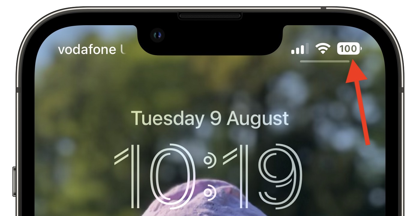
In iOS 15 and earlier, battery percent has not been present on iPhones that have Face ID because of the lack of space on either side of the notch that houses the TrueDepth camera hardware. The new design adds the specific battery level to the battery icon, providing a better idea of battery status at a glance.
In Apple's latest design, the white battery icon remains completely filled in as the battery level gradually depletes. When the semi-transparent percentage reaches 20% or lower, a fifth of the battery icon turns red and the rest of the icon becomes semi-transparent, while the percentage inverts to white.
Apple appears to have chosen this abrupt change in styling to ensure that the central percentage number remains legible as the battery level depletes – if a white bar depleted behind the number then it would be harder to make out at a glance, Apple's UI designers likely concluded.
Some users disagree with this approach, while others have suggested their own alternative designs for a battery status indicator with percentage level.
Perhaps Apple didn't anticipate that such a small design change would be so controversial, or that some users have a very clear idea of how they want their iPhone's battery level to be represented.
For some, it's simply a case of calling out what they consider to be poorly thought-out UI design. For others, it plays into low-battery anxiety, a major trigger of nomophobia. Either way, it's become a surprisingly heated topic, while it's easy to forget that the percentage display is optional (caveat: It's enforced when in Low Power Mode.)
Of course, the battery level indicator design isn't set in stone, and Apple well could change it in a later beta of iOS 16 or the final release. Whether you're testing the latest public beta or not, what do you think about the way it's been implemented? Let us know in the comments.
Article Link: Here's Why the iPhone Battery Status Icon in iOS 16 Is So Controversial

I'm pretty sure it's controversial due to the fact that Apple's gatekeeping it behind certain doors, and they aren't even being transparent as to which ones. The X gets it, the 11 doesn't, the 12 gets it, the 13 mini doesn't, even though the 12 and 13 mini have the same space (because the notch is smaller on the 13 mini).
I guarantee the proposed alternative designs will be unreadable on actual phone screens, especially the regular and mini sizes of phones. Masked text like that gets really hard to read at small sizes. It's easy to come up with alternative designs when you get to design for very large sizes.
I like the B alternative proposed. Maybe Apple will tweak this feature a fair bit in betas.
What's seriously wrong with green, yellow, red with numbers is legibility. Let graphic designers do graphic design. The proposed image is perfectly functional, and more legible than all of the suggestions from posters.I'm not sure how any of these are improvements on what I have on my iPhone SE2 running iOS 14? Both seem like huge downgrades to the UI/UX to me? Who is actually getting paid to make everything *worse*? I can do at least half as bad a job, and I'll do it for half the money!
Seriously, what was wrong with green, yellow, red with numbers? You know, something that's actually visually useful?
Apple's continued fetish for form over function, and change for the sake of change, is just ***** mind blowing.
A bunch of bored armchair UI designers wasting time on Twitter ≠ a "controversy" for most normal people.Perhaps Apple didn't anticipate that such a small design change would be so controversial
The whole point of Apple releasing betas to the public is to get feedback on implementations and changes.... So if people don't like something in a beta why can't they voice it? This the time to do so, because apple is more likely to listen and make changes if enough people provide feedback. get over yourself. this is the point of betas.... I'm sure you've never complained about anything apple has done right? the hypocrisy in this thread is at an all time high.Wow! Talk about first world problems! How much must you be looking for something to whine about in order to make this an issue. It's a picture of a battery with a percentage of remaining charge in it. It's crystal clear to anyone with any modicum of human intelligence. Yes, I'm sorry that your cat has a difficult time interpreting the picture, but short of that, I think it will work out for most humans!
I agree. That's why I submitted feedback. Told them I like the new icon but was concerned about low-contrast issues.The whole point of Apple releasing betas to the public is to get feedback on implementations and changes.... So if people don't like something in a beta why can't they voice it? This the time to do so, because apple is more likely to listen and make changes if enough people provide feedback...
Register on MacRumors! This sidebar will go away, and you'll see fewer ads.