Become a MacRumors Supporter for $50/year with no ads, ability to filter front page stories, and private forums.
Gimmick Island that will die and be forgotten as fast as the touch
This is the truth. Same as the 3D touchpress or whatever it was that never caught on. This “feature” is stupid. It won’t be around long…
I said that both because poking fun at apple fanboys is fun since they accept almost any new feature as "best thing ever" - but in all seriousness "everyone" knows that all phone mfgs are working on cameras, sensors etc that will be hidden under the screen. If it's doable now... probably not. This is a purely cosmetic improvement that shuffles things around on the screen to make it a bit better. That's it! Just like the touch bar along with similar products like customizable buttons with built-in screens... sure, that 2-3% of users will be extatic because THAT is what they needed... the rest will be in awe the first two months then say "meh".
 
  • Disagree
Reactions: Tech for Kings
I cannot wait to see now all the Android terminals that had a X shape coutout for years now, coming with the same implementations. That being said, great implementation, and a big hint to the fact that the notc... sorry, island, will not go away for years to come now. This will be a feature for the Pro models.
 
Personally think its a nice idea....The cynic in me suggests it gives Apple scope to not remove the Pill in iPhone 15
 
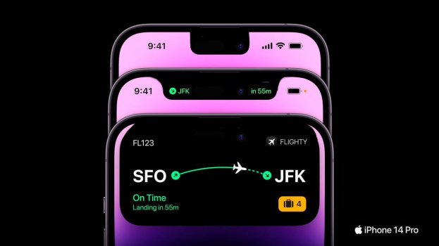
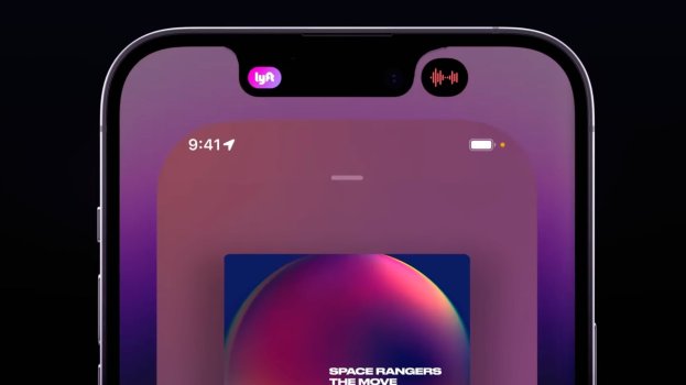
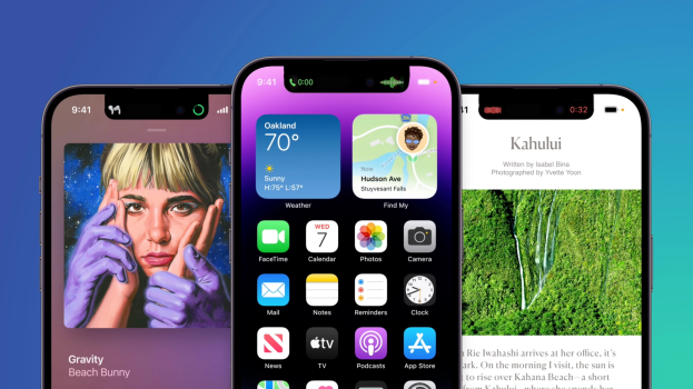
I have to say, Apple really surprised me with this dynamic island thing. Adding all this dynamics and functionality transforms dead pill-shaped space into a really useful UI element on screen. Design always needs "empty space" to function, and with carefully designed layouts, they managed to use that pill shaped empty space in different contexts beautifully.

Well done Apple.
 
With the crazy price increases in the UK on these new models, i’m more than happy that I got my 13 Pro when I did and definitely won’t be upgrading.

The A16 performance wise is almost the exact same as the A15. Battery life is essentially the same according to Apple’s specs. And I just can’t get used to the look of this new ‘dynamic island’ notch. I genuinely think it looks uglier than the 13 notch - it’s more noticeable and cuts down further into the useable screen area, which is significant even when it’s just a little distance due to video playback.

I also fail to see why this dynamic island is such an advertised ‘feature’ - sure you get a nice new status widget at the top but it does everything that my 13 Pro already can do. All of those live activity interactions will be just a swipe down for me in the notification center, and at the bottom they seem a lot more handy and useful than reaching up to the notch area to interact with them.

If you’re getting the 14 pro, more power to you. By all means it’s nice to see Apple try new things as it keeps things more interesting. I guess I’m just glad that this year I can rest knowing i’m genuinely not missing out on anything new by not upgrading from my 13 pro, in my opinion.
 
Incremental updates are not for everyone but some always want the latest stuff regardless of whether they need the power or features. Cant be seen in public with last years Porsche or iPhone.
 
  • Love
Reactions: Sergiu.
It's neat, but I see a couple things that could be improved...

The time is now hidden when a new call comes in. Can't quickly see the time to decide if you want to take the call before your next meeting, or maybe you're expecting another call soon.


The signal bars are now hidden during a call. Can't see if poor reception could be affecting the call at a quick glance.


This is exactly it. Similar to how Apple's caving to the Zero Bezel Society resulted in the notch compromise which resulted in much less usable space up top, which resulted in the major backstep like not being able to see battery % 24/7.

Or how adding certain statuses at the lock screen (like music controls upon waking) prevented seeing the day/date and countdown timer status immediately; you have to wait for the status screen to shuffle over to show the countdown status.

It's amazing how poor Apple's development team's judgement is sometimes when removing something that's deemed absolutely key/mandatory when bringing out something new. Or like the physical escape key when introducing the Touch Bar.

On a different topic, the dynamic island is just a reworking of the smaller notifications that already permit opening up for more functionality, like when you receive a text and can open/respond without moving away from the app you are in. Just now with better marketing/implementation to add some add'l features and cover up the notch/pill.
 
  • Disagree
Reactions: Tech for Kings
I was all set on the 14 plus but the new DI features and always on exclusive to the Pros has caused me to switch to the 14PM. The DI is a welcome surprise and reminds me of the Apple innovation we used to get.
 
  • Haha
  • Like
Reactions: Bawstun and Tagbert
Errrm there is a very clear silent mode indicator on the side of your phone? Just look at the button? Because Apple makes the hardware, not everything needs to be on the screen. I've never had any trouble looking at the button. It's even marked red when activated.
That's a bad place to put the silent mode status indicator. It's not visible while using the phone (checking the time, writing messages, etc.), especially in the darkness. People rarely look at any side of the phone except the front. That's why the indicator should be displayed on the front panel, the screen in particular. Because of the lack of the indicator on the front people tend to miss notifications and messages when using iphone:
Screen Shot 2022-09-01 at 04.58.25.png

Screen Shot 2022-09-01 at 04.58.57.png
 
I think putting things under the screen is not going to be there for a while until Apple feels it can implement it with low to almost non existent failure rates. For example the under screen fingerprint scanner on Samsung and Pixel phones has been quite the frustration as finger placement and consistent activation are constant issues
I know the few phones that have tried it with cameras have had pure **** quality, so I don't expect it anytime too soon.
 
  • Like
Reactions: Tagbert
Am I the only kne worried about how the touch points could potentially be focused at the top again after all these years of trying to move them towards the bottom?
 
It's neat, but I see a couple things that could be improved...

The time is now hidden when a new call comes in. Can't quickly see the time to decide if you want to take the call before your next meeting, or maybe you're expecting another call soon.


The signal bars are now hidden during a call. Can't see if poor reception could be affecting the call at a quick glance.

Buy your mom an Apple Watch...
 
I wouldn't call it a flaw, it is just the only useful technology available today. Under screen tech isn't ready for primetime. So making the most of the situation they are in is a better way of putting it.

Having a hole in the screen is a flaw to me.
 
I was referring to the camera and the FaceID tech.

Since Touch ID isn't a feature on the new iPhones and likely never will be again since FaceID is superior, I didn't think I needed to specify that.
in what regard faceid is superior to (underscreen) fingerprint sensors on a phone?
in design? no, notches, pills, etc look uglier.
screen real estate? no.
cost? no, it costs more.
size it takes inside such a small device like a phone? no, fingerprint sensors are smaller, the spare space could be used for bigger battery e.g.

There are just too many tradeoffs when using a face recognition system on a phone.

P.S. If you claim that faceid is better than touchid, then why it's not used in any mac? TouchID is used instead in imac and apple (XDR) monitor + mac studio.
 
Last edited:
To reinforce a bit what I've said earlier, that this will be sold as a feature, and it was made on purpose to put a stop to everybody that required Apple to drop the notch. They won't.


Screenshot 2022-09-09 at 15.38.41.png
 
I don't see any reason it wouldn't work with the notch just as well, and it seams to me that the notch is higer up on the display
 

Attachments

  • flighty-iphone-14-digital-island.jpg
    flighty-iphone-14-digital-island.jpg
    52.2 KB · Views: 52
  • dynamic-island-split.jpg
    dynamic-island-split.jpg
    80.3 KB · Views: 48
  • iphone-14-pro-blue-image-2 copy.png
    iphone-14-pro-blue-image-2 copy.png
    1.8 MB · Views: 50
Register on MacRumors! This sidebar will go away, and you'll see fewer ads.