Become a MacRumors Supporter for $50/year with no ads, ability to filter front page stories, and private forums.


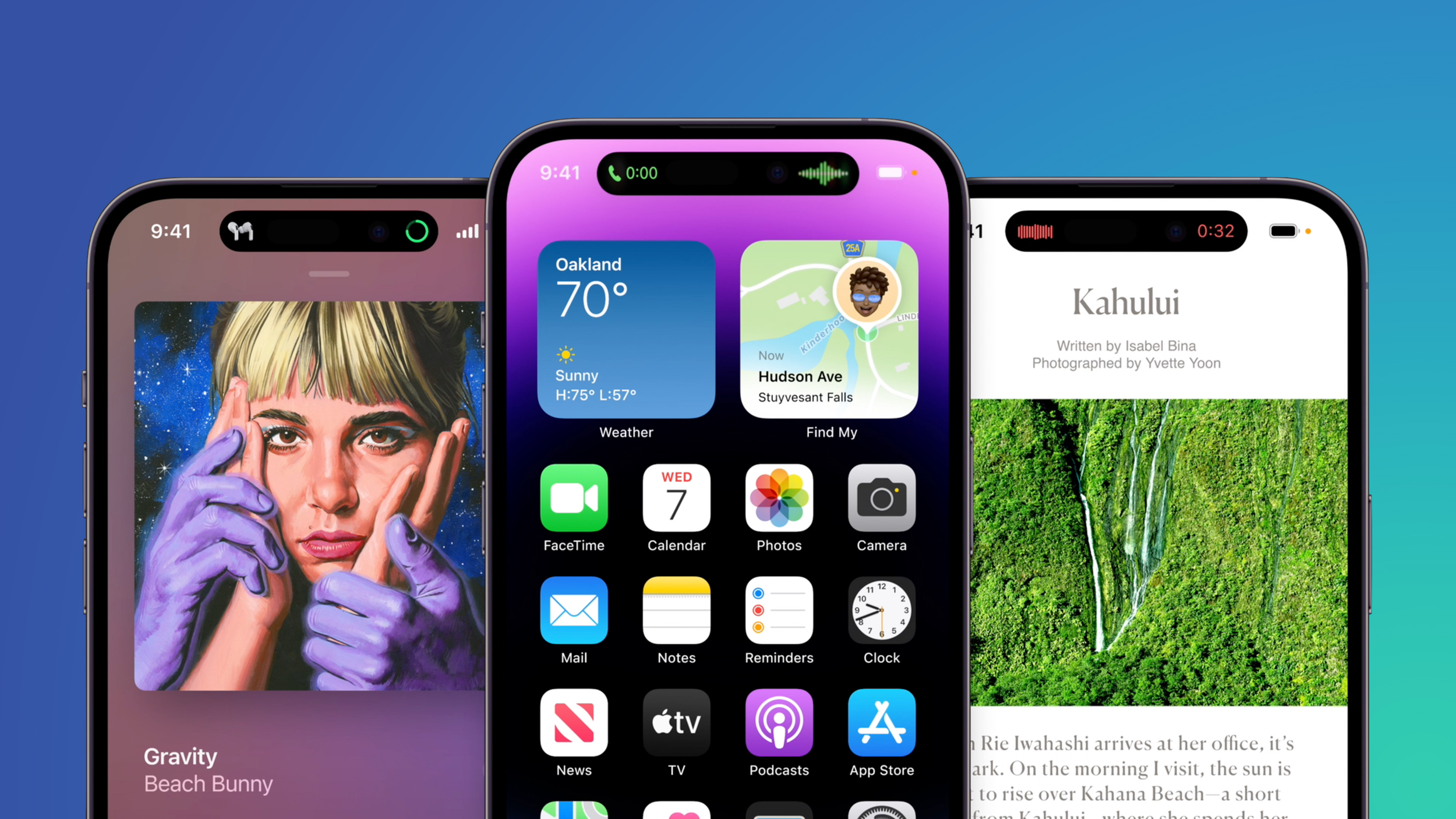
With the launch of the iPhone 14 Pro and iPhone 14 Pro Max, Apple introduced an updated design that does away with the notch at the front for the TrueDepth camera. Instead, Apple has slimmed down the hardware and put the proximity sensor under the display, allowing for a smaller pill-shaped cutout.


As we learned during the rumor cycle, the new cutout consists of a circle for the camera and a second pill-shaped cutout for the TrueDepth hardware, but Apple has combined these into a single cutout that it is calling the Dynamic Island. We thought we'd take a closer look at the Dynamic Island, which is one of the most clever user interface changes Apple has implemented in recent years.

Dynamic Island Shape

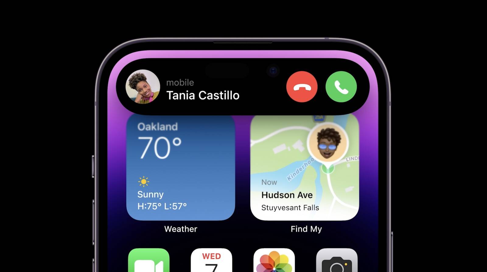
The Dynamic Island is not a static cutout, and can shift in size and shape to blend itself into the UI and provide new visual tools front and center on the iPhone's display. In standard usage, it is a small pill-shaped cutout, but Apple uses pixels to expand it to match different tasks.

iphone-14-pro-blue-image.jpg

When making an Apple Pay payment, for example, the Dynamic Island expands into a square shape to match the Face ID confirmation interface, and while on a phone call, it expands to be larger so you can have the phone controls front and center.

Basically, the Dynamic Island is able to house ongoing background tasks that you might need to come back to while doing other things on your phone

Ways the Dynamic Island Can Be Used

So far, we only have Apple's demonstrations to go on, but it looks like the Dynamic Island can show all kinds of different information. We're rounded up the ways it's been used so far.

iPhone-14-Pro-Dynamic-Island-3.jpeg

  • Expanded into a large rectangle to show upcoming Maps directions without having to open the Maps app.
  • Displaying Maps directions in a smaller pill-shaped interface for when you just need a quick glance at the next turn.
  • Square shaped for an Apple Pay payment confirmation.
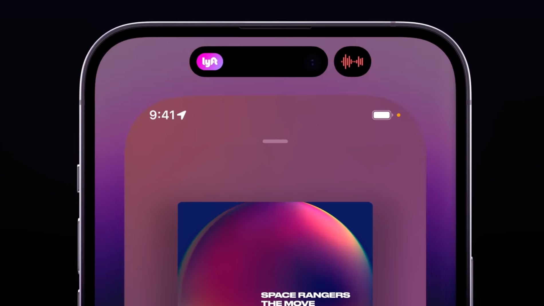
  • Showing a music waveform and time remaining on a song that's playing.
  • Tracking the time of arrival of a Lyft.
  • Displaying privacy indicators when the microphone or camera is in use.
  • Displaying a small bar with the phone icon and the length of the phone call.
  • Showing a timer.
  • Keeping track of sports scores.
  • Accessing music controls and a music player.
  • Showing AirPods connection status and battery life.
  • Displaying iPhone charging status and battery life.
The Dynamic Island can show notifications or information that you're actively keeping up with. It's going to work with the Live Activities feature coming in iOS 16, so you can track sports scores, Uber rides, and more right from the top of the iPhone's display.

It's worth noting that any time the Dynamic Island is in use like this, it is doing its task without interrupting what you're doing in the app you're in. So if you're reading Twitter, you can also be controlling your music through the Dynamic Island with just a tap.

Split Island

Because the TrueDepth camera system is actually housed in two separate cutouts that are merged through software, the Dynamic Island can do a neat trick where it separates into a small pill on the left and a circle on the right, both of which are able to display different information at the same time, such as music controls and a timer.

dynamic-island-split.jpg

Dynamic Island Interaction

When tapped, the Dynamic Island expands to become larger so you can interact with the content that it's offering at the current time, and when you're in an app, you can swipe up to send the app's content to the Dynamic Island so you can get back to the Home screen.


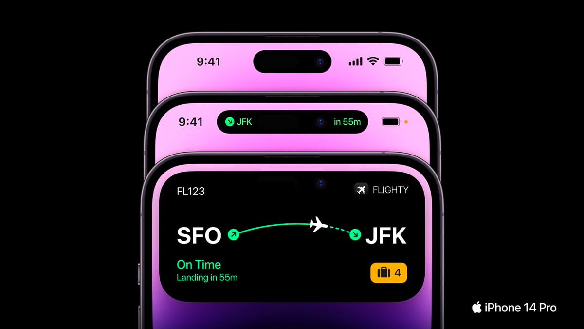
Third-Party App Support

Apple is allowing third-party app developers to integrate their apps into the Dynamic Island so you can access third-party app content as well as Apple's own app content. Third-party app Flighty, for example, is able to put your flight information in the Dynamic Island so you can see it with a tap.

flighty-iphone-14-digital-island.jpg

Dynamic Island Reactions

So far, reactions to the Dynamic Island have been largely positive, as can be seen in our roundup of commentary on the feature. It has been called "one of Apple's best designs."


Availability

The Dynamic Island is limited to the iPhone 14 Pro and the iPhone 14 Pro Max. The standard iPhone 14 models continue to offer the same notch as the iPhone 13 models.

Additional Coverage

We'll be picking up an iPhone 14 Pro when preorders go live tomorrow, and when it's delivered on the 16th, we'll do an in-depth look at all of the new features, providing a much more detailed overview of the Dynamic Island and its functionality.

Article Link: How the iPhone 14 Pro's New 'Dynamic Island' Works
Has anyone seen how a normal notification such as an iMessage will look? Very interested to see how this is done
 
  • Like
Reactions: bejib66000
Because the TrueDepth camera system is actually housed in two separate cutouts that are merged through software, the Dynamic Island can do a neat trick where it separates into a small pill on the left and a circle on the right
I haven’t seen Apple splitting the pill in software between the two cutouts. They always seem to create a separate circle in software and not the one from the camera.
 
I haven’t seen Apple splitting the pill in software between the two cutouts. They always seem to create a separate circle in software and not the one from the camera.
Right? How the camera system is split doesn’t have anything to do with that little circle um in the right.
 
  • Like
Reactions: kiensoy
I am flabbergasted that people see these demos and think the deadspace pill shape isn't still just a deadspace pill shape. All the cool stuff is just activity kit which we saw demoed at WWDC, and it's nice and all, and all they're doing is making the backgrounds of those things always black and hiding the pill shape in the margins so you don't see the deadspace pill shape. but it's still a deadspace pill shape.
 
I am flabbergasted that people see these demos and think the deadspace pill shape isn't still just a deadspace pill shape. All the cool stuff is just activity kit which we saw demoed at WWDC, and it's nice and all, and all they're doing is making the backgrounds of those things always black and hiding the pill shape in the margins so you don't see the deadspace pill shape. but it's still a deadspace pill shape.
So… to be clear… you still think it’s a dead space pill shape right?
 
To me it looks like an ergonomic nightmare? When I'm holding my iPhone 11 Pro my thumb doesn't reach the top of the screen - so why move all these widgets to a part of the screen I can't interact with? I like them in the middle of screen where my thumb reaches.

Example, right now a call comes in - boom I can use my thumb to hit the green button at the bottom of the screen. Why move that way the hell up the screen (in the example).
You've been able to use an iPhone 1-handed since the 5? I haven't.... oh for my 4s, the last phone I could use 1-handed. :-( .
 
Just sit right back and you'll hear a tale,
A tale of a fateful notch
That started from this west coast port
After the Apple Watch.

The mate was a mighty counter man,
The skipper looming large.
An unincluded power brick.
For a small extra charge, a small extra charge.

The refresh rate started getting rough,
The LCD's were tossed,
If not for the COURAGE of Tim and crew
The notch would be lost, the notch would be lost.

The screen settled down with this mighty morphin isle
With Timmy and
Mr. Eddie Cue
The Williams' heir and his wife
Srouji Hard (ware)
And the rest
Here on dy-na-mic isle.
 
Last edited:
I am flabbergasted that people see these demos and think the deadspace pill shape isn't still just a deadspace pill shape. All the cool stuff is just activity kit which we saw demoed at WWDC, and it's nice and all, and all they're doing is making the backgrounds of those things always black and hiding the pill shape in the margins so you don't see the deadspace pill shape. but it's still a deadspace pill shape.
That literally doesn't bother me.

I like the clever bit of UX Apple is doing to integrate the cutout with the OS.
 
It is and the people crapping on it are for the most part Android users who were prepared to crap on anything presented.
I’m an iPhone user and I don’t like it as it’s basically taking up even more space then the notch,

I’m sure Apple will have an option to disable it. Visually just the pill design looks better then the notch.
 
  • Disagree
  • Like
Reactions: Tagbert and ric22
this is why I’ve never had an issue with the notch. Yes it cuts in to the picture but to me at least it didn’t stand out as much as a hole punch because it blended in to the border.
I will say I really like the UI implementation and I don’t watch a lot of videos on my phone so I will reserve judgment I guess.
 
I am flabbergasted that people see these demos and think the deadspace pill shape isn't still just a deadspace pill shape. All the cool stuff is just activity kit which we saw demoed at WWDC, and it's nice and all, and all they're doing is making the backgrounds of those things always black and hiding the pill shape in the margins so you don't see the deadspace pill shape. but it's still a deadspace pill shape.
Absolutely true.

But it’s a FUN deadspace pill shape now. It’s actually a target, something to interact with.

The way I see it is , it was gonna be there anyway, but now Apple has tricked us into something new, fun, and actually useful.

It makes me happy, the WAY IT WORKS.

But hey, we all see what we want to see, so I don’t fault you for the disdain.
 
  • Like
Reactions: cyanite and Tagbert
S*** like this is why I LOVE Apple.

I also don’t get the hate for the name. Apple has ALWAYS done stuff like this. ProMotion. MagSafe. Etc.

I like it. The “DI” for short.

It's just the way it is. Many people can't feel good about themselves or feel they need to be noticed by others. And one way to ameliorate that is to find something innocuous to be outraged about on a public forum.
 
  • Angry
Reactions: ric22
Register on MacRumors! This sidebar will go away, and you'll see fewer ads.