Become a MacRumors Supporter for $50/year with no ads, ability to filter front page stories, and private forums.
You can hate on the notch as much as you want from an aesthetic standpoint, but not in any logical one from a usage POV.

The old 16” screen was 16:10.

The new 16” one is 16:10 *below the notch*. So everything full screen is just as good. There’s no notch in any area where you wouldn’t have had one on the last gen.

The people against the notch refuse to consider this.
 
  • Like
Reactions: Piplodocus
I have no issues with the notch.

I absolutely don't understand all the notch haters who outdo each other at finding ever more extreme ways to express their disdain for the notch. I mean, seriously, how much can you hate such a relatively insignificant detail :rolleyes:

It still seems ludicrous to me that people are complaining about getting more screen real estate.

If you have the choice between no notch with less screen real estate and a notch that can either allow for more screen real estate or look the same as if it weren't there, then the latter has only advantages and no disadvantages. The notch is all upside, no downside.

It's also all the same people who say they don't care about design and they just want a powerful machine, not at the expensive of thinness, weight, looks or lack of ports - suddenly losing their mind over a notch and design all of a sudden is the most important thing for them.
 
  • Like
Reactions: Stella
Travels behind the notch . . . sounds like an afterthought.
I think it's the simplest solution. Traveling across the menu bar and "hitting" the notch and hence needing to mouse around it like an obstacle would be far more annoying. People aren't going to be losing their mouse pointer behind the notch, because a) it's a small space, b) you can already shake your cursor to find it, and c) there's very little reason for them to leave their pointer in that space on any Mac computer right now, let alone one of these ones.
Maybe I'm in the minority, but I have no issues with the notches.
I get where people obviously prefer an uninterrupted screen, but especially considering that ideal does come with its own realities and drawbacks I don't get why people get so bent out of shape about it. Rare is the time I spend contemplating a notch on my phone, and there it isn't really added space (like how the notch is in this one versus a 16:10 display) and is far more of the total surface area of my screen.
 
  • Love
Reactions: chabig and Tagbert
I guess there will be a solution for disabling notch area permanently, not only in full-screen mode. If screen blacks are that good, it won't be different from regular thicker bezel.


The new 14-inch and 16-inch MacBook Pros both feature a notch, a first for the Mac. Given we've never had a notch on a Mac, there are some questions over how macOS handles the notch, and more specifically, how the mouse pointer does.

macbook-pro-2021-notch-feature2.jpg

The predicament about how the mouse pointer handles the notch has been a question floated across Twitter and Reddit over the last 24 hours or so since the new MacBook Pro's announcement. An animation 
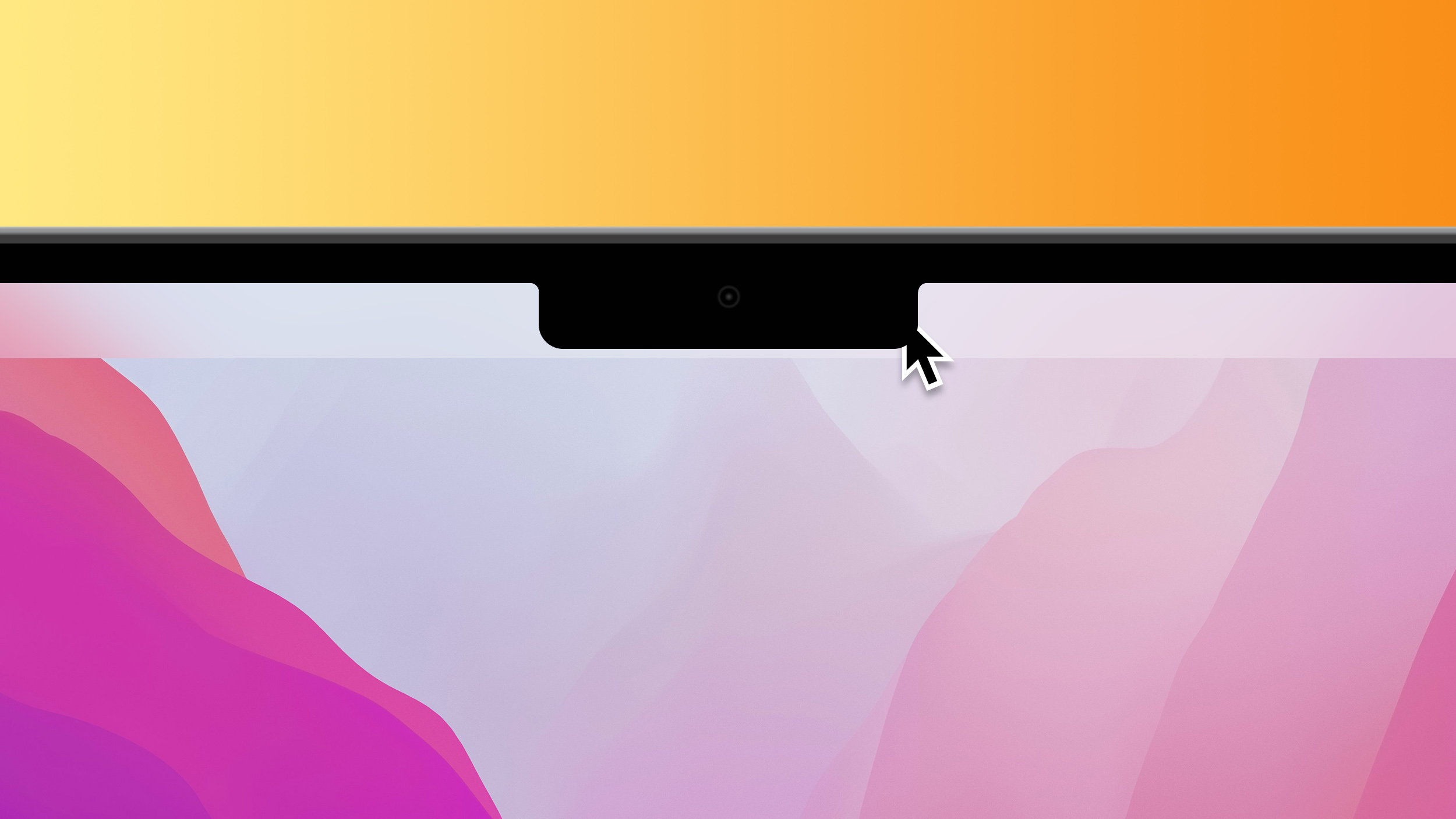
posted on Reddit portrayed two main possibilities, one in which the mouse pointer travels behind the notch, being invisible to the user. The other option showcased the mouse pointer traveling around the notch.

The new MacBook Pros will begin arriving next week, but thankfully, we don't have to wait that long to get an answer. Linda Dong, an Apple designer, has confirmed on Twitter that the macOS pointer travels behind the notch, allowing users to essentially hide the mouse pointer from view.

This behavior will come in handy, fundamentally making the notch a hiding place for the mouse pointer. This may come in good use, for example, when users want to more easily hide the mouse pointer while they watch a video.

Apple is taking steps to make the notch less of an annoyance for most customers in day-to-day use. When macOS apps are in full-screen mode, Apple adds an artificial black bar to the top of the display that hides the notch. Developers can, however, opt to allow their apps to make full use of the entire screen real estate, notch included. Learn more about the new 14-inch and 16-inch MacBook Pros in our comprehensive roundup.

Article Link: How the Mouse Pointer Deals with the Notch on the MacBook Pro
The "notch" will serve as an iGarage for your mouse pointer! By using the iGarage feature, you will gain two more zeptoseconds of battery life!
 
This actually makes me like the notch. (Before I didn't care). When I'm writing full screen I hate seeing the mouse. If this means I can just toss it up and have it hide from view that's a great feature.
The right side of the screen has worked for this for 30+ years now.
 
  • Like
Reactions: chabig
If it jumps around it, that'll make it even more annoying.

And since only a small fraction of people use whole screen mode, we need the ability to do the same thing - black it out and never, ever, see it
Having an option of always showing the black band would be WAY better for me, but I'd actually have to see it in action before I'd think of ordering one. I don't think it would be invisible enough, but I wouldn't mind seeing if it is.
 
Am I the only one that just sends it all the way to the right of the screen? Not hidden entirely but close enough.
I wouldn’t go so far as to call this a feature. More like an unintended consequence of an idea that was not fully thought out.
No, you're not the only one, and it works that way in Windows too.
 
  • Like
Reactions: Stridr69
A photoshop template to add a black bar on top in line with the notch would be great. That way you can easily have any wallpaper and trick the notch / menu bar into being black at all times
Except the menu bar needs to be displayed in a lot of apps. What you'd have to do is move the menu bar down instead.
 
So do you prefer having a black bezel and no screen on the sides of the camera as on older models, or no camera at all?
Either would be fine for me. I may be notch intolerant, but I'm not bezel intolerant. (unless it's like 2"'s all the way around.) I really don't need a camera though...
 
  • Like
Reactions: CC77
I've heard a lot of complaining over the notch but yet I have yet to read one single post that addresses something different! There's nothing more frustrating than people complaining instead of suggesting a solution. By all means, explain the issues/flaws but address it with a solution.
Put the bezels back and the camera on the bezel. It's been said many times.
 
  • Like
Reactions: CC77
Travels behind the notch . . . sounds like an afterthought.
Definitely not. The alternative would have the pointer hit the notch like a wall, so that a user swiping along the top would have to maneuver around it. Going behind it is the only approach that makes sense.
 
  • Like
Reactions: chabig
I happen to have a Logitech webcam on top of my 27" monitor. It has a base that looks exactly like a notch, hanging off the top border and covering the menu bar. It is very annoying.
But at least you can take it off when not in use!
 
Put the bezels back and the camera on the bezel. It's been said many times.
So, reduce functional screen size to what it was before? That seems like a bad idea.

I don't love the look of the notch, but I greatly appreciate Apple's attempt to reclaim some of the space lost to the menu bar in situations where the menu bar is present. Since the center of the menu bar is rarely used for anything -- and probably never essential -- why not have it and the camera assembly occupy the same space?
 
Maybe I'm in the minority, but I have no issues with the notches.

You're not. I'd say the vast majority of iPhone/Mac users don't have issues with it. There is a small, vocal minority though who have decided it's an issue, and so you normally only hear about it in a negative context. If they'd simply use their device and not fixate on "the notch", they'd soon forget it's even there.
 
  • Like
Reactions: chabig
So, reduce functional screen size to what it was before? That seems like a bad idea.
If that's the only way to get rid of the notch, yep, and I wouldn't even have to think about it.

I don't love the look of the notch, but I greatly appreciate Apple's attempt to reclaim some of the space lost to the menu bar in situations where the menu bar is present. Since the center of the menu bar is rarely used for anything -- and probably never essential -- why not have it and the camera assembly occupy the same space?
Because the notch is ugly and takes up room on the menu bar. As for never used, nope, not correct. Any app with lots of menus/status icons could be impacted.
 
  • Like
Reactions: CC77
Put the bezels back and the camera on the bezel. It's been said many times.
Not that simple. Then my menu bar will be in the same place it is on the current 16” - taking up some of my main 16:10 area. I’ll have less screen real estate to show tracks and synths in Ableton Live. Gimme that extra 75 pixels for *16:10-and-a-bit* for my menu bar and more space with 16.2” and I can actually be more productive. You can have a smaller screen with straight bezel, or more screen with a notch. I want more screen if possible.

I’d currently run Ableton full screen to maximise the screen as much as possible for this reason, but the top menu bar jumps down too easily after too short a time over the top of Live’s top controls when trying to do stuff as fast as possible. So I don’t do that as then I have to wait for it to go away before I can click controls when I inevitably overshoot. I’m always running with max window size and menu bar showing. But getting that menu bar up into the new space suits me great. Yeah I get a notch. But the cost is negligible to taller more usable screen area. So no. That’s not a solution to giving me more screen area in the same size laptop. Gimme that extra screen in the unused space each side of my camera.

Or if you want an *actual solution* bezels back, but gimme a 17”! I’ll take a 17” without a notch. But then others may complain it’s too big. As the old saying goes “You can please some of the people all of the time, or all of the people some of the time, but not all of the people all of the time.”

I’m sure probably sooner or later you can shrink your useable screen and move the menu bar below the notch via software probably in some future add-on. I won’t be able to magic extra pixels onto mine later in the unused space in the bezel. So your “fix” is removing what would be an improvement for me in a lot of use cases just for aesthetics. Just get Apple to give you software checkbox, not make the screen smaller again. 🤷🏻

People complain about the notch on the iPhone, but would they really rather go back to a smaller screen and move the status bar down into their app area? Sure everyone would rather no notch, but if the option are notch and more screen or a smaller perfectly-rectangular screen I’m guessing they’d still rather a notch and that extra line or 2 on that webpage due to the bigger display. I’m still on a 6S. You can happily take all the unused space on the bezels of this phone in exchange for a notch and a load more screen (although I’d still take a Touch ID button on the side if an option - but that’s another discussion entirely)
 
Not that simple. Then my menu bar will be in the same place it is on the current 16” - taking up some of my main 16:10 area.
It's that simple for me. But they could have actually made the screen even bigger physically, and still put the camera in the bezel. i.e. making a new menu bar that's above the 16:10 area, unbroken I might add, and you'd get even more screen real estate.
 
  • Like
Reactions: CC77
Or if you want an *actual solution* bezels back, but gimme a 17”! I’ll take a 17” without a notch. But then others may complain it’s too big. As the old saying goes “You can please some of the people all of the time, or all of the people some of the time, but not all of the people all of the time.”
That'd be fine by me -- I wouldn't consider it, it'd be too heavy for me, but I certainly wouldn't complain!

If I wanted a good size bigger, I'd use a Mac mini and a large screen -- oh wait, I already do that. 27" no notch. :)

Anyway, they really should have had a choice of notch or no notch, then we wouldn't have had anything to complain about. (well, it is Macrumors, so someone would think of something) Like the old 13" MBP, it had a choice of touch bar or not...) I really wanted one of those new M1 Max's, but oh well, it is what it is and I have more than enough computing power already.
 
Register on MacRumors! This sidebar will go away, and you'll see fewer ads.