Become a MacRumors Supporter for $50/year with no ads, ability to filter front page stories, and private forums.
What I find interesting is all of the (or most) android watches look amazing in professional photographs - then you see them in person and they all look cheaply made. I was really excited to see the moto360 at the Best Buy near me - picked it up and - wow - what a difference from the pictures. I haven't seen the apple watch in person - but the non-professional pictures still look beautiful. Apple products, I feel, tend to look better in person.
 
I agree with what Huawei stated... Huawei watch looks like a real watch while Apple watch looks like a Casio from 1980
 
I actually like the looks of their watch, but to each their own. I'm a fan of round watches, never liked square watches. I own a Moto 360, and that's what drew me to it, that it's round, and of course, a really cool smart watch. To each their own, If I hadn't bought the 360, I'd probably look into the Huwei. I just need a company to make a round smart watch that syncs with the iPhone.

----------

What I find interesting is all of the (or most) android watches look amazing in professional photographs - then you see them in person and they all look cheaply made. I was really excited to see the moto360 at the Best Buy near me - picked it up and - wow - what a difference from the pictures. I haven't seen the apple watch in person - but the non-professional pictures still look beautiful. Apple products, I feel, tend to look better in person.

I think Apple makes really good quality products. They are just awesome, that being said, I can't tell you how many compliments I get on my Moto 360, everybody I run into loves it. To each their own though, I think it looks great.
 
I actually like the looks of their watch, but to each their own. I'm a fan of round watches, never liked square watches. I own a Moto 360, and that's what drew me to it, that it's round, and of course, a really cool smart watch. To each their own, If I hadn't bought the 360, I'd probably look into the Huwei. I just need a company to make a round smart watch that syncs with the iPhone.

----------


I think Apple makes really good quality products. They are just awesome, that being said, I can't tell you how many compliments I get on my Moto 360, everybody I run into loves it. To each their own though, I think it looks great.

If you're happy, thats all that matters!!!!! :) Taste is very personal.
 

Attachments

  • 16506254060_3e632778ec_c.jpg
    16506254060_3e632778ec_c.jpg
    96.8 KB · Views: 166
According to the linked article Huawei didn't single out the Apple Watch as 'geeky and clumsy', but rather applied it to (non Huawei) smart watches in general.

The Huawei watch, particularly the faces, can look fantastic...

dRRup5h.jpg


...although those *have* to be renders rather than photos – the displays look too perfect – and that side-on photo of the gold model looks a) badly machined, and b) ridiculously fat.
 
Out of curiosity why are some saying the screen looks like crap?

Pixel density?
The exposure of this particular photo under artificial lighting?
The design of the on screen face?

It's just a screen, which can show anything of course, as long as the pixel density is good, the colours are bright and vivid, then what's the problem?

I appreciate some don't agree with the round format.
The bezel width looks reasonable. Less than the Apple watch, but more than the 360, but of course no area at the bottom like the 360.

What's the issue with the screen?
 
Understanding

I see big problem with these designs and logic that most people think Apple watch or the iPad are devices mainly for replacement of something (watches, notebooks, etc.).

Design of the Apple Watch is great. HW/SW - simple and function. Bright colors and mostly vector graphic on the deepest black that you can have for the easy readings. Force touch, Digital Crown (rotary movement and button), One extra button and touch interface. Well, yeah....the're clumsy :D
 
What I find interesting is all of the (or most) android watches look amazing in professional photographs - then you see them in person and they all look cheaply made. I was really excited to see the moto360 at the Best Buy near me - picked it up and - wow - what a difference from the pictures. I haven't seen the apple watch in person - but the non-professional pictures still look beautiful. Apple products, I feel, tend to look better in person.

I agree with you re: Android OEM watches looking better in computer renders than in real life. Even on The Verge posters were originally loving the Huawei watch when first revealed and then disappointed when real life photos came out. But for a lot of people round automatically equals better, nicer, non geeky.

----------

According to the linked article Huawei didn't single out the Apple Watch as 'geeky and clumsy', but rather applied it to (non Huawei) smart watches in general.

The Huawei watch, particularly the faces, can look fantastic...

Image

...although those *have* to be renders rather than photos – the displays look too perfect – and that side-on photo of the gold model looks a) badly machined, and b) ridiculously fat.

These are definitely renders. The watch doesn't look this good IRL.

----------

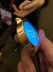
I agree, but the screen looks pretty bad in real life:

Image

Does that say OK Google? Hard to read.
 
What's the issue with the screen?
The face design looks rushed and cluttered.

It doesn't bode well for a contender to unveil their new product to the world with (obviously) little thought put into the UI.

"OK oogle". Seriously. Don't they care?

----------

...although those *have* to be renders rather than photos – the displays look too perfect...

Of course they're renders. The faces appear to be reflecting ambient light. Something a light source wouldn't do.
 
The face design looks rushed and cluttered.

It doesn't bode well for a contender to unveil their new product to the world with (obviously) little thought put into the UI.

"OK oogle". Seriously. Don't they care?

----------


Of course they're renders. The faces appear to be reflecting ambient light. Something a light source wouldn't do.

It does say Google but you can't see the G. Who thought it a good idea to place text directly over a clock face with complications?
 
The face design looks rushed and cluttered.

.

I have to admit, I don't really take a lot of notice of face designs on these devices.

When I buy one, I certainly won't be using any of the watch makers faces anyway. That's like buying a computer and using the default background wallpaper it comes with.

Or more so, going into a computer store and buying or not buying a PC/Laptop based upon the wallpaper and icons on screen!

If the screen is technically great as a screen, bright, crisp, clear with high pixel count that's what matters.
Then I shall go and select the face from 100's probably 1000's of different ones there will be waiting for me.
 
Then I shall go and select the face from 100's probably 1000's of different ones there will be waiting for me.

With all those screens waiting, you'd think the manufacturer would've selected a better one for the product publicity shots? :confused:

First impressions, and all.
 
With all those screens waiting, you'd think the manufacturer would've selected a better one for the product publicity shots? :confused:

First impressions, and all.

Well, I cannot disagree with that.

If I had made any watch, I would wish to make sure I had got someone very good to design a very nice face, or selection of faces for my product.

But you see, we are again going down the fashion and personal taste route.
I think most men's watches, look like something a teenage male would like before any sense of taste kicked in. But they sell by the million.

We all like different things when it comes to fashion/style.
I'm a less is more type of person, so I would find, what people call a dress watch more appealing.

Yes, I see those Rolex watches with many little circles inside the big clock circle and I think they are way too busy. When I used to wear watches, I'd hunt down the simplest watch I could find. Just the numbers 1-12, hour, minute and second hands, nothing else. When I went watch shopping, typically, in the entire store, there would be only 2-3 watches that fit that criteria, lol.

That said, I do like some of the more complicated watch faces on the Apple watch, and I think I'd use a face that shows the date and time. The square shape makes the extra elements not feel cluttered, at least to my eyes.

I agree simple is better. That's why I like apples watch faces - they're very clean
 
Register on MacRumors! This sidebar will go away, and you'll see fewer ads.