I just downloaded it to my iPad and can't see anything that bothers me yet.
Got a tip for us?
Let us know
Become a MacRumors Supporter for $50/year with no ads, ability to filter front page stories, and private forums.
I absolutely loathe iOS 26
- Thread starter profmjh
- Start date
- Sort by reaction score
You are using an out of date browser. It may not display this or other websites correctly.
You should upgrade or use an alternative browser.
You should upgrade or use an alternative browser.
I managed to change my wallpaper to something darker. It made it way better and less screwy.
You can make the iPhone look like iOS 18, when you make your icons jiggle, select customize and select default. This will make it look normal.
iOS 26 is a big update from iOS 18. You need a lot of patience and understanding. Continue to tweak the settings to your likings. If you see something you don't like do a search and ask how can I change this to this on iPhone with iOS 26. Apple is constantly moving the puck forward. Products that they plan to launch in the near future will need to will work better with these new adjustments. The 20th anniversary iPhone is going to be big...
I'm good with it - 13" M4 Pro & 16 Pro Max. I'd never go back to Android.
iPhone 13 Pro Max here. No problem with the function, but it’s the ugliest OS I’ve ever seen on an iPhone in my opinion.
EDIT: Two days later. I've warmed up to the UI. It didn't take long. It is rather nice looking.
EDIT: Two days later. I've warmed up to the UI. It didn't take long. It is rather nice looking.
Last edited:
Just “up”graded my iPhone to iOS 26 and I absolutely hate it. It’s visually the ugliest iOS Apple has ever produced. The icons all have a distracting (and non-sensical) edge to them. The blurred wallpapers look nothing like they used to.
It’s so ugly I’m thinking of cancelling my iPhone Air order and looking at Samsung options.
Can you add screenshots of the worst offenders? I’m pretty picky but find it ok after fixing some accessibility settings.
Bold text
Button shapes
Reduce transparency
Increase contrast
iOS 26 looks cheap to me. The way all the UI constantly changes colors and shape and shading is so distracting. To say nothing of the shimmering edges on everything.
Whoever pitched Liquid Glass needs to be moved to sales if they managed to convince the powers that be that it's a good idea.
See above for some suggestions to try.
Just updated my 14 Pro to 18.7.
I think I’ll let this one simmer for a bit.
I think I’ll let this one simmer for a bit.
Do you have eyes lolI literally don’t really notice too many changes. In my few hours i have never once thought i dislike this or dislike that.
Cool, but call me a Karen, has zero to do with this thread.Just updated my 14 Pro to 18.7.
I think I’ll let this one simmer for a bit.
It's the ugliest damn version of any Apple OS I've ever seen. Can't believe this got the go-ahead. Looks so cheap and strange. Seeing people get reaallllllly defensive and snotty about it so quickly is the kind of thing that curiously only happens when Apple releases a pure dud. Reminds me of the touchbar or butterfly KB.
There's a reason there's a flood of articles and posts by users about how to unglassify and roll back. For many/most, it stinks.
There's a reason there's a flood of articles and posts by users about how to unglassify and roll back. For many/most, it stinks.
Can you add screenshots of the worst offenders? I’m pretty picky but find it ok after fixing some accessibility settings.
Bold text
Button shapes
Reduce transparency
Increase contrast
See above for some suggestions to try.
This definitely helped on my non, iOS 26 customized wallpaper set that I’ve been rocking for the last month.
I definitely think the UI sucks. I’m here in the Apple ecosystem for macOS though, so iOS 26 doesn’t bother me that much. I only just installed Tahoe on my Macs. Opinions forthcoming in the appropriate threads about that.It's the ugliest damn version of any Apple OS I've ever seen. Can't believe this got the go-ahead. Looks so cheap and strange. Seeing people get reaallllllly defensive and snotty about it so quickly is the kind of thing that curiously only happens when Apple releases a pure dud. Reminds me of the touchbar or butterfly KB.
There's a reason there's a flood of articles and posts by users about how to unglassify and roll back. For many/most, it stinks.
EDIT: Yeah, I've warmed up to it. It's not so bad after all.
Last edited:
Tried that but these outlines are horrendous.I managed to change my wallpaper to something darker. It made it way better and less screwy.
Attachments
yes and then texts in messages look like garbage... trade off for usabilityNo I was right. Turn off increased contrast and those lines go away.
Enjoy android.Just “up”graded my iPhone to iOS 26 and I absolutely hate it. It’s visually the ugliest iOS Apple has ever produced. The icons all have a distracting (and non-sensical) edge to them. The blurred wallpapers look nothing like they used to.
It’s so ugly I’m thinking of cancelling my iPhone Air order and looking at Samsung options.
Windows 7 was the best Windows. I stuck with XP Pro rather than going to that abomination known as Vista. Then went to Windows 7. After the crime against humanity known as Windows 8 released I switched fully to MacOS for my personal machines. Unfortunately, I still have to deal with the misery of Microsoft for some work servers, but not at home.I daily a Mac but Windows 7 is definitely the best Windows I've ever used.
To each their own. I’m a fan. They are a bit unpolished looking, I agree tho.Tried that but these outlines are horrendous.
yes and then texts in messages look like garbage... trade off for usability
I’m not sure what other setting you’ve done. But other than the irritating bubble with my contacts name, it doesn’t look all that different to me from iOS 18.
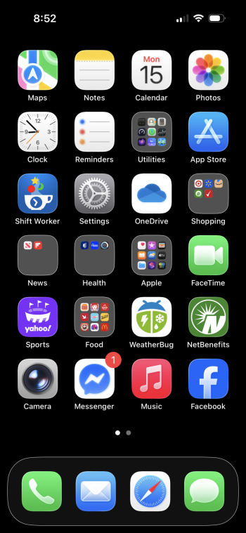
I don’t understand why some app icons now look so blurry it’s like I need glasses.
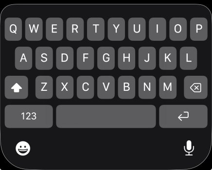
I’m still on the fence about the new UI. I especially don’t like the new keyboard and there are many bugs all over the place. But…What I don’t get is how they managed to get an approval to prioritise a new GUI. They do have other parts and a bit of a backlog of things that I would have considered more important to fix.
It’s not like the old GUI was bad and looked dated
The old UI was boring to tears. It wasn’t fun to use. It didn’t delight the user which is what differentiates a tool from a tool that is a pleasure to use.
iOS 7 sucked all the joy out of the UI in the pursuit of absolute minimalist graphic design. While I’m not convinced the new design is where it needs to be, I’m happy that Apple is exploring the idea of bringing back some fun to the UI.
Last edited:
Register on MacRumors! This sidebar will go away, and you'll see fewer ads.


