Got a tip for us?
Let us know
Become a MacRumors Supporter for $50/year with no ads, ability to filter front page stories, and private forums.
I like iOS 7.. but this is just beyond atrocious!
- Thread starter Hephaestus
- Start date
- Sort by reaction score
You are using an out of date browser. It may not display this or other websites correctly.
You should upgrade or use an alternative browser.
You should upgrade or use an alternative browser.
Well of course watching video on a laptop or TV is better than a phone, thanks for that revelation. People use their phones when they're on the road or travelling though and that's when I use it. Buying a tablet is irrelevant, I'm talking about the iPhone which is a separate device. It plays video so it should do it well, it is very unhelpful and lazy to say "go buy a tablet".
It is also extremely pointless to say get another phone with another OS, I am merely pointing out flaws in the current design which I feel exist. Is that not allowed anymore? Sure I can download another video app from the app store, almost all of which lack stability and are glitchy.
The point is, the built in video app should be obtrusive to the content, which it is.
You glossed over the other option I suggested: use another video playback app. Another posted mentioned VLC. It's a free video playback app. If you need a link, click here. I mean isn't the modern smartphone based on the "there's an app for that" premise?
Granted, you can't have ALL video playback handled by the non-built-in app since you can't change the built-in Video app in iOS but at least you can playback local files using another app.
are u forgetting how much screen real estate ios6 took up?? it was more obtrusive than ios7 IMO
Image
if you take the magnitudes of the derivative vectors of the movie frame pixels and also from those two 2 user interfaces composites, subtract the latter two from the first, and sum the differences for both i think os 6 will win according to mathematics
In iOS 7.1 it doesn't show the volume bar anymore...
I'm running 7.1, explain please because it still does it for me
tap screen > pause > adjust volume / look at video duration / etc. > play
OP, i understand your viewpoint. i just disagree. with a small amount of real estate to work with (i.e., a 4" (or smaller) screen on an iphone) and the necessity of functional controls, i think that the proportions--which is what i think your post is really about--are acceptable.
re: android, the last 4" screen device running android that i used was manuf. around late-2010. generally, android devs have more real estate to work with.
But as the OP pointed out, Google's approach is much better. And in terms of volume, I don't even need a visual to show the volume level. If I keep pressing the volume button and the volume doesn't increase then I know I'm at Max.
It's annoying... but is it really worth expending so much energy to get upset about it? What percentage of the movie do you really miss due to those items appearing on the screen? Not very much at all.
I would suggest you find another video app that suits your needs better. Certainly seems like it would be a better use of your time than belittling people who don't see this issue exactly the same way that you do.
I believe op here is talking about details and user experience. No one would've been more worried than Steve Jobs when he found that one of the letters in "google" logo had a wrong color gradient, which was way less unimportant than what op found annoying today. It's just this intensity of attention to detail that distinguishes apple from other tech companies. In a sense, yes, we are just users of apple products, not creator or manager of them, so it's not worth it expending so much energy as those who work at apple. But being a meticulous user makes apple's effort pursuing details worthwhile. And as Ivy himself said, you make changes to a thing because those changes could improve it and make it better. This intrusive UI design in video playing is obviously a violation to the value he holds and breaks his recent ideas to make content a priority instead of what bears the content.
I'm running 7.1, explain please because it still does it for me
What I think he meant is that it doesn't show the volume box in the center of the screen anymore. It just brings the top/bottom bar where you can adjust the volume either with the side buttons or the slider. And that one you can dismiss with a screen tap.
I also do agree that those bars should be a little (or a lot) more transparent.
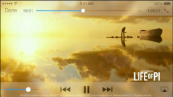
As the title says, I do like iOS 7 and the subtle transparency effects. The implementation of this in the video app however is SO ridiculous it is beyond words. I will let the images do the talking.
Here I am watching a video..
Image
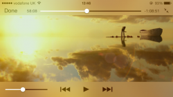
Now, I tap the screen to see the time or how long is left of the film..
Image
I mean, how can anyone consider that good design?! SO much of the video is obstructed by these new effects, at least a third of the video is distorted and unwatchable. It is absolutely ridiculous.
Moving on, here I am watching some more of my video and film..
Image
Now, I wish to increase or lower the volume, which is something pretty darn common. It's mere common sense to assume that people do this action quite a lot when viewing a film or TV show.
Image
... and I am greeted with this. Again, the stupid thing distorts SO much of the video. A large chunk of the video is unwatchable for several seconds, and if you do this a lot, it adds up to a lot of time! It is SO darn annoying.
Meanwhile, here is how Google decide to implement showing the user the remaining time or other status during a video.
Image
See the difference? You can actually SEE the video! My goodness I am literally stunned at how stupid Apple designers are at times, I'd love to meet the guy responsible for this and throw something at him. I have tried to ignore this for several weeks since the OS launched but I cannot bear it any longer.
I watch a lot of movies and shows on my phone and it really is SO frustrating.
I love The Wire! Awesome show! I agree, they should make it less obstructive.
After a little background research I have found something quite interesting. Take a look at this screenshot of "Life of Pi".

Now, below is how Apple demonstrated iOS 7 before it was released. This was taken directly from their video "Introducing iOS7". You can clearly see in the image below that the transparency effects were far more subtle and less obtrusive. You can quite easily make out the shapes of the clouds and other details.

The final image below however shows what Apple actually gave us with the public release.

Look at the difference, it is huge! Before release, the layered transparency still left the visual distinction of the image intact, you can at least see the the details of the video. Now however, it is simply a blurred mess. I find it almost incomprehensible that they changed the initial calibration to what we have now.
If it stayed as advertised initially, it would probably be bearable. The difference is literally enormous. Bear in mind that is a pretty simplistic scene, so if those pre-launch effects were layered over a busy scene it would be so much more tolerable than what he have now, where it is literally blurred into an unwatchable mess.
Now, below is how Apple demonstrated iOS 7 before it was released. This was taken directly from their video "Introducing iOS7". You can clearly see in the image below that the transparency effects were far more subtle and less obtrusive. You can quite easily make out the shapes of the clouds and other details.
The final image below however shows what Apple actually gave us with the public release.
Look at the difference, it is huge! Before release, the layered transparency still left the visual distinction of the image intact, you can at least see the the details of the video. Now however, it is simply a blurred mess. I find it almost incomprehensible that they changed the initial calibration to what we have now.
If it stayed as advertised initially, it would probably be bearable. The difference is literally enormous. Bear in mind that is a pretty simplistic scene, so if those pre-launch effects were layered over a busy scene it would be so much more tolerable than what he have now, where it is literally blurred into an unwatchable mess.
Attachments

Last edited:
I loved iOS6 but after upgrading to iOS7 I have to say I am more than disappointed it is horrible and the fact I can not go back to 6 is making me consider selling my iPhone.
I understand they want to make things simple but my phone used to be good at scrubbing videos, now it is horrible, the plain white look and everything else is just horrible in 7.
I understand they want to make things simple but my phone used to be good at scrubbing videos, now it is horrible, the plain white look and everything else is just horrible in 7.
After a little background research I have found something quite interesting. Take a look at this screenshot of "Life of Pi".
Image
Now, below is how Apple demonstrated iOS 7 before it was released. This was taken directly from their video "Introducing iOS7". You can clearly see in the image below that the transparency effects were far more subtle and much less obtrusive. You can quite easily make out the shapes of the clouds and other details.
Image
The final image below however shows what Apple actually gave us with the public release.
Image
Look at the difference, it is huge! Before release, the layered transparency still left the visual distinction of the image intact, you can quite easily see the the details of the video. Now however, it is simply a blurred mess. I find it almost incomprehensible that they changed the initial calibration to what we have now.
If it stayed as advertised initially, it would probably be bearable. The difference is literally enormous. Bear in mind that is a pretty simplistic scene, so if those pre-launch effects were layered over a busy scene it would be so much more tolerable than what he have now, where it is literally blurred into an unwatchable mess.
The middle picture is how it would look without "Increase Contrast" feature, the third one has it on. Either way, still obtrusive.
The middle picture is how it would look without "Increase Contrast" feature, the third one has it on. Either way, still obtrusive.
No that's not correct, I wish it was. The middle picture is a pre-release shot of iOS 7, and the third picture was taken by me using my iPhone. I do not have "Increased Contrast" turned on. If you increase the contrast it would probably look even worse.
Same thing applies to the dock that was much more transparent in all of Apple's pre-release information that it ever was or is in reality.After a little background research I have found something quite interesting. Take a look at this screenshot of "Life of Pi".
Image
Now, below is how Apple demonstrated iOS 7 before it was released. This was taken directly from their video "Introducing iOS7". You can clearly see in the image below that the transparency effects were far more subtle and less obtrusive. You can quite easily make out the shapes of the clouds and other details.
Image
The final image below however shows what Apple actually gave us with the public release.
Image
Look at the difference, it is huge! Before release, the layered transparency still left the visual distinction of the image intact, you can at least see the the details of the video. Now however, it is simply a blurred mess. I find it almost incomprehensible that they changed the initial calibration to what we have now.
If it stayed as advertised initially, it would probably be bearable. The difference is literally enormous. Bear in mind that is a pretty simplistic scene, so if those pre-launch effects were layered over a busy scene it would be so much more tolerable than what he have now, where it is literally blurred into an unwatchable mess.
The middle picture is how it would look without "Increase Contrast" feature, the third one has it on. Either way, still obtrusive.
The middle picture is how it SHOULD look without increased contrast on. Sadly.. Not..
are u forgetting how much screen real estate ios6 took up?? it was more obtrusive than ios7 IMO
Image
Even I agree with this

I agree with the volume indicator obstructing the screen. I just was in the middle of gameplay on GT Racing 2, decreased the volume and the volume indicator literally covered the majority of the screen causing me to not know where the hell I was driving. Ended up crashing and losing the race. I rarely play games, but the point still stands, it's obtrusive.
I rarely play games, but the point still stands, it's obtrusive.I think you're all missing a big point.
iOS 1 was also ****. It wasn't actually ****, but it wasn't that great compared to ios 6.
iOS 6 had 6 years to mature. Anyone who likes cheese knows how important this is.
iOS 7 is also ****. But I bet that by the time it's matured into iOS 8,9,10,11 it'll be the Apple system we all want.
iOS 1 was also ****. It wasn't actually ****, but it wasn't that great compared to ios 6.
iOS 6 had 6 years to mature. Anyone who likes cheese knows how important this is.
iOS 7 is also ****. But I bet that by the time it's matured into iOS 8,9,10,11 it'll be the Apple system we all want.
So Apple learned nothing or not much at all from all the experience from the first 6 versions that it has to just go back and create iOS 7 on that same novice level as it was creating iPhone OS 1? That's a rather silly position.I think you're all missing a big point.
iOS 1 was also ****. It wasn't actually ****, but it wasn't that great compared to ios 6.
iOS 6 had 6 years to mature. Anyone who likes cheese knows how important this is.
iOS 7 is also ****. But I bet that by the time it's matured into iOS 8,9,10,11 it'll be the Apple system we all want.
Now, below is how Apple demonstrated iOS 7 before it was released. This was taken directly from their video "Introducing iOS7". You can clearly see in the image below that the transparency effects were far more subtle and less obtrusive. You can quite easily make out the shapes of the clouds and other details.
Image
I agree. I think what they demonstrated was, visually, far better than what they delivered. The only reason I can think for them going backwards here is either accessibility or performance. If anyone thought that it was actually better looking with a thick wall of blur, they'd be crazy.
As the title says, I do like iOS 7 and the subtle transparency effects. The implementation of this in the video app however is SO ridiculous it is beyond words. I will let the images do the talking.
Here I am watching a video..
Image
Now, I tap the screen to see the time or how long is left of the film..
Image
I mean, how can anyone consider that good design?! SO much of the video is obstructed by these new effects, at least a third of the video is distorted and unwatchable. It is absolutely ridiculous.
Moving on, here I am watching some more of my video and film..
Image
Now, I wish to increase or lower the volume, which is something pretty darn common. It's mere common sense to assume that people do this action quite a lot when viewing a film or TV show.
Image
... and I am greeted with this. Again, the stupid thing distorts SO much of the video. A large chunk of the video is unwatchable for several seconds, and if you do this a lot, it adds up to a lot of time! It is SO darn annoying.
Meanwhile, here is how Google decide to implement showing the user the remaining time or other status during a video.
Image
See the difference? You can actually SEE the video! My goodness I am literally stunned at how stupid Apple designers are at times, I'd love to meet the guy responsible for this and throw something at him. I have tried to ignore this for several weeks since the OS launched but I cannot bear it any longer.
I watch a lot of movies and shows on my phone and it really is SO frustrating.
I agree with the OP regarding the volume HUD.... I have paused videos just to turn it up to avoid missing anything with a giant blurred hud.
Register on MacRumors! This sidebar will go away, and you'll see fewer ads.