Got a tip for us?
Let us know
Become a MacRumors Supporter for $50/year with no ads, ability to filter front page stories, and private forums.
iOS 16.1 Beta Adds More Pronounced Gray Border Around Dynamic Island When Using Black Wallpapers or in Dark Mode
- Thread starter MacRumors
- Start date
- Sort by reaction score
You are using an out of date browser. It may not display this or other websites correctly.
You should upgrade or use an alternative browser.
You should upgrade or use an alternative browser.

That looks terrible. It should be an Accessibility feature, perhaps as part of Button Shapes setting.
Or Increase Contrast.
Preposterous, one of the lazier conspiracy theories posted here recently. Nobody is going to see this in public unless they are standing right over you as you use your phone.I’m sure this is Apple wanting to keep the marketing/branding of the Dynamic Island strong by forcing it to be noticeable in public.
Wow, this is a horrible design choice. The whole point of using a dark background and using dark mode is so that the notch/dynamic island gets hidden!
Preposterous, one of the lazier conspiracy theories posted here recently. Nobody is going to see this in public unless they are standing right over you as you use your phone.
Then what’s your theory of why it exists? Apple has been known to do this with their branding of the notch in the iPhone X and the “stovetop” appearance of the iPhone cameras.
Why does everyone online have to be so passive aggressive just because they disagree? Why is everyone constantly so angry?
I really hope they change this back or make it an option. I want the Dynamic Island to completely fade into the background and, if anything, I'd prefer they made it darker or black, not brighter and more noticeable.
Hahahah just when you thought Apple designers could not get any dumber they go and do this.
My god they’re all ****** inept.
Get rid of Alan Dye immediately Jesus Christ.
How could they be so unintelligent to make something IN THE BACKGROUND DISTRACTING?
The god damn status bar and all elements within it HAVE to be static, and not have high contrast and distracting colors…like large orange font from the Timer ticking down by SECONDS on a black background.
Holy **** they’re stupid.
If I were running iOS design every single one of you would have an astronomically better experience, and I can guarantee you, your notifications would never be hidden in a submenu you have to swipe to reveal HAHAH
It should be part of high contrast accessibility, real talk.That looks terrible. It should be an Accessibility feature, perhaps as part of Button Shapes setting.
Jesus ****ing Christ. It’s always one step forwards one step back with this company.
why do they find ways to actively make things worse?
why do they find ways to actively make things worse?
Haha , Apple doesn’t want you to hide pill hole aka DI
With the latest iOS 16.1 beta, Apple has tweaked the design of the Dynamic Island on the iPhone 14 Pro and Pro Max to make it more visible on a dark background. When using a darker wallpaper or with the darker interface of Dark Mode activated, there is a light gray border around the outside of the Dynamic Island when the screen is dimmed or when the Dynamic Island is in active use.
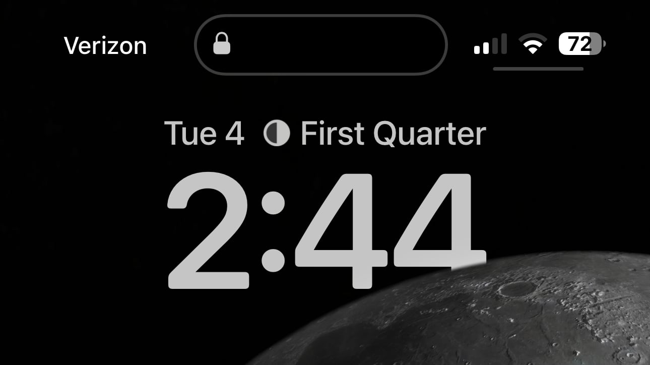
The border does not show up on lighter color wallpapers where the Dynamic Island's outline is already visible, and it disappears when the iPhone is unlocked or when the Dynamic Island is not being used. If you play music or use an app that displays content in the Dynamic Island, the border will show up again.
In iOS 16.0.2, there is a very faint border around the Dynamic Island, but the iOS 16.1 beta makes it much more apparent. It is not clear why Apple has made this change, and what it ultimately adds to the Dynamic Island interface. For those who used dark backgrounds to make the Dynamic Island blend better into the screen around it, the new outline is something of a distraction.
Article Link: iOS 16.1 Beta Adds More Pronounced Gray Border Around Dynamic Island When Using Black Wallpapers or in Dark Mode

Or it is a bug.Haha , Apple doesn’t want you to hide pill hole aka DI
When you watch video, does the image go north of Island or it creates a notch?Just tested it, and it doesn't have the gray outline while watching videos in landscape mode.
Hope this is a bug, also just let us remove the home bar already
It works the same way it does on the iPhones with a notch. You can either have the video full screen with the "pill shape" cutout on part of it. Or you can have the video have black bars on top and bottom and then not see the pill cutout at all. The default way is black bars.When you watch video, does the image go north of Island or it creates a notch?
Glad I'm not the only one whose reaction was "but why though?"
OK I'm just gonna say it. The head of design at Apple is not doing a good job. We keep just going further in the wrong direction. Specifically the iPadOS-ification of macOS UI is my main complaint, but there are many examples.
The hardware is fine but the software is getting out of hand, and I think Dynamic Island is one of the first most prominent examples of the questionable software UI choices spilling over into hardware.
Apple acts like a hole punch camera is a revolutionary and magical innovation that could not possibly have been brought to the lowly iPhone 14. This plus the block of plastic instead of a SIM slot really puts me off Apple this cycle.
They wanted the DI to be an upsell feature for the Pro line, simple as that.Apple acts like a hole punch camera is a revolutionary and magical innovation that could not possibly have been brought to the lowly iPhone 14
They wanted the DI to be an upsell feature for the Pro line, simple as that.
Yeah exactly. And I really do not like that. Every phone gets satellite connectivity but only the Pro line gets an entirely reinvented notification system? This is just distasteful to me as the most obvious example yet of Apple withholding something that could easily have gone to everyone just for the sake of the upsell.
Maybe it's a bad example. Maybe I'm all wrong. But "you no longer have to deal with a SIM card!" just soured the whole presentation for me, and then they spring an unnecessarily re-invented wheel on us to try to lure us to the otherwise relatively unremarkable Pro.
It was bad enough when just in the clock app which has a black background, showing it everywhere is awful
Understandable but it is smart business and clearly works well for themYeah exactly. And I really do not like that.
Can we see your portfolio? Surely, with that skill level you must have done work for a number of Fortune 500 companies.If I were running iOS design every single one of you would have an astronomically better experience,
Understandable but it is smart business and clearly works well for them
We'll see how clear this particular move is. It's not like they're going to take some huge financial hit even if it's clearly a bad idea.
Personally I'm not too worried honestly. I jumped on iPhone 13 Pro as the clear stable choice, and it turns out to be a good choice as this is obviously a half-step year.
Next year we should see widespread eSIM support, something in that slot besides a block of plastic, clear answers and improvements on satellite connectivity pricing and functionality, USB-C, expansion of DI to all iPhones along with more third-party support, etc etc.
I'll just give it a year.
Register on MacRumors! This sidebar will go away, and you'll see fewer ads.