Got a tip for us?
Let us know
Become a MacRumors Supporter for $50/year with no ads, ability to filter front page stories, and private forums.
iOS 16 Beta 5: Battery Percentage Now Displayed in iPhone Status Bar
- Thread starter MacRumors
- Start date
- Sort by reaction score
You are using an out of date browser. It may not display this or other websites correctly.
You should upgrade or use an alternative browser.
You should upgrade or use an alternative browser.
I'm so glad it's back. Hopefully, they'll keep it. I'm tired of constantly having to enter Control Center to find out my battery life.
Does your battery icon not deplete?I'm so glad it's back. Hopefully, they'll keep it. I'm tired of constantly having to enter Control Center to find out my battery life.
Yep higher PPI but the real estate on either side of the notch was cramped. I'm guessing it wasn't enough room or looked too cramped even though pixel density was good enough.Possibly, but what about a mini @ 476 ppi and 2340‑by‑1080? Could not they fit it there?
Well, I guess it is time to throw away my 13 mini and get myself the 14 Pro for this life essential!
/s
/s
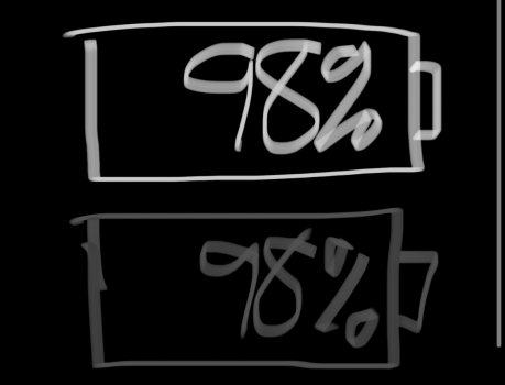
The first example the battery icon looks full, the second example the battery looks empty.Solution. Only display the battery icon outline and only the number inside.
That way the background of the icon wouldn’t trick you to think the battery is full.
Quick example.
instead of this:

it could be like this

Oh trust me I'm sure they brainstormed how they could spin that... but in the end probably decided they would look silly and get ridiculed... But if there was a way for them to spin that being an iPhone 14 only feature you better believe they would have done that.Frankly, I am surprised this isn't an iPhone 14 Pro only exclusive feature because the new A16 Bionic Ultra Max Pro chip is the only smartphone CPU capable of such incredibly innovative UI performance due to its PercentEngine specialized AI cores that render this icon in real time.
The most popular I've seen since the one about the crippled 8/256 Airs.I'm wondering if this will be the most commented post of the week.
Discovered them getting gas on the way back from VA. Wish the closest to us was closer than Philly. Need to build a Church's/Krispy Kreme combo closer than 50 miles, and I would move in thereI hope we’re talking Church’s Chicken crispier. They’re the best. 🤪

So it would trick you in to thinking the battery is empty instead...Solution. Only display the battery icon outline and only the number inside.
That way the background of the icon wouldn’t trick you to think the battery is full.
Quick example.
instead of this:
it could be like this
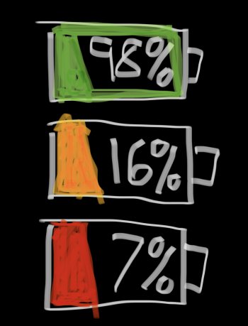
Personally, I would prefer these icons to be like these:Solution. Only display the battery icon outline and only the number inside.
That way the background of the icon wouldn’t trick you to think the battery is full.
Quick example.
instead of this:
it could be like this
(colors could be adjusted for better readability)
Attachments

Hello donut chicken sandwich 😱Discovered them getting gas on the way back from VA. Wish the closest to us was closer than Philly. Need to build a Church's/Krispy Kreme combo closer than 50 miles, and I would move in there
The clear seems to be the way to go! They already know how to program text black or white based on whatever the background is. Green and white can be difficult to read, so can orange/red and white.Personally, I would prefer these icons to be like these:
(colors could be adjusted for better readability)
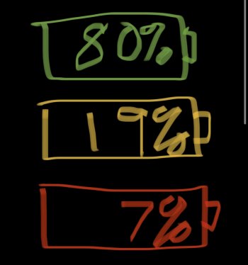
…Or they could just make black battery/white text, or white battery/white text. And on low power only show an empty battery with a little orang/red color in the little sliver at left of battery. With the white/black in the other part.
OR: green/yellow/red outline… clear inside with white/black text for number.
Like this attached in images. Sketched it out. I don’t know how to attaché images to feedback… so maybe someone else can that’s in the beta program.
Attachments
Discovered them getting gas on the way back from VA. Wish the closest to us was closer than Philly. Need to build a Church's/Krispy Kreme combo closer than 50 miles, and I would move in there
If you’re ever in San Antonio/Austin area… 😎Hello donut chicken sandwich 😱

Outrageous doughnut chain fries up opening date for San Antonio shop
Hole in one
 sanantonio.culturemap.com
I’ve never heard of that bug before!It does not
But in the Control Center the system gives out already an estimate.Well no, it didn't take 25 people 5 years working 24/7 to implement it.
The number is a unreliable guess due to charge curves, battery chemistry, battery aging and even the combo thereof. It doesn't convey an accurate actual number at all and it gets worse over time so it's a lie. So they felt the fuzzy reporting of a image was better and in a way more correct.
However some people like that false feeling of absolute certainty and other just feel they can glance faster at a number than a graphic. Whatever the reason these are valid concerns and it's good they made in an option now.
They didn’t say “on all notched devices” though.
OMG really? Ok yeah you're technically correct but "on notched devices" doesn't need the word all as it implies all. Crazy how people can justify anything these days SMH
You never needed the battery widget unless you had airpods or an apple watch. Ever since the iphone X launch with iOS 11, it has been possible to see the battery percentage by swiping down from the right corner to reveal the control center.That’s actually going to be pretty convenient since now we don’t have to get a dedicated battery widget in the new upcoming lock screens. We can use some other useful widgets instead
It wasn’t completely removed. You could still check the percentage by swiping down to reveal the control center.Dumbest thing ever removing it in the first place. Should've at least given an option...it's probably the most important info next to signal strength.
Yeah I don’t have AirPods or the watch. Also by having the battery percentage in the right corner all you have to do is tap to wake to see it now and that’s one less movement you have to do. Swiping down to reveal the control center is two steps while just tapping to wake the phone to see the battery percentage in the right hand corner is one step. Get it?You never needed the battery widget unless you had airpods or an apple watch. Ever since the iphone X launch with iOS 11, it has been possible to see the battery percentage by swiping down from the right corner to reveal the control center.
The bar doesn't deplete, no. It only changes colors when you charge up the phone.Does your battery icon not deplete?
That’s odd! With the percentage not shown my battery icon depletes!The bar doesn't deplete, no. It only changes colors when you charge up the phone.
Apparently Apple eliminated the depleting in the iOS 16 beta when they added the percentage. We’ll see if it stays that way in future betas and the public release.That’s odd! With the percentage not shown my battery icon depletes!
Register on MacRumors! This sidebar will go away, and you'll see fewer ads.