I’m way more excited about this. We’ve had enough new features for awhile. Bring on the bug fixes.the anonymous source added that iOS 17 will be focused on performance and stability improvements
Got a tip for us?
Let us know
Become a MacRumors Supporter for $50/year with no ads, ability to filter front page stories, and private forums.
iOS 17 Rumored to Feature 'Major' Changes to iPhone's Control Center
- Thread starter MacRumors
- Start date
- Sort by reaction score
You are using an out of date browser. It may not display this or other websites correctly.
You should upgrade or use an alternative browser.
You should upgrade or use an alternative browser.
Let's hear what people would like to see in control center!
I'm not sure what changes I'd like to see.
Maybe more clock and widget customization. I'd like more options when placing widgets. Sometimes they cover part of a picture that if placed differently I could avoid.
I’d like Apple to follow their own standard API’s and allow:
Voice Memo’ to record while iPhone is locked and also while the app is running in the background.
Translate app as well to use the same iOS microphone api to run in the background as Shazam can.
Since BOTH are first party applications yet if using the API within Control Center as Shazam does then neither app has to fully be running taking up battery life and system resources beyond the need.
Example use case:
A friend posted a quick status update within WhatsApp, with a speech or phrase in Español a language I’m trying to self learn in earnest. Right now I cannot playback from WhatsApp this status message and translate within Apple’s own Translate app. Furthermore I cannot playback from WhatsApp (with or without H1/H2 Apple headphones to do this either). And use Voice Memo to record.
The reason this doesn’t exist is because there is 2% of users who really want to permanently turn of WiFi. Likely 80% of users who did so would forget it was off and use up their data unnecessarily even when at home. I caught myself doing this. I personally wish I could have Siri to turn it back on when arriving at home. She can turn it on and of, the location and scheduling feature just doesn’t apply.We also need 🛜 Wi-Fi and Bluetooth Turn off buttons in the Control Center.
2% of users would need this so close to 2 billion don’t and we’re accidentally forgetting to turn it back on. This means wasting cell data when on safe networks or not automatically connecting to devices you generally use and thinking something wrong after multiple attempts.We also need 🛜 Wi-Fi and Bluetooth Turn off buttons in the Control Center.
What is often overlooked is Siri being able to control most of these features by voice. Being able to turn WiFi and Bluetooth on and of by voice is a very powerful exclusive Apple feature that many are unaware of.
I'd love the option to invoke Control Center by swiping up from the bottom; right now, it's a bit of a stretch to reach up for it.
So currently, a short swipe up has replaced the home button. A long swipe up brings up all the apps. Which would you replace to access control center when swiping up?
Swiping down invokes Notification Center, and swiping down from the right corner does the same with Control Center.So currently, a short swipe up has replaced the home button. A long swipe up brings up all the apps. Which would you replace to access control center when swiping up?
I'd just have a swipe up for multitasking, and swipe up from the right corner for Control Center.
Same as ever, but on the bottom, really.
And this requires a major version number?.
Less and less useful features every year. In both software and hardware side.
I still can’t get over the mute switch substitution. Nor about the hideous dynamic continent. Truly rubbish. Waaaay to big and sitting too low. Probably some of the changes to the control center have to do with trying to accommodate for the new “magic button” that will replace the mute switch.
This will be the 1st year in a loooot that I don’t buy the “new” iPhone, just because of that. Good luck Apple, you were nice for a while. Now you are just “teenagers phone brand” that releases the expensive phone every year with a color change and a minor camera update.
I have to think how to migrate my iCloud Photos and contacts to Android. Thanks for all the fish and so long!
Yes, this is the right wayThe control center needs to return back to the original location from a swipe up from the bottom, these two different zones to swipe down from the top is a headache.
There truly is no reason to get a new iphone every year. You're just wasting your money at that point. Just get a new phone every 3-4 years when apple stops releasing updates. Phones have gotten to a point where every year it's only an incremental change, and upgrading every single year is what companies are trying to make you do.And this requires a major version number?.
Less and less useful features every year. In both software and hardware side.
I still can’t get over the mute switch substitution. Nor about the hideous dynamic continent. Truly rubbish. Waaaay to big and sitting too low. Probably some of the changes to the control center have to do with trying to accommodate for the new “magic button” that will replace the mute switch.
This will be the 1st year in a loooot that I don’t buy the “new” iPhone, just because of that. Good luck Apple, you were nice for a while. Now you are just “teenagers phone brand” that releases the expensive phone every year with a color change and a minor camera update.
I have to think how to migrate my iCloud Photos and contacts to Android. Thanks for all the fish and so long!
I have not found the relevant thread for this but I wish there was a revert all for photos... Yes you can do it one at a time but having a one push button would also be helpful if you just want only the original unedited untouched instead of the updated edited photo all at once...
I think the main things that they could do would be to allow us to customize it more. It should match our needs more and not just what Apple assumes we want.I hope they’re right, I’m not the biggest fan of control center, but I’m not sure how they’d improve it either.
- Let us add more actions and remove those that are not relevant to us.
- Allow us to add shortcuts so that we can do automation if needed.
- Allow more control over which HomeKit/Matter devices show up.
- Give us the ability to customize the layout of the controls.
This current design aesthetic is so incredibly old and stale at this point. There is nothing about it that would be change for change sake, it needs it.
If aesthetics are the issue, are you advocating a change in control center for appearances only?
Or are you like me, who feels like the control center should at least use the same icons as are used on the Home Screen, Settings, etc. The flat-design white monochromatic dumbed-down icons in the control center have made zero sense from the start. That's an aesthetic-only thing that introduces micro-pauses to find the icon you're looking for but which doesn't look like the icon you're looking for.
The reason this doesn’t exist is because there is 2% of users who really want to permanently turn of WiFi. Likely 80% of users who did so would forget it was off
This. Users are far more likely to call up Apple support with "my Apple Watch / AirPods / etc. don't work", "AirDrop doesn't work", etc. ("have you tried turning Wi-Fi and Bluetooth back on?" — "oh…") than they are to actually want them disabled.
I think the main things that they could do would be to allow us to customize it more. It should match our needs more and not just what Apple assumes we want.
- Let us add more actions and remove those that are not relevant to us.
- Allow us to add shortcuts so that we can do automation if needed.
- Allow more control over which HomeKit/Matter devices show up.
- Give us the ability to customize the layout of the controls.
Yes. A bit more like widgets:
- let us drag them around to change their order
- let us change the size of elements. Home isn't twice as important as Camera to me, but takes up twice the space (really, four times, because it also adds two items to control random devices directly).
- speaking of: those devices it picks are a random selection in a random order. Impossible to build muscle memory that way.
I imagine people who use Shortcuts heavily would also like the ability to simply add a few shortcuts of their own to Control Center directly. I think Apple is a bit concerned about security implications there.
Then why do you bother with Apple if you have such a bad attitude about it? Android is certainly so much better, right? To many people complaining Apple’s going to make it worse, when 99.9999 percent of the time Apple makes it way better.Whatever the change is I'm sure it will require two steps to accomplish the same thing you can do now with one.
Last edited:
That is the theory. My AirPods almost never automatically switch to my current device. Apple's algorithm for deciding which one is my current device is having serious trouble and I find myself having to take manual action many times a day.If you're having to manually connect airpods via control center, you're not using them as apple designed. They're designed to automatically connect to or switch to the current device you're using as long as it's signed into your apple id, without any action on your behalf other than putting them in your ears and starting some media.
I don't want to search for settings and you reply have you tried using search??Swipe down on the Home Screen and start typing “Settings”.
I wonder what this would entail? I’m fairly happy with the current control center.
Coming from Android, honestly iOS control center seems like a clusterf*@% to me. Really hoping Apple can steal some good ideas from Android for notification management and control shortcuts.
Wish Apple would have a setting where by it wasn't possible to swipe left and activate the camera. Boils my p**s everytime I do it. Seems unnecessary when there is a camera button on the bottom right of the screen.
And you can access the camera using both methods - while the phone is still locked loll.
personally feel they need to get rid of slide-left to open camera.
Or just let us customise the buttons! Or swipe gestures!!And you can access the camera using both methods - while the phone is still locked loll.
personally feel they need to get rid of slide-left to open camera.
Why would you merge it with notification centre? just because they both pull down? Those are two very different sets of content. There's already a lot of stuff in both notification centre and control centre. Would not want to just smash them together. you'd never find anything. What if you mixed your music and your email together, would that work?
I'm just saying it works pretty well on Android? Jeez
One swipe it shows the quick control toggles, brightness control, music if playing and notifications.
Attachments
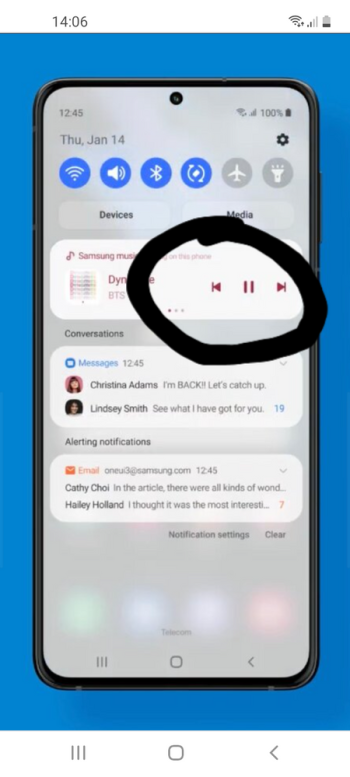
That shows very few notifications. How do you see the others in this UI? And there are very few controls, either. It seems that merging the two panels takes away a lot of functionality just to be “tidy”. I’d rather swipe one way for control and another way for notifications. They have nothing in common.I'm just saying it works pretty well on Android? Jeez
One swipe it shows the quick control toggles, brightness control, music if playing and notifications.
Bluetooth on an iPad is about two orders of magnitude less useful than than the headphone jack. It drains your battery for nothing.
I don't have a smartphone so I won't venture an opinion on whether it's useful on those or not.
I would imagine that any battery drain from leaving Bluetooth on would be minimal at best. And I do use Bluetooth for a number of scenarios. AirPods, AirPlay mirroring, airdrop and game controllers.
Register on MacRumors! This sidebar will go away, and you'll see fewer ads.