Got a tip for us?
Let us know
Become a MacRumors Supporter for $50/year with no ads, ability to filter front page stories, and private forums.
iOS 26.1 Beta 4 Lets Users Control Liquid Glass Transparency with New Toggle
- Thread starter MacRumors
- Start date
- Sort by reaction score
You are using an out of date browser. It may not display this or other websites correctly.
You should upgrade or use an alternative browser.
You should upgrade or use an alternative browser.
avanpelt
macrumors 68030

jonnyb098
macrumors 601
This is a VERY WELCOME change. But it shows Apple got in WAY over their heads with this redesign. It simply is a mess of not knowing when it wants to be lighter or darker trying to auto-adapt. Constant flickering all over the place. Especially in the photos app. Other times it literally puts white text/glyphs over bright areas or black text/glyphs over dark areas making it all impossible to navigate/read.
They could have had way more fun by getting innovative and using a mercury effect, instead of the see-through look that makes everything hard to read. It would have been super clever to leverage the front camera for realistic metallic reflections, creating a fab, standout result.
For those who didn't want to swallow batteries, then the camera could be disabled - they could have even added a low-res, low powered front camera to new phones so that it could get the colors for reflection.
For those who didn't want to swallow batteries, then the camera could be disabled - they could have even added a low-res, low powered front camera to new phones so that it could get the colors for reflection.
mrfunnypenguin
macrumors regular
Finally! Was enjoying Liquid Glass on the first dev betas until they changed its transparency, I personally think it looks a lot better when its fully transparent
vatter69
macrumors 6502a
This is our new design - it's full glass! It looks awesome! Here is the switch to turn it off.
Apple Knowledge Navigator
macrumors 601
26.2! Probably.I’m still pretty happy with the iOS18.7.1 look. Maybe they could try bringing that back?
helloapple1
macrumors 6502a
Will be cool to see someone compare the battery usage of each option. Assuming the full glass will use more battery.
jonnyb098
macrumors 601
So they admit many were telling them over the summer there should be a toggle to tone down the glass and they add it AFTER the public release to millions. Seriously what the hell is in the air over at Apple Park with some of these idiotic decisions/oversights?
They can't even keep their lies straight between this and their Apple (lack-of)Intelligence excuses.
They can't even keep their lies straight between this and their Apple (lack-of)Intelligence excuses.
David1964
macrumors 6502a
jeremyw013
macrumors member
so... exactly what the article said... did you even read it?USELESS !!! I just downloaded and you cannot even control transparency... it just changes the way the glass looks... bruh it's not like a slider where you control...
Astuces iOS
macrumors 68030
Yeah, well don't put control transparency in the title... Put : change the glassso... exactly what the article said... did you even read it?
jeremyw013
macrumors member
average apple user. complain when apple makes a change, and then they complain more when they make it optional. and they would likely complain if apple reverted the change.
Happy_John
macrumors 68000
Cool. Can people stop whining now?
helloapple1
macrumors 6502a
Readability issues.I just don't get the hate for Liquid Glass 🤷♂️
tkermit
macrumors 68040
The tinted look is way more readable, but they should just make it the default, instead of adding yet another option. It's getting ridiculous.
jeremyw013
macrumors member
a toggle is control. go take an english class.Yeah, well don't put control transparency in the title... Put : change the glass
Populus
macrumors 604
You know what I truly expect from this option? That it drastically reduces the power consumption on older devices, because the tinted option is meant to have much less transparency and, who knows, maybe it doesn’t need to perform the calculations of the glass reflections…
contacos
macrumors 604
so... exactly what the article said... did you even read it?
Seems like 90% on here didn't based on all the excitement in this thread 😅
Siriosys
Contributor
As a vision impaired user, this is a very welcome change.
With the fourth betas of iOS 26.1, iPadOS 26.1, and macOS 26.1, Apple has introduced a new setting that's designed to allow users to customize the look of Liquid Glass.
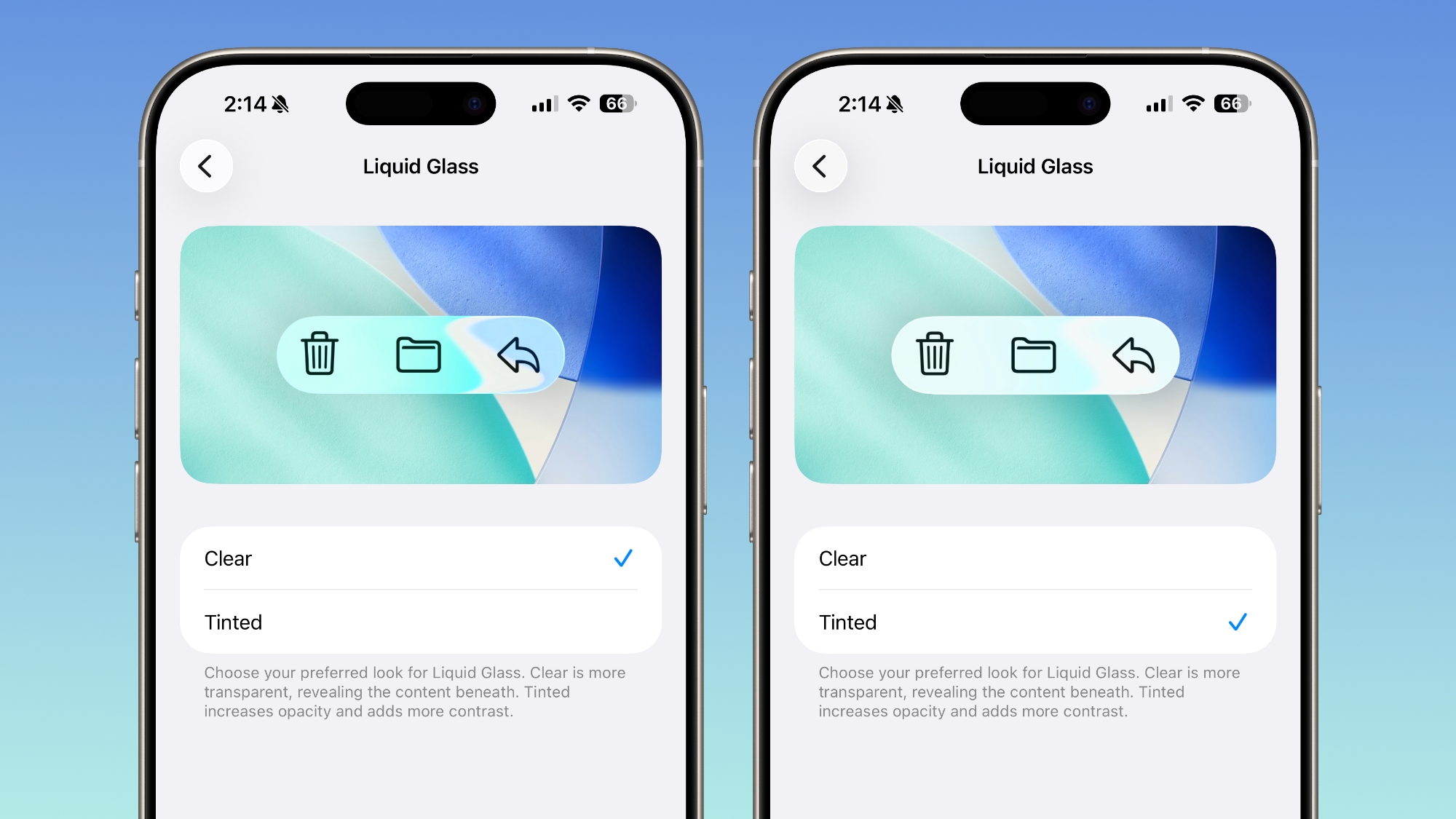
The toggle lets users select from a clear look for Liquid Glass, or a tinted look. Clear is the current Liquid Glass design, which is more transparent and shows the background underneath buttons, bars, and menus, while tinted increases the opacity of Liquid Glass and adds more contrast.
The new setting can be found on iOS and iPadOS by going to Settings > Display and Brightness, or System Settings > Appearance on the Mac.
Apple says that the new toggle was added because during the beta testing period over the summer, user feedback suggested that some people would prefer to have a more opaque option for Liquid Glass. The added setting provides additional customization in iOS 26.1, iPadOS 26.1, and macOS Tahoe 26.1.
Increasing opacity and adding contrast applies to Liquid Glass throughout the operating system, including in apps and Lock Screen notifications.
There are multiple other new features in iOS 26.1, including a new slide to stop feature for alarms and timers, new Apple Intelligence languages, a redesigned Apple TV app icon, changes to the Settings app, and more, with a full list of features available in our iOS 26.1 feature guide.
Article Link: iOS 26.1 Beta 4 Lets Users Control Liquid Glass Transparency with New Toggle

Congrats to the people crying over Liquid Glass😂🤣 y'all won but now I can crank this to full glass!