Become a MacRumors Supporter for $50/year with no ads, ability to filter front page stories, and private forums.
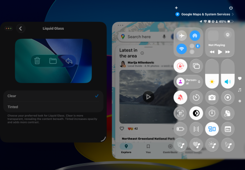
Apple finally learned to add an option similar to Windows Vista (Aero) and Windows Vista Basic. Or Windows 7 (Aero) and Windows 7 Basic. It should have been there when iOS 26.0 was released to the public.

It has nothing to do with Windows Vista, the AQUA interface of macOS existed even earlier!
I wonder how Steve Jobs would have felt about this. He wasn’t a fan of fiddly interfaces.

Come on, Steve Jobs was even against the App Store (he was forcibly convinced by the executives of that time to allow it, otherwise it wouldn’t even exist and we would have been stuck with web apps on iOS and a tremendously closed system, just as he wanted)… let’s not think that with Jobs things could have gone better, quite the opposite…
 
  • Like
Reactions: jeremyw013
I wonder how Steve Jobs would have felt about this. He wasn’t a fan of fiddly interfaces.
So hard to know. He did champion brushed metal and full on skeuomorphism. And back in the day, he extolled the very transparent Aqua 10.0 interface.

I think that the Apple of the 21st century has consistently championed 'look at me!' interfaces - although I would argue that the much maligned flat iOS 7 was pretty restrained.
 
  • Like
Reactions: hieranonymous
It would be a bit much for app developers. They're now being given light/dark and clear/tinted settings providing four basic 'looks' their users could expect from them that they have to accommodate and test.

A slider could theoretically create dozens of different interactions between the two that they'd be responsible for.

If they're making a reading app or book app, ok not a problem. But if you're making some kind of photo or camera or game or graphical app, it could really mess with them.

Fun for users, awful for developers.
Exactly. It’s not as simple as those who can mock something up in Photoshop think it is.
 
what is the difference between these 2. the liquid glass clear and tinted icons don't do much if not anything.
 

Attachments

  • IMG_3744.PNG
    IMG_3744.PNG
    1.2 MB · Views: 57
  • IMG_3743.PNG
    IMG_3743.PNG
    1.2 MB · Views: 58
I am fine with Liquid Glass on iOS but on macOS the transparency is way too distracting. I have 'reduced transparency' turned on but it does look a little plain.

This looks to be a nice middle ground, hope it comes to macOS too.
 
I felt it would come to this all along. I wasn’t worried that Apple would adjust things and this is definitely an adjustment – letting the user decide.

I really like this. It is nice with more options when they make sense.
 
  • Like
Reactions: Populus
They could have had way more fun by getting innovative and using a mercury effect, instead of the see-through look that makes everything hard to read. It would have been super clever to leverage the front camera for realistic metallic reflections, creating a fab, standout result.

For those who didn't want to swallow batteries, then the camera could be disabled - they could have even added a low-res, low powered front camera to new phones so that it could get the colors for reflection.
Oh my God, please, don’t give them ideas…
 
  • Haha
Reactions: winxmac
It has nothing to do with Windows Vista, the AQUA interface of macOS existed even earlier!
Was there an option to go back to Mac OS 9 look or a non-Aqua look for Mac OS X in the early years? I only used macOS starting with macOS 10.10 Yosemite so I don't know.

I would not have replied back if only you have immediately presented evidence that Apple gave users a choice between Aqua and a non-Aqua interface back then.
 
Register on MacRumors! This sidebar will go away, and you'll see fewer ads.